Do you remember a merry chef making burgers? That was the very first mascot used by McDonald’s, a legendary chain of fast food restaurants. In this article, we’ll reveal how the “Golden Arch” came into existence and why this branding turned out to be a tremendous success.
- First McDonald’s logo
- Logo evolution
- Three curious facts on letter M
- How would McDonald’s logo look like if it were made in ZenBusiness?
First McDonald’s logo
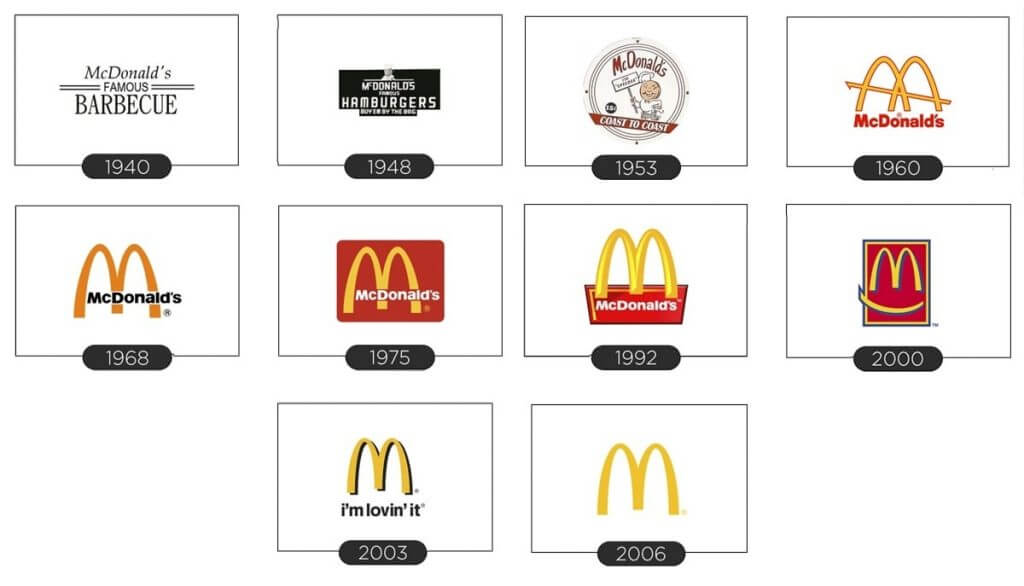
In 1948, a fast food restaurant owned by the McDonald brothers got a signage saying “McDonald’s Famous Burgers”. More importantly, the signage indicated the price of 15 cent for a burger, which was twice as low compared to competitors. Then the company replaced the text with Speedy, a merry chef with a hamburger instead of face. His name stood for fast service ..which was a signature of the restaurant.
As the brothers started a franchise chain, it was time to think about the branding. In 1952, together with a professional architect, they designed two 7.5-meter arches as a part of restaurant exterior design. Covered with bright yellow sheets, the arches were glowing in the dark. The construction did a great job at catching the attention of drivers and inviting them to grab a bite at McDonald’s.
At a certain angle, the arches looked liked letter “M”. In the 60s, Ray Kroc, the new owner of the restaurant chain, turned the arches into the brand logo.
Logo evolution
Over the next few decades, letter “M” has gone through multiple changes that regarded its size, proportions, detalization, and background color. At the same time, the company was never veering too far away from the original design – a smart move indeed!
The most drastic change dates back to 2003, when the arches got a cylindrical shape, shadow, and a slogan “i’m lovin’ it” written in a lowercase font as a sign of brand amiability and accessibility.
The modern version of the McDonald’s emblem keeps up with trends. Placed against a white background, the yellow arches have a clean, two-dimensional design. When used on the facades of McDonald’s restaurants, the emblem uses a striking red background.

Three curious facts on letter M
- There are plenty of theories on what the company logo really means. Some say that it symbolizes women’s breasts that are supposed to evoke appetite. Others are convinced that letter M looks exactly like crispy French fries.
- Colors red and yellow have been chosen for a reason. Tрese shades stir up your appetite, making your mouth water.
- There are several McDonald’s restaurants that have unusual arches. For example, in Sedona, Arizona the arches are light blue; in Paris and Bruges, they’re white; in Monterey, they made the construction black. The restaurant in Pine-Bluff, Arkansas only has one arch instead of two.
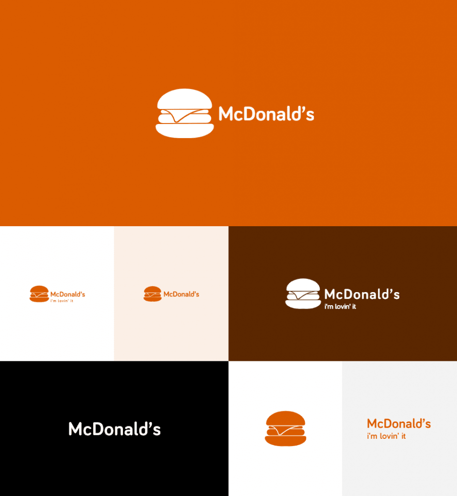
How would McDonald’s logo look like if it were made in ZenBusiness?


Final thoughts
Today, you can come across the Golden Arches in any part of the world, from Canada to Australia. With a simple and relatable concept behind it, the McDonald’s logo has truly become a part of the international culture.


