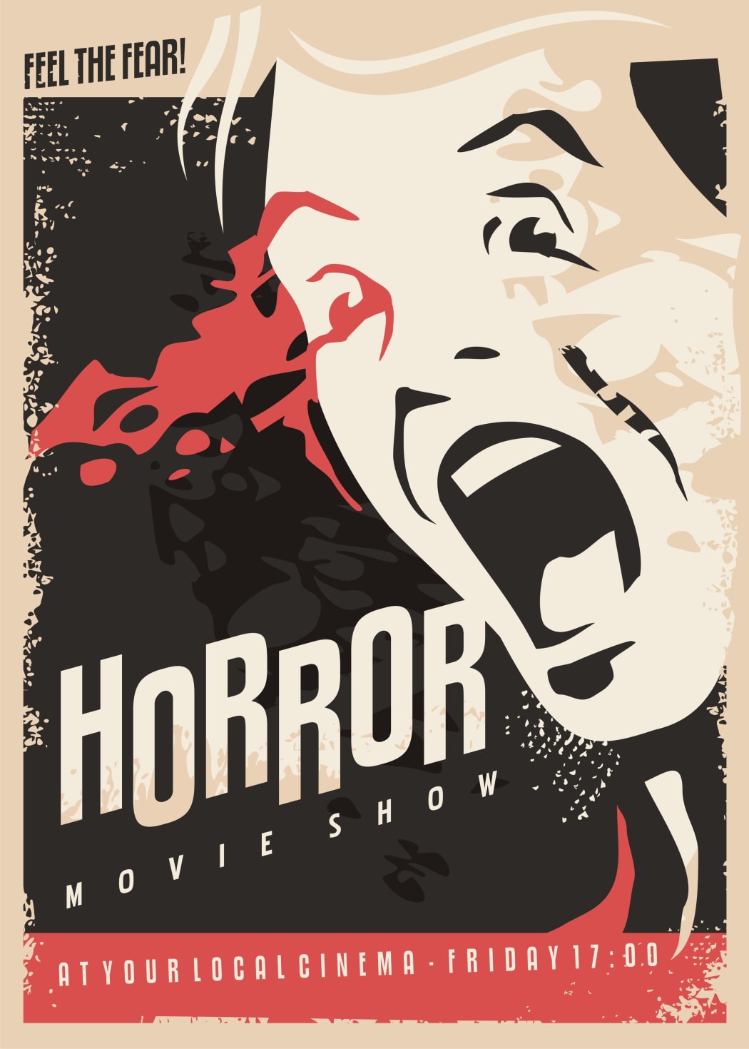
How horror movie posters have changed
Horror films have always been a hit among moviegoers. Starting from the 20s of the XXth century, horror movie posters have undergone a major transformation. In this article, we’ll examine the cinematic industry for the best designer tools and techniques. And of course, you can’t miss our tips for creating a thrilling horror-themed poster of your own!
The main goal of any horror movie poster is to scare the viewer and make them feel anxious and vulnerable. To achieve the desired effect, designers have used different methods and techniques over the years. Let’s zoom in on some of the iconic horror posters!
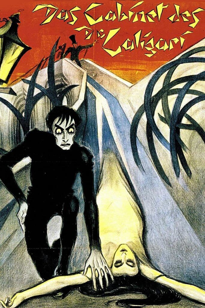
The Cabinet of Dr. Caligari (1920)
Designers that worked on the art piece for this iconic horror film did a great job. The characters on the poster look like they’re about to come to life! Jagged lines and original typefaces add an extra emotional weight to the design. The letters look like they’ve been made of crumpled paper.
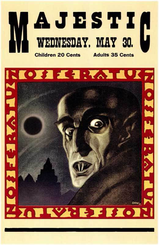
Nosferatu (1922)
This is the first screen adaptation of the blood-curdling gothic novel about the infamous vampire named Dracula. The movie poster features a huge drawing of Dracula himself, with razor-sharp teeth and bulging eyes. In the background, you can see the eerie-looking castle lit by the full moon, which is the classic landscape characteristic of many horror tales.
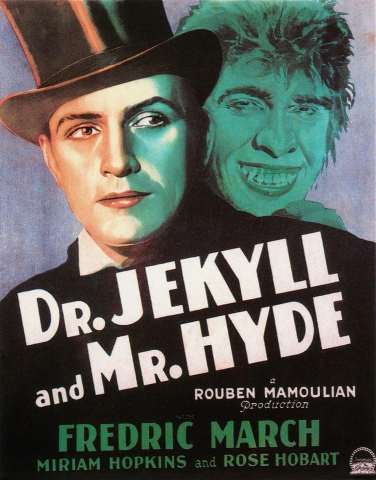
Dr. Jekyll and Mr. Hyde (1931)
The two faces on the poster stand for the dual identity of the movie’s protagonist. The main character is torn between two personalities, one of which is the noble Dr. Jekyll and the other one is the ape-like Mr. Hyde. This irreconcilable conflict is reflected through the contrasting black and white palette.
Frankenstein (1931)
This movie poster depicts the terrifying portrait of the Creature. If we’re being completely honest, evrn such a small drawing is more than enough to make you feel nervous. Written in a bold red type, the name of the movie escalates the emotional tension.

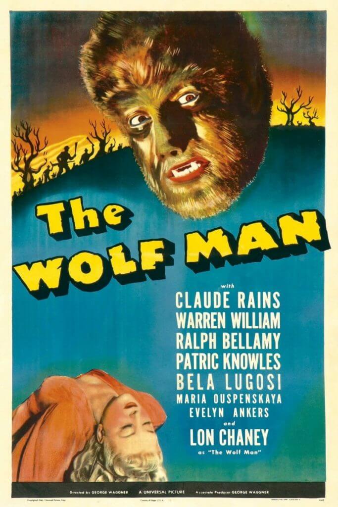
The Wolf Man (1941)
The poster features a scary werewolf leaning over the corpse of a young girl. However, the most curious thing on the poster is the text. The designer opted for a thick yellow font which is rather associated with a merry cartoon than a horror film.
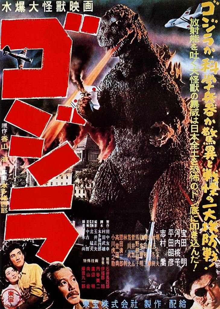
Godzilla (1954)
This art piece must be given an “A+” for playing with scale. Compared to the prehistoric lizard, cars and houses look like toys. The vertical red text is the only part of the poster that can hold a candle to the gigantic Godzilla!
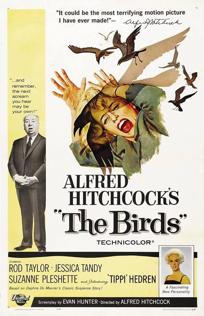
Birds (1963)
This poster hints at the movie plot without revealing too much. It features the female protagonist running away from aggressively looking birds. The movie director Alfred Hitchcock is also present on the poster. He’s scaring the already petrified public with the now iconic tagline: “And remember, the next scream you hear could be your own!”
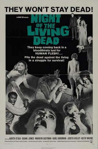
Night of the Living Dead (1968)
Here is another pretty revealing poster. The poster features people fighting aggressive zombies. The designer has done an exquisite job depicting the play of light and shadows on the characters’ faces.
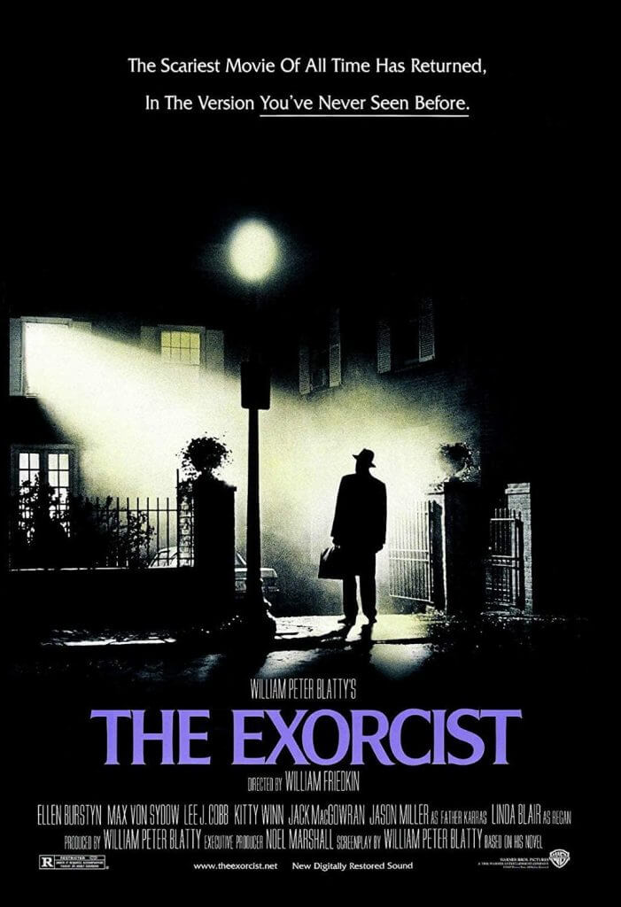
Exorcist (1973)
This is, hands down, the most mysterious poster on our list. The protagonist is standing in front of the eerie looking house. The thing that captures attention is the unnaturally bright light coming from a window on the 2nd floor.
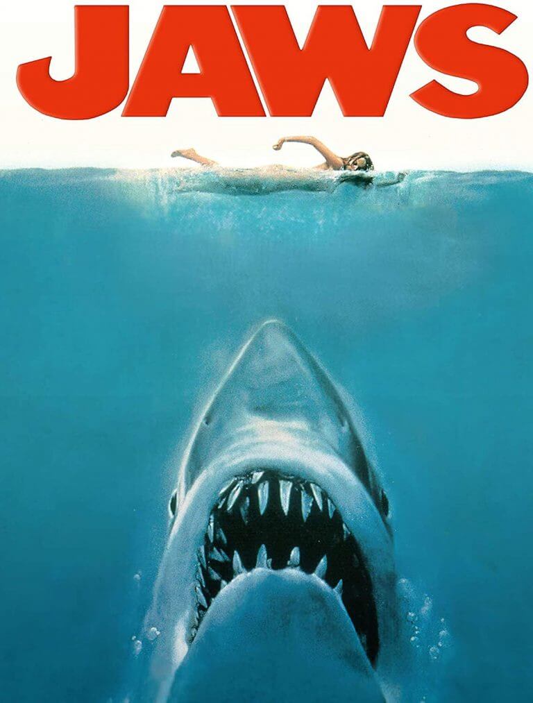
Jaws (1975)
Of course, we couldn’t miss out on the iconic blockbuster about the gigantic killer shark. Written in a bold crimson font, the name of the film anticipates a blood bath which is exactly what happens in the movie.
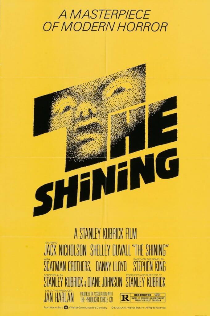
Shining (1980)
It’s a known fact that the eye-grabbing yellow poster was designed under the supervision of Stanley Cubric himself. The name of the movie is written in an impressive black font. One of the letters is stylized as a petrified face of a kid.
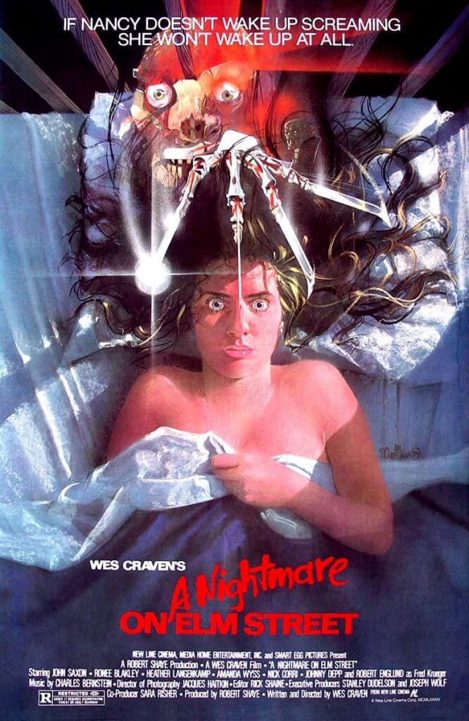
Nightmare on Elm Street (1984)
The poster to this horror classic leaves little to imagination. On it, you can see Freddie Kruger leaning over a girl lying on the bed. With his horrifying blade hands, the insane killer makes you shudder. The double exposition technique adds to the magnetic mysticism of the scene: the monster’s face appears to be dissolving in the girl’s luscious hair.
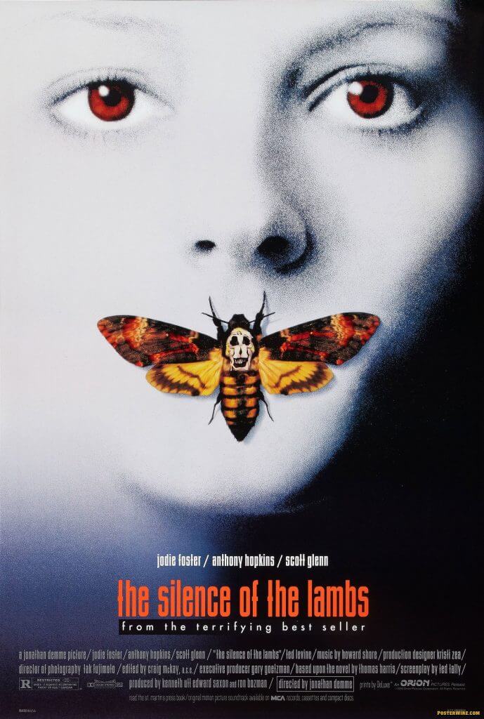
The Silence of the Lambs (1991)
This next poster looks quite disturbing. We can see a beautiful girl with a butterfly in her mouth. All would be well but the butterfly has a pattern that resembles a human skull. This is a small spoiler to the movie where the villain places a butterfly chrysalis into his victims’ mouth.
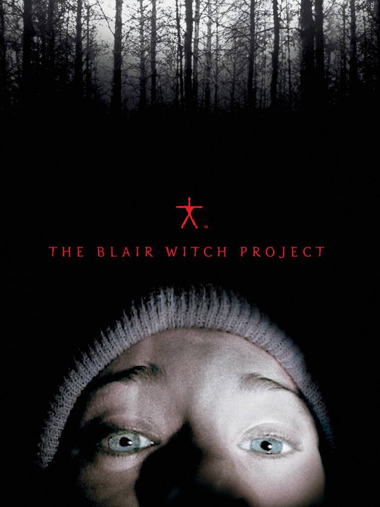
Witch from Blaire (1999)
This documentary-style horror film is built around a videotape which was accidentally found in the woods. The black and white poster features the poorly lit face of one of the characters.
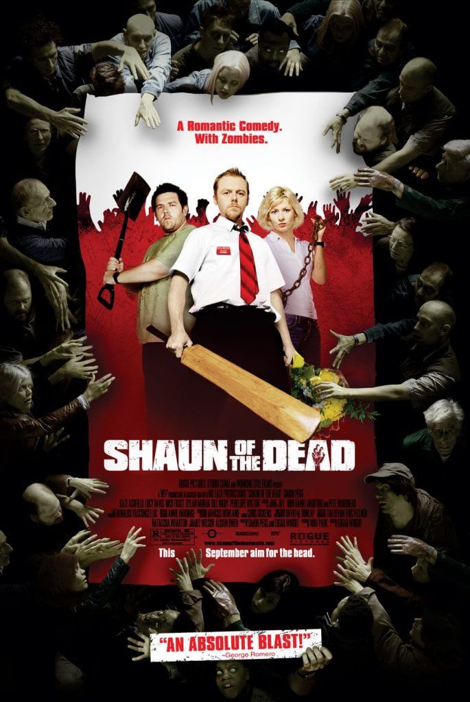
Shaun of the Dead (2004)
On this poster, you can see the three protagonists surrounded by a crowd of bloodthirsty zombies. The deadly creatures are reaching their bony hands to the men, getting ready to attack. If you’re into zombie movies, you’re sure to get hooked by this art piece!
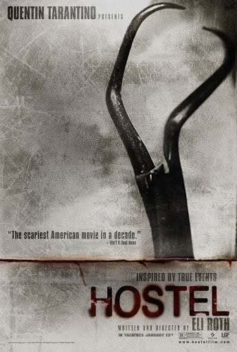
Hostel (2005)
Despite being concise and minimalist, the poster doesn’t fail to scare you out of your wits. The art piece features a surgical instrument which is used to torture people in the movie. As for the name of the film, it looks like it was written with blood.
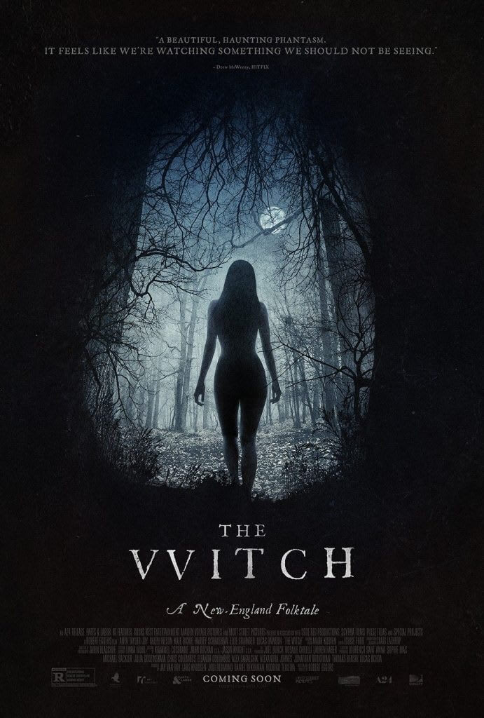
Witch (2015)
The poster portrays a naked young woman walking through the forest. While this doesn’t give away much of the plot, the font makes a reference to the 17th century. Indeed, in the word “Witch”, the first letter is stylized like “VV” which is characteristic of the old times.
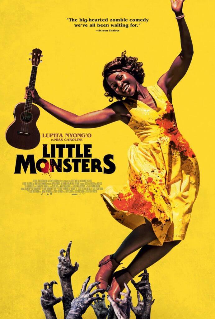
Little Monsters (2019)
The last poster on our list uses contrasting emotions and colors to create a greater visual impact. On it, you can see a zombie reaching its hands to a happy smiling woman, while the woman’s yellow dress is stained with blood.
How to create horror-themed marketing materials
A horror-themed poster or flyer will be a great way to promote a new product or Halloween celebration. Crafting a killer horror poster without professional help is easier than you think. Read on to find out how to do that!
Choose a graphic editor
You can use any graphic design program like Photoshop or Adobe Illustrator. An easier way is to use a constructor (e.g., Canva) that allows you to create a beautiful art piece using turnkey templates. .
Come up with a compelling plot
Pinpoint the central element of your future design. It can be a person, landscape, unconventional typeface, contrasting colors, etc. Think about what message you want to send to your audience and what you want them to feel.
Create a color palette
The most common colors used in vintage and retro movie posters are shades of red and achromatic palette. However, this doesn’t mean that you must limit your creativity to these hues only. Listen to your gut feeling and pick the colors that convey your idea in the best way.
Choose the best font
Focus on unconventional typefaces that give off strong retro vibes. It’s a surefire way to take your viewers back in time.
Add a logo
The central element of your brand identity, a logo is a must on your horror poster. If you want your emblem to be memorable and catchy, make sure it’s minimalist and clean. The best way to craft a nice emblem is by using ZenBusiness.
Wrapping up
Horror movie posters rely on contrasting colors, eeries creatures, scary plots, and suspense vibes. Channel your inner horror movie director to craft a visually compelling poster that will tickle your audience’s nerves and stir up their curiosity. Don’t overdo it, though, unless you want to drive your potential customers away!

