Tiffany robin’s-egg blue, Barbie pink, and Cadbury violet have become so iconic that they’ve been registered as trademarks. Through these colors, the brands set themselves apart from competitors, attract customers, and send a clear message to their audience.
How do colors affect the way your company is perceived? What emotions and moods do different hues represent? How to choose the right color palette that will speak for your brand? Let’s find out together!
- How color psychology works
- Why colors matter to brands
- How brands use colors to talk to their audience
- How to choose the best colors for your brand
- Wrapping up
How color psychology works
Look around. What colors do you see? Whether it’s a red cup, blue book or green tree, each of these shades evokes certain feelings and emotions. That’s what color psychology is all about! It studies the subjective meaning that people attach to colors.

According to color psychologists, the way we perceive colors is affected by three factors.
- Biology. Some color associations are genetically predetermined. For example, most people view red (color of fire) as passionate and energetic, while green (color of trees and plants) reminds them of nature.
- Sociocultural context. Your country of living, gender, and age also affect the way you read colors. For example, in oriental cultures, red conveys well-being, while western countries associate it with sex appeal, aggression, and energy. Light blue is a popular hue in the US, while in Asia it’s avoided due to its negative connotation.
- Personal experience. Your lifestyle, as well as events and emotions that you’ve experienced can dramatically change your perception of certain colors. For example, a person who has suffered a water accident may start to feel repulsed by the color blue.
Why colors matter to brands
Numerous studies show that colors manage customers’ emotions, shape their opinion of the company, and influence their buying decisions.
- Recognition. Colors have the power to increase brand recognition by a staggering 80%. Indeed, we can no longer imagine McDonald’s without its golden arches or Starbucks without its mysterious green siren. It’s vital that your brand color is present across all touch points with your audience, from business cards to office design.
- Uniqueness. Research shows that people tend to best recognize and remember visual elements that stand out among the rest. So if you want your brand to make a lasting impression, consider using hues that are missing from your competitors’ color palettes.
- Sales boost. Colors impact 85% of purchase decisions. When composing a color scheme for your brand, view it as an effective tool for improving your sales performance!
How brands use colors to talk to their audience
Let’s take several popular colors and explore how major businesses leverage their meanings to build a compelling brand identity. We’re by no means giving you a guide set in stone. After all, there’s no one-fits-all formula that suits all businesses. Your choice and use of colors must be determined by your company’s personality, target audience, and other factors known to you only.
White
Purity, fragility, tenderness, nobility
In branding, white stands at the core of minimalist aesthetics. To make white visible and expressive, you need to mix it with other hues.
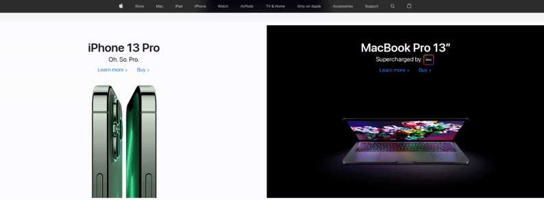
- To emphasize the visual simplicity and high technicality of their gadgets, Apple uses white packaging and monochrome website design.
- With its bold red-and-white logo, Tesla sets itself apart from other car makers that went for more reserved color schemes.

- Through its concise black-and-white emblem, Crocs transcends the idea of simplicity and innovation, which is the cornerstone of its business philosophy.
- Originating from the 1940s, the Pepsi red, white and blue logo pays homage to colors of the American flag.

Black
Exclusiveness, power, luxury, value, elegance
Black is another versatile color adored by designers. Depending on the context, black can convey a bunch of meanings. Look for yourself!
- Chanel, Dior, Marc Jacobs, and other premium brands use the timeless black-and-white palette to transcend the idea of style and luxury.

- “Squid Game”, a hit Korean TV series, uses black as a background for its logo. In addition to building tension, black provides a visually striking contrast to the text written in white and pink.

- A black triangle with fiery orange edges is a crucial design element that makes the Doritos logo dynamic and energetic. This is a sure way to appeal to the company’s target audience that consists mostly of young people.
Gray
Solemnity, reliability, serenity, reserve
Devoid of vivid emotions, the color gray is not everyone’s choice. Over the last decade, metallic gray has been a common choice among tech companies and car manufacturers.
- The gray logo artfully complements the Apple black-and-white palette and hints at the materials that are used to produce the gadgets.
- Microsoft made a smart move combining a subdued gray font with four vibrant squares. This design solution transcends the brand’s highly technological and innovative personality.

- Through its metallic gray logo, Mercedes states its loyalty to consistent growth, eco-friendliness, and minimalism. A similar brand identity is also used by other renowned car makers, such as Honda, Mini, etc.
Red
Energy, love, passion, aggression, provocativeness, danger
The color red is, hands down, a strong branding tool that never fails to catch the customer’s attention. Think about the “Stop” road sign or discount ads! It’s not surprising that brands are actively using this striking shade to make a statement.
- It’s commonly believed that red stimulates appetite which is why fast food chains, including the iconic KFC, rely on this color to attract customers and increase their average check.

- Red in the Netflix logo feels like a promise of vibrant emotions that viewers are sure to experience while watching movies and TV series on the streaming platform.
- One of the world’s biggest oil companies, ExxonMobil uses red to convey the ideas of success and determination.

Yellow
Happiness, joy, optimism, motivation, creativity
Associated with sunshine, yellow has strong positive connotations like no other color. Brands are using this cheerful hue to draw customers’ attention and create a friendly emotional environment.
- The iconic golden arches in the McDonald’s logo refer to real-life structures that used to draw attention to the first restaurants of this fast food giant.

- Thanks to the contrasting shades, the Best Buy black-and-yellow logo instantly stands out from the crowd and sticks in memory.
Orange
Optimism, vitality, joy, friendliness
Another shade that is good at catching customers’ eye is orange. However, looking less aggressive than red, orange acts in a more subtle way. Companies are using orange as a main as well as accentuating color.
- A big orange in the Fanta emblem is associated with the juicy taste of the iconic beverage and charges the viewer with energy.
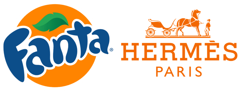
- A soft shade of orange is not a common choice among premium brands but Hermes makes an exception. The thing is that during WW2, companies only had access to orange packaging. That’s how the unusual hue has stuck with the luxury brand of bags!
- Standing for friendliness, the color orange in the Amazon logo is a nice addition to the smiley arrow and the company’s slogan, “Delivering smiles worldwide”.

Brown
Stability, support, practicality, eco-friendliness
When it comes to corporate identity, the color brown is hardly the favorite choice among businesses. There’s a substantial risk that this shade may look generic and faceless. Brown performs best when combined with other hues.
- UPS, a major shipping company, opted for a serene brown-and-golden palette to convey reliability and trust. The idea of safety is further enhanced by the shield icon.

- M&M’s all-brown logotype creates direct associations with chocolate candy which is the company’s flagship product.
Green
Nature, growth, revival, prosperity, health
The color green has a whole lot of connotations. Lighter shades of green give off a nature-friendly, healthy vibe. To translate the idea of money and financial well-being, go for deeper shades of green. On top of that, green has a calming and relaxing effect.
- Associated with fresh and healthy alimentation, green was an obvious choice for Whole Foods Market, a major chain of supermarkets that specializes in organic food.

- Established in the port city of Seattle, Starbucks was named after a character from Charles Dickens’s novel Moby Dick. The now-iconic smiling siren in the Starbucks logo makes you think of the alluring ocean depths.

- Spotify uses a tender grass-green color to allude to its approachable and inclusive personality.
Purple
Power, luxury, prestige, spirituality, mysticism
The color purple owes its meaning to a curious historic fact. In medieval times, purple dye was very expensive and only rich people could afford to wear purple clothing. This is how purple grew to be associated with power and wealth. Luckily, nowadays, the use of this magnificent shade is not limited to luxury brands.
- A British confectionery brand, Cadbury uses purple as homage to Queen Victoria that reigned in the 19th century.

- The story behind the Yahoo purple logotype is simple as much as inspiring. The company used purple to paint the walls of its first office and then decided to commemorate the beautiful color by making it a part of its brand identity!
Pink
Femininity, romanticism, sensitivity, fragility
When it comes to company branding, pink is a tricky color. If used incorrectly, it may create a naive, immature image and drive away potential customers. If you’re considering this shade, you need to be sure your audience will respond well to your choice.
- Barbie’s choice of pink is fully justified. The tender color evokes strong associations with childhood which is exactly what the toy manufacturer needs.

- T-Mobile relies on the sublime magenta shade to convey functionality, futuristic vibe, and vibrant emotions that state-of-the-art communication technologies stand for.
Blue
Serenity, intellect, depth, strength, responsibility, reliability
Its versatility makes blue the most popular color that companies choose for their logos.
- Social networks, such as Facebook, Twitter, and Linkedin, go for blue to showcase their reliability and digital safety.
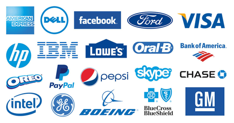
- Intel, Samsung, IBM, and other high-tech luminaries use blue to highlight their intellect and professionalism.
- When looking at the color blue in the Procter & Gamble logo, you think about unprecedented customer care and high safety standards that have long become the hallmarks of this company.
Multicolor
Creativity, originality, playfulness
Mixing several colors is a great way to distinguish your business and spark up customers’ interest. Depending on what shades you choose to bring together, you can send different messages to your target audience.
- Using a bunch of bright colors is Google’s way to make a strong statement and highlight its creative and individual approach to doing business.

- Designed back in the 1950s, the NBC peacock logo served to encourage customers to buy colored TV sets that were a hit product at the time.
How to choose the best colors for your brand
While we can’t possibly give you custom recommendations tailored to your particular brand, we’ve outlined several universal tips that will work for any company looking to put together a nice color palette.
- Define your message. Your color scheme must represent your brand’s personality. With that in mind, you need to have a clear idea of your company’s goals, qualities, and values. Also, you need to decide what message you want to send to your target audience. Once you’ve got all the answers, you can start looking for a designer that will take care of your company’s color code for you. At the same time, there’s no lack of online resources, e.g. BrandColors, where you can study color psychology and analyze color choices of successful brands.
- Create your average customer profile. Personal preferences, experience, background, culture, and social context tend to distort the way colors affect different people. As a brand owner, you need to know your average customer in and out, including their gender, age, needs, fears, etc.
- Make sure your color looks appropriate. Studies have shown that people’s perception of a certain color depends on whether or not they think it appropriate in a given context. When creating a color scheme, you need to make sure it goes in line with your products or services.
- Experiment with smart color combination. If you consider using several shades at once, you need to know the basics of how to mix colors. If you want to learn to combine colors like a pro, read our how to choose colors for a website. Also, use the ZenBusiness logo maker to compose a neat color scheme for your emblem!
Wrapping up
There’s more to a company’s color scheme than meets the eye. It shapes customers’ opinion of your brand and affects their buying decisions. Creating a clever color palette is both science and art. To choose the right shades that will give a voice to your business, you need to know, among other things, what your brand stands for and what people make up your target audience.

