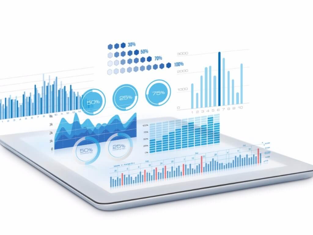
There are more than 269 billion emails sent every day around the world. Despite advancements in mobile technology and chat-style messaging, email remains the dominant form of conversation in the professional world.
The average professional spends 28-50% of their workday writing, reading, and managing emails. That’s 2-4 hours per day, or 10-20 hours per week.

That’s a lot of time. How can professionals know if it’s being spent productively or not? With email data visualization. Why?
Because that which gets measured gets improved.
So how does data visualization help you master your email productivity, how can you visualize your email activity, and how does it make you a better marketer?
Let’s dive in.
How Email Robs You of Time
First, you need to understand why email is such a vulnerable area; few professionals are truly efficient emailers, even if they’re brilliant communicators.
The amount of time wasted on email in just about any given organization is staggering.
Personal Time
You spend a lot of time on email—probably more than you’d like to admit. Most professionals do.
Email is a necessary communication medium, and in most cases, is faster than traditional methods like phone calls, but every minute you spend on email needs to be spent wisely—or else it’s a minute wasted.
Your productivity depends on your ability to handle email appropriately, giving complete information and attending to every inbound message, but it doesn’t take much to drift from this optimal ideal.
For example, spending too much time writing emails can result in wasted time, and long-winded emails that force your recipients to spend even more time reading them.
If you agonize over the details of every impending message, you might spend twice as much time as necessary evaluating your new messages.
Even glancing at your inbox to catch up on new material can result in lost time, especially considering it takes up to 23 minutes to fully recover from a single distraction.
External Complications
Problems with email aren’t limited to your own habits and organizational skills. In fact, many problems can be traced to external sources.
For example, you may have a member of your team who feels the need to email constantly, even when it isn’t warranted; just scanning these emails and deleting them costs you minutes of time.
In an isolated incident, that may not matter much, but since the average worker sends and receives about 121 emails a day, all it takes is an inefficiency of 10 seconds per email to lose hours in a single week.
Sheer Volume
All forms of interference with your email productivity are complicated by the fact that email naturally takes up most of your day.
By some estimates, the average worker spends 6.3 hours per day—or more—checking and managing their email. Imagine improving your email productivity by just 10 percent—which isn’t such a tall order.
That’d be a time savings of nearly 40 minutes a day, which adds up to more than 3 hours per week. Now imagine an increase of 20 percent, or 30 percent—by that point, you’d free up an entire workday of additional time.
Understanding the small, subtle ways that email robs you of your productivity is effective because even those small, subtle changes can add up to massive time gains.
The trick, of course, is learning exactly where those points of productivity loss are occurring, and deciding how to deal with them.
Using Objective Data to Improve
You can’t rely entirely on your intuition to solve your email productivity problems, though you probably have a few suspected points of productivity loss.
Why is data visualization the key to improving?
Removal of Bias
You might think you’re able to accurately assess the productivity and value of your own email habits, but chances are, your findings are being warped by unseen cognitive biases.
Relying on objective, external data helps you filter out some of those biases, including:
- Pre-existing assumptions. Many people think of themselves as neutral investigators, but in most situations, we enter our investigations with pre-existing assumptions (whether we realize it or not). Let’s assume you’re going to evaluate how productively you’re emailing—without data—and you start your investigation assuming that you spend an average-to-low amount of time writing emails. Those pre-existing assumptions will lead you to the trap of confirmation bias; your mind will naturally favor emails that don’t take you long to write, and discount or make excuses for more time-consuming emails. External data prevents this from occurring.
- Cherry picking. Cherry-picking is another problem that can emerge without a reliable set of data to guide you. Here, you’ll use anecdotal evidence to back up your claims, rather than high-level objective overviews. For example, you might catch a glimpse of one extended email thread that wastes you and your colleagues’ time; but is this truly reflective of normal patterns, or is it just a fluke?
- Objective vs. subjective reporting. Data is also reported in an objective format, which makes it easier to precisely quantify. For example, you might feel like you spend too much time reading emails—but “too much time” isn’t nearly as accurate or as actionable as “an average of 3 minutes per email.” Your subjective perspectives can be distorted by hundreds of different factors, especially when related to the passage of time or your perception of your current workload; your objective metrics can’t be manipulated in this way.

Automated Measurement
The real benefit of modern data analytics systems is their ability to automate measurement so you can go about your daily routines without changing your behavior at all.
Of course, you’ll still need to log in and view these data, to form your own conclusions, but the measurement portion is completely hands-free.
The automated component also ensures that no human biases interfere with the collection and storage of data related to your habits, and eliminates the possibility of gaps in measurement due to memory lapses (or apathy, in the case of other workers).
Tracking Changes Over Time
Finally, data collection gives you the power to conveniently track how your performance changes over time.
Again, this approach eliminates the possibility of bias in your measurements. Any effort you make could result in a kind of placebo effect, making you “feel” like you’re more productive when you’re really not.
The data, when properly compared to previous iterations, will show whether you’ve truly made an improvement or not.
This is especially important because the end goal of improving your email productivity means it’s not simply enough to understand the numbers—you have to make those numbers change by changing your habits.
Not all of your changes are going to be immediately impactful, and not all of them will be as effective as you think they will.
So, your only reliable method of determining whether you’ve met your goals is a “before and after” style comparison, using identical reports with identical variable controls.
The Advantages of Data Visualization
The next step may be even more important: visualizing your data, rather than simply reading and interpreting the numbers on your own.
Data visualization has a significant history. If you’re ever seen a pie chart or a bar graph, you’ve already had some experience with data visualization.
Loosely defined, data visualization is any technique or action that presents objective data sets with corresponding visual guides, such as graphs, charts, or maps.
This may not seem like a big jump from tables of numbers, but the advantages are significant.
The Big Picture
First and foremost, data visualization gives you the “big picture,” demonstrating the facts with a broad-strokes image, rather than forcing you to dig into the individual numbers that comprise it.
This is important for several reasons.
- The deception of details. If you get stuck looking at individual details within the data, you could lose sight of the major conclusions you should be taking away—this is sometimes referred to as “missing the forest for the trees.” Remember the cherry-picking problem in the previous section? It returns here with a vengeance; if you focus too much on the little details, and singular bits of information, you could form your conclusions based on a single anecdote, or an outlier, rather than getting to see the “zoomed out” view.
- Prioritization. Visualization also helps you quickly understand where your biggest priorities should lie. Our brains aren’t made for processing numerical information, which is part of the reason why it’s so hard for us to comprehend large numbers (for example, can you accurately conceptualize the difference between a billion and a trillion?). When we see two columns of numbers indicating both our writing time and reading time for emails are undesirable, we may view them as equal in severity; but once compared to each other in a visual format, it should be obvious which of them demands more attention.
- Averaging. Assuming you’ve set the parameters wide enough to provide a sufficient selection sample, visualizations also do us the favor of presenting us with an “averaged” view of the numbers. Most maps and graphs naturally filter out “outliers” in our data sets, which can skew the figures and lead us to wrong conclusions. Outliers are still important, of course, but they should be treated as an additional piece of information when understanding a problem—not a complete understanding of the problem itself.
- Big data. The “big picture” is also becoming more important now that we have the technology to deal with incomprehensively large data sets. Sure, you could wade through the numbers on each email you’ve sent over the past week—but it would be nearly impossible for you to retain those numbers in your mind long enough to properly understand them. Visualization enables us to process the meaning behind big data—rather than the individual points of data themselves. More on this in a section on conceptualization and time savings.
Memory and Learning
Data visualization is also be important for learning and for memory.
Our brains aren’t wired to process and compartmentalize large swaths of data; we’ve evolved to observe and store sensory experiences, so we can outlast predators and understand the difference between real-life threats and safe places.
Of all our senses, sight is the strongest, so it’s usually easiest for us to learn new insights (and remember them) when they’re presented to us in a visual format.
For example, you may not remember the exact number of CO2 emissions produced by mankind each year, but you likely remember seeing at least one chart with an upward climb over time.
Your memory of visual information is astoundingly good. According to one study, people only remember about 10 percent of information they hear 3 days after they hear it.
However, if that information is paired with a relevant image, people can retain up to 65 percent of that information after the same amount of time.
That means you’ll have an easier time learning from data that’s presented to you visually, and you’ll remember it for longer—which could be enormously helpful when keeping your bad email habits top-of-mind throughout the workday.

Conceptualization at a Glance
Aside from the most passionate analysts and statisticians, nobody wants to spend hours of time wading through thousands of data points to find the answers they’re looking for.
If you wanted to have the clearest, most accurate picture of your email habits, you could spend this time and walk away more informed for it—but in reality, most of us just want the high-level takeaways.
We want to log in, spend a few minutes getting the “gist” of what we need to improve, and log out to return to our day. After all, the whole point of this exercise is to spend less time on repetitive tasks, not more.
Visualization is a shortcut that enables us to skip this time—without necessarily sacrificing the quality of our interpretations.
When presented with a visual, we can quickly conceptualize what’s happening with the data, usually in a matter of seconds, making visualization one of the best time-saving data strategies we have.
Communication
The benefits of visualization aren’t purely about your own analysis and understanding. In fact, they may be even more beneficial for communicating data to others.
- Helping coworkers understand the problem. Roughly 65 percent of employees qualify as visual learners. That means they’re likely to learn faster and retain information longer when it’s presented to them in a visual format. If you explain to a coworker that statistically, they’re more likely to contribute an excessive number of emails in a thread than their other coworkers, they might hear what you’re saying, but fail to internalize the concept. If you show them a graph comparing their email thread contributions to those of other employees, they’ll be able to grasp the concept immediately. Visualization is one of the best communicative tools you have for explaining data.
- Presenting your progress over time. If you’re trying to show your supervisors, your coworkers, or other parties that your email habits are improving over time, visualization makes it easier. Rather than digging around for numbers that look good side-by-side, you can use color-coded charts and graphs to display how your productivity has improved. Seeing a taller bar on a graph means more to most people than seeing an uptick on a single number.
- Proving ROI or similar metrics. Productivity isn’t just about doing the most tasks in the shortest amount of time; it’s also about spending your time wisely. One of the most important benefits of email monitoring is your ability to demonstrate the time it takes to work on each project (i.e., how much time you spend emailing your clients, or emailing coworkers about a given project). With this metric, you can prove the return on investment (ROI) you get from each project. When presenting the figure in minutes, or dollars, your findings will likely bear an impact—but they’ll bear an even bigger impact if you can show those numbers with images and visual projections.
How to Make the Most of Data Visualization
Data visualization won’t automatically make you a better emailer. Here’s how to get the most out of your investment in email data visualization:
Start immediately, and measure consistently.
How you measure is just as important as what you measure. If you want to get the most out of your data, start as soon as possible; the sooner you start reclaiming multiple hours of work each day, the more total hours you’ll reap as your reward.
You’ll also need to measure consistently, checking in at least weekly and always controlling the variables so you compare apples to apples.
Beware the emergence of bias.
The numbers aren’t going to lie to you, but the way you choose to draw, arrange, and visualize those numbers can distort their true meaning.
For example, you may focus on specific variables or metrics that already align with your previously held assumptions, tapping into confirmation bias.
Try to remain as neutral as possible, and question your previously held beliefs.
Form actionable insights.
The new insights and conclusions you form may be interesting, but they’re meaningless until you put them into action.
Don’t focus on what the data means; instead, focus on what the data suggests you should do. All of your points and conclusions should be transformed or should lead to something actionable.
Every new insight should be accompanied by a change in your habits (or the habits of others).
Hold your team accountable.
You aren’t the only person responsible for your email productivity; for every email you send, you’re more likely to receive a response. And bogging down your coworkers’ productivity with inefficient emails can boomerang right back to you.
Talk to your coworkers, employees, and even your bosses about their emailing habits and how it may affect your productivity and the productivity of others.
If you request a change in their behavior and they agree to follow it, hold them accountable by following up with them, to ensure the change is made.
Return and repeat.
You can’t become an email master overnight. Over the course of your improvements, you’ll need to check back in regularly, and discover new ways for you to improve your habits further.
Treat your email productivity improvements as an ongoing cycle of steady progress; the more you learn, and the more you grow, the more you’ll stand to gain.

What Email Data Should You Visualize?
If you’re ready to start improving your own email productivity, and you’ve absorbed the tactics mentioned in this list, the next step is finding an email tracking tool that gives you all the information you need.
So, what information do you need to visualize?
- How many emails you send & receive per day.
- Average email response time.
- A breakdown of who sends you the most emails.
- A breakdown of who you send the most emails to.
- How long your average conversations are, and who starts them.
When it comes to improving productivity and efficiency, every informed change you make counts.
And with email activity, it’s the objective graphs and charts of data visualization that will help you make those leaps as not just a marketer, but an overall professional.


