If there was a contest held among brands for the biggest number of logos, LEGO would probably win by a big margin. Although the company’s journey to its brand identity was challenging, the efforts have certainly paid off. For example, did you know that LEGO products got the prestigious “The toy of the Century” award?
Company backstory
In 1932, the Danish carpenter Ole Kirk Christiansen established a small business that manufactured ladders, stools, ironing boards, and wooden toys. Christiansen’s right hand was his 12-year-old son Godfred. Two years later, the aspiring company was named “LEGO”. That was the acronym from “leg godt”, the Danish for “play well”.
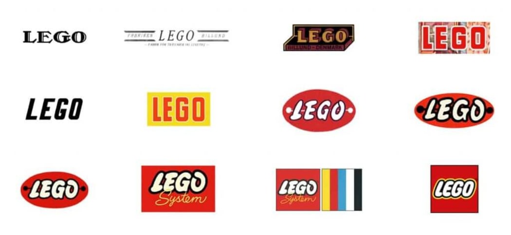
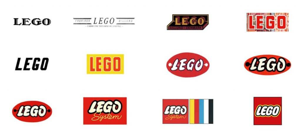
LEGO’s first logo was very unlike its modern emblem. It featured the company name written in a black serif font. The design was used in business correspondence and on transportation vehicles.
In 1936, LEGO started to mark its toys with the words “LEGO Fabriken Billund”. Clean and concise, the logotype resembled an inky imprint. Four years later, the toy giant got a new voluminous logo. With its warm colors and wooden texture, the new design looked like an engraving. The logo embellished all LEGO toys produced during the 40s.
Logo evolution
In 1949, LEGO started to manufacture plastic toys, which are considered the prototypes of its modern-day construction sets. To commemorate the milestone, the company decided to refurbish its brand identity. The new emblem was a black circle with the company name written in the spectacular red font.
In the early 50s, LEGO was doing some experimenting with different typographies. In 1954, the logo started to resemble its modern version. However, there was a bit of confusion about the corporate colors. It seemed that the brand was unsure which shades to choose and was utilizing red, yellow, and blue at the same time.
A year later, LEGO finally settled for a standardized design (red oval with white letters) and started to use it on all types of its toys.
In 1958, LEGO patented its original constructor set. Two years later, the corporation presented its new rectangle emblem that symbolized a constructor piece. During the next 15 years, LEGO was using different variations of its brick-shaped logo, including the one with colored stripes.
In 1973, LEGO entered the US market. Naturally, such an important event called for a rebranding. This is how the modern square design came into existence. For its massive, bulky letters, the new logo used the custom Lego Font. The revamped identity did a great job channeling the feelings of joy and fun.
In 1998, the brand refreshed its logo again to make it look better across different carriers. The letters became bigger, while the shades got a more saturated look. That was the final version of the emblem that we know today.
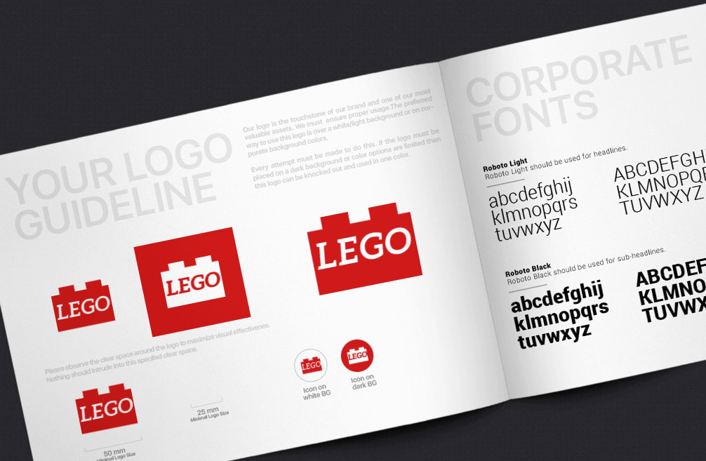
How would Lego logo look like if it were made in ZenBusiness?
Bottom line
What started as a small family business has grown into a giant international company with a big legacy. For several generations, LEGO toys became the symbol of merry childhood. One of the factors behind the LEGO success was its creative branding that relied on vibrant colors and clean typography.
