An average person living in the US has more than 100 apps installed on their smartphone, and this number is growing by year. To get a step ahead of competition, your app absolutely needs a professional icon that will enhance user engagement with your brand. Read on to find out how to do that!
- What is an app icon?
- Technical specifications for app icons on Android and iOS
- Five major aspects to keep in mind
- Three ways to create a custom app icon
- Wrapping it up
What is an app icon?
It’s a small image that stands for your app on a user’s device. Needless to say, an icon is a fundamental element of your brand identity. An icon helps you stand out and reveals the essence of your unique selling proposal.
The statistics say that users search 70% of mobile apps in App Store and Google Play. As for the remaining 30% of apps, people learn about them from advertising campaigns, reviews, newsletters, and social media posts. Your task is to create an engaging icon that will draw attention and encourage a user to learn more about your products.
Technical specifications for app icons on Android and iOS
App icons fall into two major categories — those for Android and those for iOS. Although they may seem identical on first sight, they actually have a bunch of differences that you can’t ignore.
| Google Play Store (Android) | App Store (iOS) | |
| Dimensions | 512 px × 512 px |
iPad Pro: 167px × 167px (83,5pt × 83,5pt @2x)
|
| Format | 32-bit PNG | PNG |
| Color mode | sRGB | sRGB or P3 |
| Shape | Square. Google Play automatically rounds off corners (20% of icon size) and add shadows | Square without shadows or rounded corners |
Five major aspects to keep in mind
21% of the millennials choose to delete a mobile app if they don’t like how its icon looks on their screen. This is why your icon must be not only functional, but aesthetically appealing as well. We’re about to reveal to you the secrets of smart design.
1. Simplicity
If we had to outline only one rule for creating a icon, it would be this: “Keep it clean and simple”. Let’s dive deeper into what that means:
- Say “no” to intricate designs. The more details your icon contains, the harder it will be for users to correctly perceive and recognize it. On top of that, a visually overloaded design becomes a headache when it comes to scaling. Your icon must be easily recognizable in different sizes and across different media, whether it’s an app store, smartphone menu, or control panel.
- Use symbolic images. Base your design off a memorable image. For example, Snapchat is instantly recognizable through its ghost. In case with Instagram, a camera image works great. If you’re using your corporate logo, make sure it’s clean and minimalist.
- Lifehack: Make a list of your favorite apps and scrutinize their icons. Learning from successful brands is always a great idea.

2. Color
For many users, color can be the determining factor in deciding whether or not to use your app. Here are some tips on composing a balanced color scheme:
- Avoid using more than 2-3 shades. Otherwise, you risk turning your design into a blurred mess. Follow the example of Airbnb, Pandora, and Dropbox.
- Trust the choices of major brands. A study says that the No.1 color among big-name brands (Google Calendar, Safari, Twitter, LinkedIn) is blue. It’s followed by red and white. By the way, red is commonly used by companies specializing in food and drinks.
- Your selected hues must associate with your business and go in line with your brand identity.
- Make sure your icon looks good across different backgrounds (black, white, and colored).
3. Coherence
Your icon must reflect what your app is about. Fusing together design and content is a sure way to create a strong visual image that will build an emotional bond with your audience. Customers appreciate it when brands put thought into their designs.
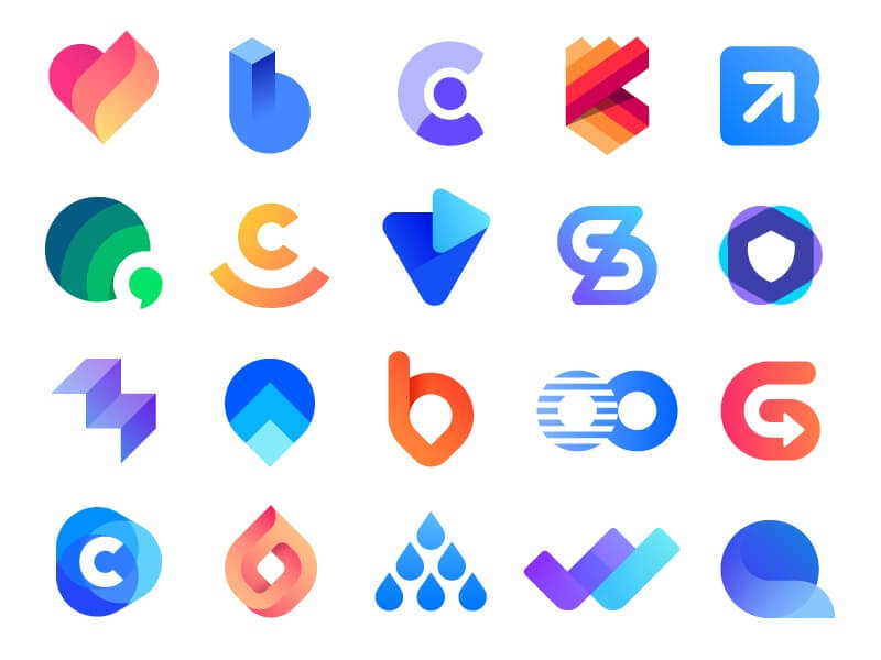
- For your app icon, borrow your corporate colors, textures, shapes, etc. Your app features a gradient, unusual geometry or retro vibes? Try working those elements into your icon!
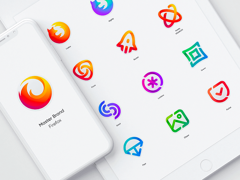
- If you have more than one app, it would be nice if their icons shared the same visual style. This is exactly what Adobe did with its products (Photoshop Sketch, Illustrator Draw, Lightroom, Skan, and others).
- Tie together design and functionality. By looking at your icon, a user must instantly identify (or, at least, guess) what your app does. For example, Vivino uses a bunch of grapes, while Spotify opted for the volume icon.
4. Imagery vs. Text
When it comes to designing a small icon, long words and photos are a definite no-go. These elements can make perceiving the icon harder for the audience.
- Users perceive imagery 60,000 times faster than text. The takeaway is clear: for a bigger impact, be sure to use a visual symbol rather than a word.
- If you’re struggling finding the right symbol for your art piece, make a list of associations that go with your product. It will be easier for you to transform words into images rather than find the suitable symbol without “warming up”.
- You can use text if your brand name is really short (BBC News, Uber). Using the first letter of your business name is also a good idea (“F” for Facebook or Foursquare).
- If you’re adamant about incorporating a photo into your icon, be sure to simplify it so that it stays perfectly legible in small size.

5. Uniqueness
Your icon will be vying with thousands of other images for the user’s attention. This is why it’s so important to create an original piece that will resonate with your audience and make them want to experience your app.
- Study the top popular apps in your niche and see what techniques they’re applying. Think about how you can use colors, graphics, etc. to set your art piece apart from the crowd.
- Find out what elements appeal to your target audience. Also, make a list of design methods that don’t work for your customers.
Bonus tips:
- Do A/B testing. If you can’t choose between two designs, do a marketing research. A/B testing is a fireproof method to pick the most effective of the two options.
- Customize. Think about how you can spice up your art piece for holidays and other important events, such as Christmas, Black Friday, Halloween, etc. You can play with new shades, add a new exciting graphic element, etc. The options are endless.
- Follow trends. Keep a balance between the need to keep up with trends and the need to stay true to your visual identity. Don’t cave in to a trend unless you’re 100% sure it’s worth it. For example, if all your competitors switched to flat designs and you’re still using the 3D effect, it might be the time to revamp your icon.
Three ways to create a custom app icon
Depending on your needs and budget, you can choose any of the three ways to design a professionally looking app icon. The call is yours!
1. Graphic editors. If you have some experience creating art pieces in Photoshop or Illustrator, don’t hesitate to put your skills to work. This method requires no money investments.
2. Online services:
- ZenBusiness. This online logo maker can do literally anything, even create a customizable imagery for your app! Create a logo, download it in the right size and format, and use it as your app icon.
- Canva. Free graphic editor with an impressive collection of templates and customization options.
- Iconsflow. The platform offers more than 200,000 icons for any purpose. Pick the best image and redesign it to fit your needs.
- Appicon. Upload your image and resize it to create an app icon for iOS and Android.
3. Designer. If you have some money laid aside, you can hire a professional designer that can come up with a great icon for your app. Where to find a reliable contractor? Go to job-hunting platforms (Upwork, Fiverr), ask your friends for references, or look on social media.
Wrapping it up
Let’s sum up the key guidelines for creating a clever icon for your mobile app:
- Make your design simple, one-of-a-kind, and easily recognizable.
- Follow trends to stay relevant.
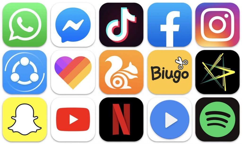
- Learn from renowned brands. As a good start, check out this list of the 2019’s most downloaded mobile apps:
- Facebook Messenger
- TikTok
- SHAREit
- Likee
- Snapchat
- Netflix
- Spotify
