Choosing a proper font combination for a website, booklet, or presentation seems to be a difficult task? The secret of success is to constantly find examples for inspiration and understand the basic principles. In this article, we’ll explain what to rely on when choosing a font pair and give examples of win-win combinations and services that will help you in the process.
General Combination Rules
There are only two basic principles for the correct combination of fonts – matching and contrast.
If they match, the typefaces complement each other by one or more attributes: style, proportions, intension, or any other. This is the easiest way to pick a pair and make no mistake.
Contrast is a more complex but also more creative way. Visually the inscriptions seem different but look together well due to one or two common attributes. There are dozens of such attributes, for example, x-height (the measure of the height of lowercase letters, depending on the height of “x”), the width of characters, and letter spacing.
We’ll tell you about the rules that will help you to accurately choose a font pair for both compliance and contrast:
- The easiest way to avoid making a mistake is to use one superfamily that includes many typeface versions (with and without serifs, handwritten and decorative). Among the most famous superfamilies are Lucida, Museo, Frutiger, Avenir.
- The reverse rule works as well. Typefaces of the same type but from different families may not combine and create disharmony, so it is better to avoid this method.
- Try any of the classic ways to create a contradiction: use different weights of the same typeface (light and bold) or combine fonts with and without serifs.
- Stick to one mood, that is the impression that the inscription creates (playful, strict, friendly, cozy, informal). Even if the print is contrasting, the mood should be similar: the playful and the serious in one context can confuse and annoy.
- Avoid low contrast, that is, too similar typefaces. This combination gives the impression that you wanted to use one of them but did not. It’s OK if you choose the same font of different weights or styles.
- Keep a balance: if one font is prominent, the other should be neutral not to draw attention to itself.
- Define a hierarchy by assigning a role to each outline: for example, one for titles only, and another for body text. Thus, you will “guide” the readers through the text and prompt in what order to read it.
- Ensure the selected fonts have all the characters for the languages you use. This is critical for companies operating in the international market.
Examples of Ready-To-Use Combinations
Designers do not recommend using more than three typefaces within the same context. Two would be the best choice. Here are some examples of the most successful combinations.
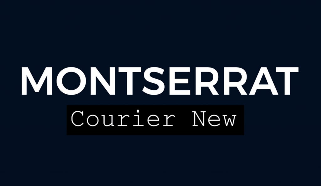
Montserrat & Courier New
A win-win contrast of classics and modernity. The universal serifless Montserrat is part of the Google fonts collection, created especially for Internet users, and Courier New is familiar to us since the days of typewriters. Such a combination is suitable for brands that want to emphasize the connection between past and present.
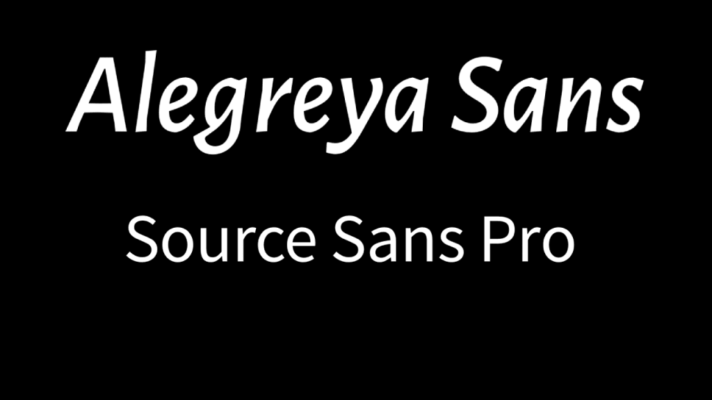
Alegreya Sans SC & Source Sans Pro
An example of universal congruence that will look harmoniously on any media and in any context. Alegreya Sans SC is a family of small capital letters in calligraphic style. It is complemented by the laconic Source Sans Pro created for Adobe and designed for user interfaces.
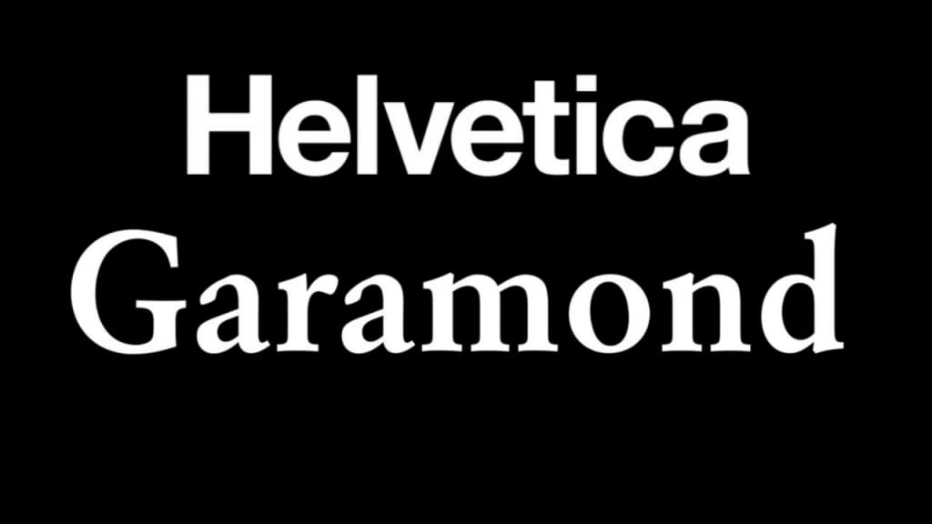
Helvetica Neue & Garamond
A classic mix of popular typefaces in contrasting styles: Helvetica Neue and Garamond. We advise you to consider this combination if you want the branding to be perceived as timeless, clear, and stylish.
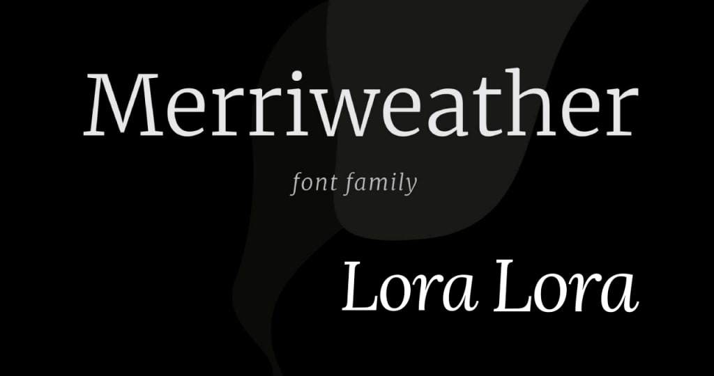
Lora & Merriweather
Lora is a well-balanced font that resembles calligraphy. Due to their moderate contrast, they are suitable for body text. For the title, you can use Merriweather with a large X-height and slightly compressed characters. Both typefaces have serifs and are therefore associated with classics and elegance.
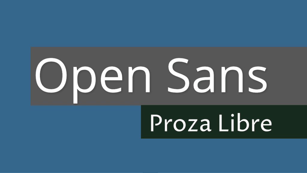
Proza Libre & Open Sans
This combination looks modern due to its minimalism. Proza Libre with its pure soft forms is designed to be used on screens. Open Sans with its neutral but friendly design and high legibility works well both on the Internet and in print.
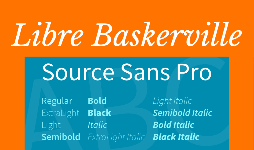
Libre Baskerville & Source Sans Pro
An example of contrast, where one typeface dominates and the other complements it. Libre Baskerville is a family of web fonts optimized for body text. Despite the serifs, letters remain legible even in small sizes on any screen. Source Sans Pro is suitable for titles as it creates a laconic design.
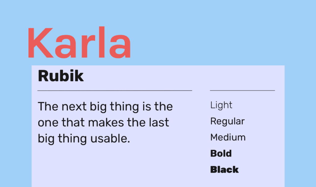
Rubik & Karla
A perfect combination for brands that want to show their closeness to users. The versatile and proportional Rubik is the perfect complement, which changes its character depending on the “neighbor”. The combination is dominated by Karla, which stands out for its intentional sloppiness represented by irregular letter spacing.
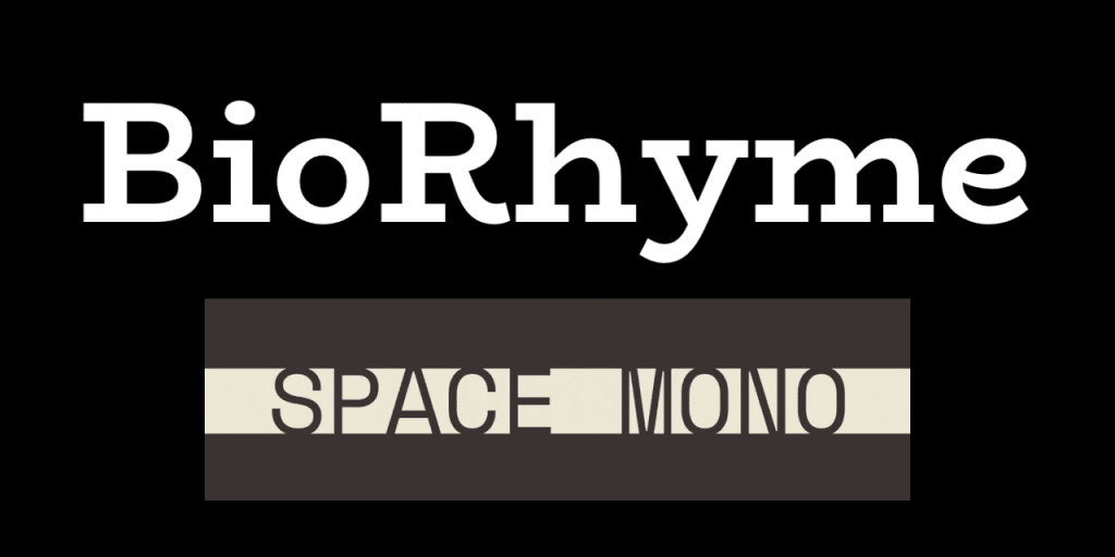
BioRhyme & Space Mono
A stark contrast will be appreciated by brave companies that want to show their character. BioRhyme, with its flat, visible serifs, refers to retro, while the monospaced (all characters of the same width) Space Mono refers to modernity. What unites the typefaces is that they are both geometric.
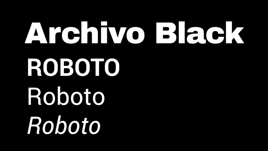
Archivo Black & Roboto
The combination is based on similarity. Archivo Black was created for titles and Roboto for working on Android. Both features look open and friendly which makes the combination suitable for democratic brands.
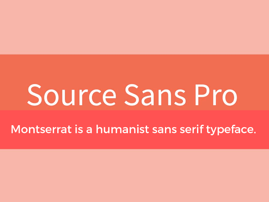
Montserrat & Source Sans Pro
Another neutral mix of easy-to-read print. Both Montserrat and Source Sans Pro are laconic and versatile and were created for internet platforms. This combination will work well for a website or a blog without distracting attention from the content.
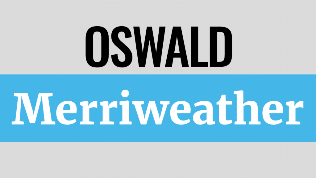
Oswald & Merriweather
An example of contrast united by proportions of symbols. Oswald is a modern revision of the classics with upwardly stretched letters and small intervals. Merriweather with serifs is also characterized by slightly compressed characters. We advise you to choose this combination if you want to show rigor, concentration, and elegance.
Helpful Services
A win-win way to successfully choose a combination is to use special services that offer ready-to-use options.
Google Fonts
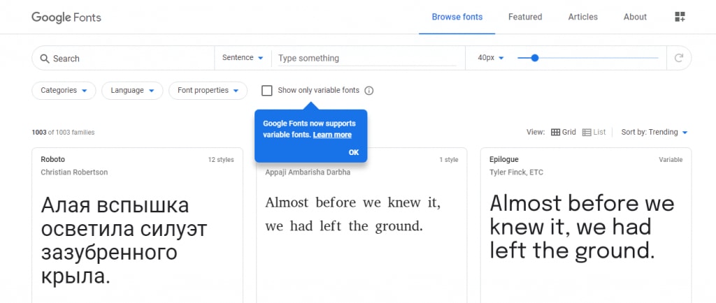
The Google collection offers several similar or contrasting options for each font. It is convenient that you can choose the weight of letters for each option and preview the result.
Typeconnection
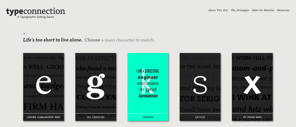
Fond of games? The service offers to master the skills in the form of a game by choosing typeface combinations for dating. Start by choosing the main character and find a suitable pair for it, while studying useful terms and receiving advice.
Typography
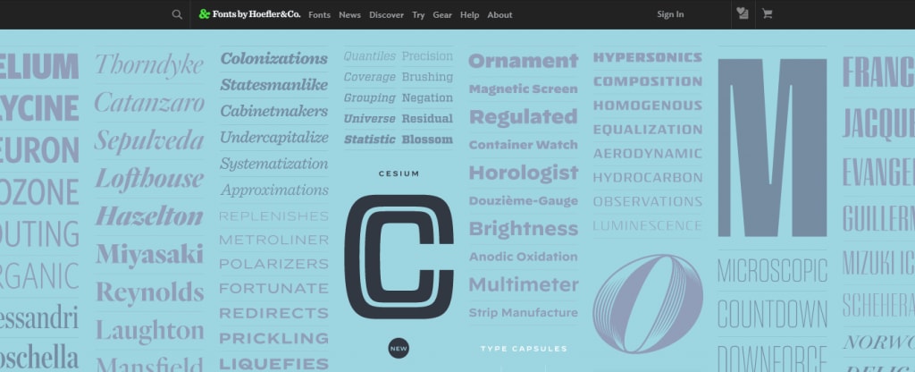
Like Google, this site offers several suitable combinations for each outline. However, there are few examples and you can’t change the weight of symbols.
ZenBusiness
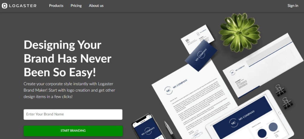
The online generator is suitable for those who need more than just fonts for the logo. Enter the company name and slogan, and the service will offer several dozens of ready-to-use options. Each of them can be edited if desired.
Summary
There are no strict rules for combining fonts. When choosing, rely on the task the text performs and the mood you want to convey. To maintain a delicate balance between contrast and similarity, we advise you to follow the basic principles that you’ve learned from this article. In case you have any doubts as to the result, refer to professional services.

