A handwritten typeface is one of the staples of a friendly and accessible brand. Handwritten fonts give a more personalized look to your brand and forge trust with your target audience. We’ve put together a list of 11 high-end handwritten fonts that are sure to become a trademark of your visual branding. Plus, all of these professional fonts are available for free. So what are you waiting for?
1. Allura
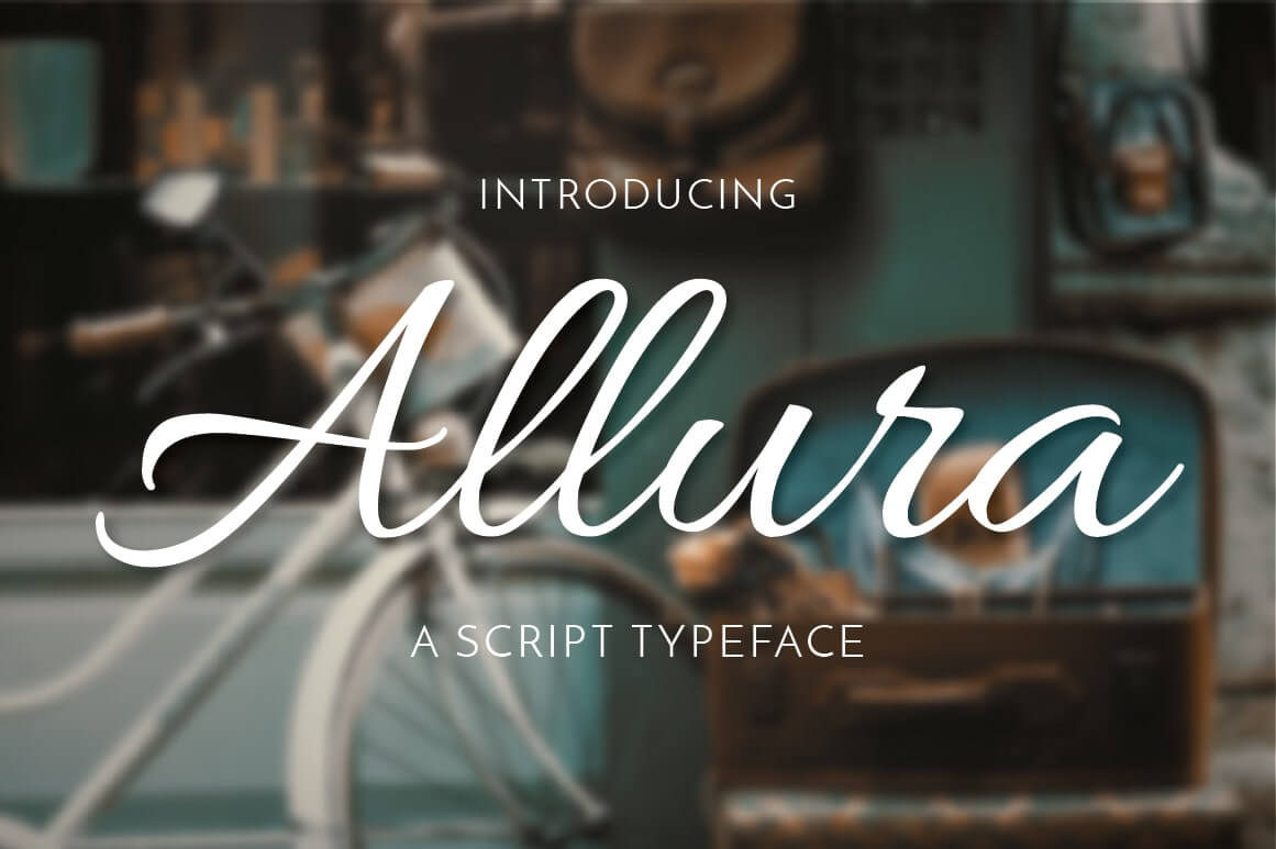
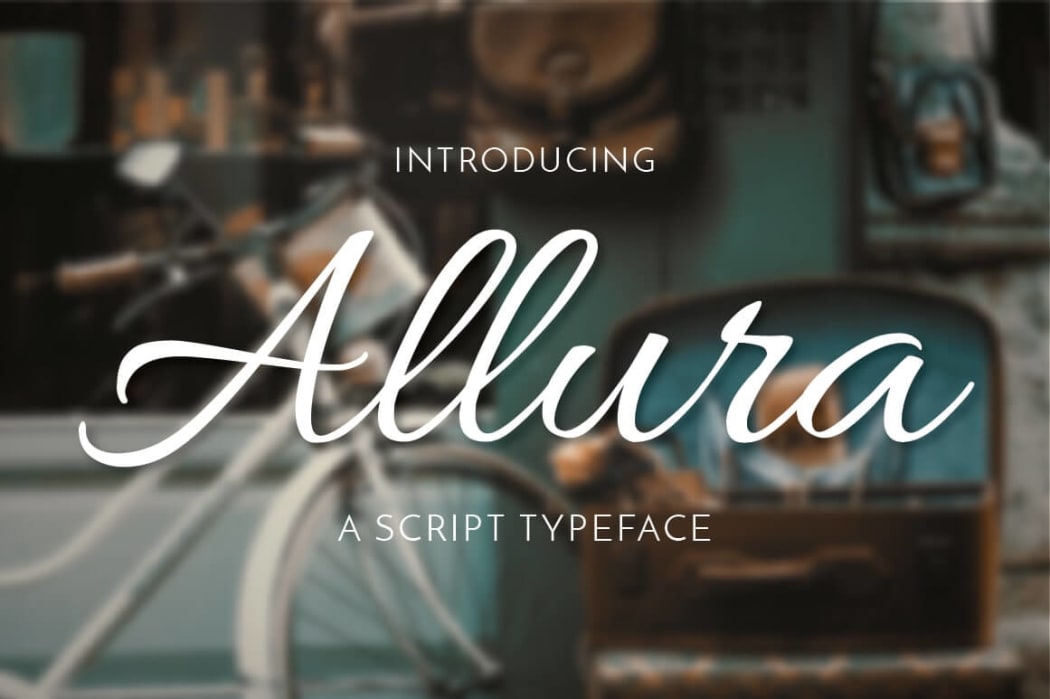
This typography has a clean and minimalist look. Like pretty any handwritten font, this typeface has small imperfections that give it extra charm, such as the ragged “m”, protruding “s”, varying spaces between letters, and more. At the same time, this doesn’t impair the legibility of the font in the slightest . Thanks to its versatility, Allura can be used across a variety of surfaces, from logos, to packaging, to outdoor advertising.
2. Alex Brush
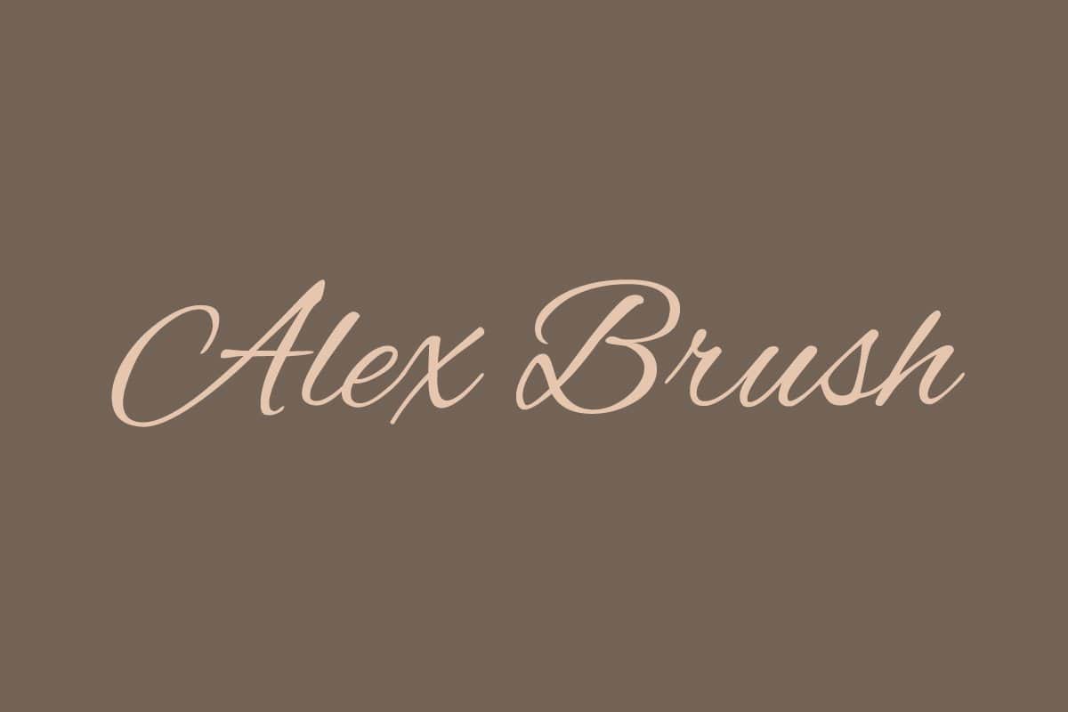
With its bulky capital letters, smooth lines and varying thickness of lines, Alex Brush is a never-dying classic among handwritten typefaces. The font stands out through its sweeping ascenders and descenders, e.g. “t”, “f”, “k”, “p” or “g”. This little peculiarity makes the typeface easy to perceive even at small sizes, including on a mobile app icon.
3. Balqis
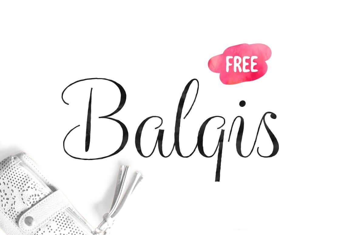
Rounded straight characters of this font look balanced and natural. The serifs on capital letters and contrasting thin and thick lines give it an elegant, almost romantic quality. Balqis is a versatile solution that will fit all types of media, from signages, to postcards, to invitations. Keep in mind that this typography solution looks better on its own. With that said, you should better avoid pairing Balqis with other typefaces and give it a chance to become the centerpiece of your design.
4. Yellowtail
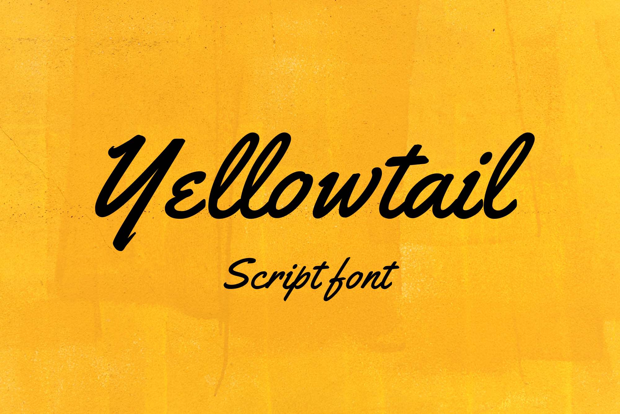
Yellowtail has a strong vintage feel that pays homage to the popular typefaces of the 1930s, such as Gillies Gothic and Kaufmann. The first thing that strikes you is how the letters are different from each other: while some have smooth linkages, others remain completely isolated. Thanks to its spectacular ascenders, Yellowtail looks dynamic and easy to read. If you opt for this typography solution, you’ll be happy to discover that you can successfully apply it across multiple touch points with your customers.
5. Qwigley

In this typeface, each letter has its distinctive, unique personality. You can see a variety of exciting features, including rough lines, playful twists and whirls, sweeping strokes, and more. Bringing together elegance and experimentation, Qwigley is a great choice for brands looking to emphasize their personality. However, this font should be used with caution because its decorative elements may interfere with its legibility, especially in small size.
6. Parisienne
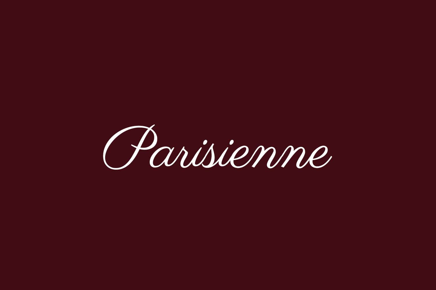
If you’ve ever tried your hand at calligraphy, you’ll be able to easily picture this amazing font simply from reading its description. Edgy and stylish, Parisienne features rounded letters which appear to be inspired by the 1960s typography classics. With its neat serifs, the font transcends the feelings of freedom and courage. This typeface will be easy to replicate across marketing materials, websites, banners, and more.
7. Mr De Haviland
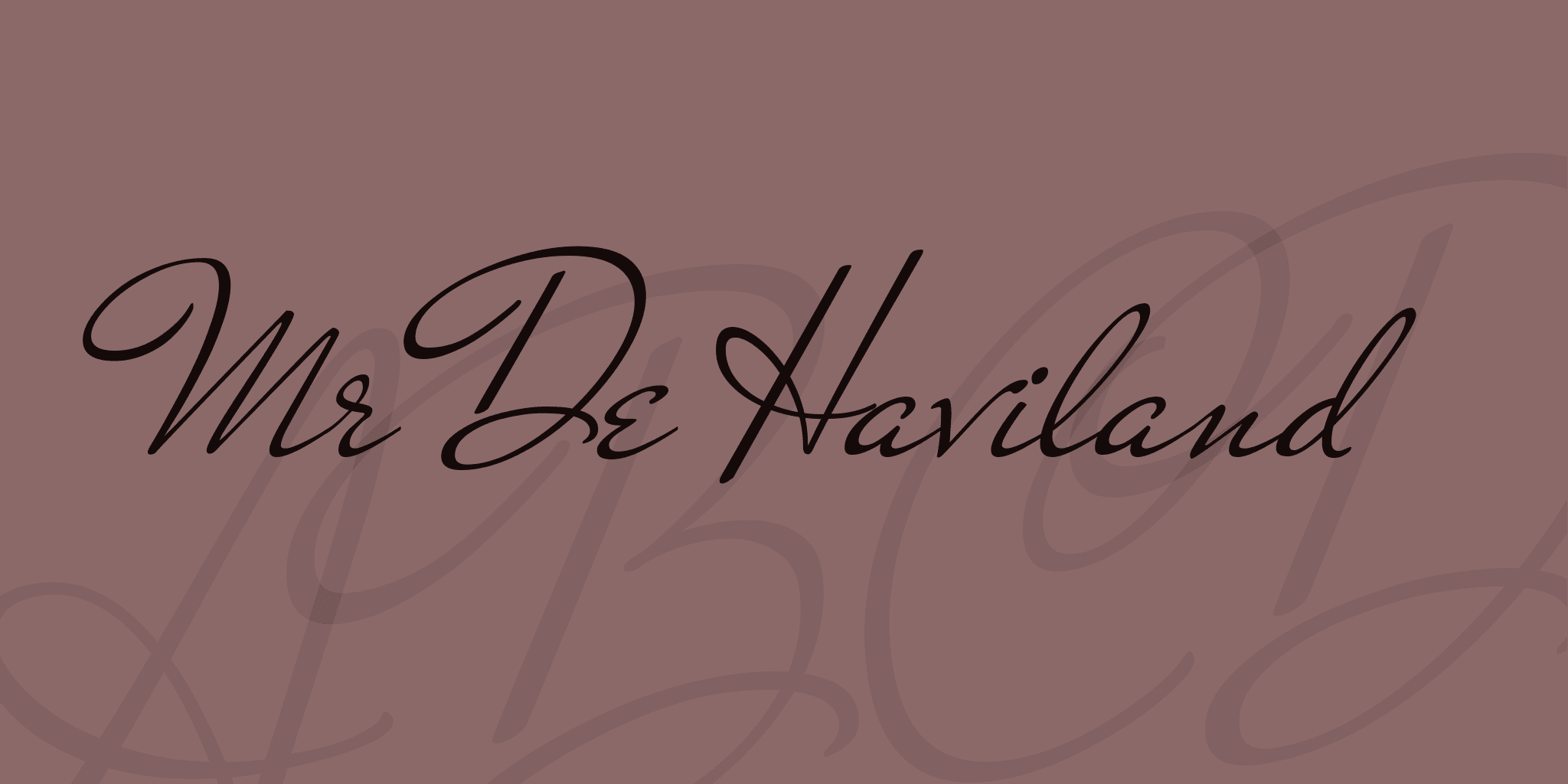
The next font on our rating is the result of joint efforts of several American calligraphers who were active in the 30s of the last century. The explosive personality of this typeface shines through its bold protruding elements, sophisticated serifs, and sweeping lines. Mr De Haviland will be a great choice for business cards, invitations, and other printed matter. At the same time, this font might be too sophisticated for digital carriers.
8. Miama
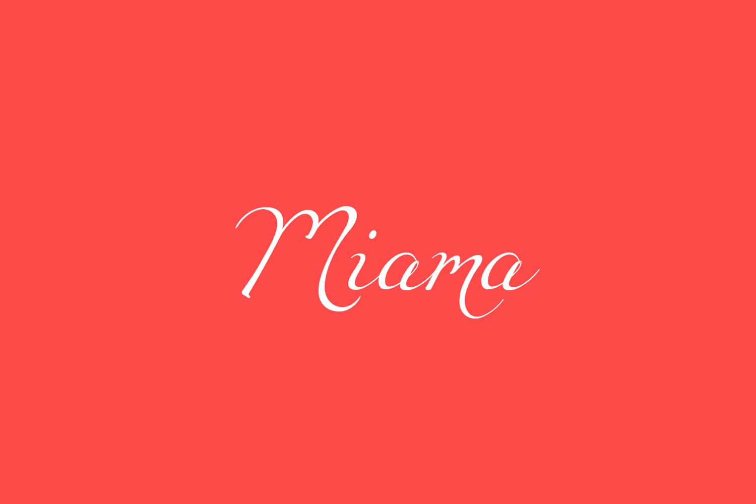
When working on this font, its author was inspired by his girlfriend’s handwriting. As a result, we now can enjoy a beautiful typography solution with an unusual backstory. Look at those large spaces between letters, bold ascenders, and unconventional shapes of “m”, “s” and some other letters. The author recommends using Miama for first-level headings, short verses, and congratulation cards. If you’re looking for a font for larger texts, Miami is probably not your best choice.
9. Great Vibes

A slight slant and smooth linkages give this font classic vibes. The most distinctive part about this typeface is serifs on capital letters and contrasting thickness of lines. Great Vibes is a Unicode font which is meant for Latin alphabet letters. However, you can also easily adapt it to Cyrillic-based languages.
10. Aquarelle
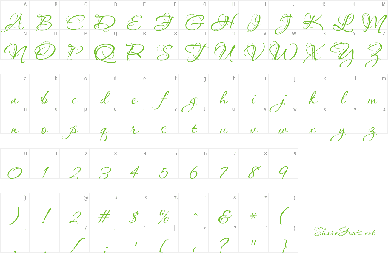
This next font will surprise you with its bulky lowercase letters with double serifs and bold loops in letters “q” and “g”. These peculiarities give Aquarelle a strong retro effect. Keep in mind that Aquarelle’s decorative elements will only look good in large size. When used in small size, the font risks losing its undeniable charm.
11. Olivia
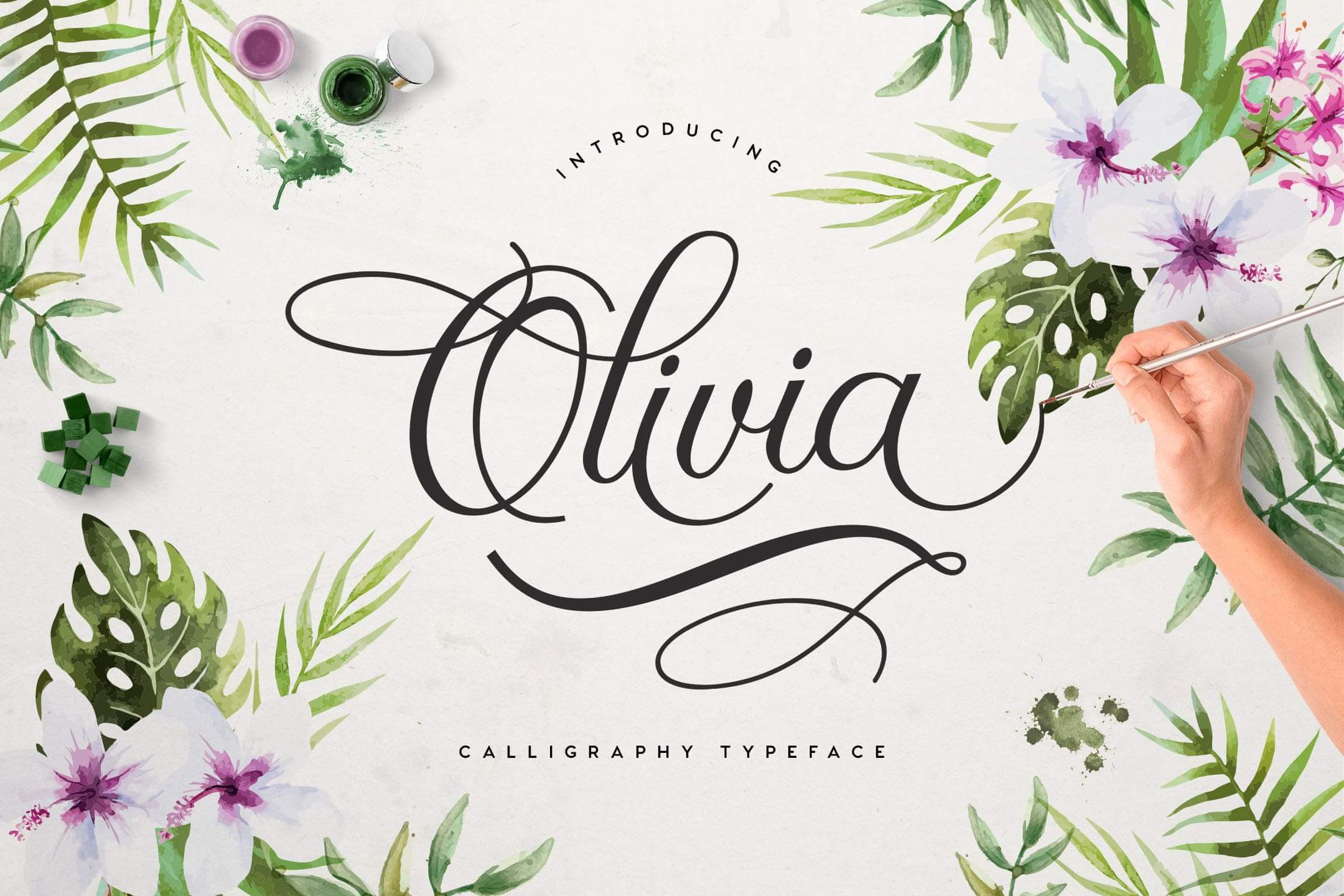
With smooth lines and linkages, this neat font emanates a serene and harmonious feel. It’s almost impossible not to fall for its fancy scrolls and bold ascenders and descenders. Olivia is amazingly easy to read which makes it tailored for a variety of uses, from large printed posters to websites.
If you want to see more handwritten fonts, you can find them here.
3 tips for choosing the best handwritten font
Choosing the best handwritten font is a thing you don’t want to get wrong. Keep in mind that in addition to being visually pleasing, your typography must also be functional. Here are three tips that will help you navigate the diverse world of fonts.
1. Your font must fit your business
Just like a person’s handwriting, each handwritten font is a one-of-a-kind art piece. While some typefaces look friendly and informal, others make a more solid impression. Beforing starting to look for the right font, think about what emotion you’d like to cultivate around your brand through your typography.
It’s always a good idea to learn from big-name brands, such as Ray Ban, H&M, Coca-Cola, Instagram, Harrods, Esquire, etc. Identify the businesses that share your niche and see what fonts they’ve opted for.
2. Your font must be versatile
Go for a font that remains legible across both digital and printed media of all sizes. This is especially true when choosing a font for a logo. Since you’re going to apply your logo across a variety of surfaces, it must have a vibrant, legible font which can be beautifully employed across all types of media.
Choose a typeface that remains readable even at small sizes. The best place to get one is the ZenBusiness logo maker!
3. Combine fonts wisely
Handwritten fonts are known for their strong personality. Ornate and intricate, they command the viewer’s attention and shape the identity of your design. With that said, handwritten typography is best combined with simple typography. The best way to put together a balanced pair of fonts is by using special online services. For example, the Google Fonts service will offer you the typography solutions that match your handwritten font and even show you what they’ll look like together.
Conclusion
Simplicity and legibility are the two criteria that must be kept in mind when choosing a good handwritten font for your brand. Also, make sure your typeface conveys the message that you want to send to your target audience. Need more insights and useful tips? We’ve got your covered! Read more ZenBusiness articles on the topic: How to Choose the Best Font: Tips from a Professional Designer and How to Pair Fonts: Guidelines and Examples.

