Explore how to create a distinctive square logo that conveys stability, balance, and professionalism, ensuring your brand stands out in the market.
Starts at $0 + state fees and only takes 5-10 minutes
Last Updated: July 9, 2025

Simple yet elegant, a square translates balance and proportions, stability and consistency. Like no other geometric figure, a quadratic has an amazing ability to instill trust and create strong emotional links, check out how to create a geometric logo. A square-shaped logo is often used by big corporations that boast a diverse history and established client base. By visualizing their corporate identity through a quadratic, brands emphasize their commitment to what they are doing.


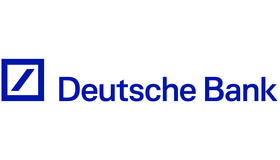
The biggest advantage of a square is its versatility. It can be successfully used by a wide range of companies, both aspiring and recognized ones. Microsoft, Deutsche Bank, Kodak, Raiffeisen Bank, Lego, and BBC have come up with creative ways to incorporate a square into their emblems. Is there a better source of inspiration than those beautiful pieces of art?

Despite its lack of sophistication, a square fills an entire logo acting as its central element and background at the same time. You can place your brand name inside a square or above it. Plus, a square gets along with other geometric elements, e.g. straight lines, rectangles, and acute angles. For additional tools, check out how to create an oval logo, how to create a circle logo, how to create a sphere logo or how to create a triangle logo

As for the color palette, a square offers you a spacious ground for experimentation. Bold shades (red, yellow, violet, etc.) are more than welcome! It’s a great opportunity to craft a cool color scheme you’ve been nurturing for years!


Before you start creating, you can familiarize yourself with the works of our users.



Disclaimer: The content on this page is for information purposes only and does not constitute legal, tax, or accounting advice. For specific questions about any of these topics, seek the counsel of a licensed professional.
Logo Resources
Ready to Start Your Business?
