It’s needless to say that a logo plays a huge role in a company’s growth and promotion. Nowadays, people are becoming increasingly aware of what they’re buying, whether it’s a product or service. Along with quality, customers are paying attention to a number of other aspects that make up a business, such as social responsibility, eco-friendliness, and brand identity. Over the years, a brand usually uses more than one emblem. Taken together, such emblems create a visual record of a company’s history and reflect its traditions, values, and competitive benefits.
If you visualize a famous logo, you’ll see that it triggers certain associations in your mind. For example, the “Golden Arch” on the McDonald’s logo make you think about juicy cheeseburgers and sweet McFlurry. When looking at the BMW emblem, your mind creates the image of a posh car that emphasizes its owner’s high social status. Furthermore, a logo shapes your opinion of a business and its products.
We’ve challenged ourselves to hand-pick 25 best company logos. Given a stunning variety of good-looking designs, the task seemed to be overwhelming at first. Nonetheless, we did it! Unfortunately, we’ve failed to find the authors of some of the emblems. At the same time, there’re logos on this list that are the result of hard work of several designers. Some brands have altered their logos so many times that we had to focus on the milestone designs only. We hope you’ll enjoy this visual feast and use your inspiration to create a staggering artwork of your own!
Nike

The legendary Nike started out as an importing company Blue Ribbon Sports. In 1971, the brand decided to expand into sports shoes production thus establishing the Nike brand as we know it today. It’s curious to know that the Nike founder Philip Knight originally found the now famous “swoosh” symbol trivial, saying that he wasn’t a big fan of the design. Can you believe it? Neither can we!
The Nike logo was crafted by Carolyn Davidson who was only paid 35 dollars for her work! Inspired by the Greek goddess Nike, Davidson wanted to convey her unearthly speed and movement through the emblem. In 1978, the shoe manufacturer overhauled its logo by adding a bolder font and slightly shifting the swoosh. No one thought that the peculiar geometric shape would soon become one of the most recognizable graphic symbols in the world! With time, the swoosh grew popular enough to drive out the company name from the logo composition. Not bad for a 35-dollar design, huh?
Coca-Cola
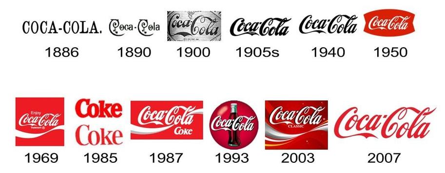
We bet you didn’t know that the iconic Coca-Cola logo was created by an ordinary accountant by the name of Frank Mason Robison! The most characteristic feature of the emblem is the elegant, flowing Spencerian font that was commonly used in documents and correspondence in the late 19th century. In 1890, the brand decided to make its logo more sophisticated by embellishing it with intricate scrolls and swirls. The scrolls on the capital “C” looked like delicious cherries hanging from a tree. Despite the efforts, the new design didn’t stick around for long, and today we can see the old emblem by Robinson on our Coca-Cola bottles. Sometimes, you just can’t beat the original design!
Ford
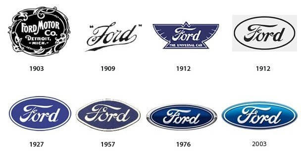
Did you know that Ford Motor was the third automotive company founded by the legendary Henry Ford? His first business went bust. As for his second company (which later became known as Cadillac) Ford left it on his own will. The original emblem for Ford Motor was an overly decorated round icon that featured the company name and location. In 1927, with the launch of a new Ford Model А, the brand decided to refresh its corporate identity. Now it’s represented by a blue ellipsis-shaped logo that has become synonymous with good taste and style.
Apple

The graphic history of the Apple brand started with an ornate emblem designed by Ronald Wayne, one of Apple co-founders. The idea behind the logo was Newton’s revolutionary discovery of gravitation. Along with the company name (Apple Computer Co.), the logo featured a long quote that said: “Newton…a mind forever voyaging through strange seas of thought…alone.” Disappointed by the design, Steve Jobs demanded to replace it with something “not so pretty.” This is how Rob Janoff came up with a colorful logo in the form of an apple and the company name reduced to “Apple.” That happened in 1977. The new logo targeted a younger audience and conveyed the unique ability of the computer to reproduce colors. You may wonder why the apple on the logo has a bite. The answer is quite funny, actually! It was done to avoid confusion with a cherry!
In 1984, with the launch of Apple Macintosh, the tech giant decided that its symbol had become famous enough to represent the Apple brand on its own. This is how the company name was removed from the emblem. Since 1984, Apple has been loyal to its amazing logo, only experimenting with shades and shadows.
Pepsi

Back in 1893, Caleb Bradham couldn’t imagine that his logo was destined to become an iconic visual symbol of the 20th century and shape the modern culture. The emblem only went through its first transformation in 1962, shedding the word “cola.” Now the logo only featured the word “Pepsi” on a round icon painted red, white, and blue. By the way, the round emblem stands for a Pepsi bottle cap. Between 1971 and 2005, the design was continuing its way to simplicity, becoming more plain and minimalist with each rebranding. Looking at the Pepsi symbol now, you can say that it has been honed to perfection!
Mercedes-Benz
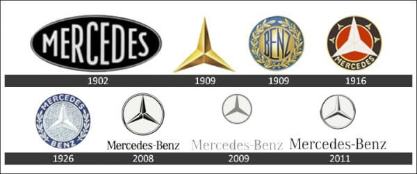
We find it hard to believe but in the early 20th century the logo for Mercedes-Benz (which, by the way, was known as Daimler Motors Corporation back in the day) was a far cry from the iconic three-pointed star. Its predecessor was an elliptical icon with the word “Mercedes” on it. By the way, do you know why the brand is called “Mercedes”? It was the name of Gottlieb Daimler’s beautiful daughter! Only seven years later, in 1909, Daimler registered two trademarks, a three-pointed star and a four-pointed star, with the former eventually chosen as a new company symbol. Since 1910, all Mercedes-Benz cars boasted a shining three-pointed star on their radiator. In 1916, the star was put into a circle becoming more sharp and stylish.
It’s worth noting that between 1916 and 1921, the logo had another circle with the word “Mercedes” written along its inner edge. The emblem as we know it today was introduced in 1921, only to give way to a new variation that resembled the old 1916 design. The year 1926 was marked by a merger of two automotive giants, DMG and Benz & Cie. This is how the Mercedes-Benz company was born. A new emblem was a tasteful mix of the two old logos, the DMG three-pointed star and the Benz laurel wreath. The names “Mercedes” and “Benz” were written along the inner edge of the logo circle. Elegant and effective, the design had been used till 1996 when the company realized it was time to go back to its roots and brought back the minimalist DMG emblem from 1921. And we’re happy they’ve done that!
McDonald’s
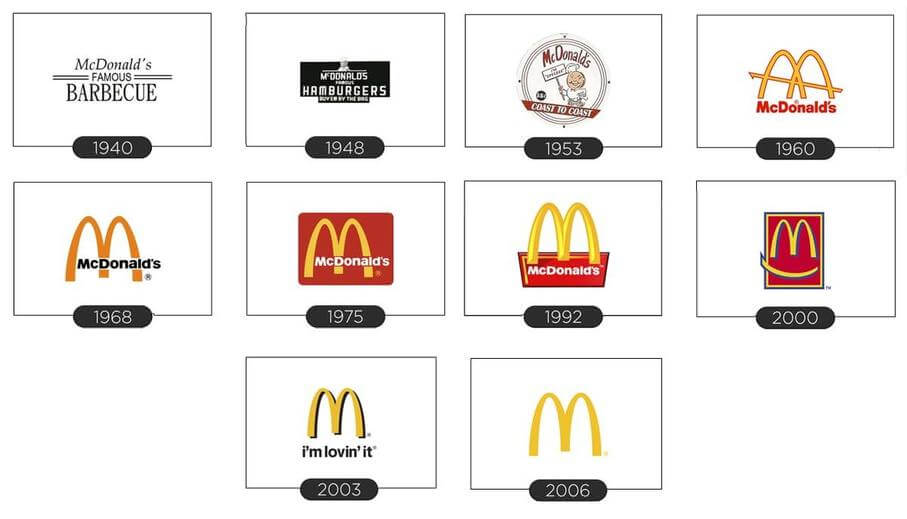
At the dawn of its stellar career, McDonald’s was known as “McDonald’s Famous Barbeque.” On the 1940 logo, burger lovers could see the company name, with the word “Famous” underlined twice. In 1948, the brand name was changed to “McDonald’s Famous Hamburgers”, followed by a major rebranding. Between 1948 and 1953, the company used a funny chef Speedee as its mascot. In 1960, McDonald’s introduced the famous “Golden Arches” in the form of the letter “M.” Created by Stanley Meston, the Arches were doomed to become a globally recognized synonym for mouth-watering fast food.
However, the journey of the McDonald’s emblem was not over yet. In 1968, the fast food leader simplified the letter “М” and painted the word “McDonald’s” black. Only in 1983, McDonald’s found the ideal graphic sign we know so well now, with a white logotype and golden “M” against a red background. In 2003, it was decided to add the “i’m lovin’ it” slogan under “M.” As a part of the 2006 redesign campaign, the restaurant chain made a wise decision to remove the excessive details from its emblem, allowing the iconic Golden Arches to speak for the entire brand.
Levi’s

Currently, the Levi’s emblem exists in two versions, a minimalist white and red logotype and a logomark with two horses. The horses logo can be seen on the patches of Levi’s jeans to emphasize their high quality and durability. The idea for the red logo was only born in 1940 as an attempt to get noticed among a growing number of competitors. In 1969, Levi’s presented its another emblem in the form of bat wings, the creation of Walter Landor & Associates. Ardent fans of the jeans brand grew to like the original design no less than the other two. The Levi’s logos seem like a big, strong family, don’t you agree?
Burger King

The second largest fast food chain in the world, Burger King managed to build a smart, elaborate brand image. Burger King’s archrival McDonald’s is probably the only brand that can do it better. However, losing to a competitor like McDonald’s is nothing to be ashamed of! As for the Burger King’s logo history, it all started with a pretty intricate emblem that featured a king (yes, the very Burger King!) proudly sitting on a burger. Although still used in some ads, the funny character didn’t last long. In 1969, the king was overthrown by … two halves of a bun. The image turned out to be so to the point that it’s been used on the Burger King emblem ever since. Nonetheless, in 1998, the logo was slightly altered, gaining a blue circle and magnetic 3D effect.
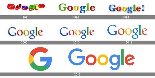
The diverse history of the Google logo started not so long ago, in 1997. The raw version of today’s Google emblem was created in GIMP by Sergey Brin, a co-founder of the IT giant. Adding an exclamation mark to its name was Google’s attempt to imitate the Yahoo! design. Realizing that copying is not the best option for such a powerful brand as Google, Ruth Kedar removed the exclamation mark in 2000. The improved corporate image gained wide popularity and lasted till 2010. In 2015, Google presented its latest logo version that serves a fine example of graphic perfection.
Warner Bros.
Known to every cinema lover, the shield symbol has been sticking to the Warner Bros. logo through thick and thin. Dating back to 1923, the very first emblem featured the abbreviation “WB” in the form of a shield. The upper part of the logo employed a photograph of the film studio. In 1929, the company management decided to replace the photo with the words “Warner Bros. Pictures Inc.” Following the minimalist trend, in 1936-37, Warner Bros. removed all text from its design. In 1937, the shield image was given a three-dimensional look. In 1948, following the first color films, the company transformed its monochromatic logo into a colored one. Between 1948 and 1967, the shield was painted blue and yellow, and the voluminous letters “WB” seemed to be made of gold. In 1967, WB saw drastic changes as it became the property of the Seven Arts film company. The famous shield became more simple and angular in form, with the Seven Arts name under it. Three years later, in 1970, Warner Bros — Seven Arts was acquired by Kinney National Company. Now it was the name “A Kinney National Company” that dominated the emblem. For a short time in 1972, Warner Bros. used a logo that resembled its old 1948 design. In that same year, a designer Saul Bass came up with a brand new logo that was employed till 1984. The new design was more straightforward than its predecessors, with the legendary “W” stylized to resemble three intersecting lines. In 1984, the film company went back to its 1948 blue and yellow design, adding more life to its colors. Over the last couple of years, the logo has undergone minor changes, such as experimenting with shades and animations.
IBM
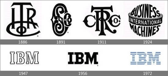
The IBM logo was born in the far 1924, when Computing-Tabulating-Recording Company changed its name to a more edgy “International Business Machines.” Logically, the name change led to major shifts in the company’s visual identity. An intricate CTR emblem from 1911 was followed by a totally different design. The new circular icon featured the words “International Business Machines” shaped as a globe. In 1947, following the company’s technical upgrade, the emblem was replaced with a minimalist “IBM” logotype. In 1956, a renowned designer Paul Rand made the letters look heavier, emphasizing the high status and flawless reputation of the enterprise. In 1972, following some massive shifts in the brand’s positioning strategy, Rand had to re-envision the logo once again. The new striped design stood for speed, versatility, and dynamics.
NASA

The first NASA was revealed in 1958 when the National Advisory Committee on Aeronautics was reorganized into NASA. As it turns out, NASA has not one but three emblems: a sign (the so-called “Meatball”), logo (aka “Worm”), and stamp. The stamp has made a truly stellar “career”: it was approved by President Eisenhower and later altered by President Kennedy himself.
Microsoft
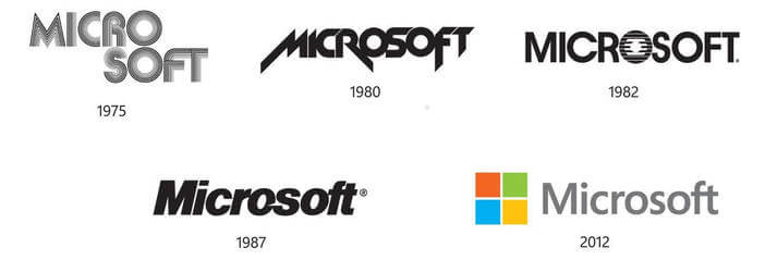
Reflecting the latest design trends of that time, the original Microsoft logo came out in 1975 and was used till 1979. In 1980, the aspiring computer company opted for a more simple and stylish emblem, with the words “Microsoft” written in one line. In 1982, the public saw a transformed Microsoft logo with an extravagant, eye-catching letter “O.” The brand advocates loved the new design so much that its cancellation in 1987 caused a major backlash. The company’s visual history continued with a concise Packman logo authored by Scott Baker. A slash between the letters “О” and “S” evoked instant associations with speed and growth. The late 90s and early 00s were the heyday of the IT giant, with its low-key logo making the list of the world’s top graphic symbols.
Adidas

Adi Dassler was a man of many talents. It was he who decided to put three stripes on the Adidas shoes to make them easily identifiable among competing brands. With time, the graphic became a fully-fledged logo that remained practically unchanged for many years. (The only design element Adidas experimented with was the form of the stripes.) In the 60s, Adi Dassler and his wife Käthe came up with another emblem that featured a trefoil. In 1997, the German shoe manufacturer introduced its new corporate symbol, with three slanting stripes forming a steep mountain. The mountain stood for the challenges faced by the company and the goals it’s pursuing.
Starbucks

In 1971, looking for inspiration for their brand identity, the Starbucks founders discovered a wooden engraving dating back to the 14th century. The engraving showed a beautiful siren (mermaid) with two tails. That image was destined to become one of the highlights of the modern graphic design. Using the find as a prototype, Terry Heckler designed an emblem with a naked mermaid wearing a crown. (It’s curious to note that back then the coffee company was known as Starbucks Coffee, Tea, and Spices.) Later on, Heckler added a few refining touches to his artwork. The first redesign took place in 1987 when II Giornale and Starbucks merged into one brand. In 1992, Heckler revisited his design again. Now the mermaid was wearing a mysterious smile and her two tails became less noticeable. In 2011, an entire team of designers combined their skills and talents to further improve the iconic emblem. The logo shed its outside circle and changed the background color from black to a more optimistic green. Such a bold design solution was a logical step as over 40 years of the company’s existence the mermaid has become a globally recognized symbol. Even tea lovers can identify it with their eyes closed!
Volkswagen
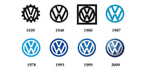
It all started when the Porsche enterprise ran a contest to find the best design for a new Volkswagen car. The contest was won by Franz Reimspiess, a designer who, among his other accomplishments, upgraded an engine for a Beetle model in the 30s. The original black and white emblem featured the “VW” abbreviation and a swastika as a reflection of the then-ruling Hitler regime. The second logo didn’t employ a swastika and looked more like a car wheel rather than a fan. After World War II, the car manufacturer was overtaken by the British who renamed it into Beetle and overhauled the logo concept. While the VW abbreviation survived the censorship, the circle was removed due to its association with the Nazi flag. However, the British management failed to find buyers for the Volkswagen factory and had to return it to the German government. With time, the automotive brand dropped the black and white color scheme and pained its emblem blue and light grey.
Visa

The VISA logo was created in the same year the company was founded. In the original emblem, the brand name was arranged in two lines, with two upper letters painted blue and two lower ones painted yellow. In 2006, the company switched to a more noticeable and recognizable font. In 2014, yellow was removed from emblem, leaving the logotype monochromatic. Today, you can see the new icon on all VISA-related marketing and advertising materials, and we think it looks sharp!
Shell
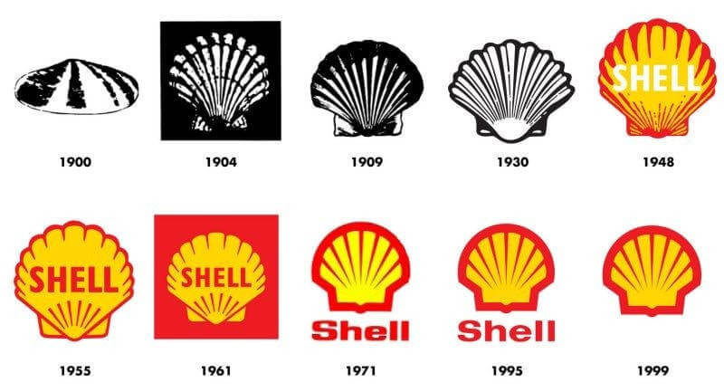
Drawing inspiration from nature, the oil giant Shell made a sea shell its corporate symbol. The evolution of the Shell logo shows how the company moved from an complicated image to a simplified shape that speaks for itself. In the far 1900, the emblem featured a black and shite design. Almost 50 years later, in 1948, the image was painted red and yellow. That option stayed practically unchanged for decades, with the company name changing its location from time to time. In 1999, the multinational corporation decided to remove its name from the emblem, relying on the shell alone for identification.
LEGO
Created in 1932, the very first Lego emblem was a fine example of minimalism in graphic design. It was a logotype that only included the company name. This is how the brand founder Ole Kirk Christiansen paid tribute to his hometown Billund that, too, had a plain emblem. In 1936, the toys manufacturer added color to its logo making it look like a rainbow (or a bright, eye-catching toy). In 1950, it was decided to put the name “LEGO” inside a circle and add the words “Billund Danmark.” Three years later, in 1953, LEGO presented a new logo with bulky white letters on a red background. In 1956, the word “System” was added under the brand name, and the word “LEGO” gained a black outline for a bigger visual appeal. In 1973, striving for simplicity, the toy company removed the word “System” and added another outline, yellow this time. The emblem as we know it today has been used since 1998, associating with joy and fun among kids all over the globe.
Hewlett-Packard Company (HP)

Can you believe that the Hewlett-Packard logo has survived practically unchanged since as early as 1939? In 2011, there were talks to make the image more dynamic by drawing diagonal lines through the letters “H” and “P.” However, those ideas stayed on the paper (which is, probably, for the better). The logo was eventually updated in 2016. Now it employs rounded letters “H” and “P” on a sky-blue background.
Gap

Between 1969 and 1986, the famous apparel brand used nothing but its name as its corporate symbol. There’s hardly a better example of a logotype, if you ask us! Then the word “GAP” was put inside a navy blue square. Simple yet effective, the logo was so loved by the brand fans that the company’s attempt to alter it in 2010 caused multiple protests on social media. Luckily, the clothing retailer listened to its customers and went back to its old logo.
Canon
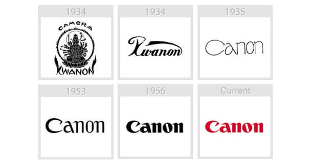
We bet that only hardcode Canon fans know that the original Canon logo featured Kwannon, the goddess of mercy that revered by the Buddhists. (By the way, in its early days, the Canon brand was known as Seiki Kogaku Kenyudho.) Furthermore, the goddess lent its name to Canon’s first camera. Following a tremendous success in 1935, the Japanese imaging company scaled up its production and revamped its brand identity. As a result, in 1956 the public saw the renowned red logo that we all know and love.
BMW

The automotive legend BMW (Bayerische Motoren Werke GmbH) was a result of the 1916 merger of two aircraft engine manufacturers, Rapp Motorenwerke and Flugmaschinenfabrik owned by Gustav Otto. The prototype for the iconic BMW symbol was a round emblem used by the Rapp-Motorenwerke brand. It displayed a horse and the white and blue Bavarian flag. The BMW logo featured two white and two blue quadrants inside a black circle. After World War II, the company, that no longer had to manufacture equipment for military purposes, set out to explore the automotive world. It’s amazing how much the modern BMW logo and its 1917 predecessor look alike! The car manufacturer has had no need to improve the already ideal design. The most noticeable change took place in 2000 when the emblem gained an attention-grabbing 3D effect.
Audi
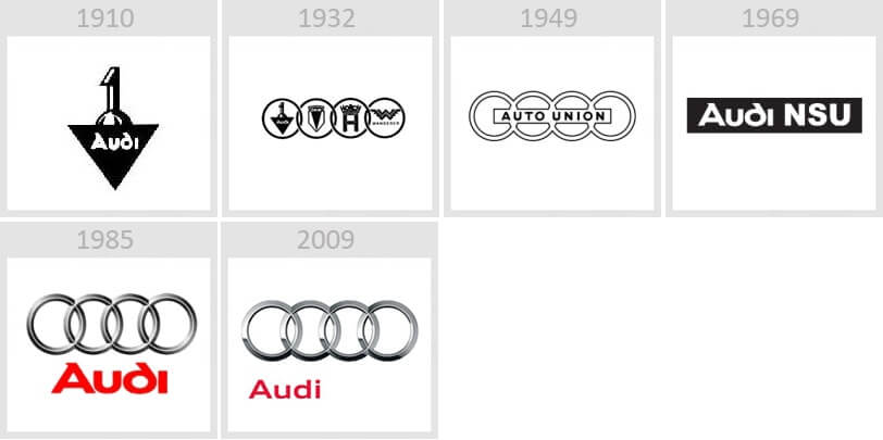
For its first logo used till 1932, Audi drew inspiration from the sinuous, elegant Art Nouveau shapes. In 1932, to cut growing expenses amidst the economic crisis, Audi merged with other three automotive manufacturers, DKW, Horch, and Wanderer. Such a major structural change led to a new logo design with the four overlapping circles we all know. The circles stood for the four united companies that now were a part of Auto Union AG. In 1965, the enterprise changed its name to Audi and was then acquired by Volkswagen Group. In 2009, to celebrate its 100th anniversary, Audi overhauled its famous logo making it more even more refined and beautiful. We totally love it!
Another logo that has become very popular in the last few years is the Bitcoin logo. You can read his story here.
For more amazing logos, follow this link!

