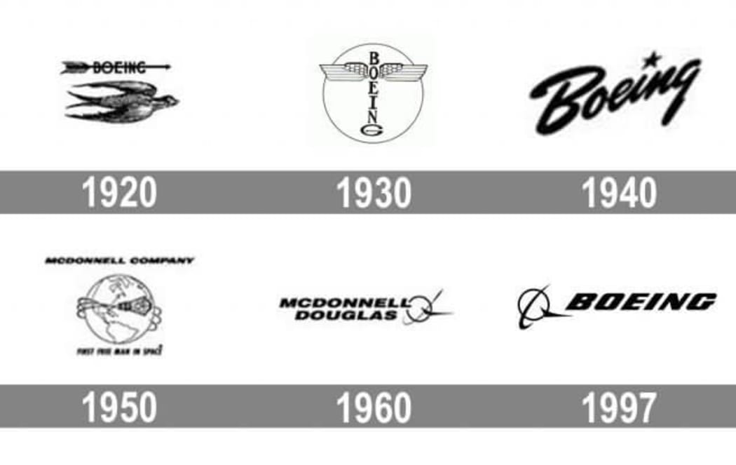
Boeing is one of the largest aerospace companies in the world. The Boeing logo can be unmistakably identified by its original font. In this post, we’ll talk about how the company’s more than 100-year-old history.
Backstory
William Boeing was a woodsman who had a passion for aircraft. In 1916, he established a company based in Seattle. Soon, together with a team of professionals, he designed his first hydroplane.
During World War I, the US government commissioned Boeing with a big batch of military aircraft for the United States Navy. It was then when the company coined its legendary slogan, “Building Something Better”.
After the war, Boeing switched to delivering mail. In 1928, the company got itself its first logo. The emblem featured the brand name written in a vertical line and accompanied by a pair of wings. Throughout the 30s, the so-called “Winged Totem” could be seen across all Boeing machines.
Logo evolution
In the times of World War II, Boeing was selling military aircraft, and quite successfully. However, in the late 40s, the company faced a hard time. To overcome the crisis, the Boeing management decided to switch to manufacturing civil aircraft and do a rebranding.
In 1947, Boeing came up with a new text logo that stood out thought its custom-designed Stratotype font. At first, the emblem was placed on all models of Boeing aircraft. However, in 1988, Boeing limited its use. Nowadays, the Boeing logo is protected by copyright from any kind of infringement.
In 1997, Boeing acquired one of its long-time rivals, McDonnell Douglas Corp. Following the acquisition, the brand had to overhaul its corporate emblem again by bringing together the symbols of the two companies, the globe and the custom font. As its corporate shade, the aerospace giant opted for blue. Color blue portrayed the company as a reputable, reliable partner.

How would Boeing logo look like if it were made in ZenBusiness?
Bottom line
Every time you hear “Boeing”, you imagine a simple yet refined logo with a one-of-a-kind font which is impossible to forget. Despite multiple changes, the Boeing emblem has kept its founder’s name. This is one of the secrets that makes it recognizable across countries and generations.
