BP is, hands down, one of the biggest oil and gas companies in the world. Over the course of 100 years, its logo has evolved from simple black letters to a bright symbolic image. In this post, we’ll look at how BP has gone through multiple emblems and brand names until finding its unique style.
- Backstory and evolution
- Drastic rebranding
- How would BP logo look like if it were made in ZenBusiness?
Backstory and evolution
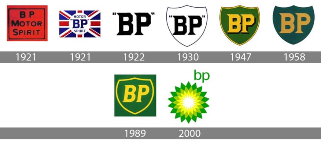
The company was established in 1909. However, back then, its name was not “British Petroleum” but “Anglo-Persian Oil Company”. In the 1920s, the company presented to the public its first emblem. It featured two massive letters BP (British Petroleum) written in quotes against a white background. The thing that instantly caught the eye was an original font with sharp serifs and angles. In 1930, the image was placed on a shield with a thin black edging.
In the wake of the crisis caused by World War II, the company decided to revisit its brand identity. In 1947, the letters and the shield were painted light yellow and got a stylish black shadow. As for the background, it turned dark green.
Seven years later, the brand changed its name to “British Petroleum”, which entailed another rebranding in the early 60s. The responsible task was commissioned to a team of talented designers helmed by Raymond Loewy. A legendary figure in the graphic design scene, Lowey crafted amazing art pieces for Exxon, Studebaker, Shell, and other big-name companies. The logo preserved its original concept while getting more saturated colors and rounded typography. Tt was decided to get rid of the shadow, though.
In 1989, a design studio Siegel & Gale made its creative contribution to the BP brand identity. The logo got a new yellow and green palette and an italic font. That version was used till the early 2000s.
Drastic rebranding
The 21st century marked a new milestone in the BP history. Following the principles of eco-friendliness, the company has took a whole different perspective on its market positioning. The new corporate style was designed by Landor Associates.
The oil titan cut its name to BP and launched an ad slogan “Beyond petroleum”. On top of that, the company started investing into the development of alternative energy sources. Inspired by Helios, the Greek god of Sun, the new logo supported the company philosophy.
The old shield was replaced with a bright sunflower painted in the BP corporate colors. To make the design more energetic and invigorating, a new complementary shade was added to the existing yellow and green palette. Now written in lowercase letters, the brand name was shifted from the center to the upper right corner.

A new marketing campaign costed BP a staggering 20 million dollars. However, the investments paid off big time. BP was named among the most environmentally friendly oil businesses in the industry.
How would BP logo look like if it were made in ZenBusiness?


Conclusion
A company image starts with branding. How do you reveal your brand identity to your audience? In your logo, use the symbols and colors that transcend your message and values. Coin a catchy slogan that reflects your corporate philosophy. Also, make sure all elements of your emblem work together towards the same goal.


