ExxonMobil Corporation, a major American oil and gas company, has lived through several reorganizations and rebrandings. It remains one the strongest oil giants in the international market. Read about how the brand structure and logo have evolved over the years.
- Company backstory
- Logo evolution
- How would ExxonMobil logo look like if it were made in ZenBusiness?
Company backstory
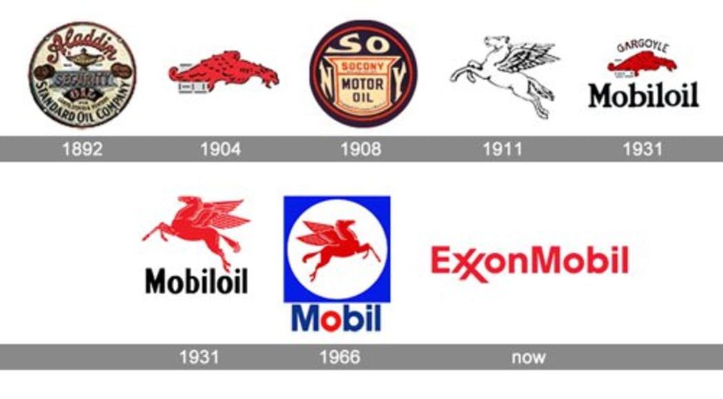
In 1870, John Rockefeller founded an oil company and called it Standard Oil. In no time, it has developed into one of the most powerful business empires in the USA. The company’s corporate colors — red, white, and blue — stood for the colors of the American flag, appealing to patriotic feelings. A big torch in the center of the logo symbolized the bright future of the oil industry.
In 1911, Standard Oil faced its first serious challenge. According to new antitrust legislation, the oil giant had to be split into 34 independent businesses. That event gave a start to a multi-stage restructuring that continued all throughout the 20th century.
The 30s saw the emergence of a partnership between two enterprises that are considered the predecessors of Exxon and Mobil. Since the two companies were targeting different markets,they were using different logos.
Mobil was involved in selling old products all over the globe. To highlight its global dominance, the brand chose the mythical winged horse Pegasus as its visual symbol.
The name “Exxon” first appeared in 1972 as a replacement for “Esso”, whose use was limited in the United States. When crafting a new emblem, designers drew focus to a double X that sounded like a double S. On top of that, the crossing Xs stood for strength and reliability.
Logo evolution
In 1999, Exxon and Mobil merged into ExxonMobil. The company’s new logo looks simple yet striking, combining the names “Exxon” and “Mobile” written in the same massive font.
The design uses a spectacular red-and-white color palette. Red communicates energy, prosperity, and determination. White is a universally recognized shade for elegance and purity.

Typography plays a major role in the logotype. The first thing that jumps to the eye is the iconic double X that symbolizes a unique fusion between Exxon and Mobil.
How would ExxonMobil logo look like if it were made in ZenBusiness?


Final words
Over the last 135 years, ExxonMobil has grown into the biggest oil producer on the planet. Its emblem is, by right, among the most recognizable corporate logos in the business arena. The brand has stood through hard times and retained its influence. ExxonMobil sets a great example for all business struggling with challenges.


