Corporate identity is not just a combination of logo, slogan, corporate colors, and fonts. Its main goal is to create a recognizable image of the company in the eyes of consumers. In this process, every point of contact with the brand becomes crucial, from branded packaging to communication with customers. In the article, we will explain how well-known brands cope with this concept.
Elements included in corporate identity
Corporate style or identity is based on the mission and values of the company, and the message which is conveyed to the target audience. You can convey it with the help of tools that evoke all the senses: vision, hearing, smell, and tactile senses. The main elements of corporate identity are:
- company name
- logo
- tagline
- typography
- color spectrum
- photos, illustrations, style-forming graphics
Depending on the type of company industry, additional elements may include:
- smells
- manner of communication with customers
- staff uniform
- style of advertising campaigns
- product packaging
- style of posts on social networks
- music tracks
Tips on creating corporate identity:
• To see how your design will look in real life, design a mockup. This is a file with the image of your logo on various objects such as cups, notebooks, and phone cases. You can download ready-made mockup templates on the Internet (sites Freedesignresources, Mockupworld, and others). You just need to upload your logo.
• Having completed the design of your brand identity, create a brand book – a complete guide on how to use your corporate identity. Describe the mission and values of the brand as well as the acceptable and unacceptable usage of the logo, graphics, illustrations, and other important elements.
Examples of famous brands’ corporate identity
1. Winter Milk
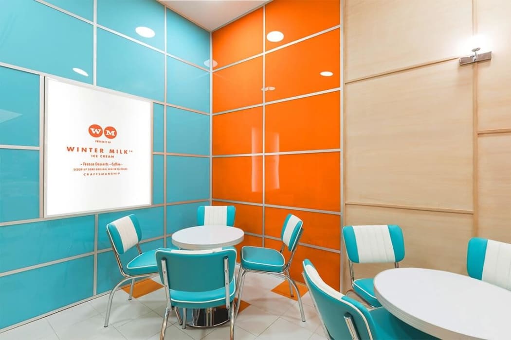
The use of natural ingredients is the core concept of the Mexican cafe chain with craft ice cream. Identity is designed in the 60s style. Nostalgic feelings evoke associations with family trips to an ice cream parlor, quality products, and a light and carefree mood.
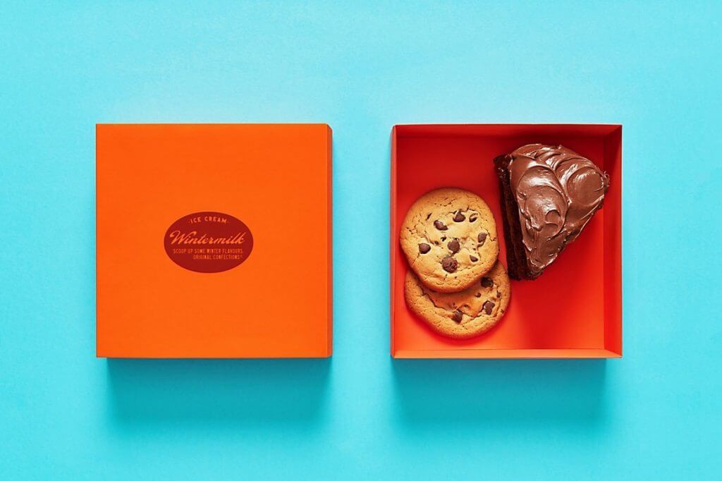
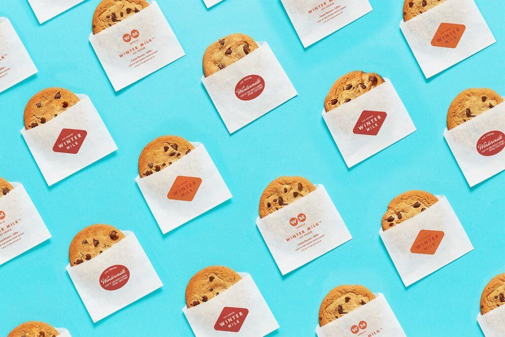
This atmosphere is reflected in the café’s interior. Corporate colors include contrasting orange (traditional for the Netherlands, which is famous for its quality of dairy products) and blue (associated with coolness). Rounded lines and clean laconic typography remind you of the 60s. The logo is also made in the same style with the brand name placed in a rhombus with rounded edges.
The brand Identity covers a maximum number of points of contact with customers including signboard, interior (plastic labels with the names of the ice cream), staff uniforms and product packaging.

2. Helvetimart
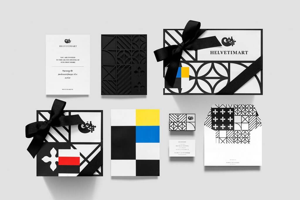
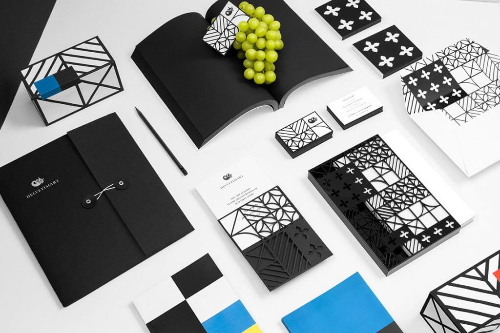
The Swiss store offers customers high-quality regional products, so its branding is inspired by national identity. Black and white graphics refer to ancient architecture. Multi-colored flags of 26 regions of the country that label its products make an excellent contrast to the monochrome palette.
The brand name is based on the word Helvetia – the Latin name of Switzerland, which is now used as a unified symbol of the country, for example, on postage stamps and coins. And the cornucopia logo represents a variety of products.
The brand identity strengthens communication with customers. The staff is happy to tell customers about all the details of production and the features of the goods. They also regularly offer tastings.
3. Foursquare
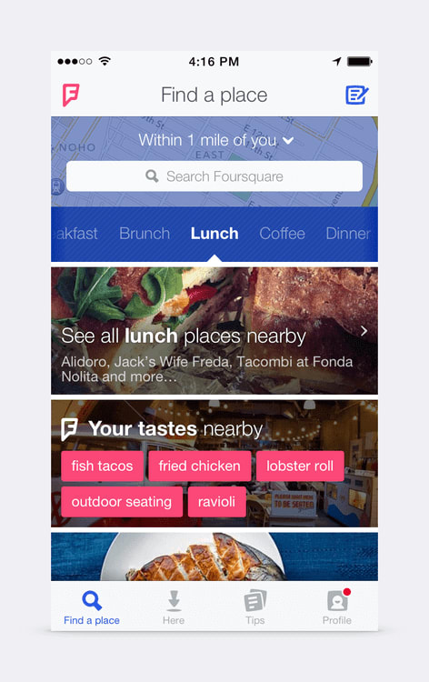
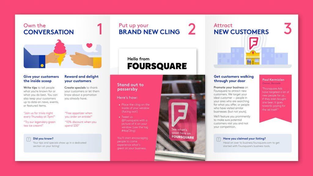
The main function of the application is to help users find the nearest location for lunch or entertainment and make a choice according to the reviews. Since mobile devices become the only point of contact with the brand in this case, designers have tried to make the application as stylish, convenient and useful as possible.
The main attention in the design of its corporate identity was paid to the logo in the shape of the letter “F”. It acts as the application icon. Its unusual form contains several meanings at once: a pin on the map (opening new places), a superhero emblem (achieving goals), and a speech bubble (users’ reviews). A set of icons with funny images of food and drinks complements everything.
4. Autistic Art
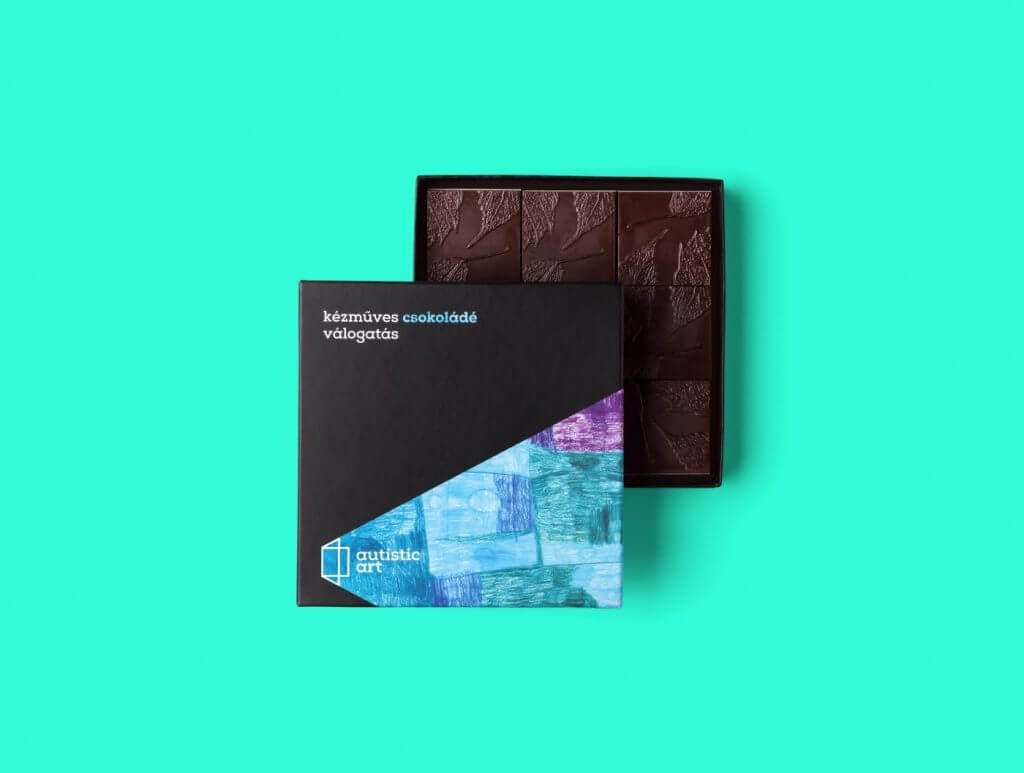
The designers had a difficult job – to create an identity for the fund that supports children with autism. The fund organizes painting lessons for them, and sell the finished paintings to raise funds.
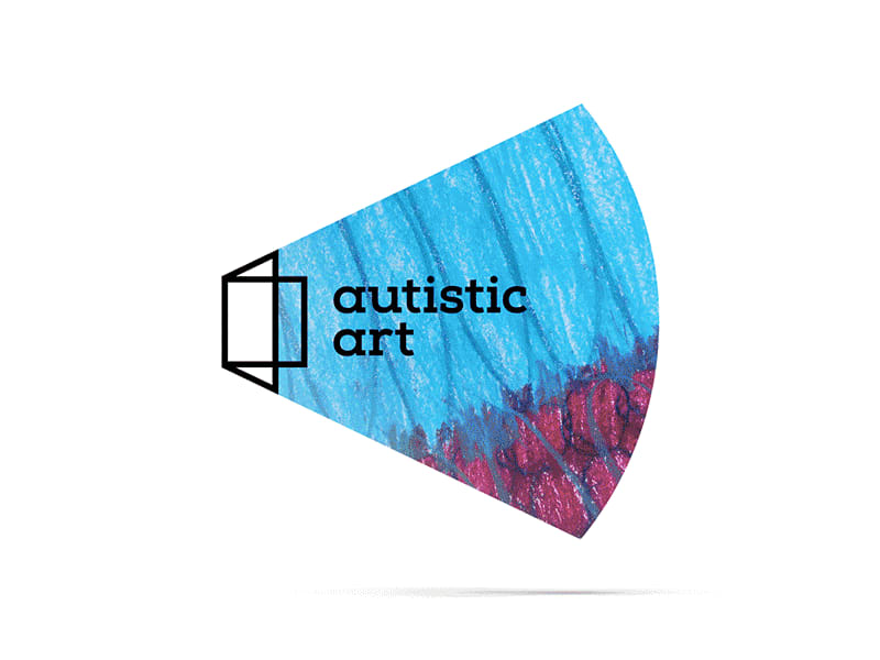
Its brand identity was built around the image of a window, symbolizing the connection between the children’s inner world and the external environment. Rays of light are casting from the window in the form of bright paintings.
The logo also has a dynamic embodiment: paintings change quickly, showing that two identical personalities don’t exist. All these elements make the identity simple, but emotional. The images could look spectacular on any products including coffee cups, notebook covers, or credit cards.

5. Apple
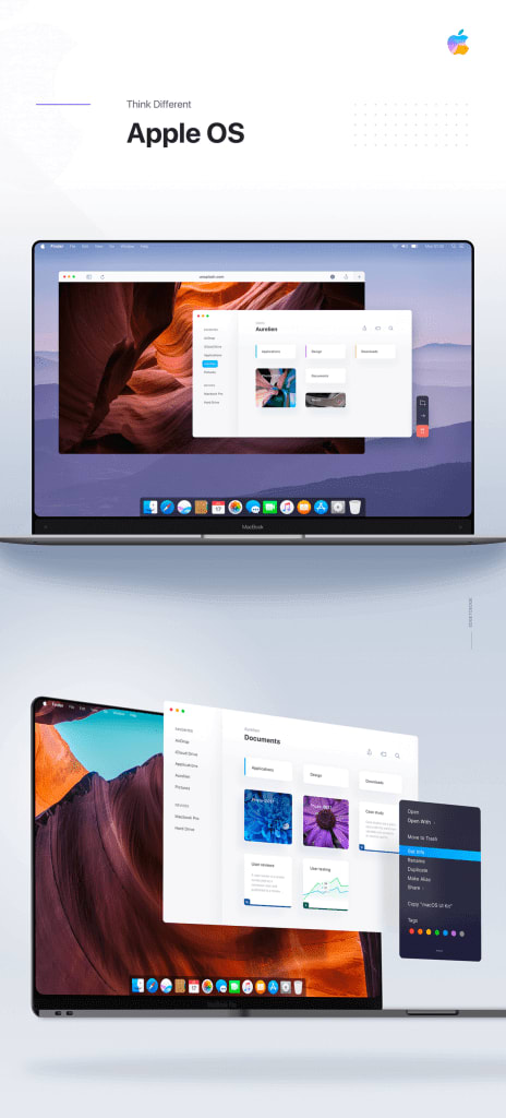
The brand strategy is built on a strong emotional connection with consumers. “Our products make you special,” the idea is embedded in all of Apple’s advertising campaigns and user communications.
A cult company does not focus on products in its branding. It focuses on the qualities you will acquire with its products such as inspiration, creativity, and originality. This message is enhanced by graphics and colors of monochrome and metallic fine lines while its laconicism is associated with luxury, style, and sophistication.
6. Animal Planet
In 2018, the channel presented a corporate style that reflects its new global brand identity. “We are here to entertain, amaze, bring people closer to animals and nature, and preserve the joy of childhood,” the company explained.
The logo with the jumping elephant became the visual embodiment of this idea. The blue color is associated with the globe, and the funny image of the animal conveys a friendly and informal mood.
Source: by Behance.net


7. Coffeecell
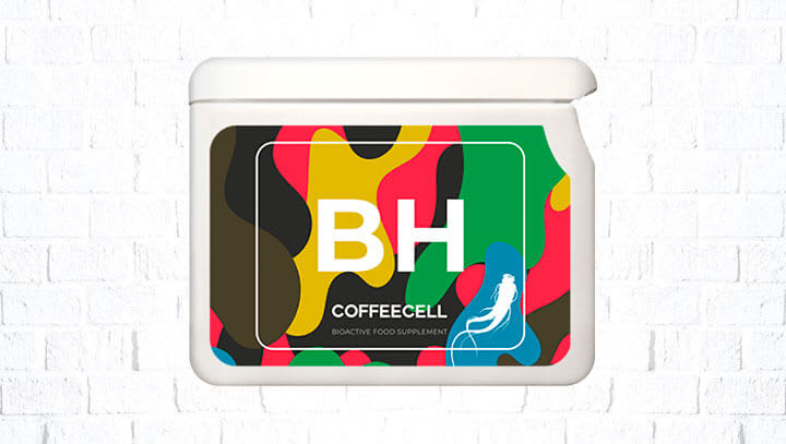
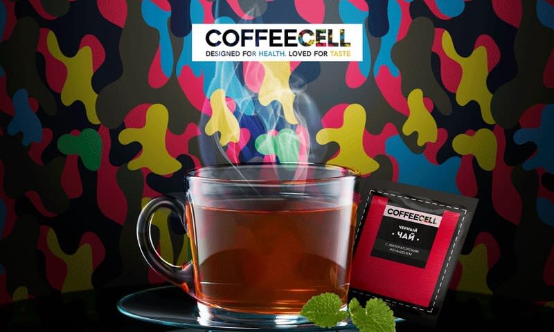
The coffee seller built its identity on a non-standard association – “protect your cells.” This refers to the scientific thesis that caffeine positively affects the cells of the cardiovascular system.
The visual elements of branding are based on camouflage, made in six corporate colors: red, blue, green, yellow, khaki and black. This picture demonstrates the cups with a drink, bright bags and stylish Coffeecell boxes.

8. Black Watch Global
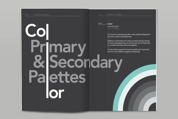
The branding conveys the main message: BWG is a company with global experience in various countries, from Africa to Asia. Therefore, its emblem consists of four geometric figures symbolizing the four cardinal points. All figures strive towards the center of the image to emphasize the combination of four qualities – research, analysis, mind and communication. You need those to achieve important goals.
Monochrome colors of identity are diluted with turquoise, which looks stylish, concise and intelligent. The creativity of BWG is confirmed by its original 40-page brand book, in which the inscriptions sometimes go beyond the pages or skip from one sheet to another.

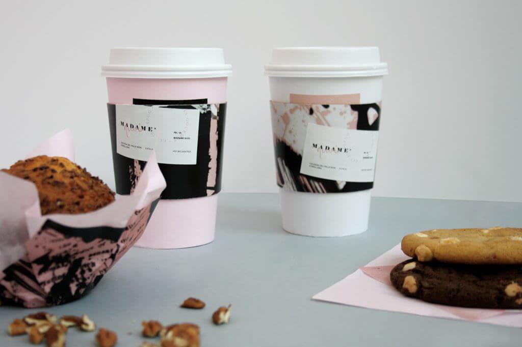
9. Madame Quoi
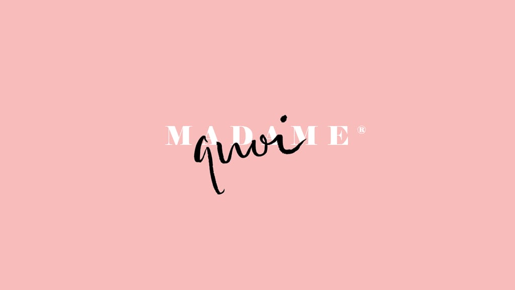
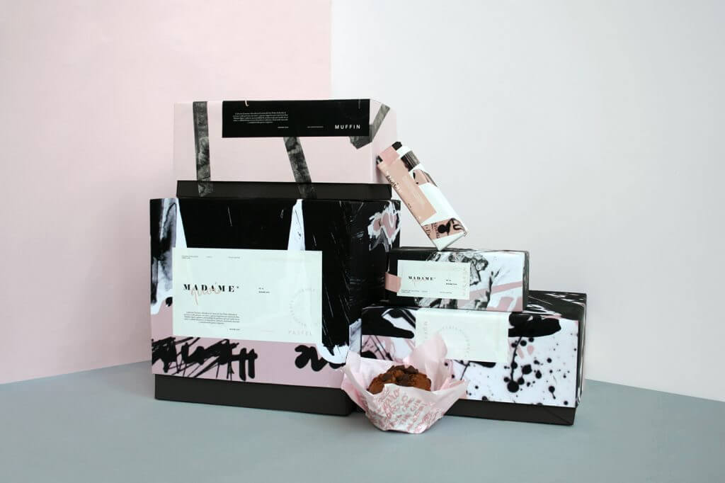
The expressive branding and the name of the French bakery are inspired by a dramatic story. In 1914, Henrietta Cayo shot and killed the editor-in-chief of the newspaper, who was at enmity with her husband, a high-ranking politician.
The visual identity reflects a mixture of strong emotions with gentleness and femininity. Graffiti-like lettering and abstract graphics are combined with black, white and pink colors. Such an identity refers to the idea of non-standard tastes of products and the explosion of emotions that it arises.
10. Orchestre Metropolitain
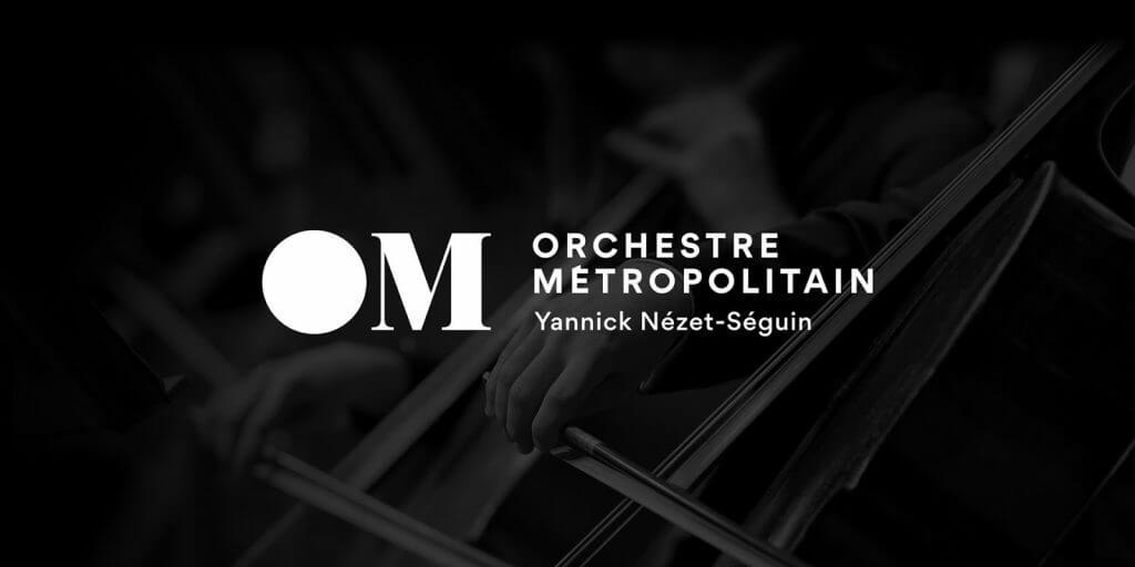
The mission of the Montreal Orchestra is to make classical music accessible to the general public. Therefore, the corporate identity successfully combines classical and modern elements in it.
The contrasts are conveyed by the monogrammed logo. The letter “O” is designed in a modern style with the shape of a black window from which “the music pours”. The idea is complemented by hands with different instruments reaching out of the window. The letter “M” with serifs, on the contrary, looks strict. This approach gave the orchestra a modern character, while maintaining an important reference to classics and elegance.

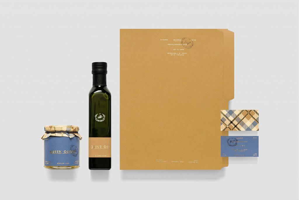
11. Bokeria
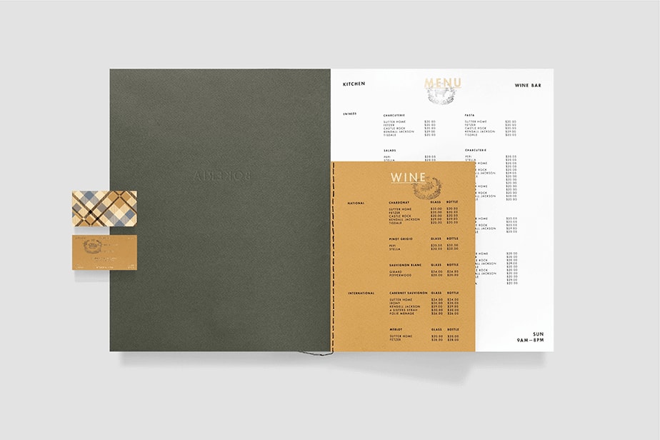
The Croatian restaurant serves quality Mediterranean cuisine in a homely atmosphere. The brand conveys the ideas of pleasure from food and wine, love for trips and discoveries, spending time together, and warm communication.
As for its identity, a warm golden brown gamma contrasts against a blue tint, conveying a balance of freshness, tradition, and quality. The text logo frames a classic pattern reminiscent of old engravings.
Icons with images of products complement the identity. They are used on the menu, labels, packaging, staff uniforms and product labeling.
12. Kallo
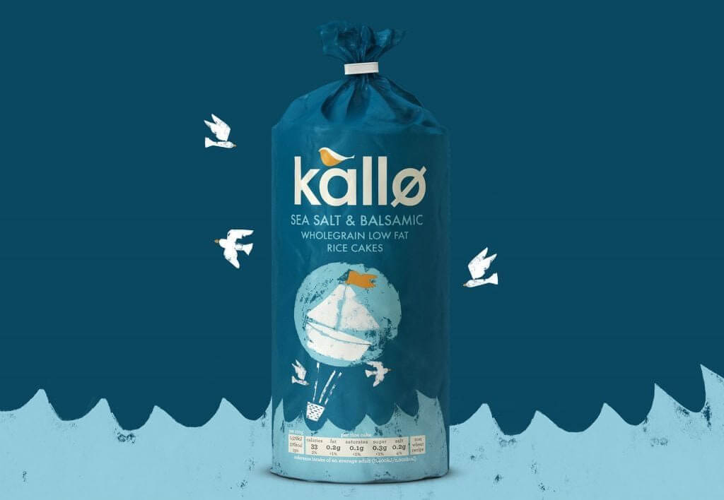
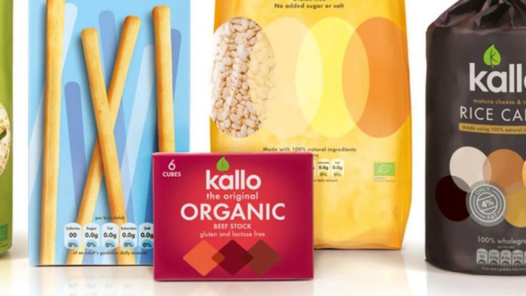
The company produces healthy and natural alternatives to cakes, pastries and cookies. This quality is reflected in its corporate identity, and the packaging has become the central element of it.
According to the designers who were involved in Kallo’s branding, the packaging was strict and unemotional before. So the healthy food lovers were made to feel themselves as people with special needs. The new identity shows that customers are gourmets who enjoy natural products.
Warmth and friendliness were visualized using stylish multi-colored illustrations that depict the main ingredient of each product. A hand-drawn bird logo emphasizes associations with nature and organism.
Conclusion
Let’s summarize the main stages of designing your corporate identity:
- state the mission and values of the brand, that is, the message that you will convey to the target audience
- think about how to express them using visual, auditory, or tactile instruments
- learn examples of brands that inspire you or conveys a meaningful message to you
- after designing the identity, implement it in the maximum number of points of contact with customers
