- Hidden Meaning, Colors, and Fonts of the “Zombie Logo”
- Target Audience
- The Mystery of the Logo Evolution Attracting the Fans
- The Walking Dead Must-Use Branding Tricks
How to convey a brand’s message through a text-based logo? Why is it important to change the identity? In this article, we are going to share some branding techniques used by the creators of the iconic TV series The Walking Dead.
Hidden Meaning, Colors, and Fonts of the “Zombie Logo”
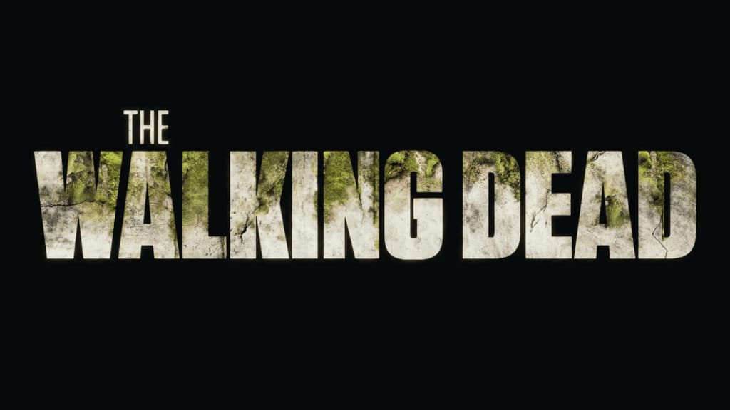
The Walking Dead is a TV series about how people try to survive the zombie apocalypse. Ironically, the symbol of this story was not a skull with bones or a clawed hand but a text-based logo. The inscription is made in soft colors which vary from sandy to earthy and dark green.

The designers chose the Tungsten Black, a concise sans serif font. The large bold print allows the letters to be used as the background for images that hint at the plot twist. We’ll tell you more about this technique below.
Target Audience
The target audience of The Walking Dead is young people and adults from 18 to 49. To hold their attention, the TV series authors ensured not only an exciting scenario but also thought about the brand promotion.
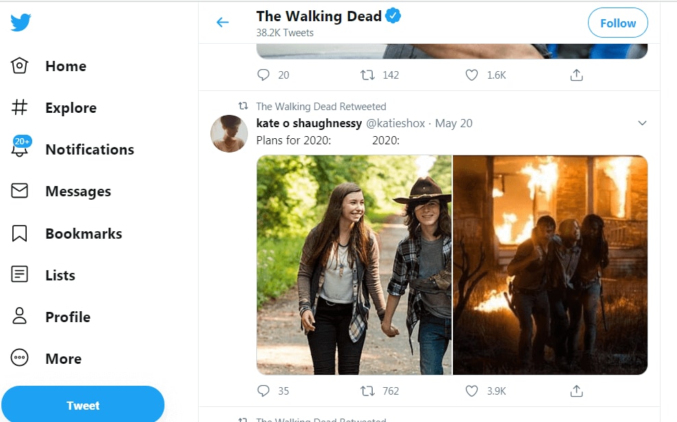
Social media have become the main tool for communication with the audience. While broadcasting, the show organizers stirred up the spectators’ interest in Twitter and Facebook: they organized quizzes and giveaways, encouraged users to create their own content and share their opinions. The viewers had a chance to discuss the series not only with other fans but also with the actors of the show!

The active involvement of the audience in the marketing campaign has turned them into the brand ambassadors – a multi-million army of devoted fans. For several years in a row, The Walking Dead was the most mentioned series on social media. According to Nielsen, each episode fostered more than 2 million interactions on Facebook and Twitter.
The Mystery of the Logo Evolution Attracting the Fans
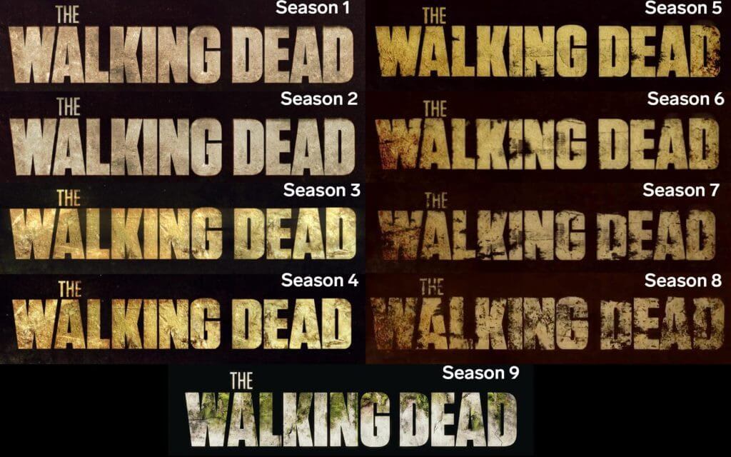
One of the features of The Walking Dead is the logo change. From season one to season eight, the letters were gradually collapsing thus mirroring the decline of the world. In the first season, we saw clear gray outlines with subtle dark spots. Then the letters got darker and the spots bigger. By the eighth season, the spots have absorbed some part of the letters – it matched the plot of the show which was becoming more and more tragic.
In the ninth season, the fans had a surprise waiting for them: the letters grew lighter and restored integrity, and green spots appeared instead of dark shadows. The new logo hinted at an optimistic turn in the story, and namely the revival of nature and the return to normal life.

The Walking Dead Must-Use Branding Tricks
- Tell a story for your target audience. Analyze what your customers are interested in, what they fear, and make it happen visually.
- Have no fear of simple solutions. A plain text-based logo can become recognizable through fonts, shapes, or colors.
- Involve the audience. Actively use your brand identity on social media, involve subscribers, and encourage them to share branded content with your logo.
- Change. Keep it up! Follow the trends, customer response, and changes in your company. Mirro these changes using your logo.


