Do you know why CBS, a high-profile media conglomerate, has been dubbed the “Eye Network”? Because of its mesmerizing logo that has remained unchanged for nearly 70 years! From this post, you’ll learn how the mysterious symbol emerged and what stands behind it.
- About the first CBS logo
- Who designed the iconic eye
- Why CBS stays loyal to its logo
- How would CBS logo look like if it were made in ZenBusiness?
About the first CBS logo
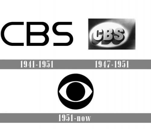
The telecom brand introduced its first visual symbol in 1941. It was a concise emblem with the company name written in a simple black font. Six years later, CBS decided to put more creative effort into its brand identity. This is how the CBS abbreviation got a shadow and was placed inside an oval spotlight.

Who designed the iconic eye
In 1951, the CBS creative director Bill Golden was inspired by the mysterious image of a human eye. He saw the image first in the magazine and then on the barns of the Shakers, a small Christian community based in Pennsylvania, USA. According to the Shakers, the eye protected them from evil spirits.
The graphic designer Kurt Weih found a smart way to incorporate the mystical eye into the CBS logo. Although the eye was a direct reference to ancient superstitions, the design looked modern and edgy. Plus, the image of an eye was a great choice for an aspiring company that was determined to take the TV industry by storm.
At first, the logo was dynamic. The eye was stylized as a camera lens that was opening and closing. Every time it opened, a viewer could see “CBS Television Network” written on it. The image was set against the sky covered with white, puffy clouds. A couple of years later, the symbol was made static, and the logo shed its dreamy background.
Why CBS stays loyal to its logo
CBS is so happy with its eye logo that it hasn’t changed the concept since the 50s. The only things that have been altered over the years are the color palette and arrangement of the elements. For example, in the 60s, to celebrate the invention of color television, CBS invigorated its design with the shades of green, blue, red, and yellow. The media company has always been at the forefront of new technologies. Thus, in the 80s, the telecom giant started to use the eye that was created in a computer program.
Interestingly enough, different CBS offices all over the world are using different logo versions. For example, the sports department of CBS has chosen a blue emblem, which is a symbol of trust and stamina.

How would CBS logo look like if it were made in ZenBusiness?


Final thoughts
Using a universally recognized symbol in black and white is a surefire way to create a timeless logo. If you want your brand identity to stay relevant through the years, you should follow the example of CBS.


