Batman’s first mascot appeared more than 80 years ago and has survived about 30 transformations since then. In this article, we’ll tell you how the logo changed and why it always remained recognizable.
The Logo Creation History
Superhero Bruce Wayne (Batman) first appeared on the cover of a detective comics in 1939. His story explains the unusual choice of the logo.
Legend has it that as a child the boy witnessed the murder of his parents and decided to devote his life to the fight against criminals. A bat became the embodiment of this mission as the symbol of the battle against evil and the pursuit of justice. Each time overcoming himself and performing a feat the hero grows stronger, and never resorts to dishonest methods of struggle.
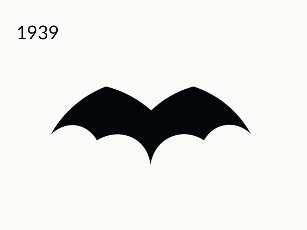
The first version of the logo was minimalistic. The animal had no ears or head, and the image itself took up a small area on the suit compared to future versions.
The Logo’s Evolution in Movies and Comics
A black bat has become Batman’s hallmark for decades to come. However, this image has changed about 30 times – mainly due to the number of webs, shape, and details. And the superhero’s mascots in comics and movies were often different.
Testing the Shapes
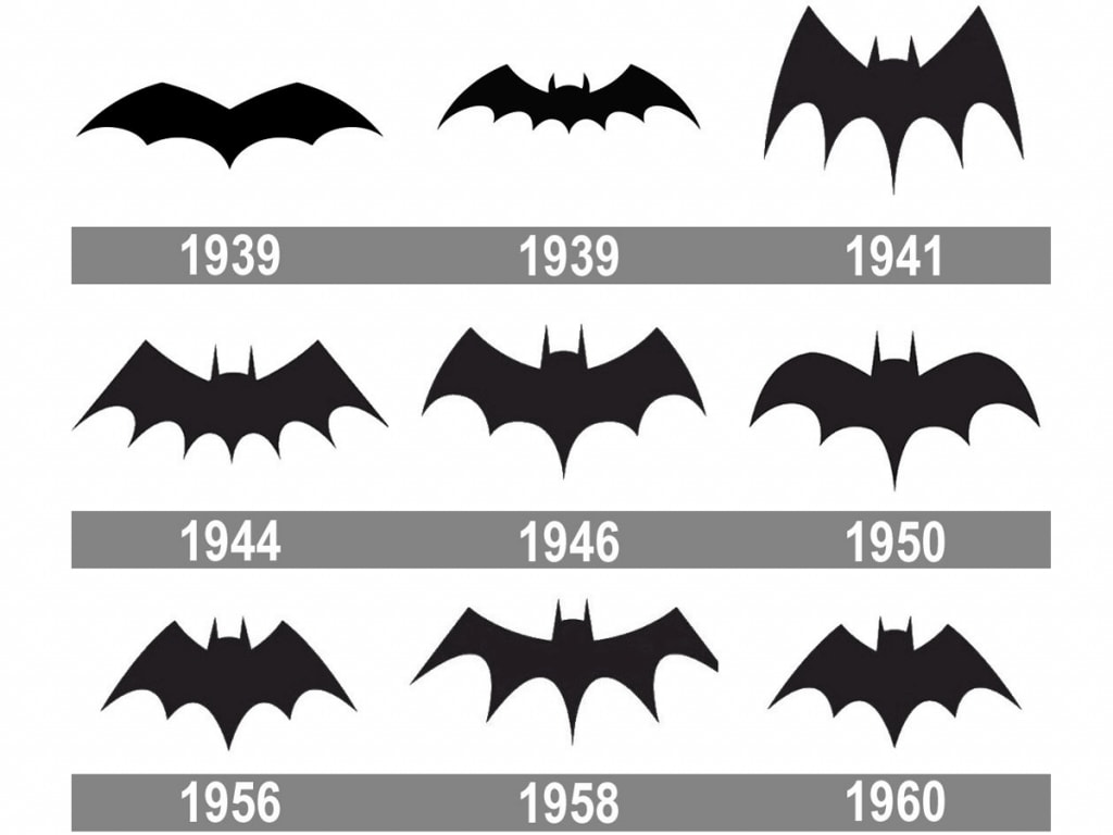
Shortly after its appearance, the logo doubled in size, the animal got its head and ears, and the number of webs increased from five to seven (in the following years it was constantly changing). In 1941, the picture acquired a Gothic style – the wings were stretched out and sharpened.
In 1943, the superhero first appeared in a TV series. Although the emblem on his chest was small, the details were worked out more carefully than in magazines. And in the series of the late 40s, in addition to the blue veins on its wings, the bat got round ears for the first time. By that time, the logo had a similar look in magazines.
The 50s were marked by changes in shape: first it was rounded, and then got thinner and wider.
A Yellow Ellipse
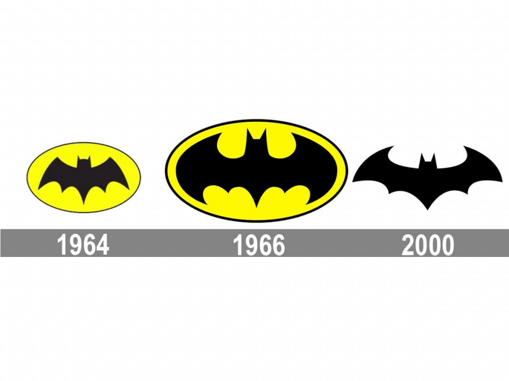
The year 1964 became a landmark for the logo when it was first placed against a bright yellow ellipse. There are many legends about the reasons for this decision. In fact, the motive was simple – to open a new era in logo design. Two years later, the image was improved: the bat “unfolded its wings” to adjust to the shape of an ellipse. At the same time, the icon appeared in a new TV series about Batman as well.
The end of the 20th century was experimental. In the 80s, they decided to abandon the yellow color: a huge bat with wide wings resembling a cape was painted on the Batman suit. Then the designers presented a more elegant variation, inspired by retro-versions. And in the magazines of the 90s, Batman got his yellow color back.
In the thrillers of that time, the hero always appeared with a recognizable colored ellipse. And with the Batman Forever movie in 1995 begins a new era of screen logo design. It becomes black, and now it is not drawn but embossed on a suit making the picture look voluminous.
The New Millennium
In 2000, the designers decided to finally abandon yellow. The shape acquired a classic well-known look: a combination of graceful curves and sharpened details of the outline. However, after 16 years, in the action movie Batman vs. Superman the bat opened its cape again. The logo became so large that it could fit a red Superman’s “S” mascot.
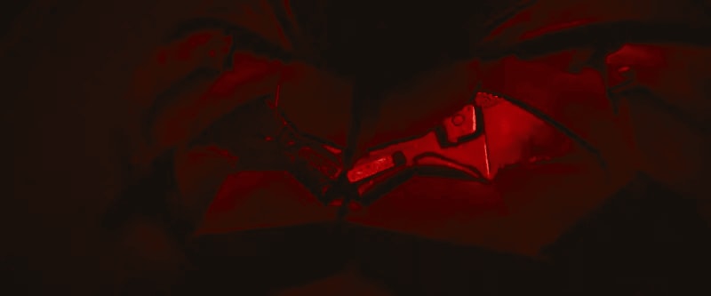
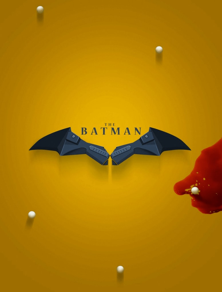
In 2021, another thriller about Batman is due to be released, and fans are looking forward to a new logo. Judging by the photos that were posted on social media, it will look like a broken gun.
How to Draw the Batman Logo
You can easily reproduce the famous logo. Use the link to watch the video with step-by-step instructions to learn all the tricks.


