Text-based logos are not necessarily boring. It has been proven by the creators of computer games that attract fans by both fascinating stories and creative branding. In this article, we are going to tell you about the techniques they use.
Minecraft
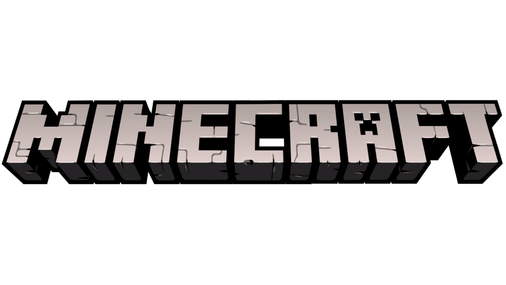
All of the logo versions were “built” from cobblestones which are the main element of Minecraft. The achromatic color palette has remained unchanged, too.
The typical typography appeared right on the first logo in 2009: the inscription with shadows was placed at an angle. Two years later, the shadows were removed, the 3D effect was enhanced, and monster Creeper first appeared on the letter “A”. In the latest version, the designers slightly leveled out the edges and added bold outlines.
Fortnite
The visual symbol reflects the plot of Fortnite which is the construction of reinforcements of various materials. The first name in 2011 was “built” of wooden elements such as boards, road signs, and stairs. The idea was backed by the slogan: “To create. To collaborate. To protect”.
Later, the outline became smooth, and behind it, there was a high hill with all the game elements: towers, satellite antennas, and trees. The modern version of the identity looks laconic: there’s only text left written in bold black font.
Roblox
Over the past 16 years, the brand’s symbol has changed several times beyond recognition. It all started with a cheerful colorful Google-style logo but soon it was changed by the strict white typography with a red outline. The sign above the first “O” showed where the emphasis should be put in the title.
In the following decade, the font was changed several times being made more and more uneven. And in 2017, the designers introduced an entirely new logo. Its mood is still defined by the typography: bold square sans serif letters. The first “O” is out of the ordinary: it is painted at an angle symbolizing the creative spirit of the company. The modern logo is made in black and white.
Overwatch
Consider an extraordinary marketing ploy: to create an ambiguous brand identity and provide no explanation for it. That’s what Overwatch did making fans wonder what the image means.
The orange-and-gray logo consists of the word “Overwatch” and a circle with two breaks. Inside it, there is a symmetrical drawing of two diagonal stripes which evoke several associations: the first one – with a stylized monogram “OW” (“Over” and “Watch” and the second one with a peace sign (the graphics resemble two hands folded for prayer, and the orange top – the rising sun).
Apex Legends
A perfect example of a simple text-based logo that doesn’t need changing. The rigor of the inscription (straight black font with neat serifs) is shaken up by the trendy effect of disappearing letters. The word “Apex” is covered with cracks, spots, and scuff marks that look stylish and laconic.
League of Legends
In 2019, for its 10th anniversary, the company introduced a new identity that disappointed fans. The old logo featured large golden letters with serifs against a dark gray background. The design and colors were associated with treasure hunting and dangerous adventures.
The modernized inscription looks quite monotonous. Its color has been made lighter, the outlines have been removed, and the serifs shortened. This logo can relate to any industry – from gambling to jewelry. However, the company is not going to change it yet.
Rocket League
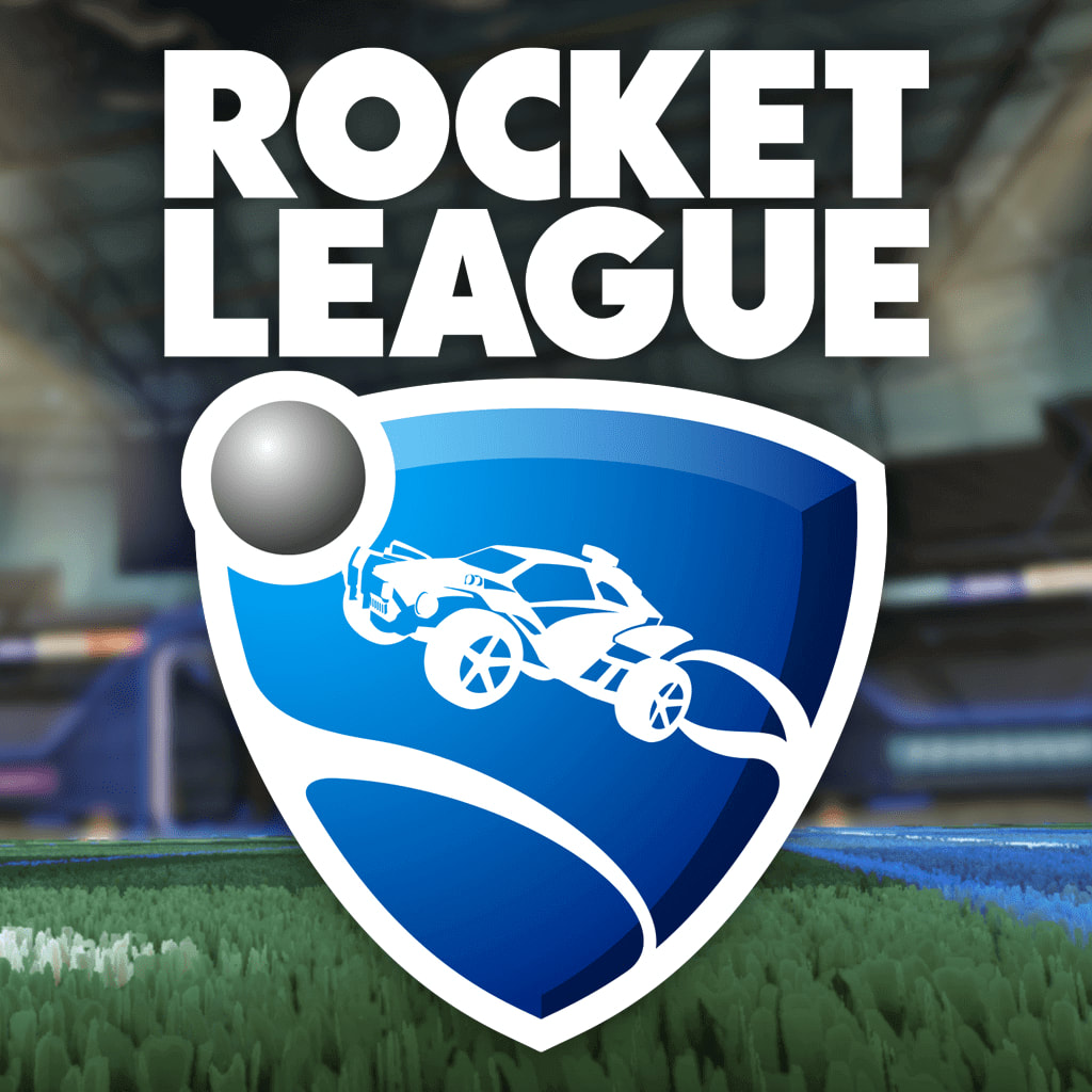
The visual symbol reflects the plot of Rocket League according to which participants must kick the ball into the goal by driving cars. The combined logo consists of a name and a blue shield with a race car and a ball on it. Dynamics is conveyed by the image of the car in motion and a curve line resembling a track.
World of Warcraft
Each new version of World of Warcraft is accompanied by a minor change in the identity the details of which are associated with the plot. For example, the ice cubes in Wrath of the Lich King hinted at the kingdom and the green color in Mists of Pandaria at the jade snake. This technique helps to evoke gamers’ emotions and get them more hooked on the brand.
The basic concept of their corporate identity has never changed. It contains two fonts symbolizing the confrontation of different worlds, the golden color, and a recognizable frame.
Call of Duty
Since 2003, the colors and typography have remained unchanged in the corporate identity. The achromatic color palette, especially the color of stainless steel, is associated with the military theme.
The words “Call” and “Duty” written in large print seem even bigger in contrast to the small preposition “of”. The letters look as if being damaged in battle. With each new version, they are slightly redesigned: some scratches or bullet holes are added.
Hearthstone
The tricky part of the text-based logo is its location. The yellow inscription is slightly hooped and casts shadows which creates a 3D effect. The letter “O” stands out in the name. It is drawn in the form of the main Hearthstone symbol, an eight-pointed star with a blue pattern. Such an approach creates an emotional connection to the brand.
Monster Hunter World
The first versions of the logo looked bright and conveyed explosive nature through sharp angles, numerous details, orange and yellow colors. With each new version, the image became more complex and chaotic until the designers decided to return to simplicity and minimalism.
The modern logo is designed in grey and white colors. The laconic inscription of thin letters with small serifs is placed against the background of the Hunter’s Guild coat of arms which are the characters of Monster Hunter World.
Tom Clancy’s Rainbow Six
The text-based logo features two contrasting fonts: the words “Tom Clancy’s” are written in small rounded letters, and “Rainbow Six” – in large and elongated.
The color palette creates an additional contrast. The word “Rainbow” is painted white against a black background and the word “Six” – vice versa. A small icon of a man with an assault rifle at the ready hints at the plot.
Counter-Strike
The black-and-white symbol has barely changed since 2012. Its core element is a dynamic figure of a man wearing a helmet and holding a gun that aims or shoots at an enemy. In the shortened version of the identity, this figure stays between the acronyms “CS” and “GO” (“Global Offensive”), and in the full version – between the words “Counter” and “Strike”.
The typography remains recognizable as well: each letter seems to be inscribed in a square with rounded corners.

Grand Theft Auto
The first logo in 1997 was represented by the full brand name written in three lines. The slanted yellow letters with shadows and the flames erupting from them conveyed speed and dynamics.
Two years later, the logo became black-and-white. The acronym “GTA” was placed in a frame with the inscription “Grand Theft Auto” written at the bottom. Finally, in 2001, the designers presented the logo familiar to gamers up to now: a large white rounded typography with a contrasting outline.
World of Tanks
The identity of the popular game conveys the power and strength that is associated with tanks. The image is designed in black and gray colors, and the large flat outline looks impressive and confident. The unusual monogram “WT” inscribed in a septangle adds to the solidity of the image.
