Over several decades, Pampers remains one of the biggest producers of baby and toddler products. Did you know that the company logo has only changed 4 times over the course of 60 years? Explore the secrets of the Pampers brand identity with us!
First emblem
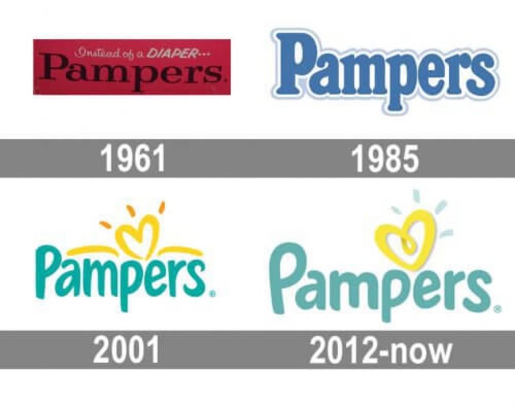
The first Pampers logo dates back to 1961. It was a classic example of a clean logotype. The brand name was written in a black serif font against a dark red background. Above it, there was a slogan that read “Instead of a diaper…”
It was a logical choice for a company which was a newcomer in the overcrowded market. The logo introduced a new product to the audience and found a subtle way to highlight its advantages.

Logo evolution
In 1985, Pampers switched to blue as its main corporate color. Also, they opted for a new elongated font with small serifs. The letters got subtle white shadows that looked like puffy clouds. That design solution added a softer, friendlier feel to the emblem.
In 2001, Pampers took courage to do yet another rebranding. The changes included a handwritten font and light blue palette. Also, the design got a neat yellow heart. Eleven years later, the color palette grew warmer and the font got a more rounded shape. The best thing about the modern Pampers logo is that all its elements work together to transcend the same values, such as warmth, love, friendship, care, and safety.
How would Pampers logo look like if it were made in ZenBusiness?


Final words
What separates the Pampers emblem from the rest is that it’s always remained text-based. Thanks to its unique visual identity, the manufacturer has achieved great success. The brand name “Pampers” has become a generic name for diapers. The company has managed to create an inviting and friendly image that audiences all over the world can relate to.


