Changing is essential to business growth. This fundamental truth was once again proved by UPS, one of the world’s leading logistics companies. Over the course of the 20th century, the brand has redesigned its visual identity more than once while maintaining an instantly recognizable image. Let’s see how UPS has navigated the intricacies of logo design!
- What UPS logo means
- Who created UPS logo
- How would UPS logo look like if it were made in ZenBusiness?
What UPS logo means
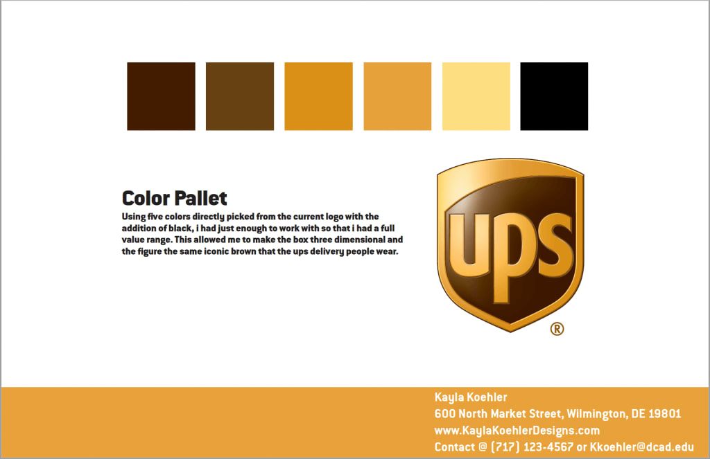
As its key symbol, UPS chose a shield. Standing for strength and reliability, an image like that has a profound effect on the audience. The color palette of gold and brown lends a further sense of stability to the emblem. The fact that these two shades are an unlikely choice among businesses helps UPS stand out.

Who created UPS logo
The first UPS logo was created in 1916 by James Casey, founder of the logistics brand. The emblem featured an eagle carrying a package against the backdrop of a bronze shield. The design was enhanced by a powerful motto saying “Swift, safe and sure”.
In 1937, it was decided to revamp the logo to display the growing ambitions of the business. At the time, UPS started to work with retailers throughout the country. To highlight that important milestone, the company embellished the emblem with a new slogan saying “The delivery system for stores of quality”. The words “since 1907” at the bottom of the design added gravitas to the brand. As for the eagle, it didn’t fit into the composition anymore.
Coined in 1961, the third UPS logo looked very different from its predecessors. UPS entered the international scene and wanted to make its brand identity universally recognizable. Minimalist and clean, the new logo displayed a stylized shield, with a package tied with a rope above it. Inside the shield, there was the company name written in a massive black font.

The next redesign happened in 2003. The logo got back its gold and brown palette. A balance between light and shadow added a delicate 3D feel to the piece. However, in 2014, UPS removed the voluminous effect, replacing it with a more relevant flat design.
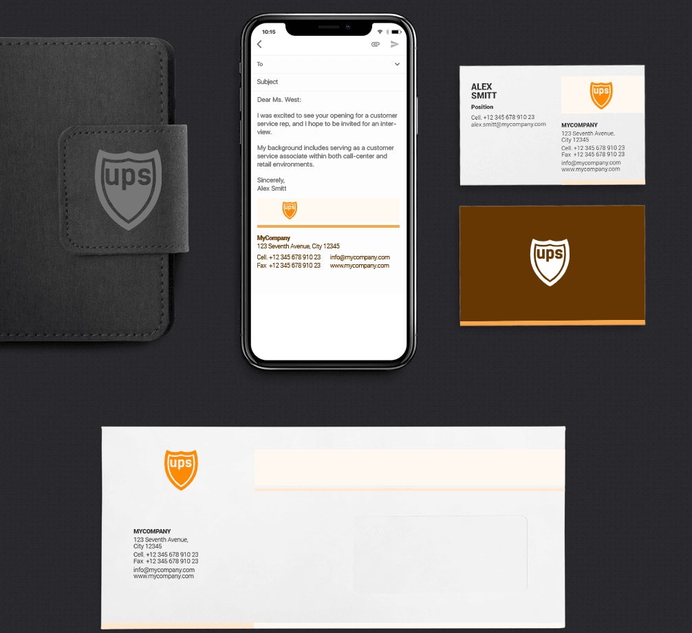
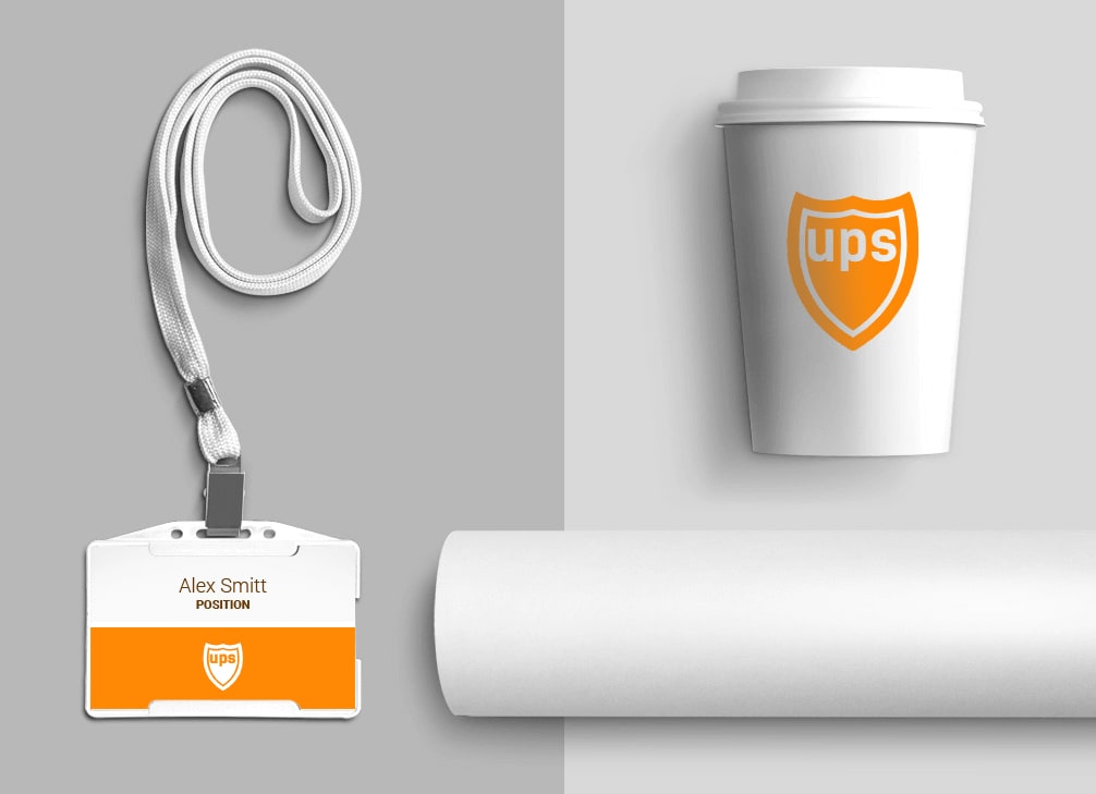
How would UPS logo look like if it were made in ZenBusiness?


Bottom line
Despite its visual simplicity, the UPS emblem has reigned the logo design scene for more than 100 years now. There are some important lessons that we can learn from the long journey of the UPS logo:
- Use a simple image that will create positive connotations and resonate with the audiences across the globe.
- Follow modern trends and update your logo from time to time to keep it relevant.
- Stay true to your brand identity. Pick one or two elements that will stay unchanged throughout the evolution of your logo.


