Out of a small family business, Adidas has grown into the second-biggest sports apparel manufacturer in the world. A forward-thinking branding strategy played a huge role in the company’s success. In this article, we’ll look at how the global giant succeeds in constantly redesigning its iconic logo while staying loyal to its brand identity.
- Who designed the Adidas logo
- Meaning behind the Adidas logo
- Why Adidas has four logos
- The secret of Adidas branding
- How would Adidas logo look like if it were made in ZenBusiness?
Who designed the Adidas logo
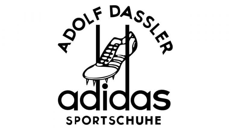
In the minds of millions of customers, Adidas is closely associated with three stripes. It’s hardly surprising because the company has stayed true to its visual symbol since 1949. On the very first Adidas logo, there was a spiked running shoe hanging between two long ends of letter “d”.

However, it turned out that the same icon was already used by Karhu Sports, a major shoe brand. To resolve the dispute, Adolf Dassler, the founder of Adidas, purchased the trademark for the sum equivalent to 1,600 euro as of today and two bottles of whiskey.
By the early 70s, the Adidas logo got three parallel stripes. As a result of the 1971 rebranding campaign, the company introduced a revisited emblem with a trefoil. In 1991, the public saw a new logo version – three tilted stripes resembling a mountain. The Adidas logo as we know it today was designed in the early 2000s and features a circle crossed by three curvy lines.
Meaning behind the Adidas logo
Initially, Adidas added stripes to its running shoes to make them more durable. By the way, the runner Jesse Owens won the 1933 Olympics wearing the Adidas shoes.
The stripes on the trefoil emblem symbolize the company’s focus on variety, while the three trefoil leaves stand for three parts of the world (North America, Europe, and Asia) where you can buy its products.
The mountain-shaped logo conveys the idea of overcoming challenges and pursuing your goals no matter what. As for the round emblem, it stands for the globe and fast adaptation to changes.

Here is a curious fact. Across all the Adidas logos, the brand name starts with a lowercase letter to emphasize that the brand produces casual sportswear which is accessible to everyone.
Why Adidas has four logos
The unique thing about Adidas is that it never gives up the older versions of its logos. The apparel manufacturer is using all four of them in different product lines and collections. Let’s take a quick look at how the logos in the extensive Adidas family coexist.
1. Тhree parallel stripes
It’s a classic symbol that appears across all product lines. It won’t be an exaggeration to say that the three-striped logo is the cornerstone of Adidas branding.

2. Trefoil
Along with the three-striped design, this version is used for the Originals product line (casual apparel and shoes).

3. Mountain
The mountain emblem is an ideal fit for the Performance line designed for professional athletes.

4. Circle
This version can be seen across the Style collections created in collaboration with famous designers.

The secret of Adidas branding
Despite constant changes, the Adidas branding stays true to its origins. Such consistency allows us to unmistakably recognize the Adidas logo in any its variation. The success of the Adidas brand identity boils down to four main principles:
- Simple design. All Adidas logos are minimalist and concise. Both the text and images are easy to read.
- Versatility. Although Adidas’s primary corporate color is black, the company varies its color choices across different product lines. Over the long course of its existence, the iconic emblem has turned white, red, and even bright green.
- Strong message. Adidas is smartly using its logo to communicate its values, such as quality, strength, and perseverance.
- Awareness. The Adidas brand is trusted by many accomplished athletes and celebrities, including Beyonce, Kylie Jenner, Cristiano Ronaldo, and Muhammad Ali. By wearing Adidas to public events, they’re further raising the brand’s profile among both existing and potential customers.
How would Adidas logo look like if it were made in ZenBusiness?


