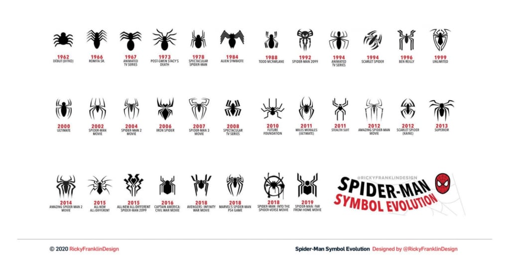
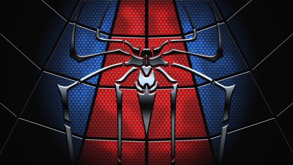
The Spider-Man brand has become one of Marvel’s best-selling comic book characters. It is recognized due to the bright symbol on his chest which has changed many times over several decades.
The Logo’s History and Meaning
Spider-Man (Peter Parker) appeared on the cover of the Amazing Fantasy magazine in 1962. He was the first teenage superhero. Legend has it that Peter was an orphan brought up by his uncle and aunt. The guy juggled the life of a regular student and a crime fighter.
Spider-Man’s superpowers were extraordinary speed and agility, sixth sense, the ability to climb on steep surfaces, sting, and sling the web. Visually this image was represented by a black spider symbolizing protection, strength, flexibility, and mystery.
The first image of the superhero was created by artists Stan Lee and Steve Ditko. They put the emblem on Peter’s chest. A contrasting red-and-black image of the character was accompanied by a stylized grid which became another branding element along with a spider. This color palette is the one the designers stick to up to this day. The exception was some brief experiments with black-and-white and black-and-blue combinations.
The logo has always remained symbolic containing no text at all. In different screen adaptations, the hero’s name was displayed in various fonts, no single solution has been found for it so far.

The Logo’s Evolution
In the early days of its existence, the logo was drawn in different ways. Sometimes the insect’s legs were straight, sometimes they were bent. Mostly they poke out from the middle of the body, although real spiders’ legs grow between the head and abdomen.
In 1966, when artist John Romita joined the process, the emblem became more homogeneous. The body was narrowed, the legs curved equally and placed parallel to each other, and black was replaced by blue. In the early 70s, the symbol was changed again: the body grew more narrow, and the limbs were pictured as a fan.
In the early 80s, Randy Schuller, a fan of Spider-Man movies offered a new version of the logo. The Marvel Company that issued comic books bought the idea and the designers brought it to life. The superhero was wearing a black suit with a white spider on his chest. It grew to a giant size taking up most of the outfit and its legs wound round of Peter.
This image has become one of the most unusual and memorable in the brand’s history. However, it didn’t last very long. Four years later, they returned the character’s black-and-red palette and modified the shape of his mascot again. And in 1994, the designers first introduced a cherry red spider with unnaturally long legs. Then the insect became even bigger, and the legs’ amplitude wider.
In the early 2000s, experiments with the logo continued: from one movie to another, the designers varied the insect’s body shape and the legs’ length. Many of them drew inspiration from the early years of the character when the image of the spider was the most naturalistic.

Over the past 20 years, the insect sometimes got jaws like a carnivorous animal, its image was first hyperbolized then schematic. Ultimately, the designers returned the hero’s mascot to its natural form.


