NBC is known for its colorful peacock emblem. However, the beautiful bird has not always graced the logo of the telecom giant. Over the years, the brand has overhauled its brand identity more than once. Read on to find out more!
- About the NBC first logo
- Logo evolution
- How would NBC logo look like if it were made in ZenBusiness?
About the NBC first logo
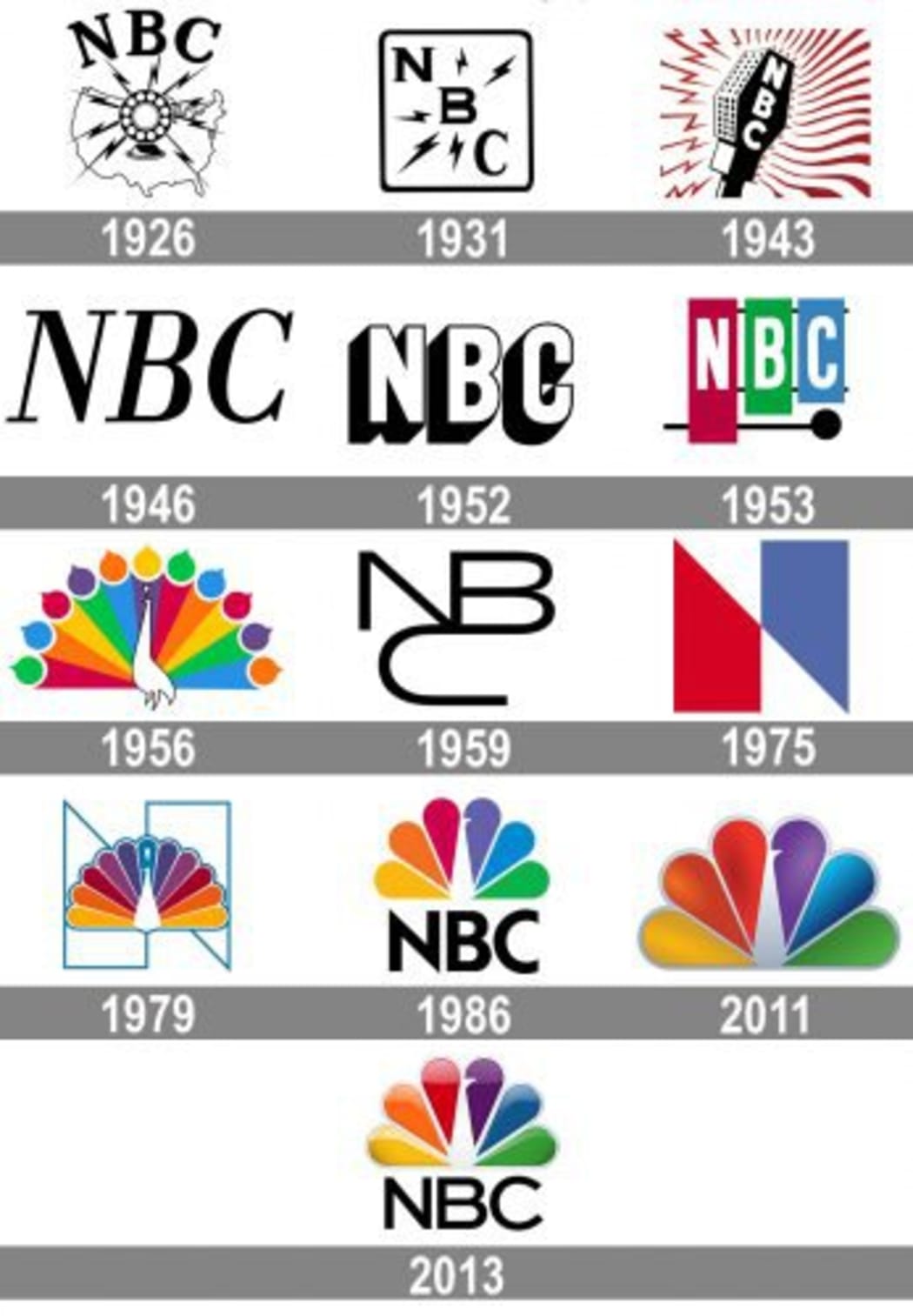
NBC started out in 1926 as the first radio network in the USA. In 1936, it expanded to television. Four years later, the company presented its first black and white emblem. It featured a microphone surrounded by waves and lightnings. In 1954, the microphone gave way to a colorful xylophones with the abbreviation NBC on it. That logo shaped the company’s future choice in terms of corporate colors.
Two years later, the NBC design director John G. Graham drew a new mascot for the company. It was a peacock with a striking colorful tail. Rather than just another emblem, it has become a true symbol of the new era. At that time, RCA, which owned NBC, started to sell color TVs. With its new logo, the company was hoping to attract more buyers.
The first peacock has 11 feathers in six colors, including bordeaux, orange, yellow, blue, and violet. The bird’s feathers were drawn very elaborately. Interestingly enough, the mascot has got no name to this day.
Logo evolution
Although the peacock logo had a tremendous success, there was a period when NBC was experimenting with other creative ideas. Between 1959 and 1975, the telecom titan was using an intricate monogram consisting of letters N, B, and C. The monogram even got dubbed “the snake”. Then it was substituted for a big letter N in a spectacular red and blue palette.
Finally, in 1980, the TV network came back to its time-tested peacock image. In 1986, NBC decided to make its design more simple, plucking some of the bird’s feathers. Each of the remaining six feathers stood for one of the six NBC offices. By turning the bird’s head to the right, the brand manifested its big plans for the future. In 2011, the colors got a glossy shine. Two years later, NBC decided to enhance its emblem with the brand name.
The original mascot allows NBC to play around with the concept. For example, before the Thanksgiving in 2018, the peacock was transformed into a turkey. On top of that, in 2020, NBC is going to launch a new streaming service named “Peacock”.

How would NBC logo look like if it were made in ZenBusiness?


Final thoughts
The NBC peacock is one of the most identifiable logos in the media industry. Despite multiple alterations, the emblem has always reflected the continuous growth and innovative solutions that NBC is respected for.


