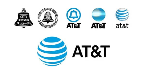
Over more than 100 years of existence, AT&T — the world’s biggest telecom company — has gone through multiple changes in its organizational structure and brand identity. Read on to find out how this powerful company has changed 11 logos so far!
AT&T: First logo
In 1885, Alexander Bell, known for his invention of the telephone, registered American Telephone and Telegraph Company (AT&T) as an affiliate of American Bell Telephone Co. In 1899, AT&T acquired Bell and soon became a monopolist in its niche. AT&T’s monopolistic ambitions sparked up a conflict between the company and US government. Almost 100 years later, that opposition would urge the telecom giant to drastically overhaul its corporate style. But first things first.
As a tribute to its founder’s name, AT&T chose a bell as its first visual symbol. Designed in 1889, the company’s first logo displayed a bell in a triple square frame. One year later, in 1900, the logo was reshaped into an emblem. Later the design went through several simplifications until in 1969, Soul Bass came up with a new minimalist design — a blue bell inside a white circle.
After shedding small distracting elements, the logo started to look more solid and edgy. The blue color stood for the promising future lying ahead of AT&T.

Logo evolution
In the meantime, the government was trying to undermine the company’s monopolistic position. In 1984, AT&T was split into several parts and banned from using the bell symbol. Soul Bass took up the challenge of designing a new logo.
After sifting through dozens of ideas, the designer chose the image of a globe. Lines of different thickness lended a realistic 3D effect to the globe. The lines stood for a global communications network that was uniting countries worldwide. That was the company’s way to announce their global ambitions. To maintain a bond with the previous design, it was decided to stick with the old color palette. Beneath the globe, there was the company name written in the uppercase Omnes font.
In 2000, the logo experienced a slight change. In 2005, following the AT&T and SBC Communications merger, the art piece got a voluminous effect to symbolize the company’s expanding range of services. The uppercase letters were replaced with lowercase ones.

In 2016, as the digital titan was exploring new markets, it did another redesign. To build a flexible and modern image, AT&T introduced a trendy flat logo. The graphic piece looked great against both light and dark backgrounds and fitted all types of media, from printed surfaces to mobile screens. As for the company name, it got back its uppercase typography.
How would AT&T logo look like if it were made in ZenBusiness?


Wrapping up
Despite a long-lasting conflict with the authorities and drastic changes in corporate style, AT&T has managed to build a strong, coherent brand. The story of AT&T has taught us some valuable lessons:
- Use universally understandable symbols.
- When redesigning your emblem, make sure you keep some of its old elements (colors, imagery, etc.).
- Be flexible. Adjust your brand identity to current trends and customer needs.


