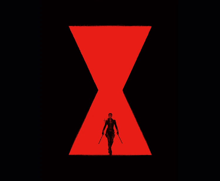
How is the Black Widow’s image connected to a red hourglass? The superhero team member’s logo has a hidden meaning and many associations. From this article, you will learn what the logo means and how to use its elements for business branding.
The History of the Logo
For a long time, the past of Natasha Romanoff (Black Widow) from The Avengers’ team remained a puzzle. Her story was marked with a dotted line: fans knew she was an enemy special agent who had defected to the superheroes’ side. But now that the movie about Black Widow was directed, the creators of Marvel Comics revealed the details of the character, explaining the choice of her alias and mascot.
Black widow is the name of a venomous species of spider. They are known by a red mark on the back and poison which is thought to be 15 times more potent than that of a rattlesnake. Black widows are called seductive killers: the females of these spiders kill their males after copulation.
This is exactly how Natasha is shown on the screen. While other superheroes act aggressively, she chooses quiet revenge: she penetrates the enemy’s lair and strikes an unexpected blow before he gathers wits. At the same time, the heroine looks delicate and seductive.

Her armory includes a weapon called “The Widow’s Bite”. Just like a spider, the bracelet releases a “sting” that strikes the enemy with a powerful electric shock. As the comic book creators explain, “Natasha is like the deadliest spider which is easy to miss until it’s too late.”
What’s interesting is that a red hourglass on the back is a sign of female black widows in the US. On other continents, the marking on the insect’s back is usually less distinctive. That is why the choice of the logo may not be that clear for fans from different countries.
The 2020 Black Widow Logo Review
Colors and Fonts
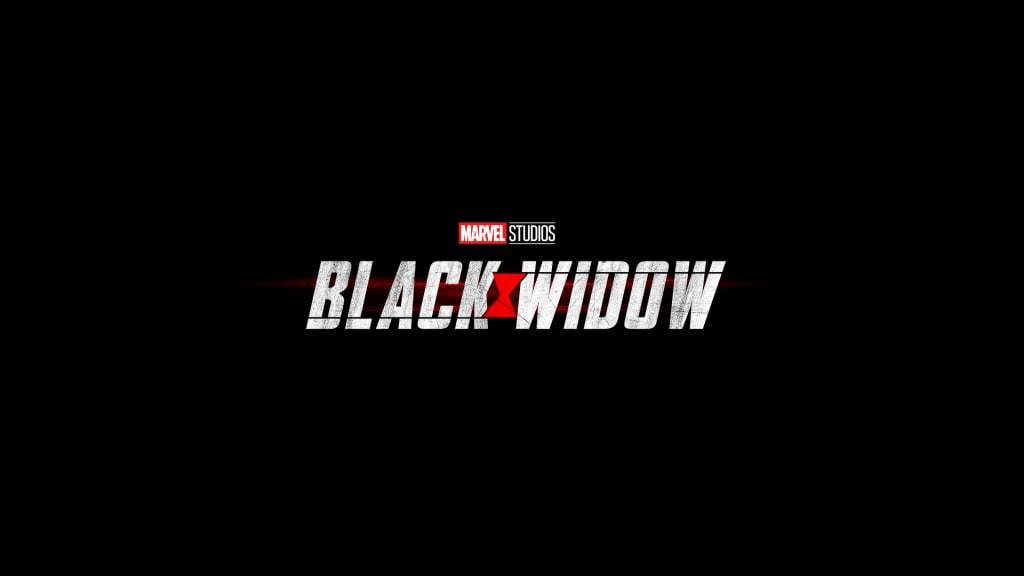
The red hourglass logo became not only the heroine’s accessory but also a part of the movie title. For branding, they used red, white, and black colors. This combination looks contrasting and dramatic: it expresses passion, dynamics, aggression, danger, and mystery.
The movie title is written in a large white sans serif font. The letters are slightly slanted and stretched. The words “Black” and “Widow” are separated by a red hourglass.

Five Useful Branding Techniques
- Tell a story. There must be a strong message behind any brand symbol. Think about the idea you want to convey to your target audience: it can be a path to success, your mission and values, or a competitive advantage.
- Think up kind of “puzzle”. Mystery always stirs up interest. Create a logo people will be tempted to discuss. This is an excellent tactic before launching a new product or advertising campaign.
- Use images of animals. Since these images are well-known to people for more than a hundred years, they are perceived on a deep subconscious level. This will help to better attract customers to the brand. However, you should be careful with working out negative emotions that they can cause. Besides, ensure that the chosen image is familiar to your target audience.
- Work with colors. The choice of colors demonstrates the character of the brand. Red will represent you as a vigorous and aggressive company, but change the color to blue and you’ll be perceived as a calm and reliable one.
- Build and associative flow. Brand visualization solutions are not always that clear and evident. To find the right image, write several dozens of associations with your company. The most unusual of those will stand at the end of the list. Come up with a visual metaphor for these images to use it in your logo development.


