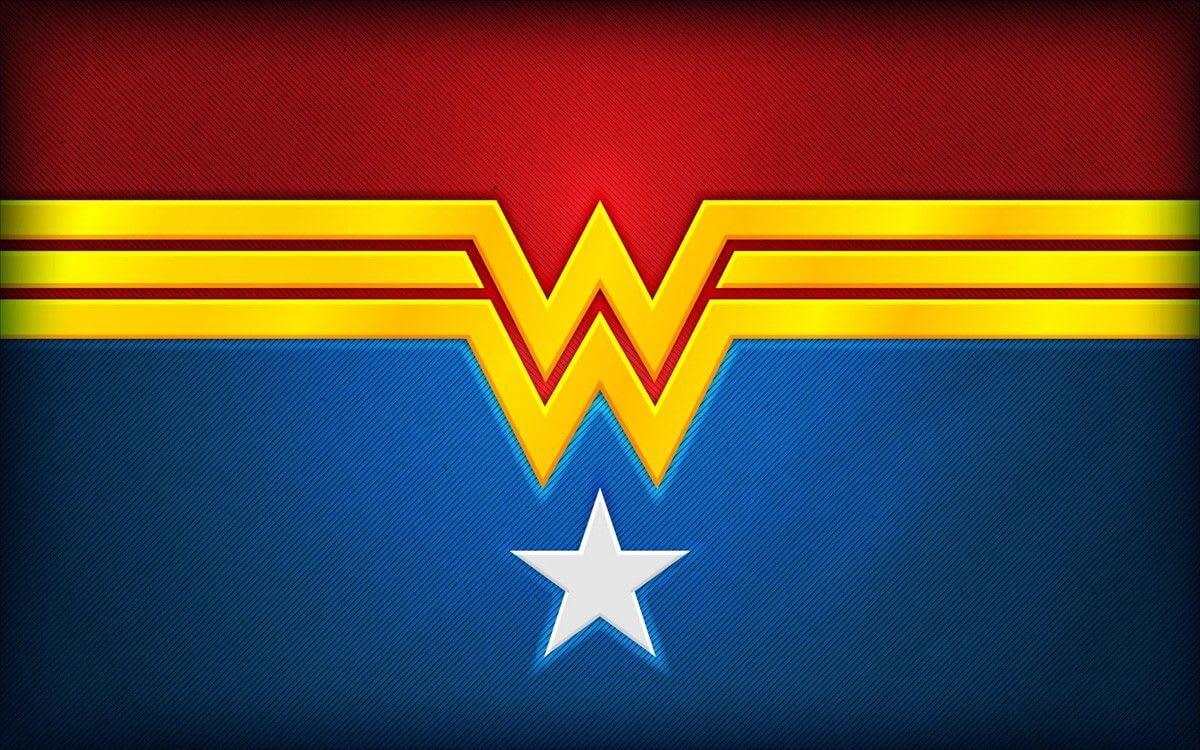
When we see the stylized letter “W” design, we think of Wonder Woman. This logo is one of the most famous signs of superheroes, along with Batman’s bat and Superman’s “S.” But have you ever wondered about the history behind the logo?
How They Created the Wonder Woman Logo
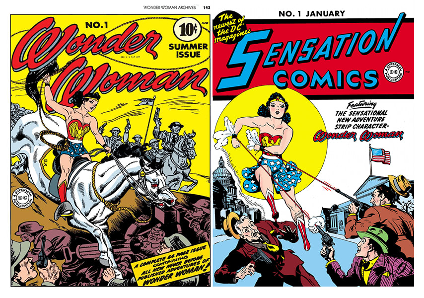
Wonder Woman first appeared on the cover of Sensation Comics in 1941. The image, created by psychologist William Marston, embodied the strength and power of a new type of heroine: a strong woman who must rule the world. She was kind, intelligent, and never stopped fighting for justice.
The visual metaphor of this character was the image of Diana, an Amazon with an eagle as her main symbol. Since then, Wonder Woman has remained one of the most iconic figures in pop culture.

The Logo’s Evolution
From ancient Greek myths to modern times, Wonder Woman’s image has changed dramatically over the decades (sometimes even contradictory ideas helped inspire its changes). But over the years, the W’s visual interpretation stayed recognizable thanks to consistent basic elements and its distinguished color palette.

A Golden Eagle
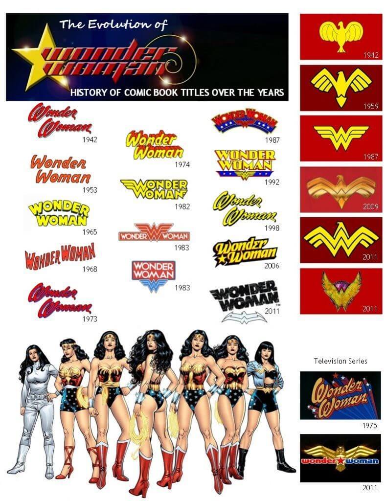
On the magazine cover in 1941, Wonder Woman appeared in a suit of the USA flag colors with a golden eagle on her chest. The inscription “Wonder Woman” was executed in a handwritten style: large red letters with shadows contrasted with a bright yellow background. This image, designed by cartoonist Harry Peter, accompanied the heroine throughout the Golden Age of comic books.
With the coming of the Silver Age in the 1950s, Diana changed. Her history was supplemented with myths: the heroine became as beautiful as Aphrodite, as wise as Athena, as strong as Hercules, and as fast as Hermes.
This image change was accompanied by a new art deco logo. Although the main attributes of Wonder Woman, including colors and the icon, remained, her image became sharper, bolder, and more dynamic. The font on the cover changed from handwritten to italic.
Failed New Image
In the late 1960s, the logo was modernized: Diana’s red-and-blue suit became a fashionable dress. By doing so, the comic book creators hoped to expand their target audience and attract a new generation. The new Wonder Woman represented the modern woman and the real challenges she faced.
However, this change proved unsuccessful: The fans could not accept the new image, and in 1973, Wonder Woman returned to her classic uniform.
That said, the sixties weren’t all bad for Wonder Woman; she first appeared alongside Superman and other heroes as a founding member of the Justice League in “The Brave and the Bold #28.” The Justice League has had plenty of successful iterations since (as has Wonder Woman herself), making it a classic component of the Marvel universe.
The Letter “W”
For her 40th birthday, Wonder Woman received a new, iconic emblem. It was created by graphic designer Milton Glaser, the author of the “I Heart New York” logo. The solution was simple and elegant: the open wings of the eagle combined with the acronym “WW.” This made it possible to keep the symbol recognizable despite the drastic changes. The logo’s color was yellow, and the font was created from scratch.
This logo still accompanies Wonder Woman, although it has been slightly modernized over several decades. For example, in the 2000s, the eagle attributes returned to the design. In 2006, they added a beak and made the wings more distinct. In 2011, the wings became more curved and took on a sandy color.
The Movie Logo
In 2016, the logo got a new look in preparation for the release of the new Wonder Woman film starring Gal Gadot. Designer Lindy Hemming tried to make the heroine look both athletic and feminine. Although the idea of the logo remained the same, it was made to look less aggressive. In the movie, the letter “W” that Diana wears on her belt looks as if it is made of wood.
Disclaimer: The content on this page is for information purposes only and does not constitute legal, tax, or accounting advice. For specific questions about any of these topics, seek the counsel of a licensed professional.


