A major American retailer, JCPenney has had a record number of logos over the years. However, constant shifts and changes have played a nasty trick on the company reputation. Read on to find out why “new” doesn’t always mean “better”.
JCPenney backstory
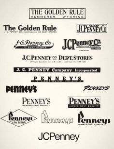
In 1902, James Cash Penney opened its first outlet, The Golden Rule. The name of the shop was a hint at the famous wisdom that says, “Treat others how you want to be treated”. The first logo featured the brand name inside a black frame. On top of that, the emblem specified the location of the outlet as “Kemmerer, Wyoming”. In 1909, the logo got a thick lowercase font, and the name of the owner — J. C. Penney — was added to it.
In 1948, the brand name on the logo was changed to “Penney’s”. It was written in a black typeface with neat serifs. The company name was complemented by an ambitious slogan that read “Always First Quality!”
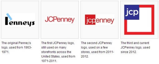
Fifteen years later, the retailer overhauled its design completely. Now the emblem featured the name “Penneys” in an original black font, with a blue highlight on the capital letter. In 1971, the brand name was changed to “JCPenney” and put inside a white square. A cleaner font made the design look sharp. In 2000, the retail giant presented another version of its logo, with a red square and white font.
Logo evolution
In the 2000s, JCPenney went through a whirlpool of brand identity changes. Between 2008 and 2011, the company opted for a red palette and then briefly switched to the combination of red and white.
At the time, the company’s sales started to plummet. The retailer went through a painful restructuring and change of management. To fight the crisis and attract affluent customers, it was decided to review the existing marketing strategy and corporate style.
A new emblem featured a white square with red edges. In one of its corners, the square had a smaller square with letters “jcp” inside it. During the next couple of years, the store chain was chaotically switching between several emblems. The audience was confused, to say the least. As a result, the logo recognition dropped by 28%.

In 2013, the retailer got back to one of its older designs, the one with the red “JCPenney”. In 2019, designers improved the piece by adding a rounder font and increasing the gaps between the letters.
Unfortunately, multiple — and often uncalled-for — changes undermined the retailer’s reputation. Today, JCPenney is going through hard times as its outlets are closing and its customer base is diminishing.

How would JCPenney logo look like if it were made in ZenBusiness?


Bottom line
When do you know that enough is enough? It’s a tricky question to answer. The story with JCPenney shows that constant rebranding can wreak havoc on your business. The retail giant ended up severing trust with its customers and losing its unique identity.


