If a company that has a widely recognizable visual symbol, it can afford the luxury of not mentioning its brand name when promoting its products. The audience can easily identify a brand by simply looking at its emblem! In this post, we want to share with you the incredible story of the Doritos brand.
- Company background
- Logo evolution
- Peculiar advertising campaign
- How would Doritos logo look like if it were made in ZenBusiness?
Company background
In 1964, a restaurant in the California-based Disneyland decided to fry the leftovers of tortilla with spices. This is how the iconic Doritos (the word means “golden” in Spanish) crisps came to existence.
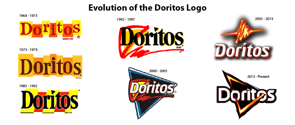
The company’s first logo heavily relied on graphics. On it, each letter in the word “Doritos” was placed inside a yellow or red rectangle. Yellow stood for corn,while red symbolized red pepper that was used to spice up the crisps.
Logo evolution
In 1973, the brand presented to the public its revisited emblem. Placed against a subtle yellow and golden background, the logo had the brand name written in a bulky brown font.
In 1985, a new logo started a new chapter in the company history. The design got back its saturated colors. A dot above letter “I” was replaced by a triangle-shape crisp that would later become the main symbol of Doritos:
- 1992: The logo features a bold red and yellow triangle around letter “D”.
- 1996: The background is painted black to make the visually engaging triangle stand out even more.
- 2000: The word “Doritos” is put inside a big black and blue triangle.
- 2005: The logo gets back its white background. Shadows are added to the white typeface. The red and yellow triangle above the brand name looks like a high voltage sign, hinting at the spicy taste of Doritos.

In 2013, Doritos launched another rebranding to bring forward its global identity. The brand put together a strong marketing team that traveled the world studying the brand’s target audiences across different countries. Based on multiple surveys and interviews, it was decided to make a new brand image dynamic, bold, and inspiring. The idea was visualized as a black triangle with “fiery” sides that pierce the two Os in the word “Doritos”.
The emblem has survived without changes till today. Read on to find out how the snack producer is using its brand identity to enhance its image.
Peculiar advertising campaign
How do you promote a product among Generation Z customers that despise traditional advertising? In its massive 2019 ad campaign “Another Level”, Doritos refused to use its product name. Instead, the giant fully relied on its logo for brand recognition.
“These crisps are so famous they don’t need naming”, says a voice-over at the beginning of the promotion video. Then we’re shown a series of triangle-shape objects, such as road sign, musical instrument, Masonic eye, Egyptian pyramids, billiards rack, and – finally – the Dorito crisps themselves. Also, you can see the stains that the delicious crisps have left on fingers and T-shirt.
To boost customer interest, Doritos removed all content mentioning its logo and brand name from its website. On top of that, the company released a few promotional products, e.g. a Snapchat mask filter that transforms your face into a triangle.
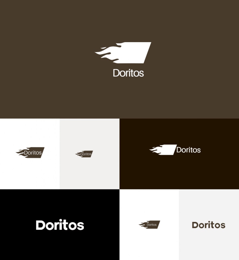
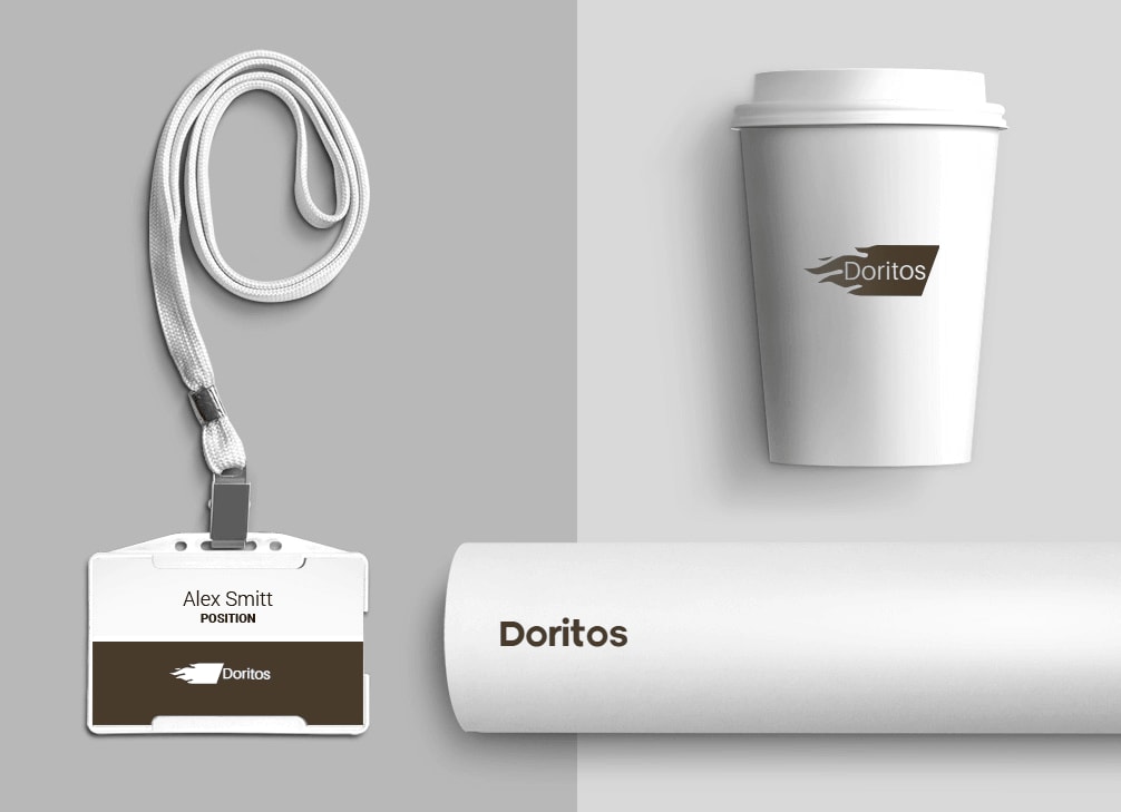
How would Doritos logo look like if it were made in ZenBusiness?


Bottom line
As you can see, the Doritos brand has set the bar really high in terms of brand identity and promotion. Let’s sum up some of the most important lessons that an aspiring business can learn from this story:
- pick a meaningful visual symbol with a strong creative potential;
- adjust your brand identity without overhauling your fundamental concept;
- study your target audience


