The name “Nintendo” speaks for itself. The renowned video game producer is enjoying a global fame. But we can bet you didn’t know that the brand started out in the 19th century as a playing cards manufacturer. In this post, we’ll talk about how the Japanese giant has managed its brand identity over the years.
Company backstory
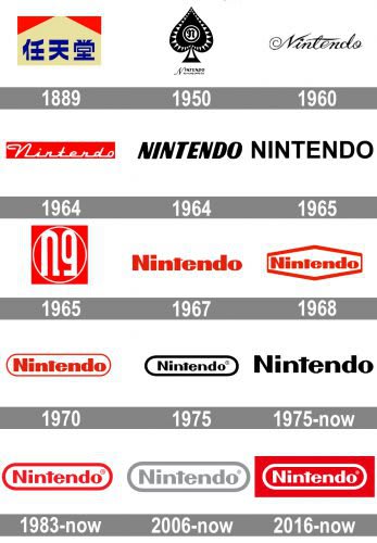
Founded in 1889, Nintendo started its journey producing playing cards. Its first logo featured three hieroglyphs that read “nin”, “ten”, and “do”. There is still debate on how to correctly translate this phrase from Japanese. For now, the commonly accepted translation is “Leave luck/fate to heaven”.
In the 1950s, Nintendo was making its first steps in the European and American markets. That strategic change made the company to move from hieroglyphics to the Latin alphabet. Also, the “westernized” logo featured the spades symbol with letter N inside it.
In the 1960s, the brand started to experiment with its logotype. They tried to write the word “Nintendo” in italics and thick font, with and without serifs, in red and black, etc. The game developer was looking for a versatile, universally understood design solution that would fit both Japanese and international markets.
Logo evolution
In 1967, Nintendo released a new toy, Ultra Machine. On it, customers could see a new emblem that resembled the modern company logo. On it, the brand name was written in a bulky red font, with a square dot above “i”. The design was considered a success and expanded to all Nintendo products.
Although the company seemed to have found the right typography for its emblem, they didn’t stop experimenting. In 1968, the brand name was put inside a hexagon. Two years later, in 1970, the hexagon was replaced with an elongated oval. After that, Nintendo continued playing with shapes and colors.
Finally, the company got back to the oval that got dubbed “racetrack”. Together with the font, the “racetrack” became the signature element of Nintendo’s visual style. By the way, the frame and the letters have the same thickness, which makes the design look more harmonious.
In 1983, the brand name was written in red against a white background. In 2006, the emblem was painted grey. In 2016, the logo regained its time-tested red and white palette.

How would Nintendo logo look like if it were made in ZenBusiness?


Bottom line
The Nintendo logo is an excellent example of a clean, minimalist design which is resistant to fashion whims. Despite having numerous rebrandings behind its back, the iconic “racetrack” remains easily identifiable by both Nintendo fans and regular customers.


