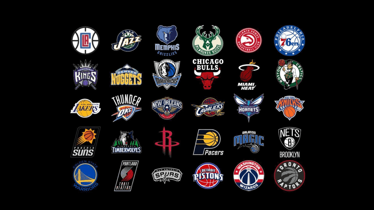
Wolves, bears, deer, and dinosaurs are often the main symbols in sports branding. Behind every logo, there is an exciting story we are going to tell you today.
Los Angeles Lakers
In the late 40s, the team was named the Minneapolis Lakers because of the thousands of lakes that this area is famous for. Its symbol was a picture of the state against a yellow ball and the signature “MLPS Lakers”.
In 1960, after moving to Los Angeles and rebranding, a golden basketball with a purple signature “Los Angeles Lakers” became the corporate image. In this form, the logo still exists up to now with minor changes.
Milwaukee Bucks
More than 14,000 fans took part in the contest for the best name in 1968. The winning version was “buck” which is associated with speed and agility. The fan who offered this word won the car, and the animal became the team’s mascot for years to come.
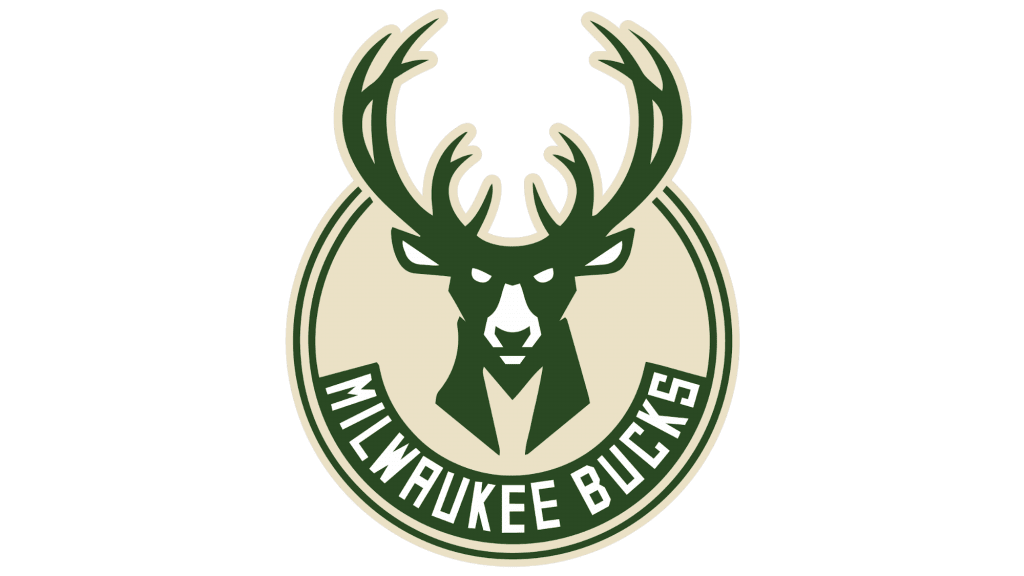
Since then, the Milwaukee Bucks has changed four logos. The first one is the most remarkable – with a funny deer in a sweater with the letter “B”. After 25 years, the animal became more aggressive and got a threatening green muzzle with large horns. Despite slight modifications, this image has remained till now. It has two secrets: the animal’s dicky resembles an “M”, and the negative space between the horns resembles hands holding a ball.
Chicago Bulls
The Chicago Bull is one of the most recognizable and expensive logos in the NBA, which has remained unchanged since 1966. That’s exactly when the brand was founded: its name is associated with the history of Chicago, where the world-famous slaughterhouse was located.
The short vibrant name was as tough as the kick of a bull and the character of the Chicago Bulls players. An aggressive and energetic spirit was supported by the red-and-black palette.
Miami Heat
The image of a burning basketball that flies into a basket appeared on the first logo in the 80s. The idea was complemented by the orange and black colors and a tail in the form of a flame on the letter “T”. After 11 years, the picture received more intense shades to which the red color was added. In this form, it still exists today.
Toronto Raptors
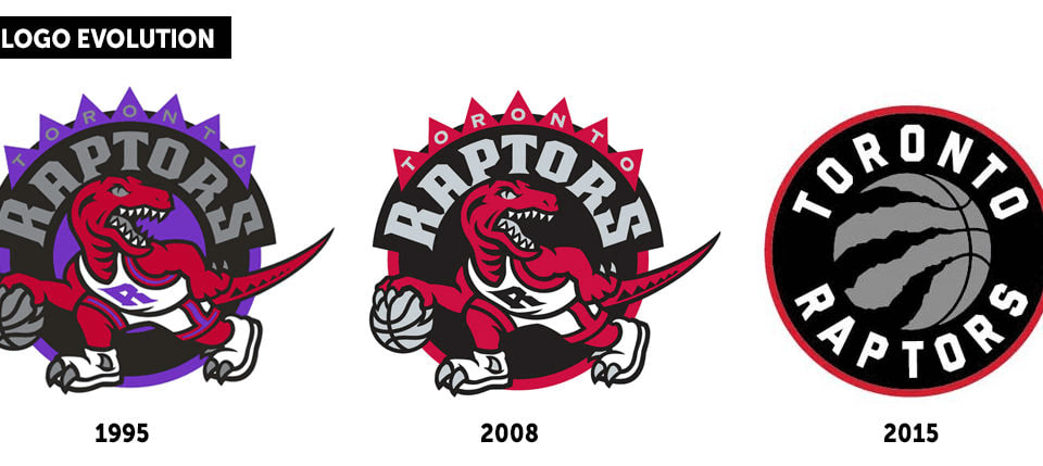
In 1993, the blockbuster Jurassic Park aroused unprecedented interest in dinosaurs. It’s no surprise that at that time the Toronto Raptors club was founded in Canada.
A predator wearing a T-shirt with the letter “R” and with a ball appeared on the logo. The circle that surrounded the image was decorated with flanges. The picture was modified several times, and five years ago it was radically renewed. Now it looks more aggressive and stylish: in the red circle against a black background, there is a silver ball with large marks of claws.
Houston Rockets
The word “rockets” refers to the club’s place of origin: first, it was based in San Diego, where the “Atlas” rockets were developed, and then it moved to Houston, where the NASA’s Space Science Center is located.
Since the 60s, their corporate style has changed six times beyond recognition: at different times they used unusual balls, rockets, and even a cartoon character flying up with a rocket behind his back.
In this millennium, the logo was changed to a text-based one: the red color and the letter “R” dominated, the latter resembling a rocket at launch. Then the “R” was placed on a gray-and-black ball encircled by the inscription “Houston Rockets”.
Boston Celtics
The team’s name refers to the history of Boston where many people have Irish roots. In the 40s, this concept was embodied via a white shamrock against a green background known as the symbol of Ireland.
Soon the “Celts” acquired a mascot – an Irish leprechaun with a pipe and a cane. This image in various modifications accompanies the team’s identity to this day. The “Irish” emerald color remains unchanged as well.
Utah Jazz
The name of the club comes from its history that began in the 70s in New Orleans which is one of the jazz capitals. The word “jazz” caught on so well that they decided to keep it even after moving to Salt Lake City.
The homeland of the “Jazzmen” also defined the musical concept of their brand identity. On the first text-based logo the letter “J” resembled both a note and a ball. Then the designers bound the image to the mountains that Utah is known for. But in 2015, it was decided to return the “jazz” mascot with some slight improvements and paint it in the rich yellow, green, and blue colors.
Orlando Magic
In 1986, a contest was held in Orlando to decide on a new club’s name. The winner was its owner’s seven-year-old daughter who called the city “magic”.
Interestingly, in the history of the “Magicians” the identity was renovated just three times, and only slightly. The main idea remains the same: the inscription “Orlando Magic”, a ball, stars, and the white-and-blue color palette.
Phoenix Suns
Another brand with a fixed symbol in the identity – the sun. The state of Arizona, where the club was founded, is one of the sunniest in the United States; this is shown even on its flag.
Interestingly, the company’s leaders didn’t like the first logo painted by the artist for 5 thousand dollars. The new logo created at the printing house cost only $200. The sun-shaped ball with the inscription “Phoenix Suns” was drawn in purple and orange. This palette has been kept for 45 years, although the picture has been corrected several times. In 2013, a new version with a black background and a futuristic font was presented.
Brooklyn Nets
The club experienced constant moves and rebranding. Its homeland in the 60s was New Jersey, and the name was the New Jersey Americans. After moving to Long Island, the “Americans” changed their name to the New York Nets. The word “Nets” rhymed with the “Mets” and the “Jets”, the other two New York teams, and was also associated with basketball. The team then returned to New Jersey under the name of the New Jersey Nets.
It’s no surprise that the corporate identity was constantly changing. Only the colors of the American flag remained unchanged. When the “Nets” moved to Brooklyn, one of their owners, rapper Jay-Z, was inspired by the old signs of the New York subway. He helped create a logo in the shape of a black shield with the word “Nets” painted white and a basketball.
Atlanta Hawks
This club is a record-breaker in renaming and changing its brand identity. Since 1946, he changed four states and 11 symbols, almost always keeping only its mascot which is a hawk.
The bird was pictured in different ways: sometimes it held a ball in its claws, sometimes it was preparing to throw it into the basket, and sometimes it was just a schematic image. Now the red profile of the predatory bird is surrounded by a circle with the inscription “Atlanta Hawks”.
Portland Trail Blazers
The name of the brand, founded in Portland in 1970, refers to railroad builders in Oregon. For the brand identity, the only symbols always used were five red and five black (later silver and white) curved stripes, signifying the competitors on the court. For 50 years, their corporate identity has remained minimalistic and recognizable.
Denver Nuggets
The team changed several names (including the Rockets and the Larks) before being called the Nuggets. It hinted at the “gold rush” in Colorado in the 19th century.
The logo first featured a cheerful miner with a hammer in one hand and a ball in the other. Then the concept was drastically changed several times: the picture showed now the silhouettes of Denver houses, and now the mountains. In 2019, the symbol acquired a round shape. Two golden picks were intercrossed against a dark blue background.
Sacramento Kings
One of the oldest teams in the NBA has changed cities and names several times. Since 1945, it had been called the Rochester Royals. These words stood out on a purple shield-shaped logo. After moving to Cincinnati, the team turned into the Cincinnati Kings and received the mascot in the form of a smiling basketball. Then the logo was reshaped back into the form of a shield.
After moving to Kansas and Sacramento, the “Kings” changed their names, but not the identity. It wasn’t until 1994 that they decided to completely update it by making it more aggressive. The crown with crossed spears was framed by the inscription “Sacramento Kings”. Finally, a few years ago, the team received a modern concise shield-shaped symbol.
Dallas Mavericks
Founded in 1980 in Dallas, the club owes its name to Samuel Maverick, a Texas landowner who refused to brand his cattle. This name has become a symbol of independence and dissidence.
It is no surprise that the first logo featured a cowboy hat. And since 2002, the Dallas Mavericks’ mascot has been a profile of a stallion on a silver shield.
San Antonio Spurs
From the 40s to 70s the team was called the Dallas Chaparrals, and then the Texas Chaparrals (“chaparral” is a kind of Texas shrubbery). But in 1973, to attract more fans, the name was changed to the San Antonio Spurs as a tribute to the history of the Wild West (because of the spur associated with cowboys).
The first three logos featured the Californian earth-cuckoo (often inhabiting the chaparral thickets) with a ball. And since the 70s, the spur which the letter “U” turned into has been dominant in the identity. This idea is also reflected in the black-and-gray color palette which is associated with metal.
Charlotte Hornets
The team with a checkered past has survived rebranding twice. In the late 80s, it started as the Charlotte Hornets with the logo of a turquoise hornet playing basketball.
After its decline and rebirth, it was renamed into the Charlotte Bobcats because of the large number of bobcats in North Carolina. The mascot looked dynamic: the profile of the lynx in motion was complemented by an elongated slant font. But in 2014, the “Bobcats” became the “Hornets” again. The aggressive spirit is represented by a threatening look, a sting attached to the ball, and the wings opened.
Cleveland Cavaliers
The name of the club in 1971 was chosen by fans: “cavaliers” means musketeers famous for their bravery and determination. This idea can be traced in almost all the versions of the brand’s identity.
In different years, the symbols included a musketeer, a ball with a sword, the word “Cavs” with a “V” in the form of a rim. The modern version is a black shield with the phrase “Cleveland Cavaliers” and a sword framed by the crimson letter “C”.
Washington Wizards
The players started their careers in the 60s in Chicago under the name of the Chicago Packers. After moving to Baltimore, the former armory capital, the name was changed to the Baltimore Bullets. The most memorable solution for the logos of that period was the combination of letters “LL” which turned into hands reaching for the ball.
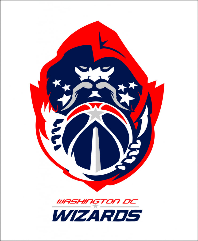
In the 70s, the club ended up in Washington under the name of the Capital Bullets and then the Washington Bullets. However, the negative associations with the word “bullet” made the owner consider rebranding. That’s how the Washington Wizards were born with a logo featuring a bearded wizard. The modern version looks patriotic: it is a ball in red and blue one of the seams of which resembles the Washington Monument.
New York Knicks
“Knickerbocker” is the name given to the descendants of Dutch settlers who stood at the origins of New York. This word served as the basis for the New York team’s name.
The brand sticks to the simple concept of corporate identity. The first logo, in 1946, was decorated by a chubby Dutchman playing basketball, and then the designers resorted to the image of the ball with the word “Knicks”. Interestingly, the color palette remains unchanged as well: it has blue, white, and orange colors, like the New York city flag and the old Dutch flag.
New Orleans Pelicans
The “Pelicans” grew out of the Charlotte Hornets team founded in the late 80s in North Carolina (because of the city’s bellicose past it was called “The Hornet’s Nest”). Although that nickname lost its meaning in New Orleans, they decided to keep it. For decades, a turquoise hornet in different variations served as the mascot.
However, in 2013 the club abandoned the Hornets franchise and turned into the New Orleans Pelicans (for pelicans symbolize Louisiana). The modern logo is made in the form of blue-gold wings of a bird that holds a ball in its beak.
Philadelphia 76ers
Although the club had to go through rebranding, both of its names represented the idea of patriotism. The history of the brand began in 1946 in Syracuse with the name the Nationals and the logo in the form of a stylized map of the United States.
After the sale and relocation to Philadelphia there appeared the Philadelphia 76ers (1776 was the year of signing the American Declaration of Independence). The team earned the sound nickname “Sixers” and the red-and-blue logo in the form of the number 76 and a circle of stars.
The identity’s colors and concept are still kept today. The logo features a ball with the inscription “76ers” surrounded by stars.
Minnesota Timberwolves
Since 1989, the team’s mascot, Minnesota’s forest wolf, has invariably appeared on symbols in blue, green, and gray colors. This animal conveys the idea of teamwork and danger to rivals.
First, the wolf’s profile was placed in a circle, then it looked out of the forest. The modern version features a polar star (the symbol of Minnesota) and a howling wolf that looks into the future.
Memphis Grizzlies
A team from Vancouver picked a grizzly as a totem. After moving to Memphis, it was decided to keep the symbol, although grizzlies do not live in Tennessee.
Since 1995, the animal has been the team’s fixed branding element. First, the grizzly growled and held the ball in its paw. Now we see a large harsh muzzle in two shades of blue with bright yellow eyes.
Oklahoma City Thunder
The Seattle Supersonics club was founded in 1967 but after moving and being sold in 2008, it changed its name to the Oklahoma City Thunder. This is due to the region’s climate where thunderstorms and tornadoes are common.
First, the logo featured a green ball depicting the Sonic spacecraft. Then, in different years, various balls and the silhouette of Seattle were chosen for the logo. Since 2009, the logo has looked minimalistic: the monogram “OKC” on the shield and the word “Thunder” on top. The blue color is associated with the US flag while yellow and orange with sunlight.
Indiana Pacers
In the 60s, the naming was defined by the place: the people in Indiana like driving at a great pace.
The team’s branding main feature is stability. They used only three colors (white, yellow, and blue) and a ball as symbols throughout their history. Initially, the ball was held by a hand inside the letter “P” which was replaced with three stripes indicating movement. Now this image is placed in a yellow circle with the inscription “Indiana Pacers”.
Detroit Pistons
In 1939, the founder of “Zollner”, a piston manufacturer, organized the Fort Wayne Zollner Pistons club. In 1957, when he moved to Detroit, the Detroit Pistons were born.
The first logo in 1941 featured a cartoon robot-like character made of pistons. But since the end of the 50s, their corporate style has been characterized by simplicity and conciseness. So, the logo was represented by the inscription “Detroit Pistons” against the background of the ball. With minor changes, this branding has been preserved to this day.
Golden State Warriors
In 1946, the Philadelphia Phyllis team was born in Philadelphia. Two years later, the name was changed to the Warriors. This name was visualized by the image of an Indian. This symbol has been preserved in various versions for 24 years.
After relocating to San Francisco, the team acquired a new name – the Golden State Warriors – and the logo depicting the famous Golden Gate Bridge. Since then, the team’s branding elements have always included the bridge or the bay outlines. The only exception was a short period at the turn of the century when the designers suggested the image of a warrior holding lightning.
Los Angeles Clippers
The team went from the Buffalo Braves (the Indian soldiers) to the San Diego Clippers (a fast sailing ship San Diego was famous for) and then to the Los Angeles Clippers.
In the 70s, the history of the team’s identity began with the image of a bull that stood on a ball framed by feathers. Then the designers used the image of three triangles symbolizing a sail and a circle resembling a setting sun. In the 80s, the branding became laconic: a ball, the inscription “Los Angeles Clippers” and horizontal stripes. Since then, the concept of the emblem has hardly changed: now it is dominated by the large word “Clippers” framed by curved lines reminiscent of the sea horizon.
