The Paramount Pictures logo graces with its presence the opening titles of “Godfather”, “Transformers”, “Mission: Impossible”, and hundreds of other iconic movies. From this post, you’ll find out who coined the Paramount Pictures emblem and how it has evolved over the course of more than 100 years.
- Meaning behind the Paramount Pictures logo
- Logo background
- Logo design
- Why the Paramount Pictures logo works
- How would Paramount Pictures logo look like if it were made in ZenBusiness?
Meaning behind the Paramount Pictures logo
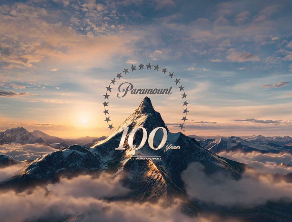
The two main symbols depicted on the logo are a mountain and stars above it. There is still debate about the backstory behind the emblem. According to some researchers, it was based off the childhood memories of William Wadsworth Hodkinson – the man who founded Paramount Pictures.
The 24 stars that form a circle over the mountain stand for 24 actors who signed their contracts with the film studio in 1914. The original plan was to add a new star onto the emblem every time a new actor joined the team. However, the movie industry was developing so fast that Paramount Pictures had to give up on the idea.

Logo background
There is a legend saying that the very first Paramount logo was drawn on a napkin in 1914. The emblem featured a mountain against a black backdrop, with the company name and stars shining above it.
On the new 1952 logo, the mountain grew higher and moved to the center of the composition. A blue sky with fluffy white clouds lended a fresh, vibrant feel to the design. In 1957, the Paramount branding took a turn towards minimalism. The logo was painted blue, and the landscape lost some of its details.
The next rebranding milestone happened in 1987. The revamped emblem was based off a painting which was commissioned by Paramount to celebrate its 75th anniversary. A picturesque lake appeared at the mountain foot, and the stars got a realistic shining.
In 2002, it was decided to add dynamics to the emblem. A new design displayed shooting stars over the the snowy mountain peak. The landscape turned out to be very romantic and dreamy.
Logo design
- The main strength of the Paramount logo is that it’s easily adaptable to different contexts. For example, the art piece can change its color palette depending on the movie it precedes.
- If we were to single out one signature element on the logo, it would be the handwritten that hasn’t changed in years.

Why the Paramount Pictures logo works
- Consistent. For more than 100 years now, the Paramount Pictures film studio has been committed to nurturing a trustful relationship with its audiences worldwide. The brand has enjoyed the love and respect of several generations of loyal viewers.
- Symbolism. As its fundamental symbol, Paramount uses a mountain, a symbol of power and reliability.
How would Paramount Pictures logo look like if it were made in ZenBusiness?


Conclusion
Breathtaking blockbusters produced by Paramount Pictures are instantly recognizable through the studio’s powerful logo. The film studio is not afraid to expose its emblem to new design techniques. The today’s version of the logo looks relevant and dynamic, which is exactly what the movie company stands for.


