Content:
- Pop-up windows: Goals and types
- Pop-ups: Functions
- How to set up a smart pop-up
- 7 principles of a high-conversion pop-up window
- Recap
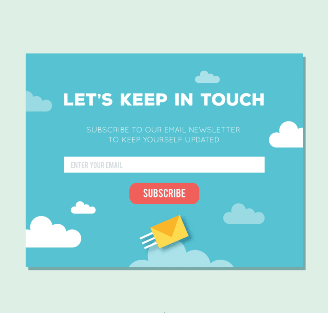
A pop-up window, or simply pop-up, is a short message that appears on a website page. Its goal is to convert a website visitor into an email subscriber or customer. Pop-ups are used to build a subscriber base, increase following on social media, and boost sales.
Analyzing 1.75 billion pop-ups revealed that their average conversion stands at 3.09%. If we only consider those pop-ups that have been set up correctly, their conversion reaches a whopping 9.28%. In this article, we’ll talk about how to use pop-up windows for enhancing your business.
Pop-up windows: Goals and types
Pop-ups urge website visitors to perform certain actions, e.g. take advantage of an offer, submit contact information, subscribe to a newsletter, etc. If set up correctly, pop-ups can increase user engagement and improve your sales performance.
Pop-ups fall into two main types:
1. Hello boards cover a small part of the screen without preventing the user from browsing through the content. Although subtle and unobtrusive, such ads aren’t particularly effective. Most of the time, visitors continue to navigate the page while completely ignoring a hello board.
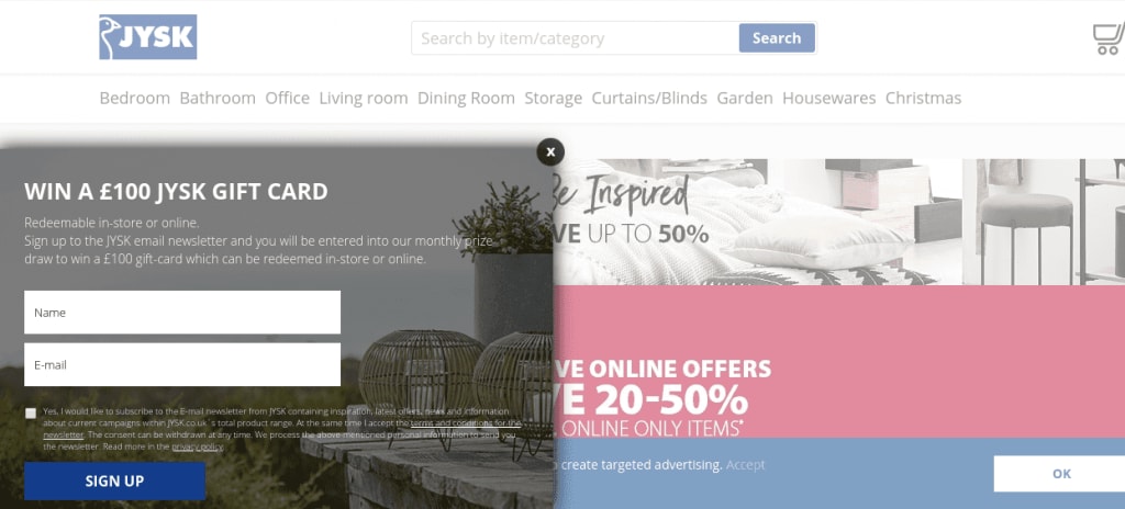
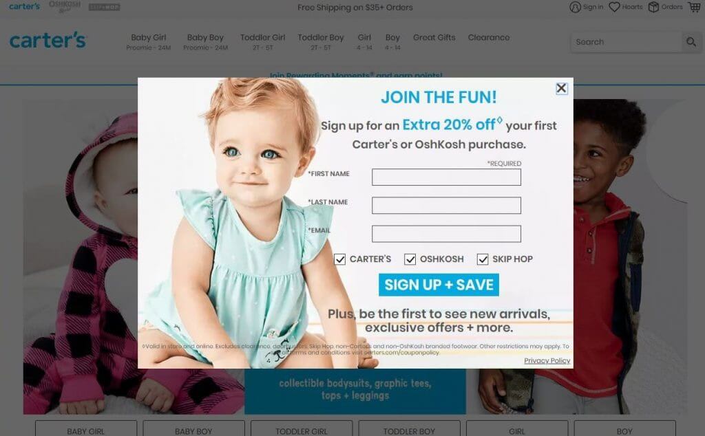
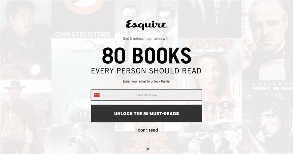
2. Page stop is a pop-up that occupies almost the entire screen, blocking the website functionality for a user. The latter can choose either to do the required action (subscribe, click the link, etc.), or close the pop-up. Although this type of pop-up irritates many users, it also generates more conversion.
Pop-ups: Functions
Let’s classify pop-up windows by their function.
Welcome pop-ups
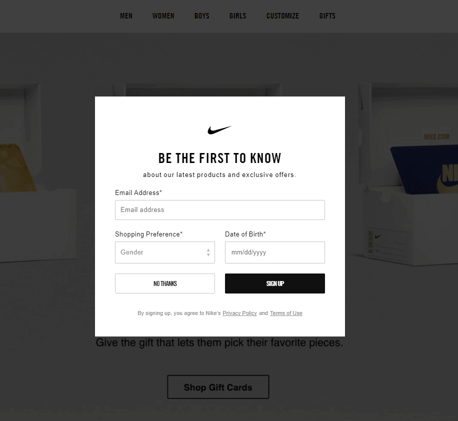
A welcome pop-up appears right after the page has loaded. While it may bring inconvenience to users, there are situations when a welcome pop-up is absolutely appropriate, e.g. when you need to update your audience on important news and offers. Use welcome pop-ups to market .the last available tickets to an event, promote a time-limited promo code, etc. For example, Nike invites its users to subscribe to a newsletter to “be the first to know about the latest products, exclusives, and offers from Nike.”
Target pop-ups
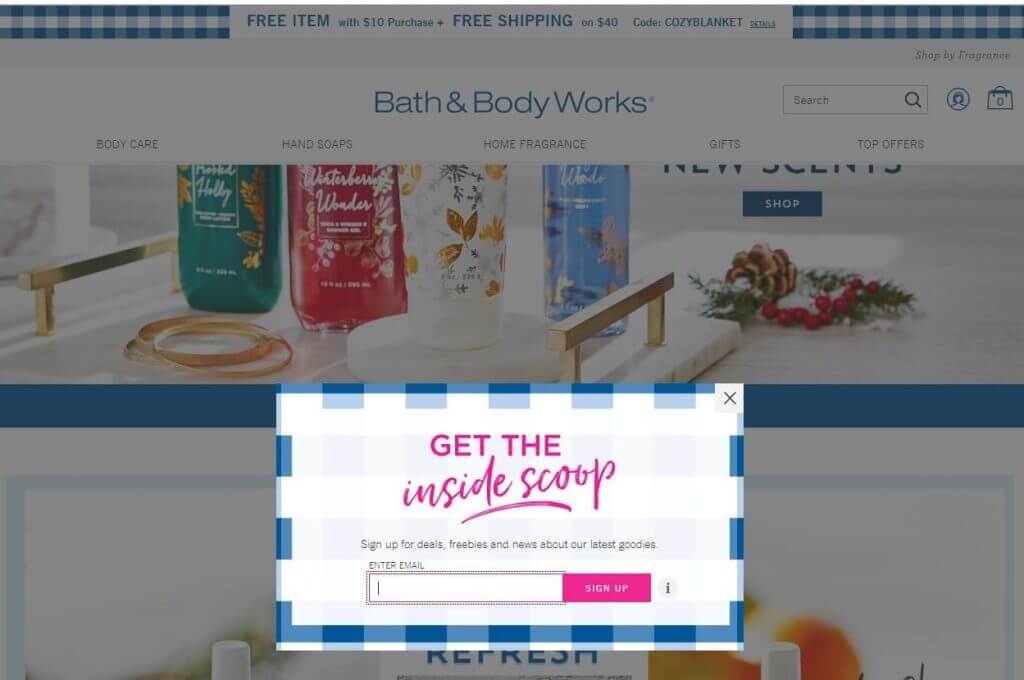
A target pop-up window appears once a user has scrolled down the page to a specific spot. For example, when a user is halfway into the article, you can subtly push them to making a purchase. Alternatively, once a user has reached the end of the post, you can invite them to subscribe to your emails or offer them a link to more relevant content. You can set up any pop-up based on your marketing goals.
Scheduled pop-ups
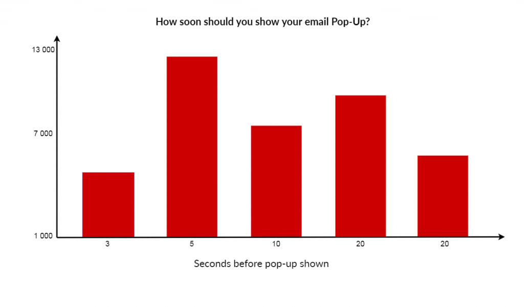
You can set up the exact time when a pop-up will be shown to your audience. According to research by AppSumo, pop-ups that come up 5 seconds after the page load tend to generate the biggest conversion rates.
Survey pop-ups
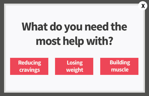
Pop-ups containing a question serve to pique the interest of a user and prevent them from leaving the page. Some brands use a little trick and highlight the button with a “Yes” and obscure that with a “No”, urging a visitor to answer affirmatively. A multiple-choice question is also an option.
Source: optinmonster.com
How to set up a smart pop-up
Your task is to set up an unobtrusive yet highly effective pop-up window that will get you leads. Listed below are the key standards a high-conversion pop-up must meet.
1. Simple interface. Along with a clear font, your pop-up must have big, easily visible graphic elements (CTA button, X button, etc.). This is how you encourage a user to make a fast decision.
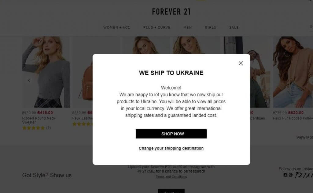
2. Respectful attitude. Talk to your audience in their language but don’t cross the boundaries. Be careful with jokes.
3. Relevance. When working on your pop-up, put yourself into the shoes of your website visitor. Would you leave your email and subscribe to a newsletter after only 10 seconds on a new website? Probably not!
4. No spam. Fine tune your pop-ups unless you want to get on your visitors’ nerves. For example, be sure not to show the same pop-up twice to a user who has already performed a target action. Also, if a user closed a pop-up, it must not bother them again.
5. Clear call to action. A website visitor must have a clear idea of what you want them to do, whether it’s a click, subscription, order, like, etc. Boil your call to action down to 1-2 short, concise sentences.
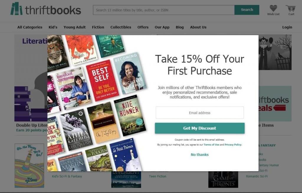
6. Adaptive. Nowadays, mobile users account for the biggest part of web traffic. If you want to reach out to a vast audience, be sure to optimize your pop-ups for smartphones and other touch screen mobile devices.
Elements of a pop-up window
When creating a pop-up window, you must think over each single detail. Let’s break down the elements of a typical pop-up.
CTA text. A call-to-action text is, hands down, the most important part of your pop-up. As mentioned earlier, your call-to-action must be short and straightforward. Pick a simple massive font that will be clearly visible against the background.
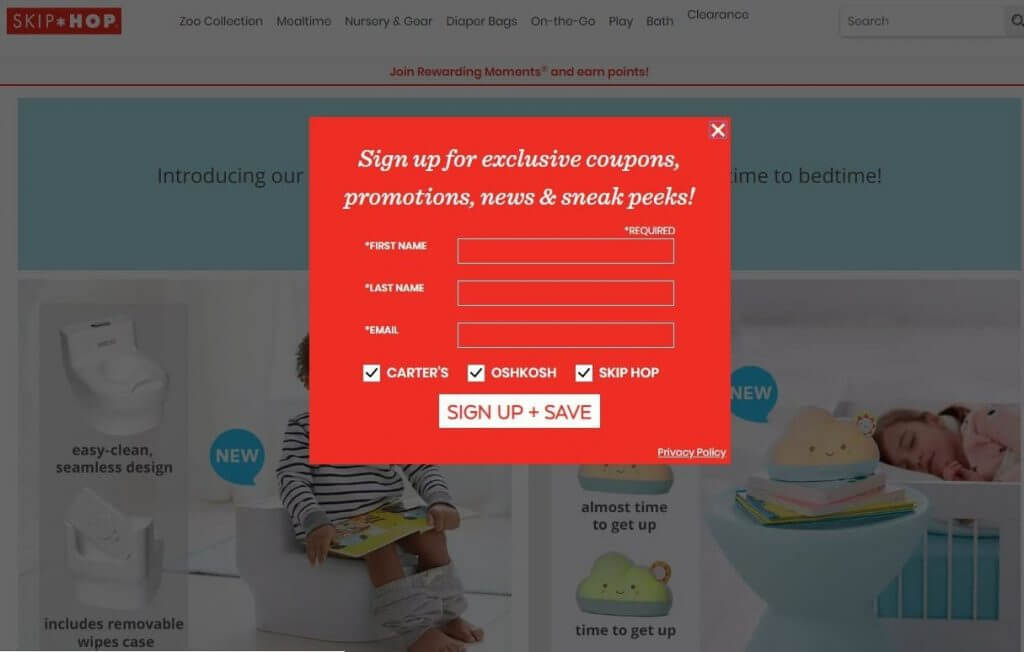
Shape. A square or rectangular pop-up is a safe choice. However, if you’re up for bold solutions, you can come up with an innovative form for your pop-up (e.g., a fluffy cloud).
Design. Brand your pop-up window with your corporate patterns, fonts, and colors. This is a sure way to appear more professional, enhance your brand recognition, and cultivate customer loyalty.
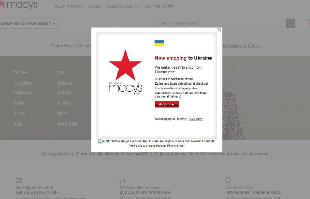
To draw customer attention, it’s a good idea to put your brand logo on your pop-up. Have a look at the screenshot above. The vibrant Macy’s logo arrests your attention at a first glance! A corporate logo creates a strong visual connection with your brand. On top of that, it performs a bunch of essential functions:
- evokes emotional associations;
- protects your content from unauthorized copying;
- creates a unique aesthetics;
- promotes your business.
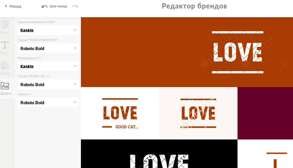
Avoid putting your logo too close to the text. A cluttered window may confuse a user. If you don’t have a logo or brand book yet, check out the ZenBusiness Logo Generator logo maker!
Fill-in form. Make your full-in form as brief as possible. You don’t want to scare off your potential leads by asking for too much information. For example, for a subscription pop-up, you only need two fields (name and email address).
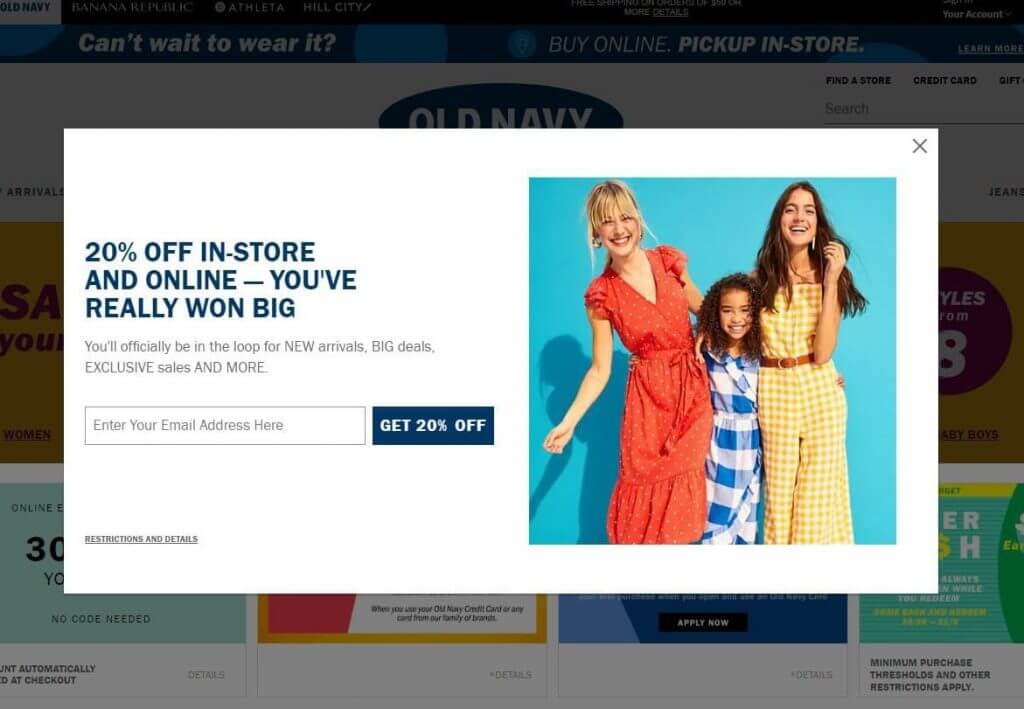
Main text. Give your audience more context. If you’re asking for a permission to send emails, you can talk about their topics and frequency. Also, businesses tend to motivate users by offering them discounts, promo codes, and other lead magnets in exchange for the required action.
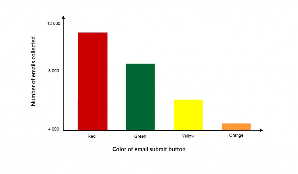
CTA button. Decide on the message, shape and color of your CTA. According to the research done by AppSumo, green and red CTAs ensure the highest conversion rates, while orange buttons prove the least effective.
X button. Hiding the X button is a bad idea. Users must be able to instantly close your pop-up without having to look for the exit button. Here are some tips:
- Try color highlights (e.g., a red CTA vs. grey X button);
- Appeal to a user’s emotions (e.g., when a user hovers the cursor over the X button, you may show them a sad emoji).
Cookies. Offer your audience an opportunity to hide your message by adding the check boxes “Don’t show this message again”, “I’ve already subscribed”, and the like.
7 principles of a high-conversion pop-up window
Oli Gardner, a sought-after speaker and online marketing expert, has come up with a formula for a conversion-centered pop-up. Check out the 7 principles of a smart pop-up window:
1. Clarity. Your pop-up must be simple and easy-to-perceive, both text- and image-wise.
2. Control. Give a user the choice to accept, refuse, or ignore your offer.
3. Originality. Using an unconventional approach is a sure way to attract more potential leads.
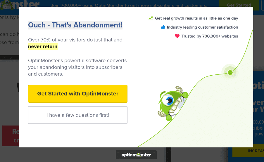
4. Relevance. Your pop-up must correspond to the topic of the page where it appears.
5. Emotions. A good pop-up triggers positive emotions and even urges a user to screenshot it.
6. Value. Explain to users what value they will get in exchange for the action.
7. Responsibility. Respect a person’s right to say “no” to you. If a user refuses your offer or simply closes the pop-up, don’t even think of using offensive or insulting remarks, e.g., “No, I prefer paying for movies” or “No, I don’t want to become a businessman. I’m a loser.”
Recap
Although small, a pop-up window has a tremendous marketing potential that can take your business to a new level. In a pop-up, every single detail can have an impact on the final result, i.e. conversion rate. When creating a pop-up, consider its shape and colors, when and where it appears, what value it offers, etc. If you follow our recommendations, you’re guaranteed to come up with clever pop-ups that will help you build leads and achieve your marketing goals

