- What is a monochrome color scheme?
- Why use a monochrome palette?
- Why monochrome designs?
- Tips for creating a monochrome palette
If you’re struggling with choosing an ideal color palette for your logo, website or packaging, we recommend using a monochrome scheme. A monochrome palette contains different shades of one and the same color. To put together a classy monochrome scheme, you don’t need any particular graphic design skills. Let’s go into details of how to make the most out of a monochrome logo design.
What is a monochrome color scheme?
As we’ve already mentioned in the introduction, a monochrome palette is made of different hues of the same color. You pick the base color and add any number of its shades while changing:
- brightness (you can add white or black to make the shade lighter or darker);
- saturation (you can add grey to make the shade more saturated or, on the contrary, more muted).
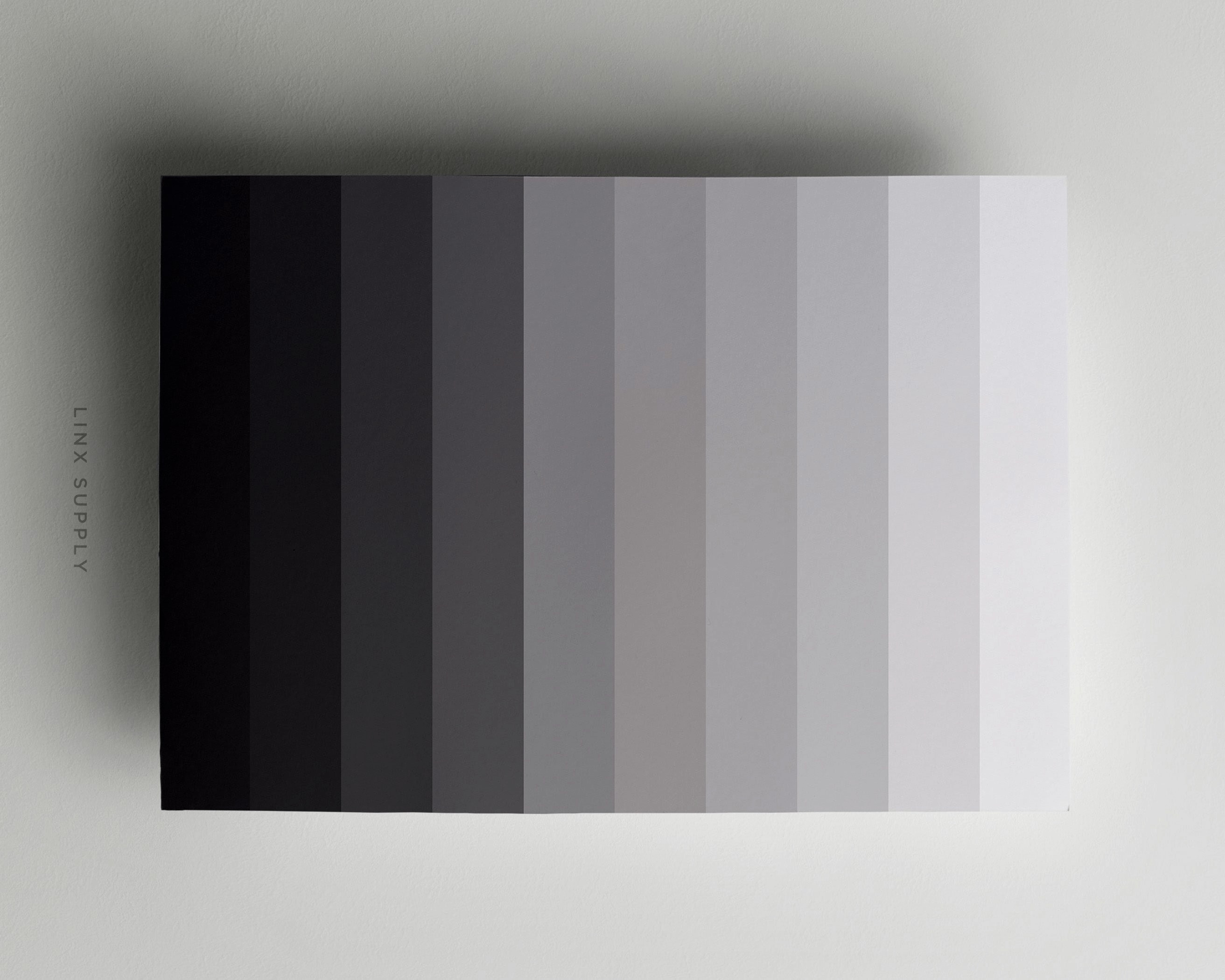
Creating an eye-pleasing monochrome palette is easier than you think! Use smart online services like Adobe Color or online color scheme generators.
Why use a monochrome palette?
A monochrome color scheme allows you to create a stunning color combination with minimum effort. Let’s take a closer look at the advantages of using a monochrome scheme.
1. Helps you avoid mistakes
Since all shades within a monochrome palette match with each other, you don’t have to worry about whether or not your resulting palette is nice to the eye. Even if you’re a wide-eyed novice when it comes to graphic design, you have all chances to craft a professionally looking design.
2. Saves your time
You don’t need to worry that creating a monochrome palette may take up all your free time. Instead of several different colors, you only need to choose one and then play around with its shades.

3. Makes a simple and clean design
A monochrome palette creates a visually balanced image that conveys the feelings of harmony and consistency. Eventually, this has a good effect on the overall perception of your brand by your audience.
A monochrome design is particularly effective when you need to fit a large amount of information into a limited space. A color palette made of matching shades makes your design look more organized and orderly.
4. Facilitates visual perception
The fewer colors in your logo, the faster a viewer’s brain will process your design. A one-color scheme is good at catching the viewer’s attention and creating strong associations with your brand.

Why monochrome designs?
Visual consistency is paramount to an effective branding. If you want your customers to readily identify and recognize your company, you need to use the same branding across different media. To make the most out of your monochrome color palette, be sure to use it:
- on your logo. If you have a sophisticated logo which consists of several elements, using a monochrome color palette is a surefire way to make it easier to perceive. For a stunning one-color emblem, use the ZenBusiness logo maker! Choose the main color, and the smart generator will offer different shades for the background, icon, and text!
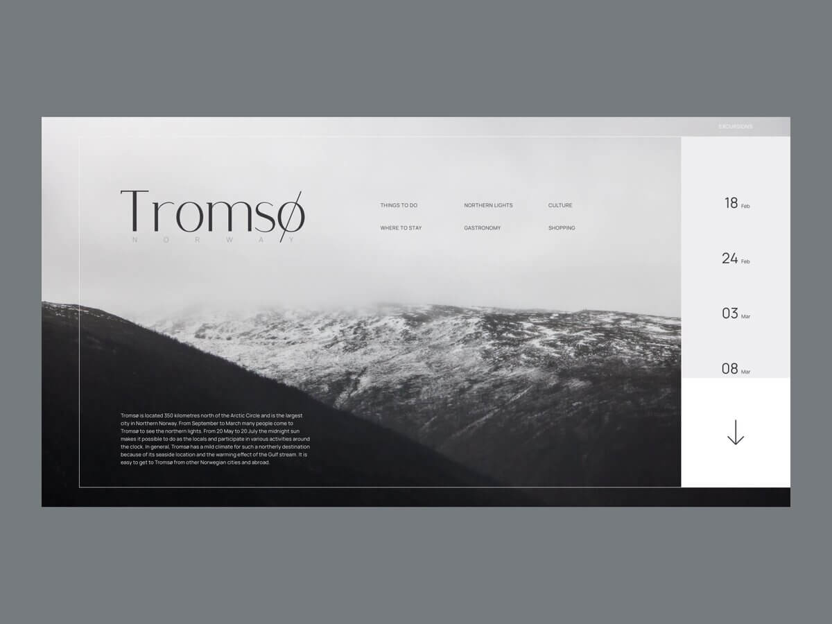
- on your website. If you’re unsure as to what colors to pick for your website, you can’t go wrong with monochrome. A monochrome page always looks simple and minimalist. Design tip: To keep your webpage from looking too bland, your palette must have at least one bright shade.
- on printed materials. Monochrome color schemes pair well with printed matter, such as business cards, calendars, booklets, flyers, and the like.
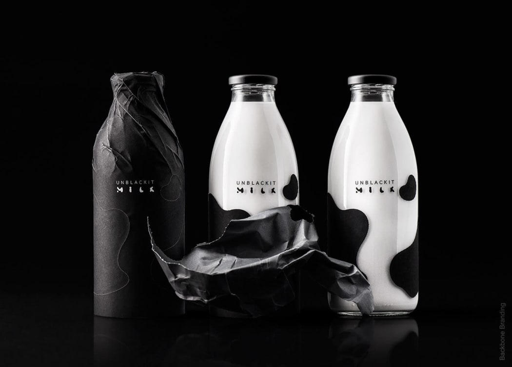
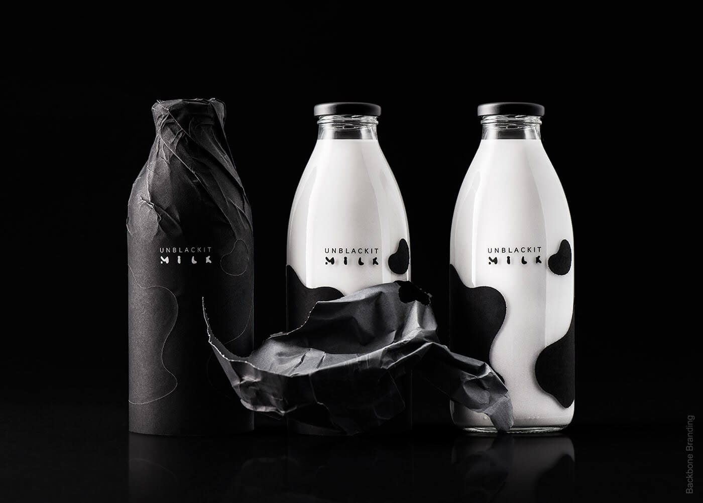
- on packaging. Using a monochrome palette gives you the freedom to use a variety of materials, such as paper, cardboard, fabric, foil, wood, etc. Life hack: One and the same shade can look different on different textures.
- on social media. Monochrome designs can take your social media page to a new level. This is especially true for Instagram where visual content is key.
Tips for creating a monochrome palette
Let us give you a few tips for creating a good-looking and memorable monochrome branding.
1. Keep it simple
If you want your color palette to look clean and balanced, avoid using too many hues.
- Stick with 3-4 shades, each for a different element of your logo. For example, if you’re putting together a palette for a website, pick different hues for headlines, buttons, background image, etc.
- Define the use for each shade and stick with it. If, for example, you’re using a dark green shade for text and a light green shade for graphics, be sure to apply this rule across all media, including your letterheads, social media images, etc.
2. Manage your viewers’ attention
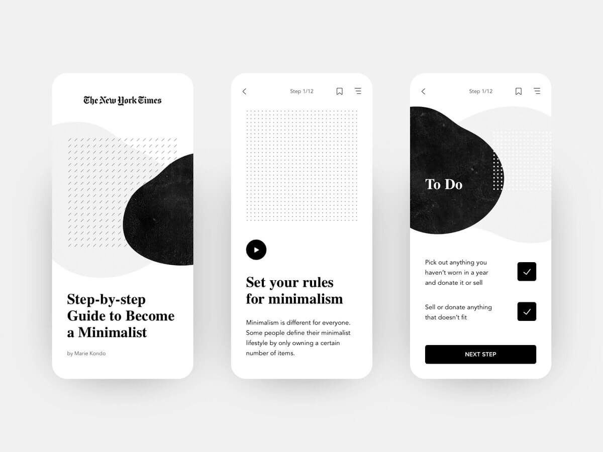
Monochrome is not only about visuals but also about functionality. It helps create a strong visual hierarchy, i.e. arrange elements in a specific way. The goal is to make the blog, booklet, etc. easy to navigate and help potential customers find the right information fast and easy. To achieve that, you can:
- use different shades for different parts of your design;
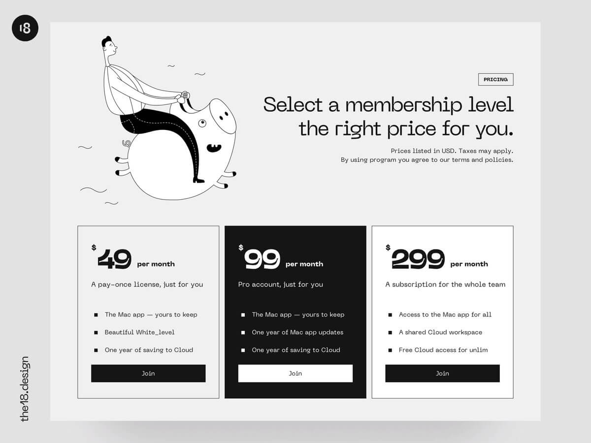
- use color gradation in infographics and pricing charts (for example, you can use a gradually darkening shade to go from cheaper plans to more expensive ones).
3. Apply filters
A monochrome palette is a great choice not only for texts and graphics, but also for illustrations. Here are a few useful guidelines:
- use filters to brand your image;
- enhance your monochrome image with a colored semi-transparent filter (this technique works especially good for black-and-white images).

4. Use a contrasting effect
If you’re opting for a muted color palette, one good way to spice it up is by adding a contrasting accent color.
- It’s a great way to draw attention to your ads, both digital and printed.
- Use a contrasting shade to highlight important elements, e.g. “Buy” button, CTA button, contact information, etc.
- Tread carefully and try not to overdo it with a contrasting hue. It must not steal the thunder from the main palette.

5. Create a second monochrome palette
If you have a big selection of products, try working with two monochrome palettes. This is a great way to showcase that your products are manufactured by the same company but at the same time have their unique characteristics. .
- This technique can be effectively applied on labels. If, for example, your juice cartons have similar designs, it might be a good idea to differentiate them by using different color palettes. Such visual hints will help your customers find the product which is right for them.
- Be careful when choosing an additional monochrome scheme. It must be made of shades which are either complementary or analogous to the hues from your first palette. Rely on the color wheel for the right choice.
Final word
A monochrome color palette is a simple way for creating a killer branding. You can use monochrome palettes in logos, business cards, letterheads, websites, mobile apps, packaging and other carriers of your brand identity. At the same time, don’t be afraid to push the boundaries and refresh conventional monochrome palettes with accent hues.

