In this post I’m going to share a bunch of images, tools and tricks to help you design your own ebook without spending any money on a designer.
We all want our websites, emails and ebooks to help us look professional, stand out from the crowd, get recognized and, ultimately, delight our audience.
And hopefully we all know how offering a giveaway on your site can significantly increase the number of people who signup for your email list.
Here’s how things changed when we started offering an ebook:
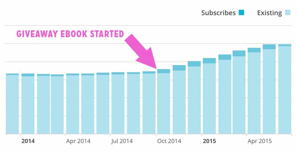
Here’s stats from our email list for the past year +. Can you tell where we started promoting the Audience guide?
(Click here to learn more about freebies, opt-ins, lead magnets or giveaways.)
So in this post I want to share all sorts of ways you can put something into the hands of your readers, something they will love to read, something that will grow trust with them and make them more likely to choose us when they need our products or services.
These are tricks I’ve picked up, ways to get us from here to there without getting too technical or artsy fartsy.
But, before we do that we need to get clear about what your ebook is for, what it’s supposed to do.
What’s in this post
- What your ebook is supposed to do
- Case Study: 10 Photo Challenges Ebook
- Tools for making ebooks
- Use landscape mode (or portrait)
- Just use a theme
- Steal great colors
- Steal great font combinations
- Anticipate boredom: break up the flow
- Build in your calls to action (CTAs)
- End sections with a full-page quote
- 10 page templates to use in your ebook
- A guideless masterclass in ebook design
- A big list of design tips
What your ebook is supposed to do
Here’s 3 things every ebook is supposed to do:
- Your ebook is supposed to be interesting. Rule #1 of designing an ebook is make sure the topic is f*%^ing interesting to your audience! The fanciest design can’t outperform a killer topic and headline.
- Your ebook is supposed to be readable. If your reader can’t read the words due to color choice or font choice or lack of contrast, etc., then you can’t get your ideas from the page and into their head/heart/life, you can’t help them, you can’t build trust. Whatever else your ebook is, it must be readable.
- Your ebook has to be out in the world. We can’t be fiddling with this thing forever. The point of it is to be out in the world affecting hearts and minds, so let’s get this done now. It can always be better; don’t let that keep you from getting your book out into the world.
To illustrate this last point, let me tell you about how Darlene made (and leveraged) her ebook.
Case Study: 10 Photo Challenges Ebook
Below is a before and after of Darlene’s 10 Photo Challenges ebook. The new version is definitely an improvement over the old one, wouldn’t you say?
Before:
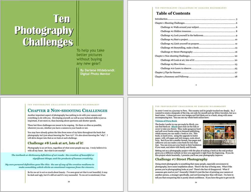
Here’s a few sample pages of Darlene’s Photo Challenge ebook before she worked with a designer.
After:
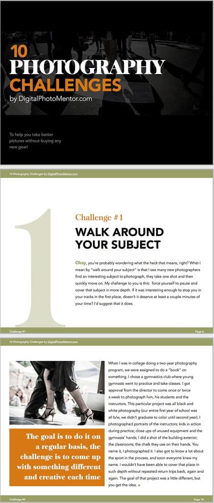
Here’s a few sample pages of Darlene’s Photo Challenge ebook after working with a designer (3.5 years after first publishing the ebook).
Darlene actually made the “before” version herself using Open Office (an open source word processor). Did you hear that? She did it herself using free software.
Then she used it and it worked. She’s used that version for 3 years and grew her blog to over 22,000 email subscribers.
Yes, the second version looks nicer than the first — she says herself that she wanted to update the look and feel of the book — but her business grew because she used what she had. She didn’t fiddle and whine about making it look better, she used it.
There will always be a possible better version of what you’re making. Successful people know when to stop fiddling and start shipping.
Tools for making ebooks
YOU DON’T NEED TO USE FANCY OR EXPENSIVE APPLICATIONS TO MAKE YOUR EBOOK.
Did you get that? Sorry to yell. I just really want you to get it — you don’t need fancy tools to make a killer ebook.
You could use presentation software like PowerPoint, Google Slides or Keynote. Michael Hyatt used one of these when he made his super successful life plan ebook.
You could use word processing software like Microsoft Word, Open Office, Google Docs or Pages. As I mentioned above, Darlene used Open Office to make her ebook.
You could use any of these tools and export a PDF of a great ebook.
But my favorite tool for making ebooks is definitely Apple’s iBooks Author. It looks amazing, it’s really easy to use, and it’s free.
Note: there was some worry when iBooks Author first came out that the app’s terms of service didn’t allow users to sell their books anywhere but the iBooks store. That’s not the case. If you use Apple’s .ibook format, you can only sell through the iBooks store. All other formats have no restrictions, and you can sell your ebook using any platform you want.. We make all our guides in iBooks author and export as a PDF.
If I were starting from scratch today, I’d use iBooks Author with one of the built in themes.
If I were on a PC and couldn’t get iBooks Author, I’d use PowerPoint or Google Slides. If I planned on collaborating with anyone I’d definitely use Google Slides.
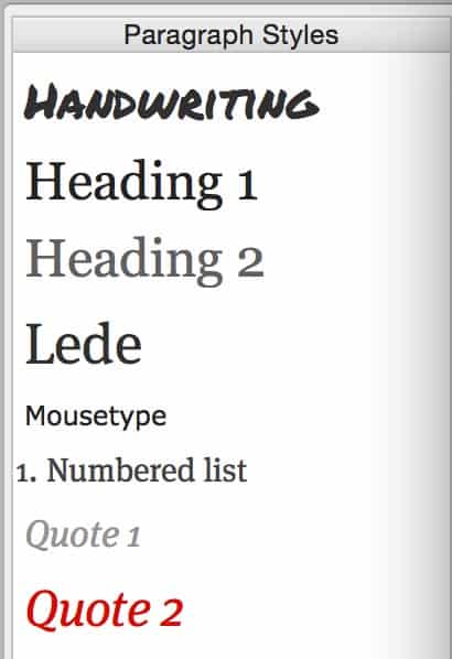
the styles drawer in Apple’s iBooks Author
Tip: Use formatting styles. In most of these apps there’s a way to save how an H1, H2, H3, body copy, link and blockquote should look. Then you can simply select some text and choose that style to format it the same as all the other similar elements in your book.
Added bonus here is that you can change the style of all those elements throughout your ebook by changing the formatting of the master style.
Another bonus here is that hopefully it’ll keep you from selecting this word and making it red and that one and making it green and that one and making it huge or small, etc. Play it cool, Sundance.
1. Use landscape mode (or portrait)
I like landscape mode for a PDF ebook much more than portrait. Its wide pages make it easier to include graphics and it has room for two columns of text (keeping your body text’s line length from being too wide, which makes for easier reading on computers).
This is not a rule. If you feel your ebook should be in portrait mode, do it. If you feel it should be in landscape, do it. If you feel strongly it should be a parallelogram, you’re on your own. I don’t think any of the apps mentioned above do that. But they all do portrait or landscape.
Go download some ebooks and see what the experience is like. Model yourself after the ones you like and you’ll learn fast.
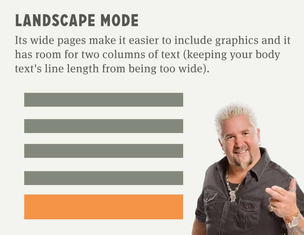
Landscape Mode: a little better for a graphical experience (and a computer reading experience)
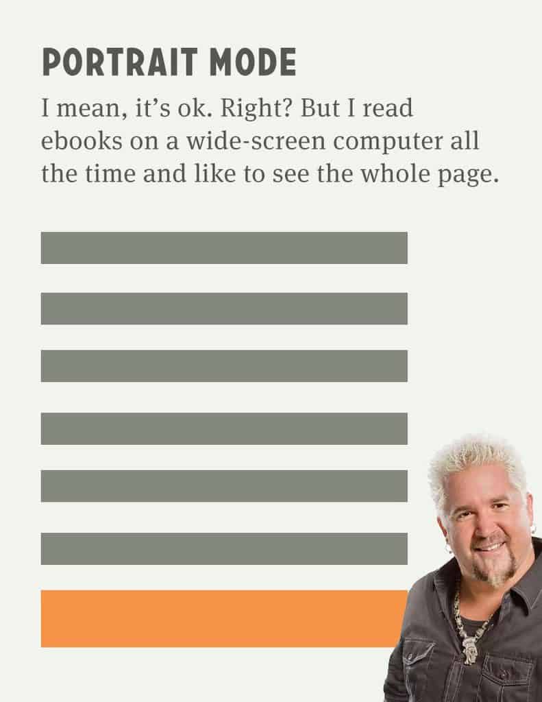
Portrait Mode: great if you’re focusing on mobile devices. But I’m missing Guy’s hand 🙁
2. Just use a damn theme
There are hundreds of great themes out there that make it easy to dress your ebook up. The applications mentioned above all have built in themes you can apply in the click of a button. (Again, this is a place where iBooks Author really shines.)
A theme makes so many difficult decisions for you, giving you a handful of page templates, colors, fonts, etc., enabling you to get into the real work of putting words, images, stories and ideas on the page to connect with the reader.
And there’s a bunch more themes available for free or fee around the web, like these (unfortunately, you may have to signup for a few email lists to get them):
- PowerPoint + InDesign: Hubspot’s 5 Ebook Templates
- PowerPoint + InDesign: Hubspot’s 13 Ebook Templates
- PowerPoint: InboundPro’s 2 Ebook Templates
- Apple Pages + iBooks Author: Author Ready Templates
- Keynote: Weelii’s 32 Keynote Templates
- Google Slides: Slides Carnival – Free presentation templates
The downside of using a theme is, of course, you may not look as unique. Someone else may use the same theme, the theme may not look exactly the way you want it, etc.
However, themes make it easy to get your book out the door and into the world. Can you do like Darlene and just get your first ebook out the door and into the world and working for you? Using a theme gives you the advantage of speed and ease.
If this is your first ebook, can you simply find a theme you feel good about, one that gets you 80% there, and force yourself to work with that this time around?
Remember, as we say all the time on our small business podcast: your goal is to release your content, test it, get feedback on it and improve it over time. Using a theme helps you do that without all the fiddling.
I want you to just use a theme for your first ebook… because your ebook only wins if it’s a great topic + a good title + very useful + people are finding it and trusting you enough to download it + people are sharing it because they found it useful. The best custom design in the world can’t fix those if they’re broken. And a theme helps you get it out and get some feedback.
Then, when you’ve proven the book works and filled in any gaps, you can invest $500-1,000 to hire a designer and really make it represent you and your brand.
Ok, I’m done with my theme rant now. Hopefully you’ve stopped reading and you’re already writing your book in a theme of your choice. For the rest of you gluttons for punishment: let’s get into color.
3. Steal great colors
Many of the great designers I know start on a project’s color palette by stealing. “Stealing” sounds a bit harsh… let’s call it “modeling.”
We model our colors on other works, be they in the real world (houses, buildings, nature) or printed world (book covers, posters, etc.) or work online (websites, images, etc.).
One of the harder things about colors is picking colors that feel right together. So, let some excellent designers put groups of colors together for you and find palettes at ColourLovers.com.
They’ve got thousands of color choices put together; it’s searchable, browsable and easy to find good stuff. (It’s also easy to spend a lot of time here. Beware.)
Use these great color picking tools:
- Palettes: Latest Web Palettes :: COLOURlovers
- Palettes: Adobe Color Themes
- Color Wheel Picker: Adobe Color CC
- Color Wheel Picker: Paletton
Color considerations:
- The background of your book should be white or a light color if you want it to be printable.
- Don’t choose more than 4 colors (unless you know what you’re doing).
- Page background: again, keep it light
- Body text: you can use a little color but keep it dark enough to read.
- Link color: you’ll want to hyperlink text throughout the book to promote stuff. Make sure hyperlinked text is still readable.
- Callout/header/footer color: something that plays nicely. You could use the link color as the background and make the text white on top of it. Or you could choose a totally different color.
- Other accents and elements can use darker or lighter versions of the colors above.
Tip: Model your color choices on what other designers are doing. Use ColourLovers.com to find a palette you like and go with it!
4. Steal great font combinations
Everybody want’s to know about what fonts to use. I’ve been hot and heavy passionate about fonts for a few years and here’s what I have to say:
- Different fonts have different feels.
- Go for something you feel good about.
- Remember to keep it readable. Don’t get too fancy or too weird.
- There are so many free fonts out there. Did you know you can download any of the fonts from Google Fonts?
- Steal great font combinations from others. Let them do the work for you. No need to repeat why.
- Use no more than 2 fonts unless you really know what you’re doing. I normally pick one font for headings (h1, h2, h3, etc.) and one font for body copy. Added bonus if the body copy font looks great in large sizes for those big quotes (we’ll get into them in a bit).
I could talk about fonts until I’m blue in the face. I hear them, I feel them, I talk to them when no one’s around. I love them.
Tip: Model your font choices on what other designers are doing.
5. Anticipate boredom: break up the flow
Have you ever wanted to read something, been interested enough to click and get started reading, only to realize that it’s a big-ass wall of text all the way to the end? Text endlessly, incessantly lined up like like some old English king’s army, poking and prodding you with their swords and spears and ascenders.
I just want to Braveheart it, scream “FREEDOOOOOOOOOOM!” and break the tyranny.
You can call your ebook a “book” if you want, but you’re not Shakespeare or Malcolm Gladwell (yet). And you don’t have to be. So let’s use images and typography in your book to break up that daunting flow of text and keep me curious and interested in what’s on the next page.
Besides, even Shakespeare and Malcolm Gladwell could use some excellent callouts, images and large quotes, right?
Remember what your ebook is supposed to do. It’s not supposed to win you the Pulitzer prize. That’s a different project with a different set of design requirements.
Really, fundamentally, your job is to keep the reader interested and engaged. Breaking up that flow of non-stop body text is an essential part of that, making your book fun, intriguing and delightful.
Ways to break up the flow
- Tell them what you’re going to tell them (in a big headline), tell them what you’re telling them (in a page or two of text), then tell them what you told them (in a box callout with a couple bullet points of “key takeaways” or something like that).
- Use lists. Admit it, you skim through stuff until you see a list.
- Use headings (h2, h3, etc.). As I scroll through your ebook, these headings help me know what section I’m in. I normally only use 3 levels of headings: the huge headline that starts the section (h1), the main breaks within that section (h2), and then the smaller section within sections heading (h3).
- Use images. On half the page or a quarter of the page or the whole page or whatever. Great images, images that help me understand your words better, will make your ebook feel like it’s designed really well.
- Here’s 50+ places to find great, free images.
- Pro tip: add captions to your images. These are some of the most read pieces of text in any book or webpage.
- Build in your CTAs (calls to action). (See below.)
- Use any (or all) of the 10 page templates I list out below throughout your book.
These boredom breakers can work really well even if they’re not designed all that wonderfully. I may not immediately be blown away by your design and think, “wow, this lady’s good,” but I may read enough to get sucked in and curious about what’s around the next page turn, and in that page turning come to know, like and trust you.
Tip: Expand your line height. You can make those little lines of text easier to tumble through by expanding the line height.
Line height is how short or tall the space is between lines of text in a paragraph. Let it breathe. I normally set that something close to the golden ratio: 1.62. (E.g., if I’m using an 18px font size, I’ll start with a line height of 1.62 times that… 29px).
Some fonts are quite tall and need more line height. Others are quite squat and need less. Move things around and see how they feel.
6. Build in your calls to action (CTAs)
You have business goals with this ebook. Not only that someone would download it, but also that they’d read it and take even more action from there. What are those actions you want them to take?
- to hire you?
- to subscribe to your podcast?
- to buy your product?
- to promote your book to their network?
- to leave you an Amazon review?
- to draw them into a next step in their learning journey?
What are the things you want your reader to do? Have you identified them? Can you cull them down to just a couple and really focus your book to get them into one of those next actions?
These calls to action need to be designed things, they need to be thoughtfully prepared — what sequence they come in, what form they take, etc. And they provide great ways to break up that flow of text and help the reader understand what you’re saying.
Some specific ways to do this are called out in the page templates below, but these are a few more ways to add CTAs that will help make your ebook feel more interesting.
- Add “key takeaways” to the end of each page where you include a link. E.g., “learn more about including links.”
- Add a little “tweetable” block on a page that encourages someone to share a quote or statistic.
- Create a dedicated call to action page. (More on this below.)
- Use images or screenshots from videos to entice someone towards your youtube channel or blog post. (See the example of this below)
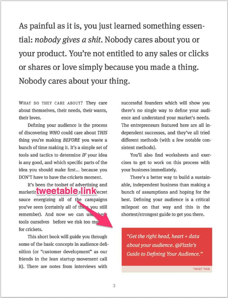
Callout tweetable quotes and stats in a block like this to encourage sharing. This one’s from our guide to defining your audience.

Create full-page “advertisements” for pieces of content that further explain a concept. This one’s from our top 10 mistakes in online business.
There’s a bunch of ways to fold in well designed calls to action. But the best designed CTA is the one that makes sense, the one that’s thought through, that anticipates the reader’s needs and questions and delivers the solution at the right time.
Again, download a handful of ebooks and see how others are doing these kinds of things. Get inspired and decide how you’ll do it your way.
7. End sections with a full-page quote
I hesitated to put this one in. It felt kind of too simplified, but the truth is it’s one of my favorite tricks.
People love quotes. Quotes feel like statistics in some ways. They feel hard, sturdy, more like data points than opinions. Of course they often are just opinions, but when I say make an argument and then conclude it with a quote from some important person there’s something stronger than an opinion about it. I believe Winston S. Churchill said it best:
See what I did there?
I call this out as a page template below, but I thought I’d include it here for one special reason: if you want to make the writing of your book easier, identify a quote (or statistic) to close each section of your book off with.
It’s a hack, and in time it’ll probably feel hacky, but I collect quotes for this very purpose because when I’m writing towards a conclusion already written down it focuses me. And focus is a secret weapon.
And, just for the sake of argument:
10 page templates to use in your ebook
Ok, I’m going to share 10 page templates you can use in your ebook to break up the flow of text, draw your reader further into insights for them and a relationship with you and, ultimately, to make your book more interesting and engaging.
I’ll just say a word about each. You should be able to get an idea or two of how you can do a similar thing just by looking at each.
1. Cover page
Cover pages are hard. They’re hard because they can be really important. The best way to design your own cover page is to to look at a ton of examples of cover pages and take notes on what you do/don’t like.
This is a perfect time for you to find a few covers out there you really like, pick one and model your cover after that one. Make it your own, but put it together similarly.
I’ll bet you can guess what I think the most important part of your cover page is. It’s your title. It’s the focus of your whole damn book. Don’t forget that as you look at the examples and think about colors and fonts and more.
Here’s a bunch to check out.
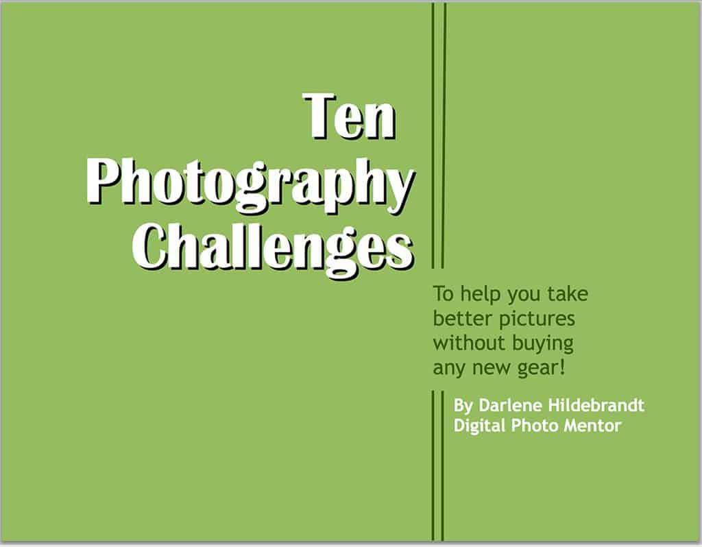
This is Darlene’s first ebook cover.
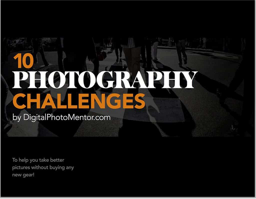
And here’s Darlene’s new ebook cover.
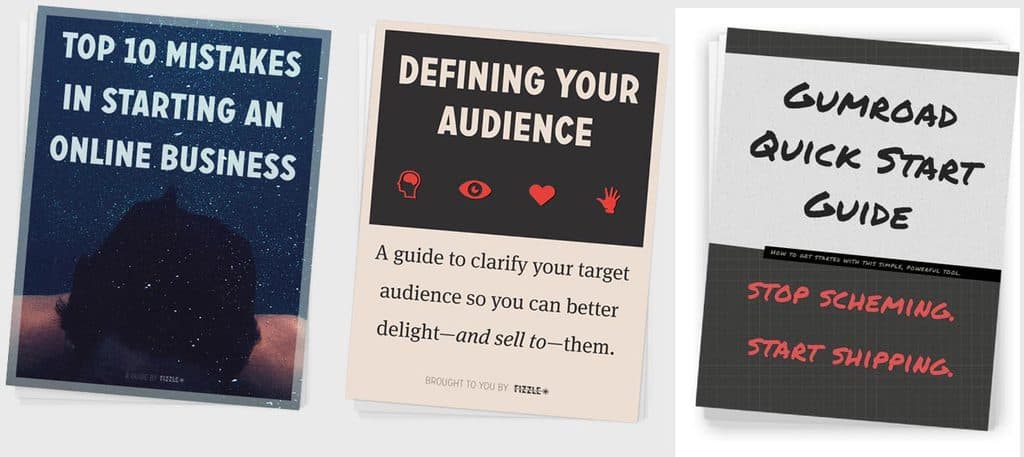
Here’s the covers of each of our business guides right now.
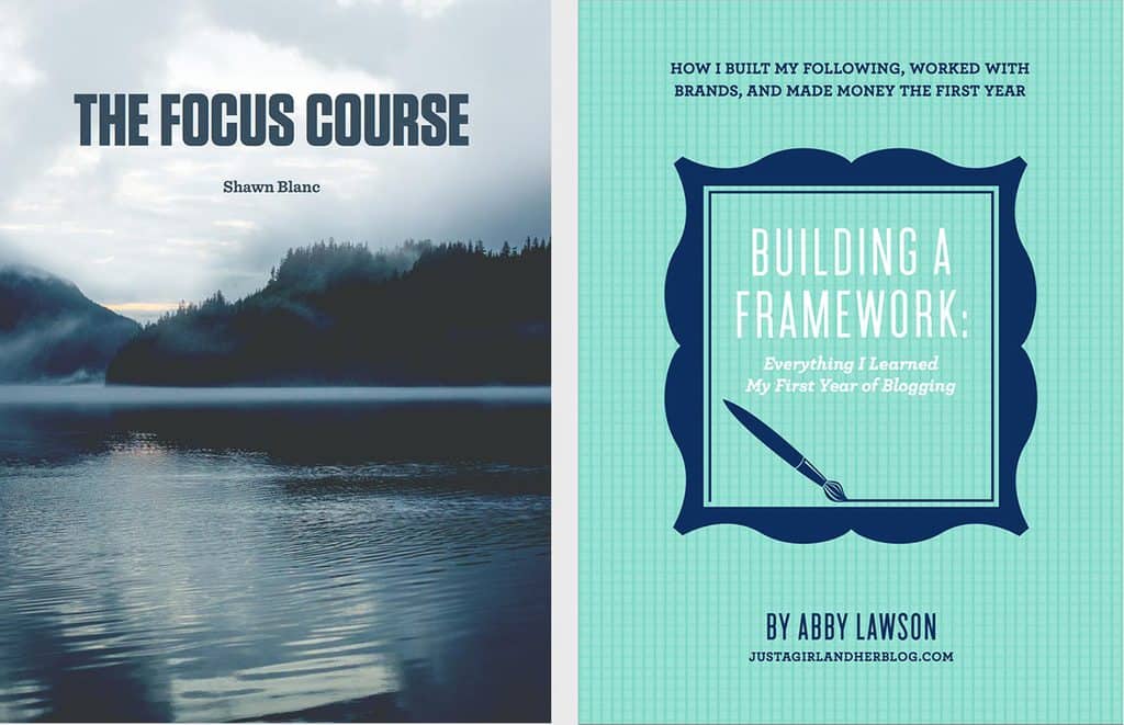
Shawn Blanc’s Focus Course and Abby Lawson’s Building a Framework.
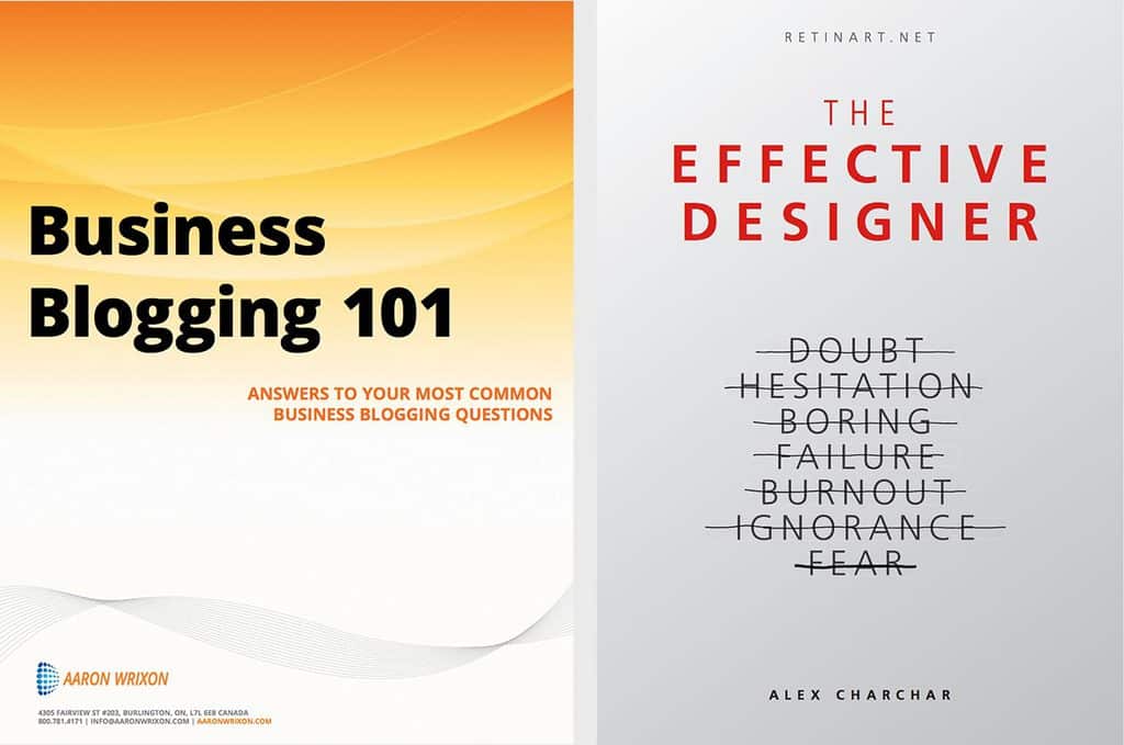
Aaron Wrixon’s Business Blogging 101 and Alex Charchar’s The Effective Designer.
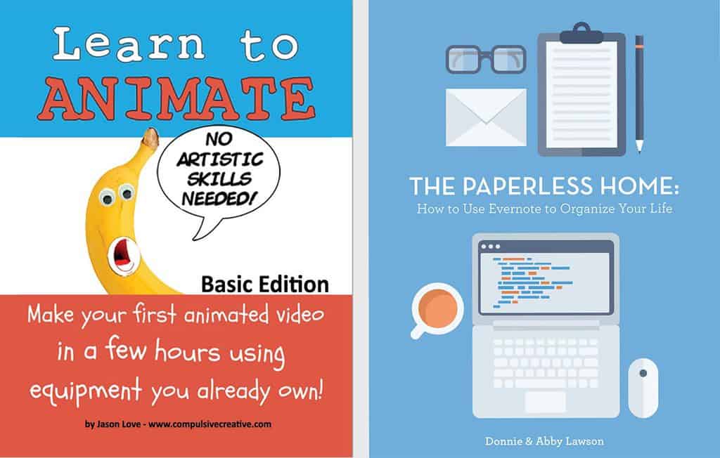
Jason Love’s Learn to Animate and Donny Lawson’s The Paperless Home
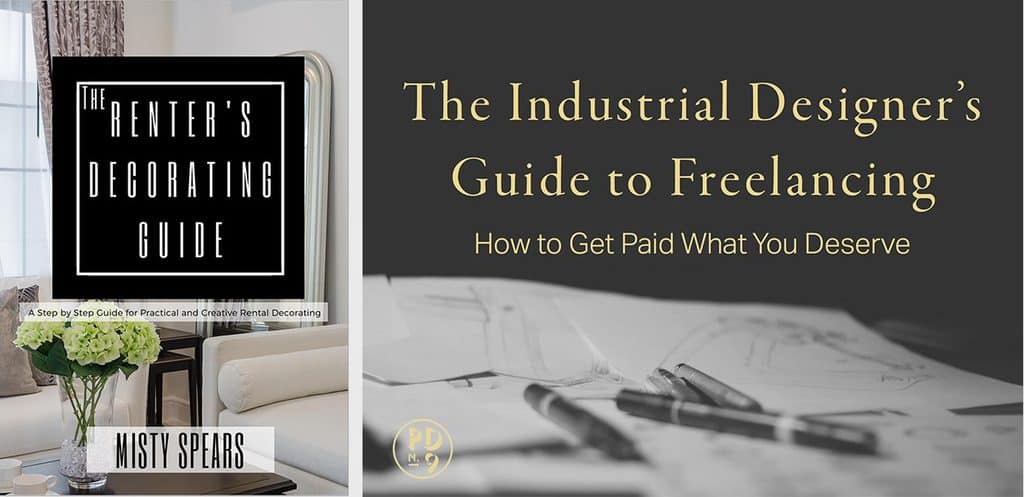
Misty Spears’ Renters Decorating Guide and Will Gibbons’ Industrial Designers Guide to Freelancing
2. Chapter/section page
Each chapter (or section) of your book can feel like another enticing excursion if you have a great chapter page.
Think about it like watching a TV series on Netflix. What can you show them that’s going to get them into that next episode?
Note: design plays a role in arousing the reader’s interest, for sure, but it also has a great deal to do with what you call the chapter, what the topic is. Remember that and get in the headspace that each chapter is a new conversion experience.
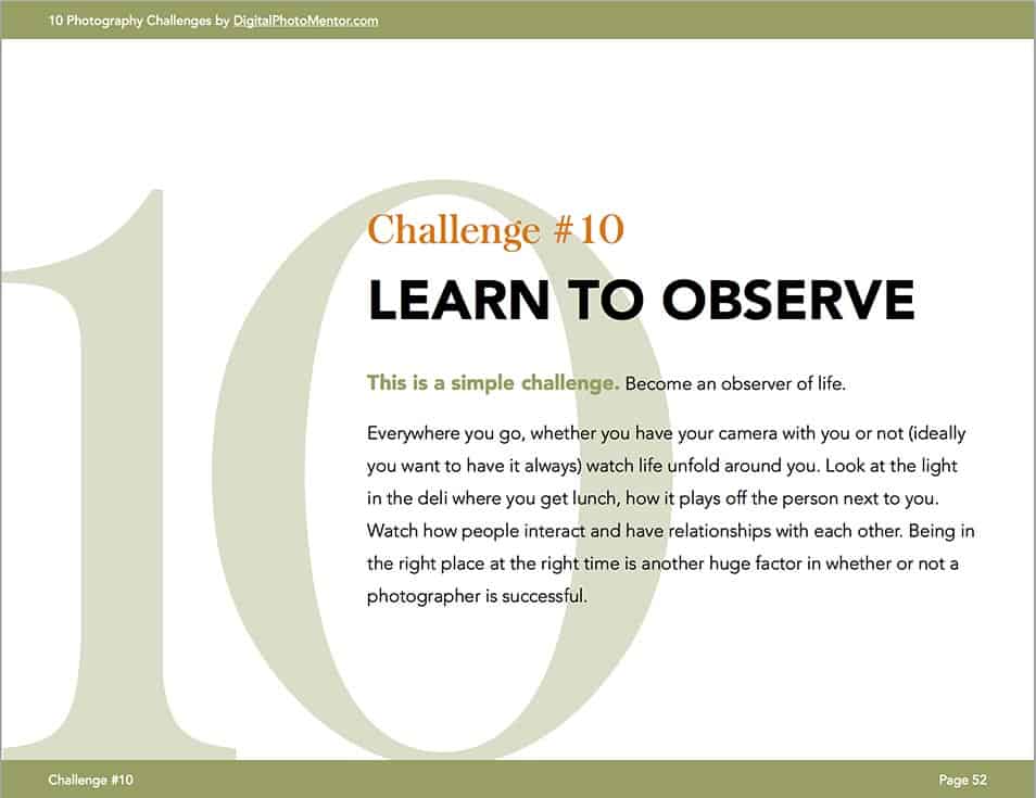
This is Darlene’s chapter page. I like that it includes the first paragraph of the chapter. Very readable, don’t you think? One idea: use less text and make the font size bigger.
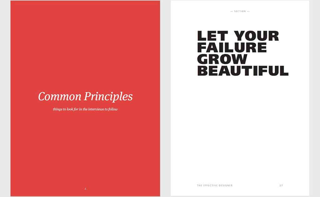
Here’s a couple really simple section pages. One from our audience guide, another from Alex Charchar’s The Effective Designer. Maybe too simple, but it gets the job done.
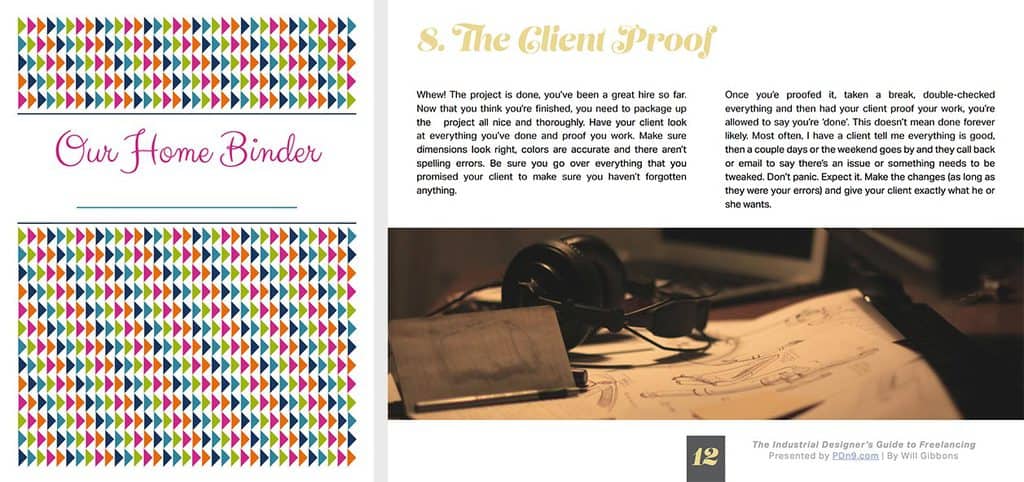
Here’s the section pages for Abby Lawson’s ebook and Will Gibbons’ guide.

Here’s a beautiful section page from Shawn Blanc’s Focus Course
3. Wrap up or “key takeaways” page
This is something I don’t see many people doing. And they should. It makes me as the reader feel like I’m getting it, like your book is making me feel smart… not dumb.
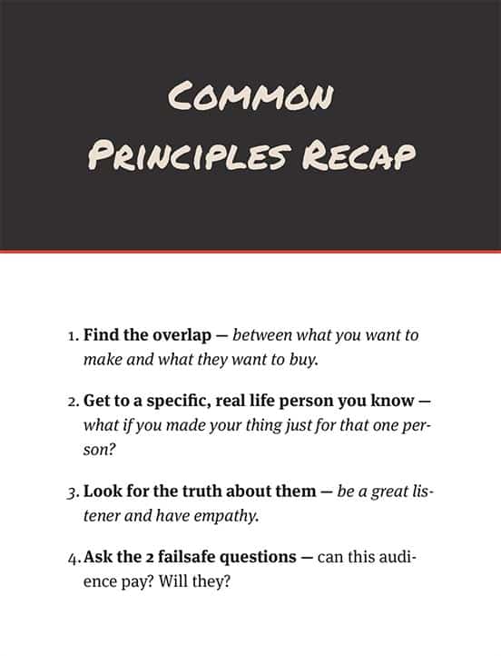
Takeaway page from our guide to defining your audience. Truth is, I didn’t have one of these in there. I just added it right now.
4. Quote image page
Like ol’ Willy Churchill said above, quotes are the shit. Here’s how I’m using these in our top 10 mistakes in online business guide.
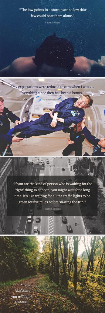
Some of our quote pages from the very visual top 10 mistakes guide.
5. Call to action page
Here are some examples of how you can use a part- or full-page of your book to call the reader’s attention to an action they can take (either because you want them to or because it’s the right next step in their learning journey. Ideally it would be both.)
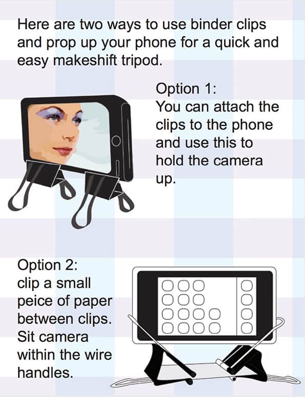
I love how Jason Love uses these large images to show exactly how to do something (instead of just using words). From his Learn to Animate ebook.
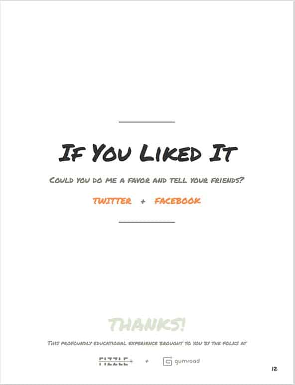
Here’s the simple call to action page at the end of our Gumroad guide.
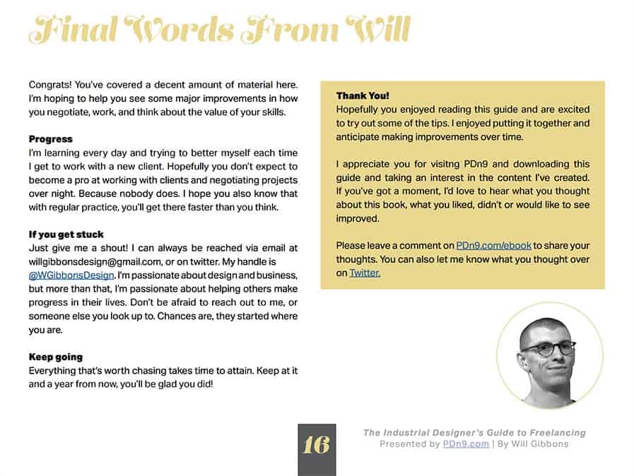
And here’s a conversational page sharing some next steps at the end of Will Gibbons’ Industrial Designers Guide to Freelancing.
6. Tweetable quote page
Want your reader to share your ebook with their network? Ask them to. You can make a specific quote a “click to tweet” link or you can simply ask them to share about your ebook.
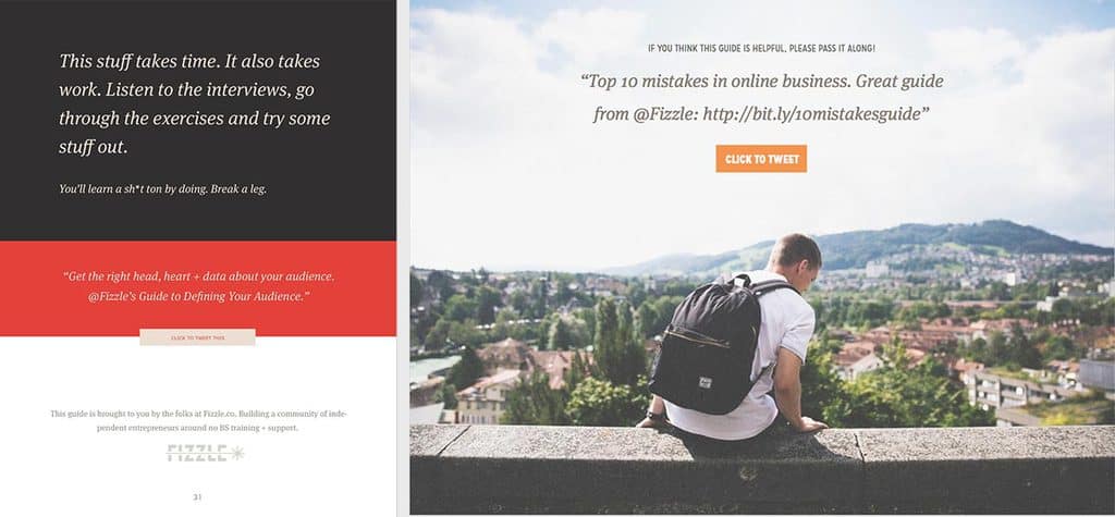
The final page of our Audience and 10 Mistakes guides. Both sharing a quote and presenting a button to click to tweet the quote.
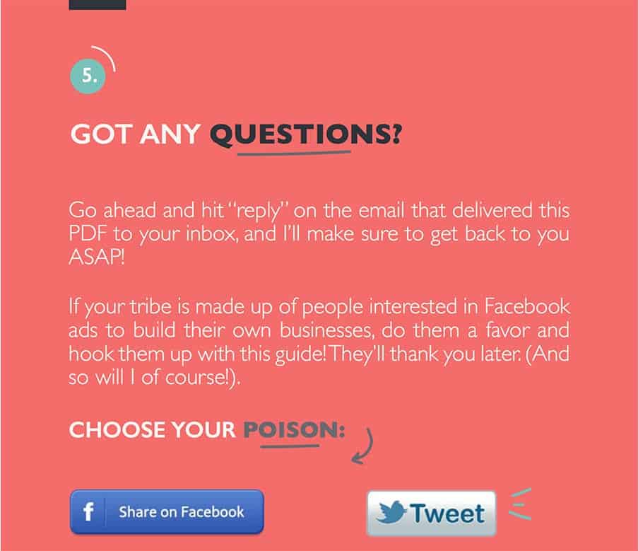
Here’s how Claire Pelletreau asks her readers to share her List Building with Facebook Ads ebook.
7. Question, definition or statement page
Why not call out an important term on it’s own page with big text and plenty of whitespace? Or make a statement or ask a question of your own? (We don’t have to rely on the quotes of dead people, you know.)
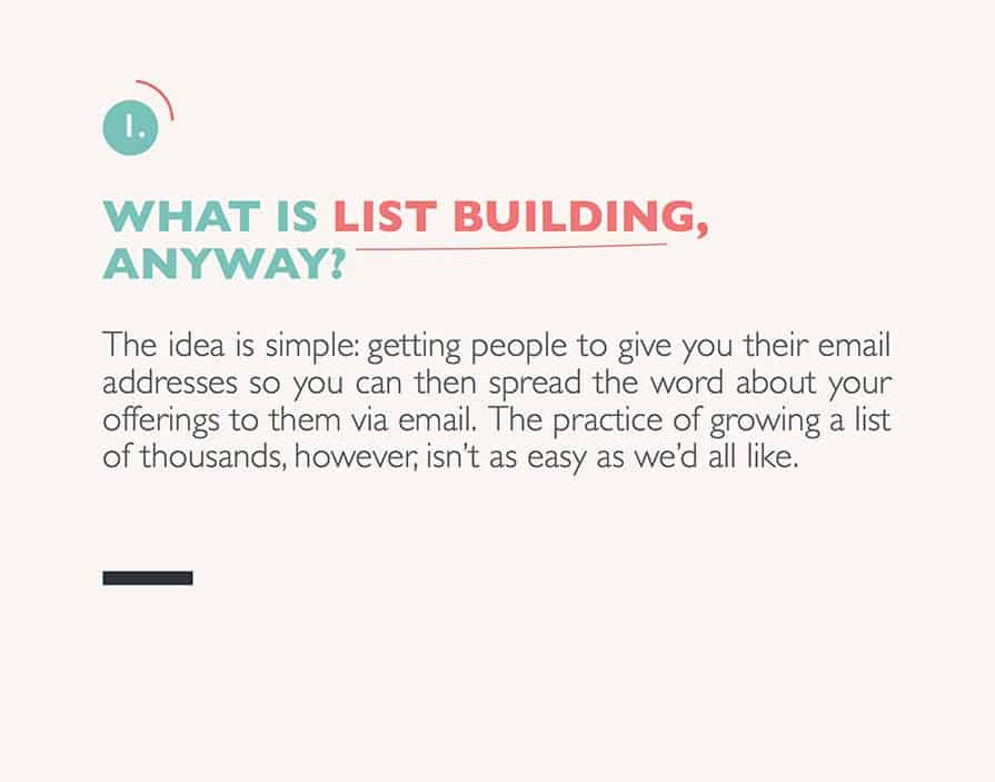
Claire does this nicely on this page where she defines list building.
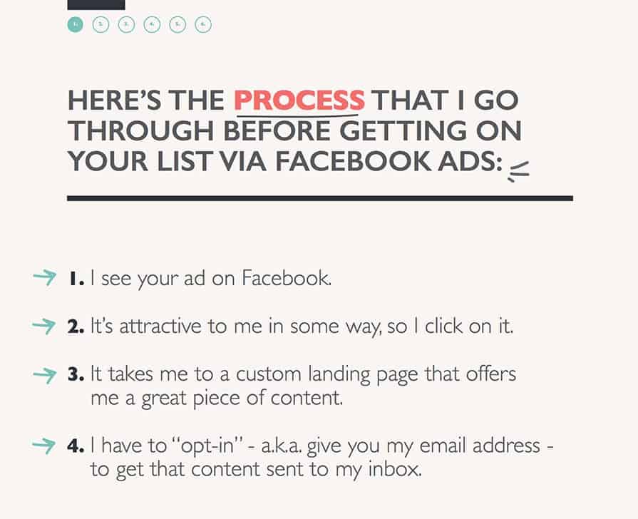
BTW, I had to share this as an awesome example of breaking up the flow of text with a list. And also notice that breadcrumb nav in the upper left. Really great idea to help a reader know where she is in the book.
8. Data, graph, statistic or graphic page
Graphs and statistics can bring a nice, “researchy” feel to your ebook. Show us you’re informed not just by your ideas but also by some real research out there. Added bonus: they break up that flow of text and, if done nice and understandable, can a reader understand your ideas better.
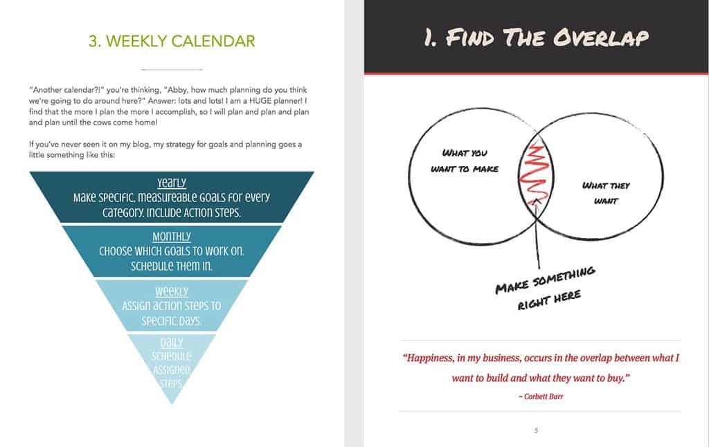
Graphic pages from Abby Lawson’s Simplify book and our Audience guide. (The latter was made directly within iBooks Author.) Graphics like this work a charm to communicate an idea visually.
9 + 10 Worksheet page and Checklist page
Give your reader some actions to take. Take all that theory, all those words, and condense them down to a sharp point in the form of an action list or worksheet.
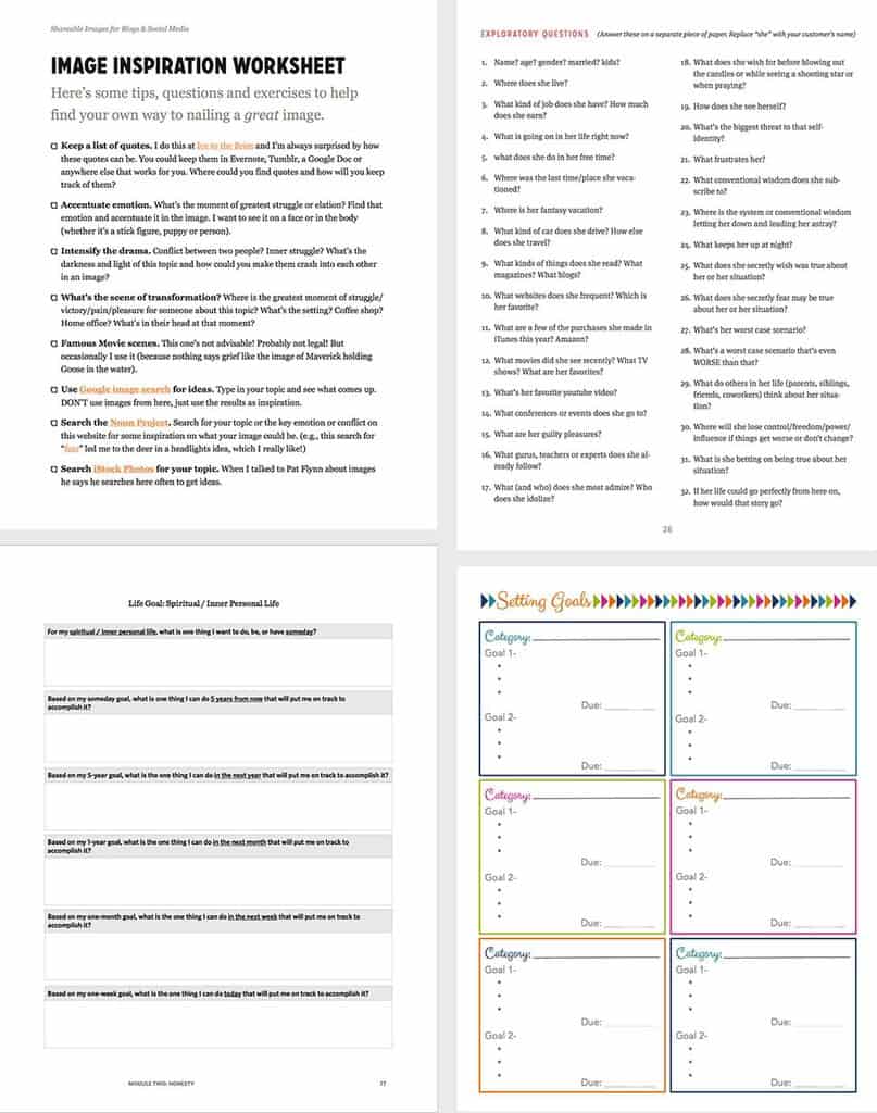
Here’s worksheets from our audience guide (top 2), Shawn Blanc (bottom left) and Abby Lawson (bottom right).
How to write a quick ebook
So there are 10 page types you can include in your ebook. If you made one of each of those page types, do you think you could add a page or two of text in between each to fill in the gaps and help a reader learn something badass?
I think you can. And you’d be well ahead of those folks out there still fiddling with colors or wondering if they should hire a designer for their ebook.
A guideless masterclass in ebook design
I’ve been a designer for a long time. I come by it honestly; self taught, no lessons. Everything that I’ve shared here is just stuff that I’ve picked up over the past 8 years.
And yet, that picking up of stuff has led me to be the designer of some of the biggest blogs on the web. I’m well known for it, people respect me for it, and I learned it all by simply paying attention to the experience I wanted to make.
Here’s the #1 thing you could do to learn how to design a badass ebook: go download a bunch of ebooks, one at a time, and keep note of your experience with each. Actually try to read them. Find some on topics you’re actually interested in and pay attention to what it feels like to try to learn something.
What did you feel when you saw a wall full of text? Did you read through any of them? Which was the easiest to read through? Why? Which one was your favorite? Why? Which one had the worst experience? Why?
Write down your notes about each. Go through maybe 10-20; you’ll probably know when you’re ready to stop.
This will be your own personal masterclass in what you want your book to be like (and what you don’t want it to be like).
Don’t go throw together an ebook and hope for the best. You’ll create a pointless one and done experience for your reader with you.
Instead, experience what it’s like to download an ebook and open it up. Experience the hope that it’ll be great, easy to get through, informative, the answer to so many questions. Experience being let down terribly. And commit yourself to doing what you can to build an experience that will actually matter to your readers.
If you want a guided masterclass in design, I have a course on it. I created the C.R.A.F.T. process for making websites, and it translates nicely to ebooks.
A big list of design tips
Before I go, here’s a big list of design tips for you that you can apply to your ebook. If you have a question about any of them ask about it in the comments below.
- Put your logo on the cover of the book. Don’t make it big. Make it tasteful.
- Don’t use more than 2 fonts. Limit yourself. Your work will be more understandable.
- Callout quotes in big text if it’s a short enough quote.
- Use images liberally in your ebook, but don’t choose cheezy images. Here’s 50+ places to find good stock images.
- Can you divide your book into a few sections and use an icon to represent each section? Here’s some places to find icons.
- Start your book with exactly what the reader’s going to walk away with at the end. Then fulfill that promise.
- Anticipate their boredom. I said it above. I’m saying it again.
- Conclude your book with a next step for them. Don’t leave them hanging if they want more. Anticipate what they want next on their learning journey.
- Why not let them email you directly? Add your email to the end of the book to clarify any questions. After all, they read your damn book! You can always take it out later.
- You have a landing page for your book, right? Click on each of our business guides to see how we do our landing pages.
- Watch someone read your book. Literally. Stand behind them and watch them read your book. You’ll be amazed how much you learn. (You will owe this person cake.)
- Highlight what’s on the next page when I get to the end of a section. I can always feel when a point is starting to wrap up, and I may just put your book down and never pick it back up.
- I listed a lot of page templates above. They can all look similar, even though they do different things. Don’t get too crazy. You want each page to feel like it’s a part of the same book.
- Use paragraph styles in the application you’re using to create your book. If you’re a pro, change those styles to be exactly how you want them.
- Design supports your content — not the other way around. Everyone knows that. This is just another reminder.
- Please notice your line length (that’s how wide your lines go across the page). Nobody likes reading a line for 22 inches across their whole monitor.
- Use bold and italic a few times on each page. It helps the eye move down the page in chunks. But don’t overuse them.
- Do you know what whitespace is? It’s emptiness. Space. Room to breathe. How do you feel when you’re locked in a closet? How do you feel in an empty arena? How do you think your words feel all cramped into their little boxes with no space to breathe? FREEEEEDOOOOOOOOMMMMMM!
Compare and select a package
starter
Standard
Covers all your required filings with the state, 100% accuracy guaranteed.
+ state fees
-
Standard 7-10 day processing*We prepare and submit your filing to the state within 7 to 10 business days.
-
100% accuracy guaranteeWe’ll file your paperwork quickly and accurately. If there are errors, our team will make it right.
-
Domain, email, and website 30-day special offer included†Secure a business domain name and email and use the AI website builder to quickly and easily create a custom, professional website.
pro
Most Popular
Fastest processing with ongoing state compliance and EIN set up.
+ state fees | renews at $199/yr
-
Fastest 1-day processing*We prepare and submit your filing to the state within 1 business day.
-
100% accuracy guaranteeWe’ll file your paperwork quickly and accurately. If there are errors, our team will make it right.
-
Ongoing filing compliance (state-required)This covers state-required annual report filings and up to 2 amendments per year to maintain LLC protections and avoid fines (a $199 value).
-
Employer ID Number (EIN)Our team will secure your EIN from the IRS so you can open a bank account, hire employees, and pay taxes.
-
Operating agreement templateThis essential document is like the constitution for your business, setting the rules that will govern how you operate and run your LLC.
-
Business logo builderCreate your own unique and professional logo in seconds with the easy-to-use logo generator.
-
Domain, email, and website 30-day special offer included†Secure a business domain name and email and use the AI website builder to quickly and easily create a custom, professional website.
premium
Best Value
Advanced compliance and registered agent services to meet all requirements.
+ state fees | renews at $399/yr
-
Fastest 1-day processing*We prepare and submit your filing to the state within 1 business day.
-
100% accuracy guaranteeWe’ll file your paperwork quickly and accurately. If there are errors, our team will make it right.
-
Ongoing filing compliance (state-required)This covers state-required annual report filings and up to 2 amendments per year to maintain LLC protections and avoid fines (a $199 value).
-
Employer ID Number (EIN)Our team will secure your EIN from the IRS so you can open a bank account, hire employees, and pay taxes.
-
Operating agreement templateThis essential document is like the constitution for your business, setting the rules that will govern how you operate and run your LLC.
-
Business logo builderCreate your own unique and professional logo in seconds with the easy-to-use logo generator.
-
Registered agent service (state-required)Meet the state requirement to appoint a registered agent that will be available during all business hours (a $199/yr value).
-
Advanced Compliance Coverage (state-required)Get 24/7 monitoring, unlimited amendment filings, a good standing certificate, and money-back guarantee on any fees for missed events.
-
Business documents libraryIncludes over 25 business document templates, including liability waivers, employment agreements, contracts, and more.
-
Business advisor consultationGet a one-on-one consultation to ensure you have the services you need to confidently start and grow your business.
-
Domain, email, and website 30-day special offer included†Secure a business domain name and email and use the AI website builder to quickly and easily create a custom, professional website.
*Processing times are based on receiving complete information. ZenBusiness processing times do not include Secretary of State processing times, which can vary.
† SPECIAL OFFERS – Each package includes special service offers. After the initial period ends, these services automatically renew at their regular price. You can cancel these services at any time before or after the introductory period ends.
Ready to Start Your Business?
