Dive into the dynamic world of logo animation, where creativity knows no bounds, and learn how to bring your brand to life with an interactive logo design that not only captivates but also inspires and engages your audience in a whole new way.
Starts at $0 + state fees and only takes 5-10 minutes
Last Updated: July 9, 2025
As you all know, a logo is the heart and soul of a brand. It’s responsible for establishing a communication with your audience and visualizing your company’s values in an understandable way.
When it comes to drawing a logo, you’re the boss. You can choose from a big variety of techniques for designing a corporate emblem. While each method has its peculiarities, all of them involve working with colors, fonts, geometry, and patterns. If combined in a smart way, these elements can result in a beautiful, effective logo that will become the backbone of your business.
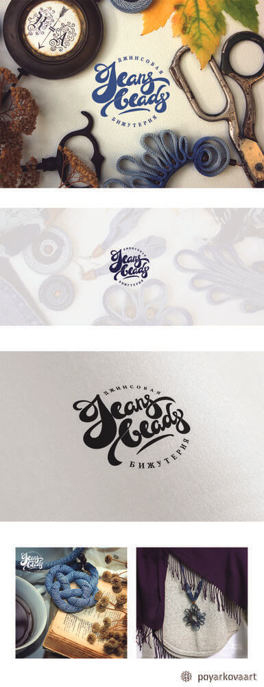
In this article, we’ll talk about drawing a lettering logos. An emblem created by using the lettering techniques is a true design masterpiece that will never remain unnoticed.
Lettering (written logo) is the art of inscribing with letters. It’s a great way to make your logo dynamic and “breathing.”
It’s not surprising that lettering is an extremely popular graphic design technique. It’s safe to say, lettering is at its peak nowadays. Small shops, boutiques, bakeries, family cafés, and art studios are choosing lettering to make memorable and unique logos. For small businesses, lettering is a truly versatile solution that can help craft a one-of-a-kind brand identity and create a welcoming atmosphere. Lettering is used in menus, on chalk boards, and, of course, in logo design. Have we managed to stir up your interest? Take a look at the amazing lettering designs we’ve found on the web.
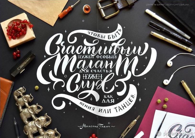


Plainly speaking, a lettering logo is a manually created emblem. It’s a graphical composition that includes hand-written letters, symbols, signs, and other decorative elements. Lettering holds a special place in logo design. It has the power to breathe life into any logo and marketing collaterals. What’s more, lettering is a very flexible technique that can be applied to both individual letters and whole sentences. Also, lettering pairs well with other design methods. You can put your inscription inside a circle, square, or other geometric shape. Plus, you can work other symbols and signs into your lettering logo, making it look even more impressive. If you like experimentation, lettering is the best design technique to apply your creative powers! We won’t be exaggerating by saying that lettering logos stand out from other designs. Lovingly written with hand, each line has its own character and looks “alive.” As a result, you get a one-of-a-kind emblem. Just imagine: there is no other logo like yours in the whole wide world! That’s what every business wants, doesn’t it?
Here are a few more lettering logos made by talented designers:
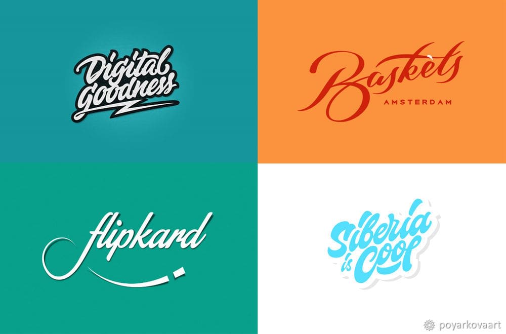
We bet you can’t wait to create a lettering logo of your own! In this article, we’ll show you how to draw a custom lettering logo. Feeling challenged? The task of creating a logo with your own hands shouldn’t scary you. We’ll be there every step of the way!
In this lesson, I’ll be drawing a logo for Jeans Beads, a jeans accessories brand.
While this is one of the advanced-level tutorials, there is nothing to worry about. We’ve made our best to provide every step with detailed and easy explanations. The only thing you’ll need is the basic knowledge of Adobe Photoshop, Adobe Illustrator, and Corel Draw.
Psychology of fonts. When it comes to creating a lettering logo, typography is the most powerful solution in the toolbox of a professional designer. The font you choose for your emblem can have a major impact on how your brand is perceived by the public. With that said, you need to have a good understanding of different fonts and their graphic possibilities. While a lettering emblem incorporates a lot of creative freedom, there are a few golden rules that ensure a smart result:
These are just some of the many rules every designer must follow religiously. Typography is a multi-layered and complicated discipline that features lots of psychological tricks. If you want to know more about fonts and their secrets, we recommend that you explore this topic further by reading the books by Y. Gordon, R. Brinhurst, D. Felici, and E. Spiekermann.
Meaning behind a brand. Inspiration and visual journey. Along with having a beautiful, easy-to-perceive image, a logo must bear a meaning, both direct and hidden. The secret to creating an up-to-the-point emblem is to look into the personality of a company or individual the emblem is meant for. If you’re a designer, be sure to meet with your customer and ask them about them and their business. Plus, you need to make sure you understand what kind of a logo your customer wants. Does the customer have a clear idea of their future logo? Or do they rely on your creative powers? Discuss every detail, from colors to geometry to patterns. After all, asking questions is a part of your job.
After obtaining the necessary information, you need to analyze and structure it. Write down a few keywords that characterize the company and its owner. You can use nouns, adjectives, verbs, and whatever words that help you get a better understanding of the brand personality.
Making a list of keywords for Jeans Beads was an enjoyable experience. I drew inspiration from the brand’s beautiful accessories and decorations. This is what I came up with: artistic, unique, jeans, nature, warm, classical, simple, joyful, hand-made, welcoming.
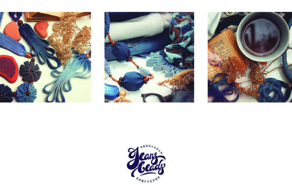
Of course, there are no two different lists of keywords, and yours can be completely different from mine.
Here is a useful exercise for you. Take a close look at the keywords above and come up with a few associations. What things come to your mind when you hear the word “warm”? Or “nature”? The ability to visualize your feelings and emotions is a major skill that can be of great help to an aspiring designer. When working on a list of keywords, I look at the company’s products or think about its services and doodle everything that comes to my head. It’s a great way to stir up your creative energy. Plus, this will warm you up before getting down to the main stage of work, which is drawing a logo.
I’d like to share a small trick with you. To capture the visual style of the future logo, I create a so-called “mood board.” When creating a mood board for the Jeans Beads brand, I was using the vintage font Script as an inspiration. Its characteristics will guide me in drawing the logo. Script is a delicate, calligraphic font. It features smooth line made with a brush or feather. I’d describe it as traditional, romantic, subtle, and soft. It’s a perfect match for my future design.
Now to the mood board. I’ve picked the best lettering logos belonging to other companies. I recommend placing at least 15 emblems on your mood board. You can print out your collection or store it on your computer. With a good mood board, you’ll be able to track the latest logo design trends in terms of colors, geometric forms, etc. Here are the artworks that caught my eye:

What do you think about the idea with a mood board? What inspiration methods are your favorite? Be sure to share your time-tested tricks in the comments!
Be careful with popular trends. It’s a slippery ground. Such trends tend to pass away very fast, depreciating your logo overnight. Instead of trying to be trendy, it’s safer to choose design techniques based on your brand’s personality. Your uniqueness is something that will never go out of style.
Now it’s time for a well-deserved break. Give yourself 1 day to process and filter the information you’ve gathered. Your brain will use this time to come up with fresh ideas. If you need a little more time, it’s absolutely OK. But don’t linger too long unless you want to lose touch with your creative self.
After a break, it’s time to make the first sketches of your future logo. Alongside with a few sheets of paper, you’ll need pencils, brush pens, feather pens with different tips, markers, crayons, and any graphic tools you prefer to draw with. The main thing is that you feel comfortable and confident as an artist. When it comes to sketching, experimenting is key. It’s not uncommon that a drawing looks boring in pencil but starts to shine when drawn with a feather pen. As for me, I was making my sketches with a round brush and water colors. Oh the sheets of paper I’ve spoilt! Here are the resulting sketches:
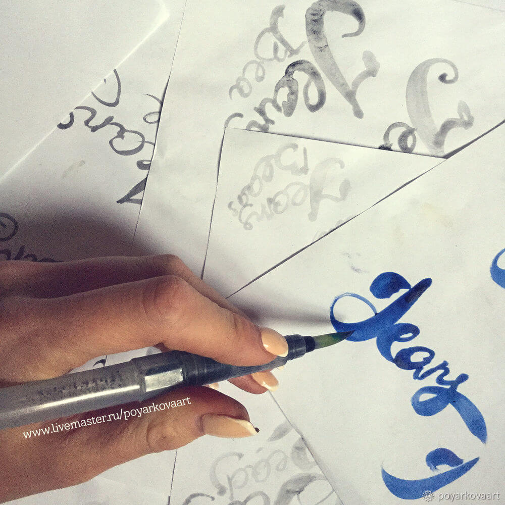
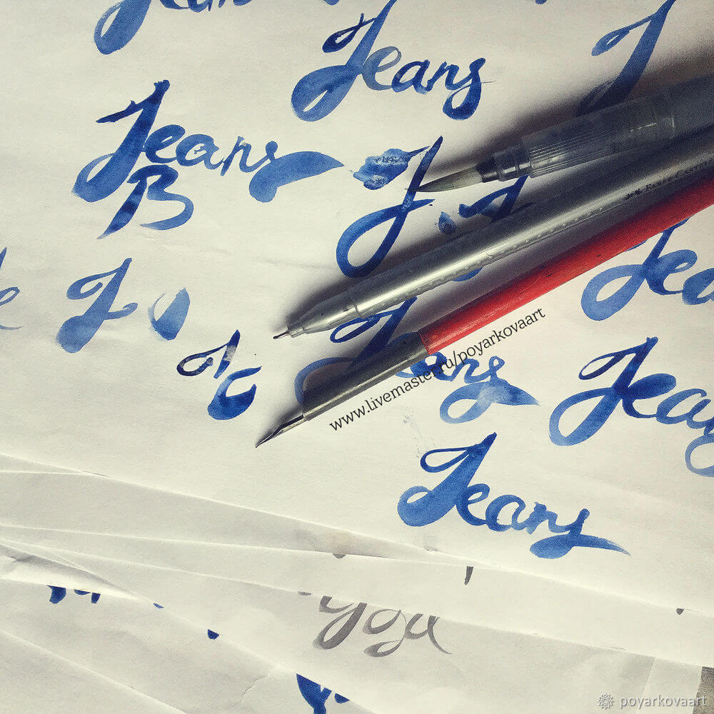
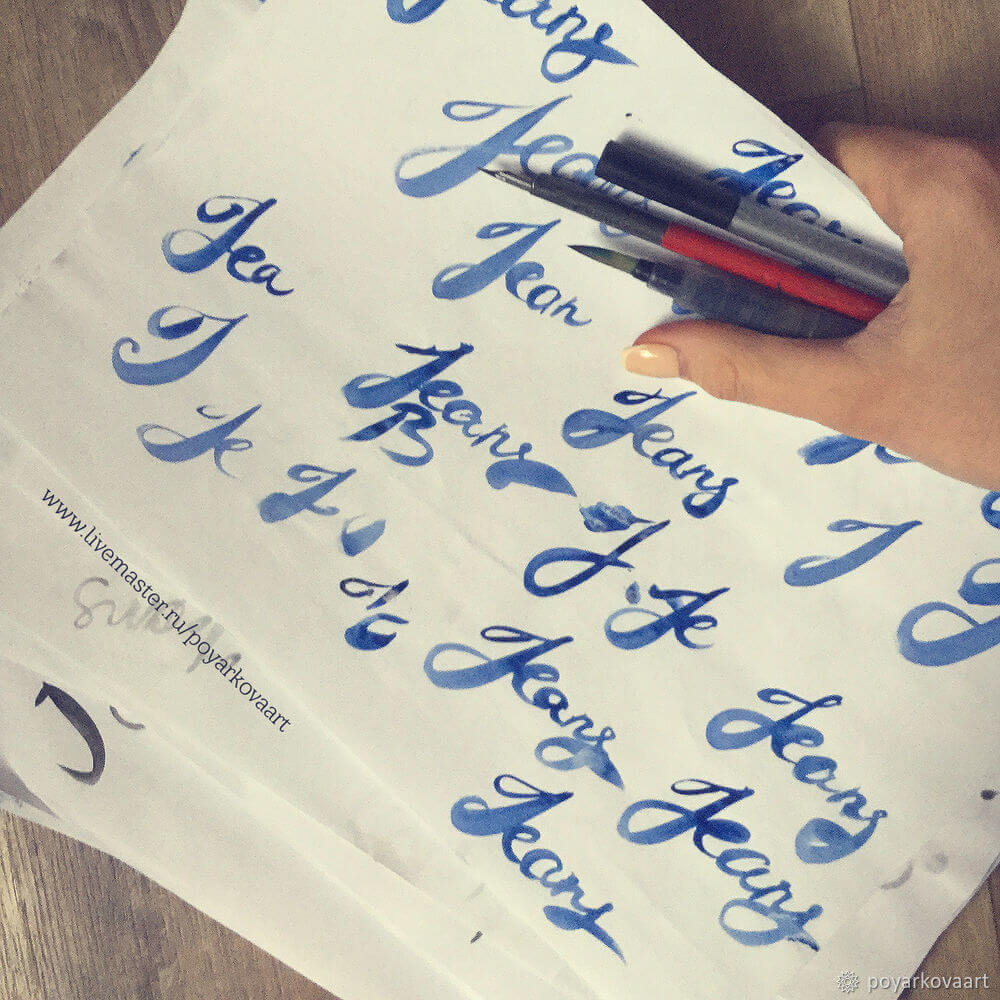
My tip is to start drawing the keywords associated with the brand. It’ll help you get in the groove. Once you feel your way, start adding new details, remove excessive elements, play around with the thickness of lines, combine lowercase and uppercase letters, and so on. I bet you’ll have lots of fun!
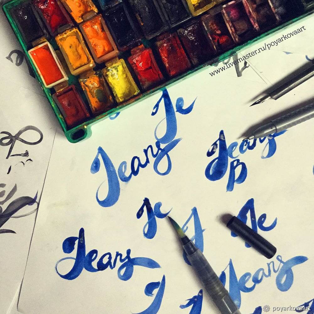
Now it’s time for another break. For a creative person, it’s important not to overstrain yourself. Otherwise, you risk losing interest in your artwork. Have a good night’s sleep and resume working on your sketches the following day.
When you feel like you’re out of ideas, browse through your sketches and pick the best samples.
As you can see, I’ve sketched separate words, letters, and even lines. What I mean to say is that you don’t need to draw an entire logo at once. You can start with minor parts and gradually work your way to a fully-fledged drawing.
Prepare that you’ll have to redraw your sketches over and over again. Even the best designers can’t get it right the first time. It’s important to remember that art is a continuous search. Moreover, it’s the searching that makes logo design so appealing and inspiring.
Take a critical look at your selected artworks. Are you fully satisfied with them? Do they need a few more finishing touches? Don’t be impatient to proceed to the next step. The better your sketches, the easier it will be to digitize your drawing. Here are the lines, letters, and words I’ll be converting into digital images:

Now I need to convert my sketches to digital images. I’ll be using Photoshop, Illustrator, and Corel Draw.
Erasing unnecessary elements in Photoshop.
1. I scan my sketches at 600 dpi.
2. I open the scanned image in Photoshop.
3. I need to erase all the unnecessary letters and words. (If you don’t have such, go directly to Step 9.) I use the Lasso tool to select the elements I don’t need.
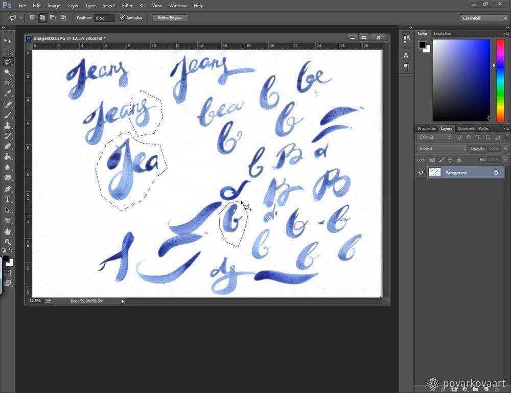
4. In the upper menu, I go to Sеlect — Inverse and then click Delete.
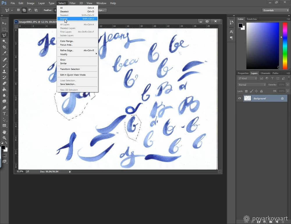
5. The unnecessary elements have been erased.
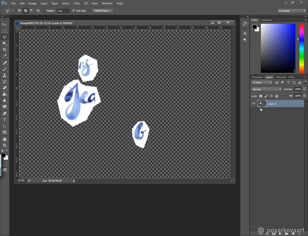
6. Now I need to add a new white layer. Why white? Because it makes ragged edges and other deficiencies stand out. In the upper menu, I select Layer — New layer.
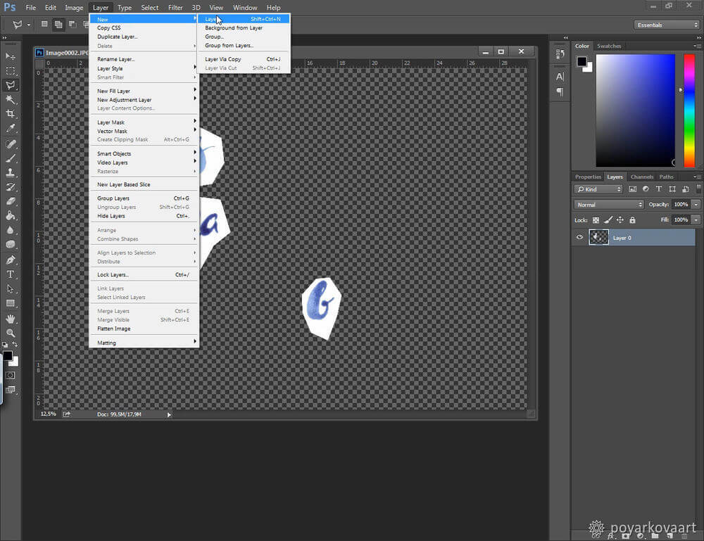
7. I want to fill the new layer with white color. I select white in the color scheme.
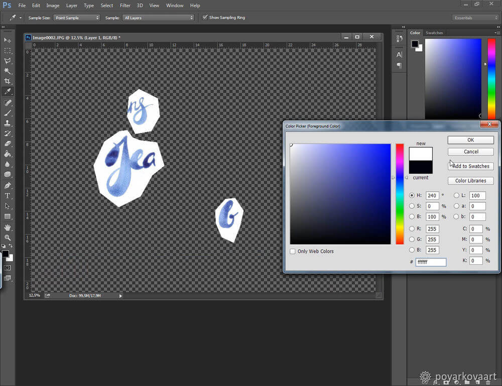
In the side panel, I select the Bucket icon and then click on the new layer. Now I have a new white layer.

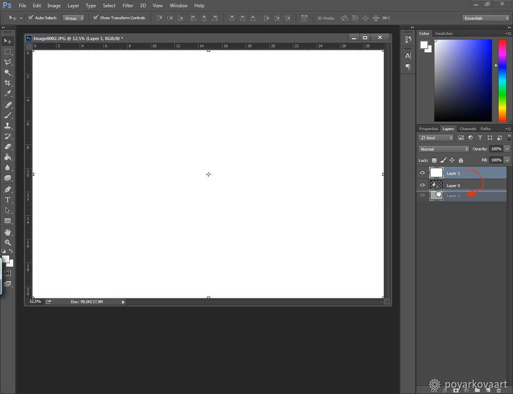
8. To put the letters on a white background, I simply shift the new layer under the letters.
9. I select the layer with the letters. I go to Image — Adjustments — Levels and adjust the levels of black and white until the inscription is seen clearly.
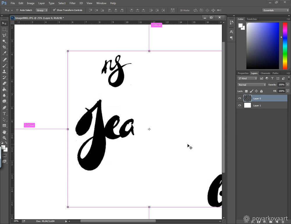
10. I zoom in the inscription and see jagged edges.
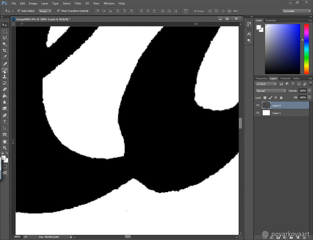
11. Now I need to smooth the jagged edges to make them look sharp and clear. I’m using a black round Brush to draw the missing elements and edges, the Eraser tool to remove the excessive parts, and the Selection tool to copy elements from one letter and add them to another one. You’ll easily find these tools in the tools panel.
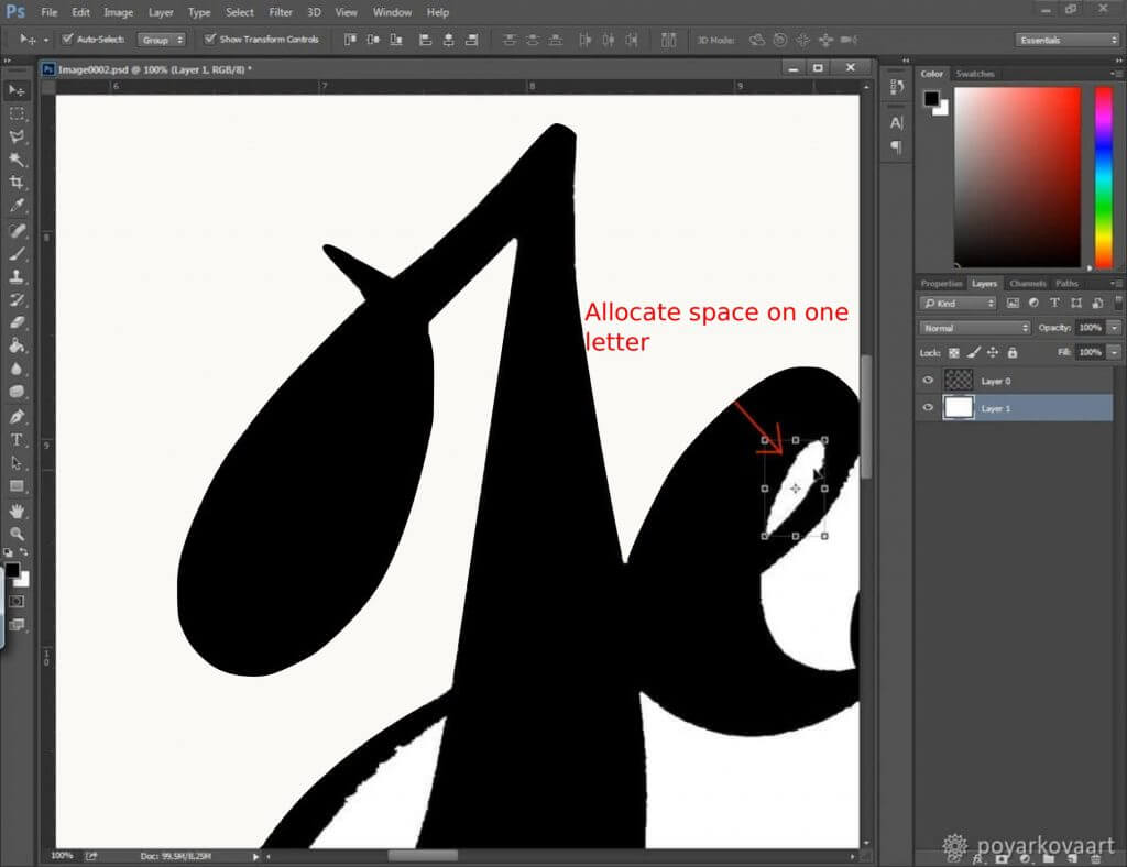
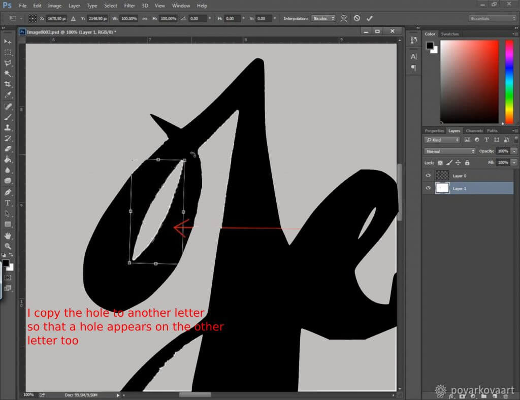
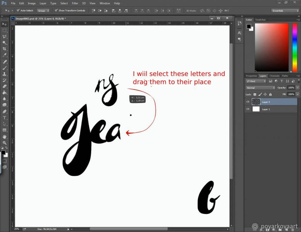
12. I arrange the letters into one word.
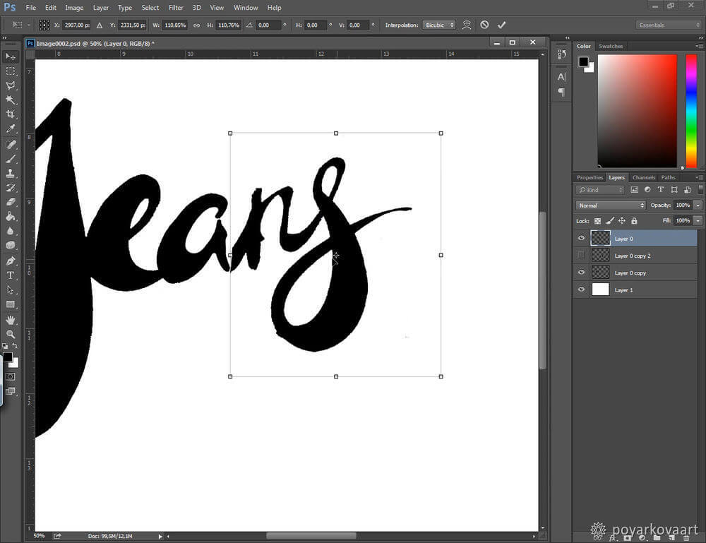

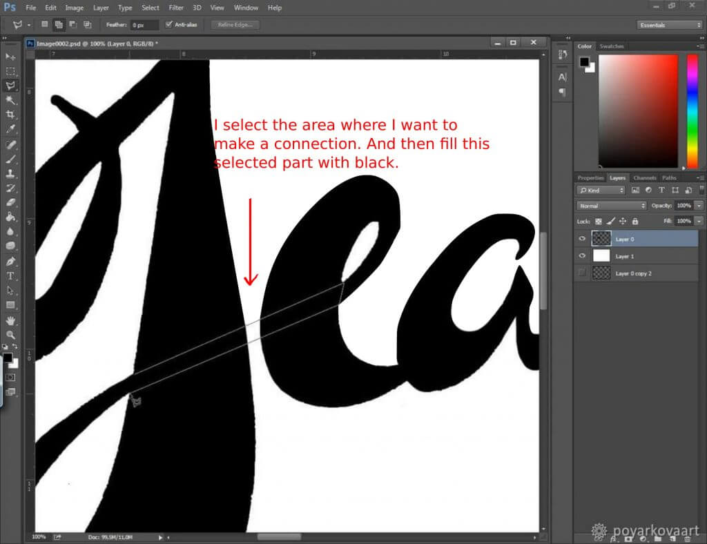
13. I rotate the letters, add new lines, and smooth the edges to create a clean composition. Since I’m copying and adding new elements, the number of layers is growing.
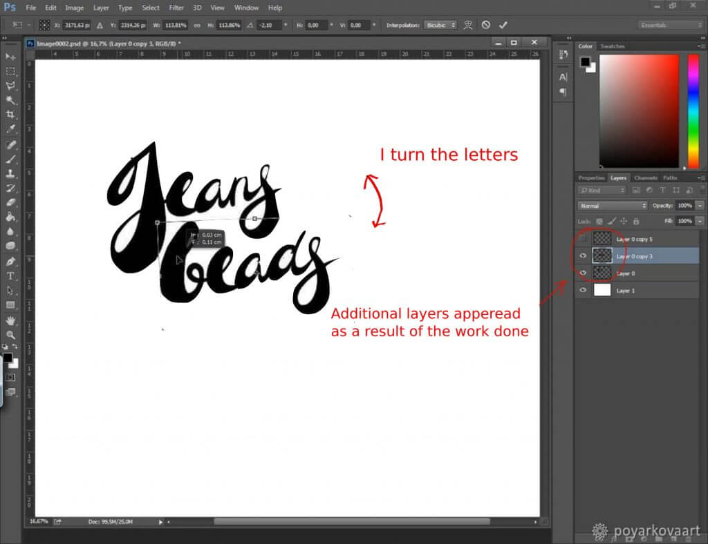
14. If you have new layers added to your canvas, you need to merge them into one layer. I select all the layers (except for the white one) and click on Layer — Merge Layers in the upper menu.
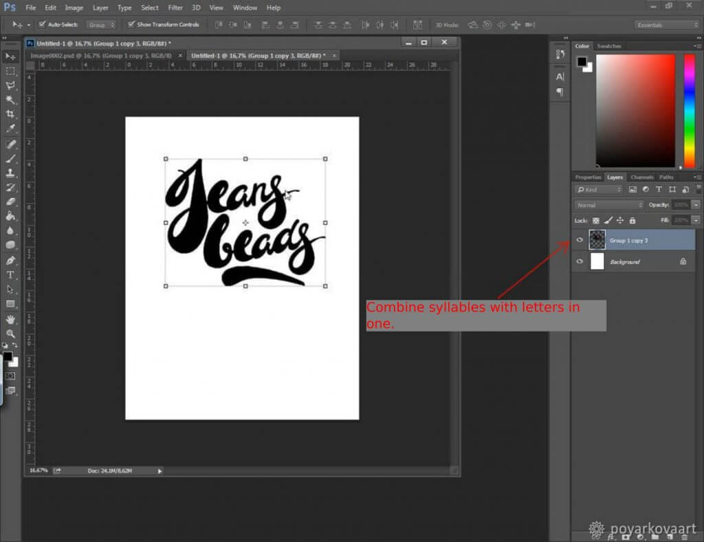
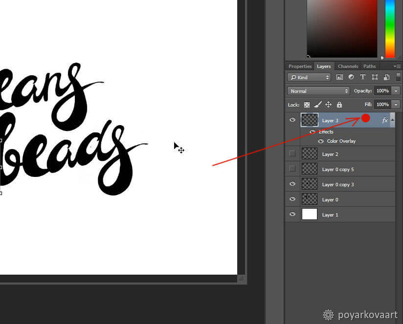
15. Once I’m happy with the result, I use a small trick. I overlay black color on my letters and decorative elements. To do that, I make a double click on the layer in the side panel (see the red dot in the image below).
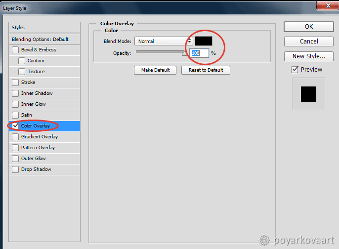
16. The Layer Style window appears. In the Color Overlay tab, I choose black color and set opacity at 100%. I click ОК.
17. Now that the inscription is overlaid with black color, I can see all the dots and other flaws that I didn’t notice before.
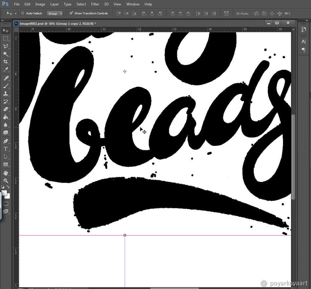
18. I remove the dots and smooth the edges.
19. Now I turn the logo upside down. This way, I can instantly see asymmetry and uneven letter spacing. I proceed with correcting the image.

20. I turn the logo in its initial position and click Save. Now we’re all set for converting our image to vector in Adobe Illustrator!
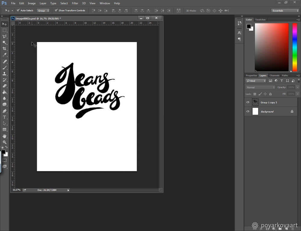
Tracing.
To make the logo look more realistic, I’m using the Live Trace tool.
1. I open the PSD logo file in Adobe Illustrator.
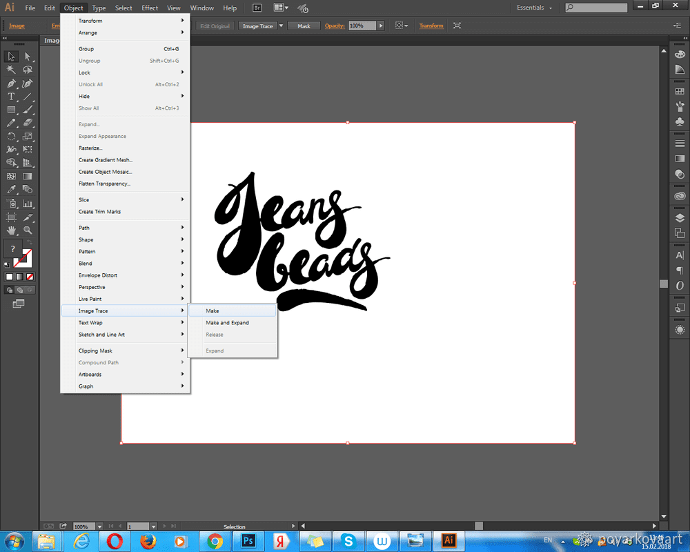
2. I select the logo and go to: Object — Image Trace — Make.
Doing this, I convert my logo from raster to vector. The reason why I need my logo in vector is that I can scale it without loss of quality.
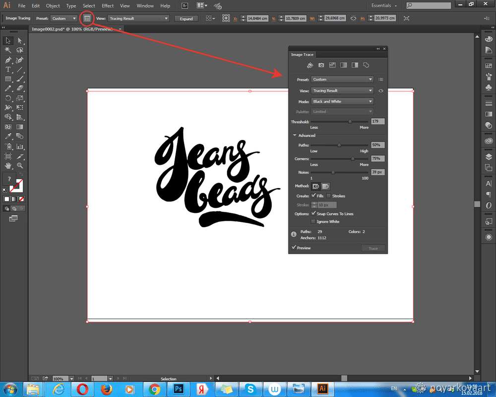
3. Now I’d like to play around with settings. In the upper panel, I click the Trace Panel icon and customize the settings.
4. Now I go to Object — Expand. In a new window, I check the Object option and click OK.
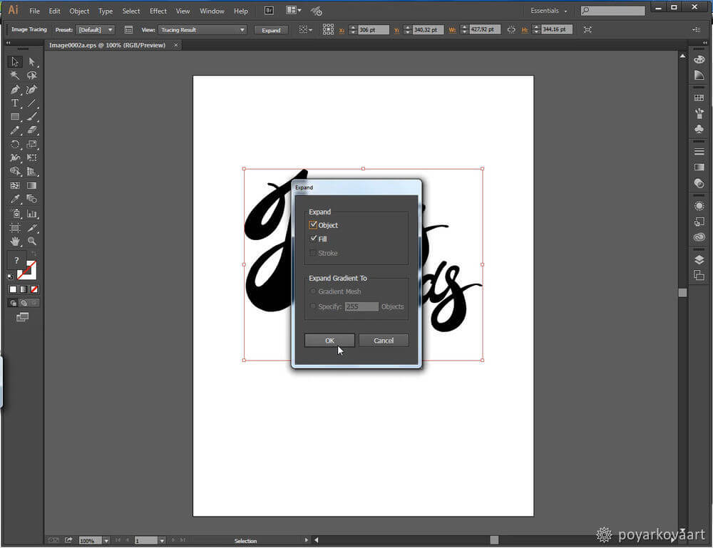
Here is what my logo looks like now.
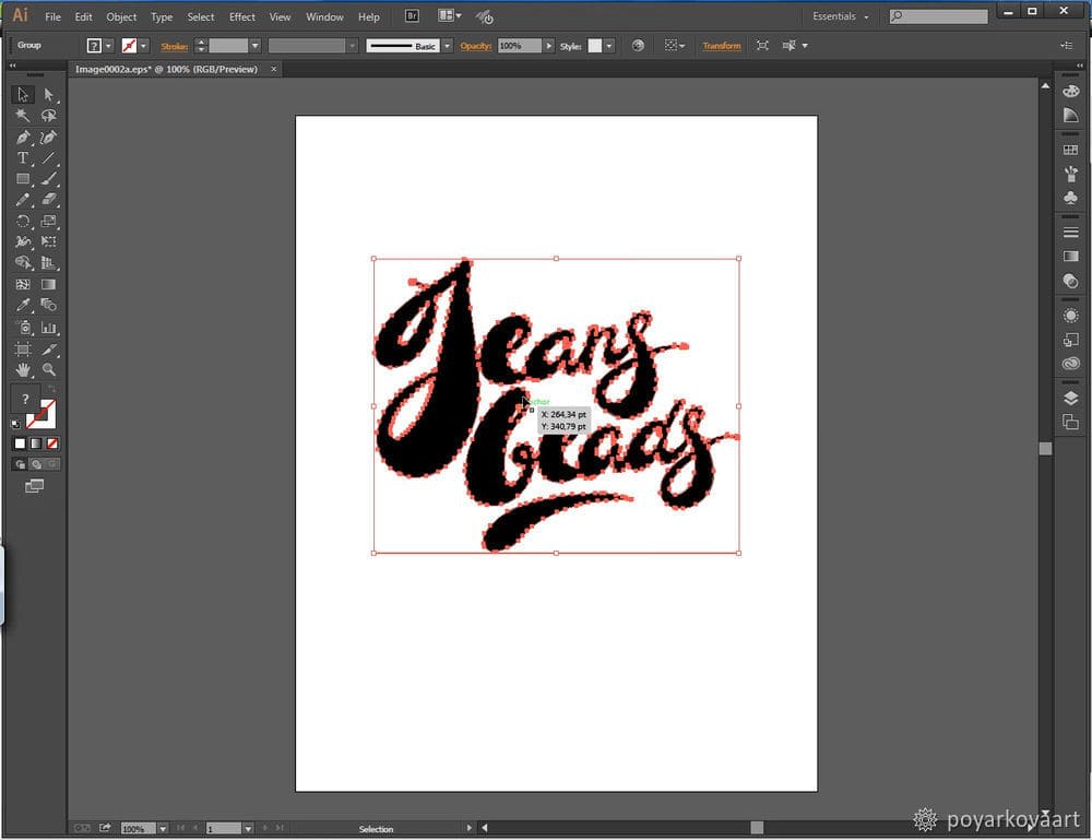
5. I save the logo in the EPS format to continue editing it in CorelDraw.
Theoretically, I could retouch the curves in Adobe Illustrator. My problem with Adobe Illustrator is that I find its big selection of tools a little confusing. For me, it’s easier to use the Bezier tool in CorelDraw.
1. I go to File — Import to import my EPS file to CorelDraw.
Working with guides and curves requires some practice. However, the Bezier tool in CorelDraw allows to use fewer points. As a result, you get a clean and beautiful emblem with less effort.
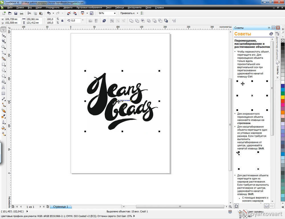
2. I’ll be using the following tools:
1. Bezier tool.
2. Shape tool (F10).
3. Pen Tool (P).
I’ll be using the Bezier and Pen tools to adjust and smooth the curves of my logo.

3. I’ll be using guides to adjust the height of the letters and other elements. To add the guides, I simply draw them from the ruler above. You can move and rotate your guides as you like. When moving the guide, remember to keep the Shift button pressed.
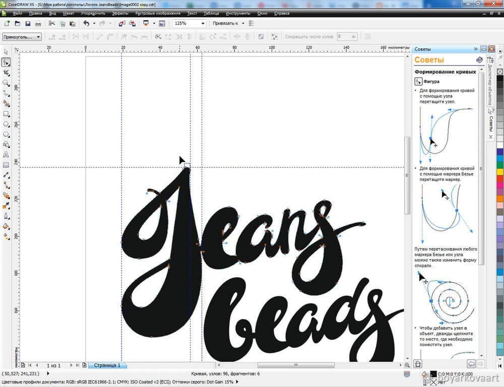
4. I continue adding the final touches to the logo. I erase excessive lines and draw new scrolls to bring the letters to perfection.
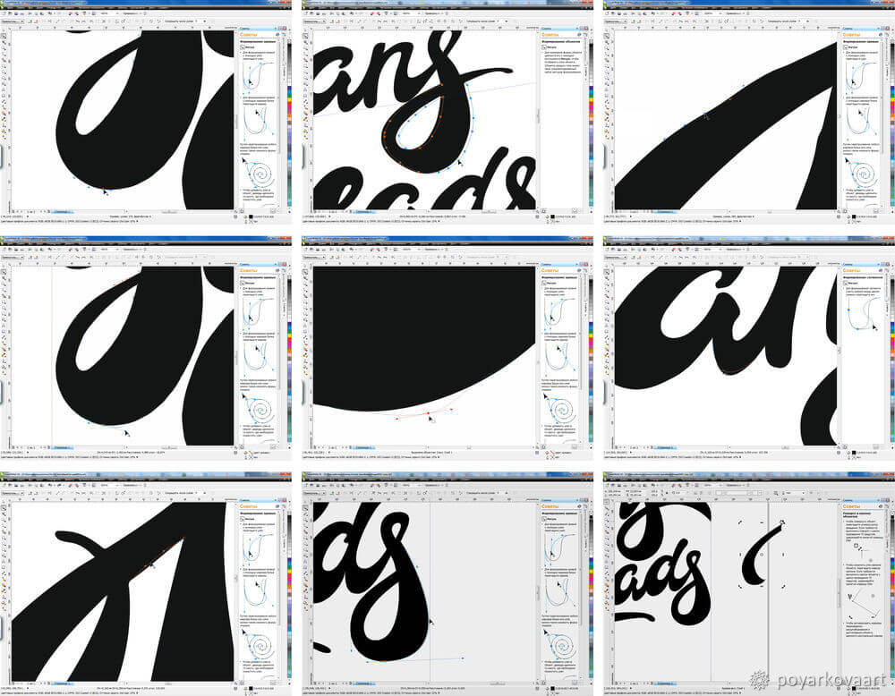
5. I add the words “Джинсовая бижутерия” (Jeans Accessories) along the logo edge. First I draw a half-circle and then tie the inscription to it.
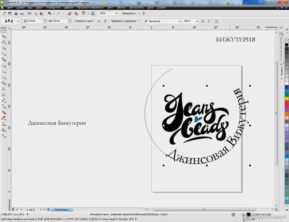
6. At first, I added a blue heart but then I changed my mind and removed it.
This is what I got. To convert the logo file in the PSD format, I go to File — Export. The Export dialog box opens. I select the PSD file type from the drop-down box. I also check the Transparent background box. Then I click OK to save the changes.

While I think about the color palette for my logo as early as at the sketching stage, I always leave coloring for dessert.
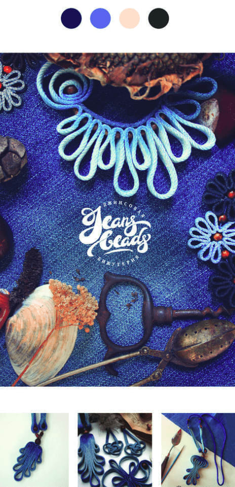
When choosing colors for a logo, I usually go through the keywords I’ve come up with at the start. The ones that caught my eye were “jeans” and “hand-made.” Based on these associations, I chose black, white and blue as my main colors. Plus, I selected a few complementary hues.
To add the logo on a photo, I import the PSD file in Photoshop and simply drag it to the photo.
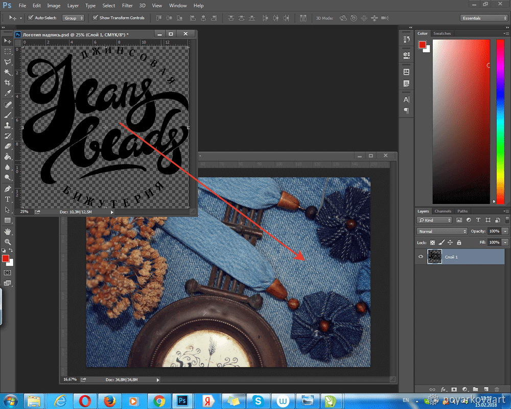
At this stage, you can play around with transparency and layer overlay modes.
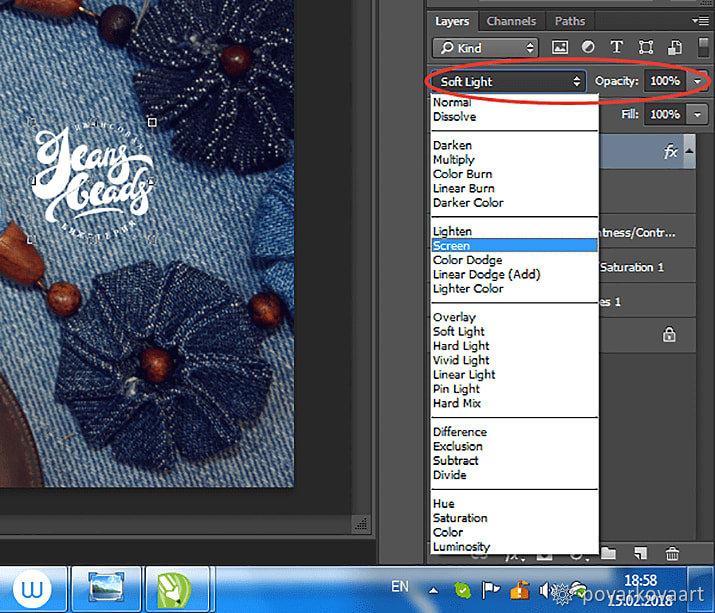
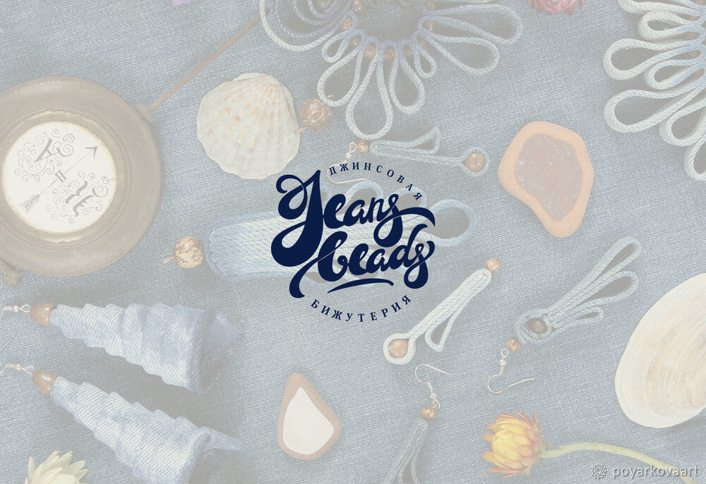
This is what the final logo for JeansBeads looks like.

Of course, there are plenty of ways to create a lettering logo. While each designer has their own methods and tricks, the major steps are more or less the same.
In this tutorial, I shared my secrets to making a beautiful lettering emblem.
Designing the logo took me about a week:
I recorded the last step and then sped up a 9-hour clip to a 10-minute video. In it, you can see how I’m fitting together separate sketches into a lettering logo. Enjoy watching!
My tip to all amateur designers is not to be afraid to make the first step. Take brushes, pencils, and paper, and off you go! Experience comes with practice.
Can’t figure out how to draw a logo? Let ZenBusiness handle the design process for you! Our logo maker can create an eye-grabbing written logo logo in a few clicks, and you can download it for free!
Source: Logotype. Lettering. Ideas and realization.
Recommended articles:
Disclaimer: The content on this page is for information purposes only and does not constitute legal, tax, or accounting advice. For specific questions about any of these topics, seek the counsel of a licensed professional.
Logo Resources
Ready to Start Your Business?
