Viewing a company logo as nothing more than a nice image is a dangerous misconception. The true power of a logo is concentrated in the meanings and messages behind its visual appearance. That’s why creating a logo starts with thorough analysis of your business and brand. This article is a detailed DIY tutorial for everyone who is looking to craft a visually striking logo by themselves. We’ll guide you through each step of creating a neat design, teach you how to convey meaning through graphics, and share useful tools that will make the task easier for you.
Step 1. Identify your brand personality
A good logo is the one that transcends the unique personality of your brand. If you’re still unsure as to what your brand stands for and how it’s different from competitors, you need to answer the following questions:
- Why did you choose this niche?
- What is the backstory behind your brand?
- Who is your target audience?
- What are the core values that guide you?
- Describe your brand with three adjectives.
- What do you want your customers to feel when engaging with your brand?
- What is your main advantage over your competitors?
- What are your goals and mission?
Visualize your answers in any form that you find convenient. One way to go is to put together a mind map. A mind map contains the keywords, ideas, and associations that make the essence of your brand. You can easily create a free mind map using a dedicated online service, such as Mindmup, Mapul, Mindmeister, and others.
Step 2. Do research
Your next task is to learn how to represent your brand through visual means. Start by looking at:
- brand identities of your immediate competitors;
- brand identities of top-tier brands within your niche;
- best artworks by freelance designers on Dribbble, Behance, and other platforms.
At this step, you need to get a basic understanding of how to convey meaning through colors, fonts, geometry, and images. When browsing through other companies’ designs, take the time to scrutinize each artwork that catches your eye. Ask yourself the following questions:
- What are the design elements that I like and don’t like?
- What techniques did the designer use to translate the brand personality and get across the right message?
- What are the practices that I can apply to my own design?
Add the best designs onto a mood board in Pinterest. (Or you can simply save them into a dedicated folder on your device.) Use these artworks as a source during your brainstorming sessions.
Step 3. Brainstorm ideas
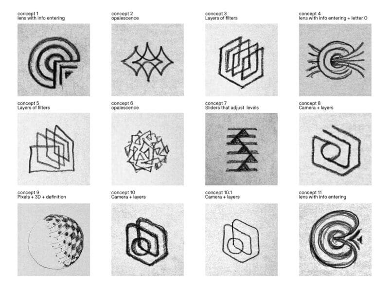
Draw the keywords from your mind map. It doesn’t matter if you do that on a piece of paper or in a graphic program.
When it comes to brainstorming, the rule of thumb is this: draw all ideas that come to your head, even those that seem silly or irrelevant. Switch off logic and let your creative juices flow freely! Remember that even the weirdest idea can grow into a successful design.
Experiment with two different approaches:
- Literal approach, i.e. when you interpret meanings in a direct way. For example, the idea to put a bird onto the Twitter logo came from the verb “tweet”, while the triangle on the Doritos emblem imitates the shape of a potato chip.

- Metaphorical approach, i.e. when your design talks to your audience through associations and metaphors. Think about the “smiling” arrow on the Amazon logo or Nike’s swoosh symbol which stands for speed and movement.


Here are a few tips for getting the most out of your artistic efforts:
- For more exciting ideas and concepts, use smart online services, such as ZenBusiness. Enter your brand name and industry, and get a bunch of professionally designed logos fuss-free!
- Involve your team. The more people are participating in a brainstorming session, the more ideas will be coming your way. If you’re feeling stuck, your teammates are sure to bring in a fresh look at things!
- Set a deadline. Determine how many logo sketches you’d like to create within, say, a week.
- Remember that you’re creating blueprints, not final designs. Don’t waste energy and time on creating detailed drawings. At this point, your task is to simply sketch down your ideas so as not to forget them.
- Shortlist the best ideas. Split all designs at your disposal into several groups, based on their topic and the approach you used to create them. Identify 2-4 designs that you can enhance and build on.
Step 4. Choose the right colors, fonts, and geometry
Now it’s time to look into individual design elements of your logo. The thing is that each color, geometric shape, and typeface translates specific emotions and sends a specific message to the audience. That’s why you need to put much thought into what design elements to incorporate into your logo.
In our subconscious mind, each geometric shape is associated with certain emotions. For example, a circle stands for gentleness and friendliness, while a triangle gives off energetic and inspirational vibes. As for a square, it’s traditionally associated with reliability and consistency. For more eye-opening insights into color psychology, click here.
Colors. Blue, red, and black are the three most common color choices among big-name brands. Red is the color of passion or anger. Blue translates the feelings of reliability and trust. Black and white color palette is often viewed as a synonym for luxury and elegance. By the way, this article contains everything you need to know about choosing the right color for your design!
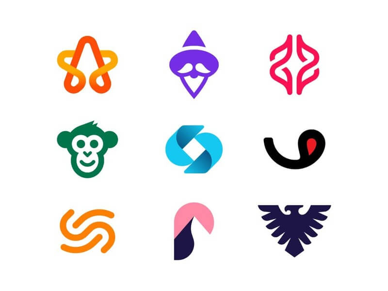
Fonts. Typefaces fall into four main types: serif fonts, sans serif fonts, handwritten fonts, and decorative fonts. Serif fonts send strong classic and retro vibes, while their counterparts without serifs look modern and minimalist. (Did you know that major businesses tend to prefer sans serif typefaces to all other typography solutions?) Handwritten fonts are a No.1 choice for companies involved in creative industries. If you’re looking to emphasize the unique personality of your brand, you can’t go wrong with a neat decorative typeface.

Curious to know more about how to choose the best fonts for your company? Check out this ZenBusiness interview with a professional typeface designer!
Step 5. Choose the type of your logo
Logos come in three types:
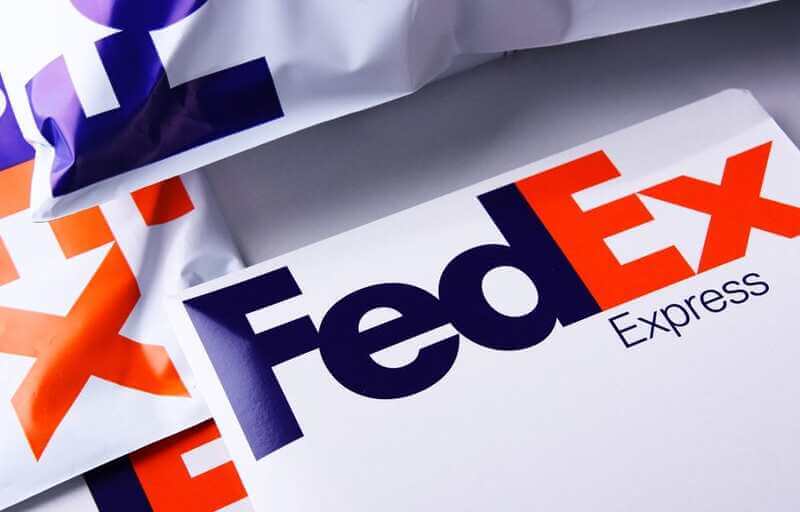
- Text-based logos (logotypes) only include the company name. Logotypes put visual emphasis on the typeface. Some great examples are the logos of FedEx, Coca Cola, Google, and Facebook.

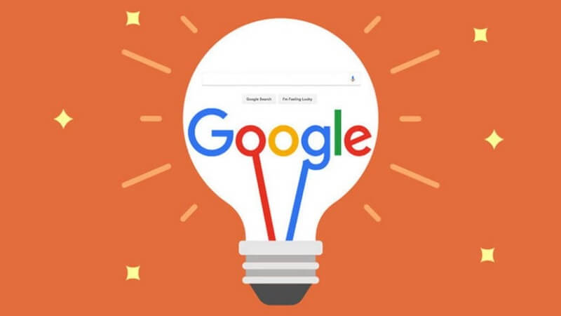

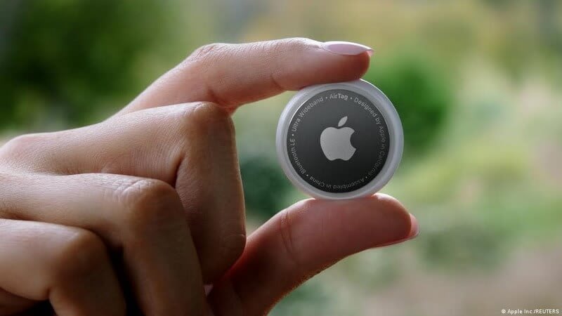
- Graphic-based logos (logomarks) rely on images, drawings, and other graphics. Logomarks are mostly used by globally recognizable businesses that no longer need to put their brand name on display. Think about the emblems of such giants as Shell, Pepsi, Nike, and Apple.


- Combination marks represent a fusion between text and graphics. It is, hands down, the most popular type of logo out there. Some of the big names that opted for a combination mark are Adidas, Microsoft, Unilever, Harley Davidson, and Levis.


There are no stats that would show which type of logo is the best one. After all, there is no cookie-cutter solution for all businesses. Try to choose the type of logo that works best for your brand.
Step 6. Pick the best logos
Now you need to shortlist the best logo designs and toss out the rest. We’ve compiled a list of criteria for a professional emblem.
- Simple. A good logo must be concise and on-point. It must give an instant understanding of what your company is doing. Steer clear of sophisticated designs that may lead to ambiguous interpretations.
- Memorable. Simple doesn’t mean faceless. Your logo must have an element (color, geometric shape, image, font, etc.) that catches the eye and helps your target audience identify your business.
- Unique. Look at the logos used by your competitors to make sure your emblem stands out from the crowd. It would be a pity if customers confused your emblem with that of another company — especially if you share the same niche!
- Emotionally engaging. A high-quality emblem must reflect the essence of your brand. On top of that, it’s expected to resonate with your target audience and cultivate their affinity to your brand.
- Timeless. By stuffing your logo with trendy design techniques, you risk ending up with a design that will look out-of-place in just a year or two. It’s a good practice to craft a classic logo that will stay relevant throughout the years.
- Scalable. Make sure your logo scales well across different media. A good emblem must remain perfectly legible at all sizes, whether it’s a favicon, mobile app icon or billboard. Also, your design must work in black and white. Testing your design against both light and dark backgrounds is also a must.
- Versatile. You can’t properly test your logo by looking at it on a piece of paper or computer screen. Put your logo on the media that you’re going to use it on, e.g. business cards, letterheads, etc. (By the way, the ZenBusiness logo generator can help you create these branded designs and more in just two clicks!) Also, try to create the animated version of your logo for your website and social platforms.
Step 7. Get feedback
Now that you’ve shortlisted the best designs, it’s time to gather feedback. Encourage people to weigh in on your designs. Ask your teammates, friends, social media followers, designers, etc. Also, it might be a good idea to conduct a customer focus group.
Ask people how they perceive each design, what emotions it evokes, what information it communicates, whether it’s easy to read, etc. If you find out that most people failed to grasp your message, don’t hesitate to discard the logo. Keep in mind that a good logo must have a clear meaning behind it.
Step 8. Add finishing touches
Based on the respondents’ reactions, choose the best design and polish it. Follow this quick checklist to not miss a thing:
- make sure your design is legible across all sizes, formats, and colors;
- manually adjust the space between letters (if your logo has text);
- make sure your logo is balanced and well-proportioned;
- save the logo file in vector and raster formats (SVG, PDF, PNG, JPEG) to be able to both print it and use it online.
Wrapping up
There is no one-fits-all approach to creating a well-crafted logo for your brand. That’s why you should use this tutorial as a backbone while tailoring it to your unique situation. When it comes to logo design, there is no place for haste or shortcuts. Putting together a visually engaging emblem involves a good deal of market research, strategic thinking, and creative freedom.


