Let’s start with two curious facts on the BMW logo. Number one is that the emblem is on Top 10 of the most recognizable logos in the world. Number two is that the car producer has stayed true to its corporate design for nearly a hundred years. Learn how the logo emerged, what it stands for, and how it has changed in 2020.
Logo backstory
BMW, or Bayerische Motoren Werke, was established in Munich in 1916. At first, it was involved with the production of aircraft engines. The company’s first emblem had a round form to highlight its connection with Rapp Motorenwerken, the brand that gave birth to BMW. The black horse was replaced with a blue and white circle that became a topic of hot discussion.
The company itself contributed to the rumors. In 1929, the company published the photo of a plane whose rotating propellers bore a very close resemblance to the emblem. At that time, the company was in the process of obtaining a license that would allow it to manufacture a new type of aircraft engines. By using the new logo, BMW was hoping to boost its sales.
In reality, colors blue and white are a reference to the Bavarian flag. Since the legislation banned companies from using the official national symbols, BMW decided to arrange the colors of the flag in a different order.
Logo evolution
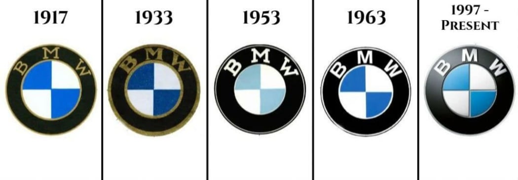
Over the years of its existence, the logo has been through a couple of insignificant changes. For example, the golden lining was replaced with a black one, the serif font gave way to a regular typeface, and blue changed its shade more than once. In the late 20th century, the emblem got a spectacular 3D feel to it.
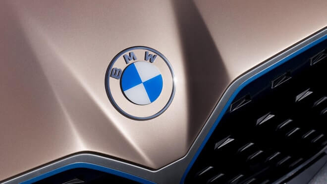
Year 2020 brought a drastic change to the BMW brand identity. In March of 2020, the company introduced a new emblem. On it, the black circle was substituted for a transparent background with a white lining. Flat and minimalist, the new design was in line with modern trends.
This is how the car manufacturer is adapting to the needs of a new generation of customers. By overhauling its brand identity, the company demonstrates its accessibility and open mindset. Also, the new corporate style marks the beginning of the “electric revolution” as BMW has recently presented the concept of its first electric car.
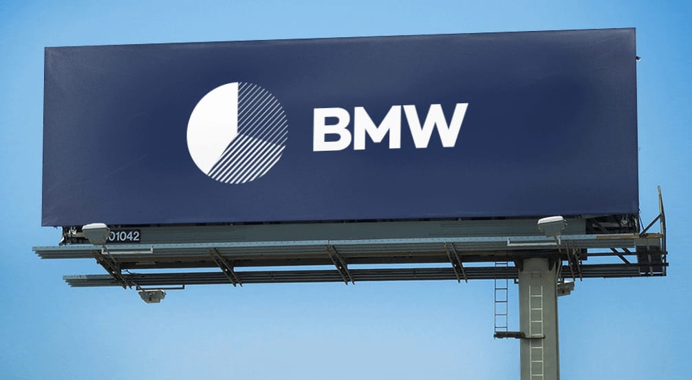
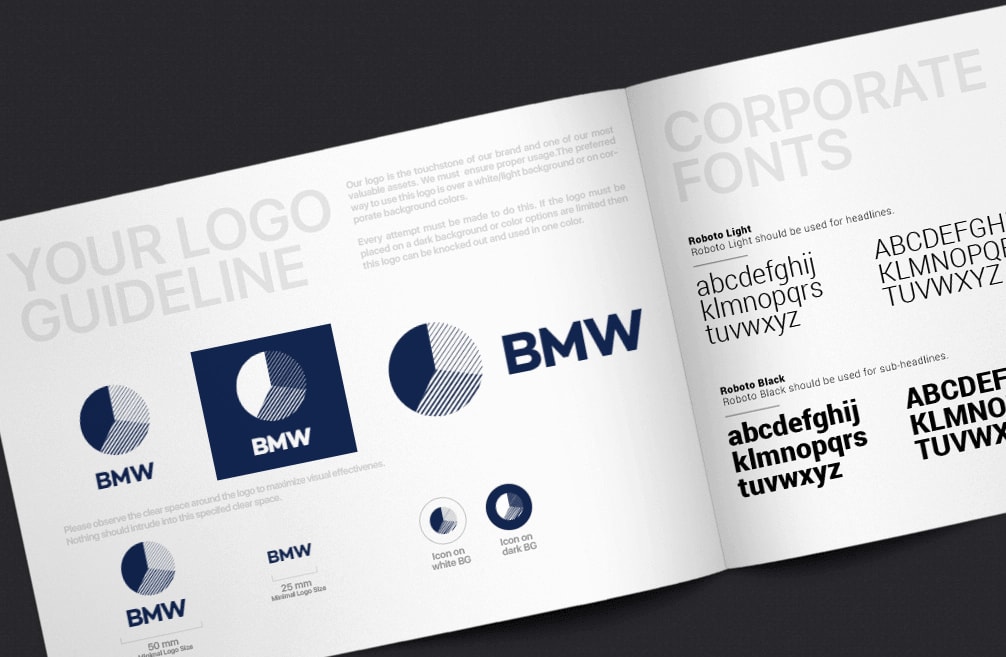
How would BMW logo look like if it were made in ZenBusiness?
Bottom line
If you asked us to name the top recognizable emblems in the world, the BMW logo would definitely be among them. Simple yet original, it has successfully stood the test of time. As for the theories regarding its origin and meaning, they contributed to the popularity of the brand.

