The logos of magical institutions from Harry Potter are as recognizable as their names. In this article we will share the secrets of these logos’ popularity: we’ll analyze all the techniques and tell you how to use them to create your logo without using magic spells.
Hogwarts
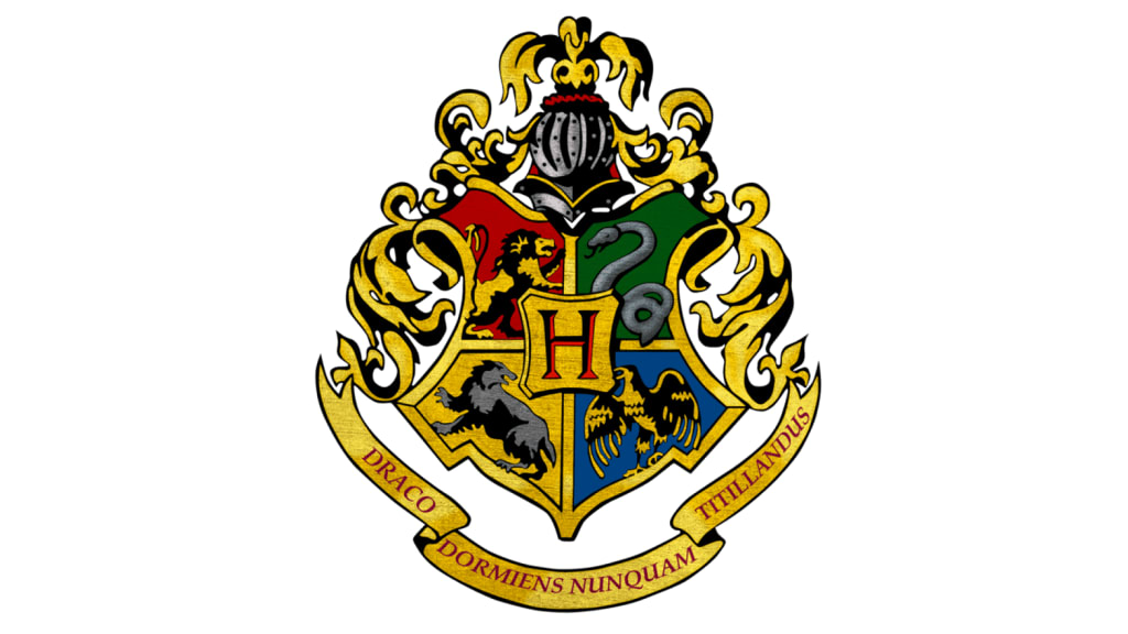
The logo of the School of Witchcraft and Wizardry reflects its ancient history which began about a thousand years ago. The emblem is designed as a shield divided into four parts indicating the four main houses of the school which are Gryffindor, Slytherin, Ravenclaw, and Hufflepuff.
The letter “H” in the middle of the shield stands for Hogwarts. At the bottom, there’s a ribbon with the school motto in Latin: “Draco dormiens nunquam titillandus” (“Never Tickle a Sleeping Dragon”).
Colors and Fonts
Each part portrays a mascot in the form of an animal in the faculty colors. In addition to the students’ characteristics, they embody the four elements: fire, water, earth, and air.
In order not to overload the complex emblem, the inscription in Latin is made in simple, sans serif font.
Useful Techniques
If you want to convey the seriousness of the brand, use the form of an emblem. But remember that a modern logo should look more minimalistic than the Hogwarts symbol.
Gryffindor
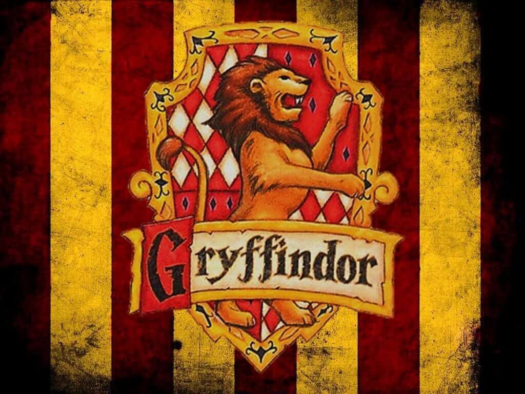
Courage, honesty, and bravery are the main characteristics of the students of the faculty Harry Potter enrolled in. Therefore, the mascot of Gryffindor was a lion embodying courage, boldness, and nobility.
Colors and Fonts
The red-and-gold palette mirrors the element of fire and conveys a vibrant character. The inscription “Gryffindor” is made in the Gothic style with serifs and slightly outstretched letters with irregular outlines.
Useful Techniques
The combination of a powerful symbol and bright colors is a bold technique that will not leave the brand unnoticed. Such a set of tools is perfect if you want to make yourself known loudly.
Slytherin
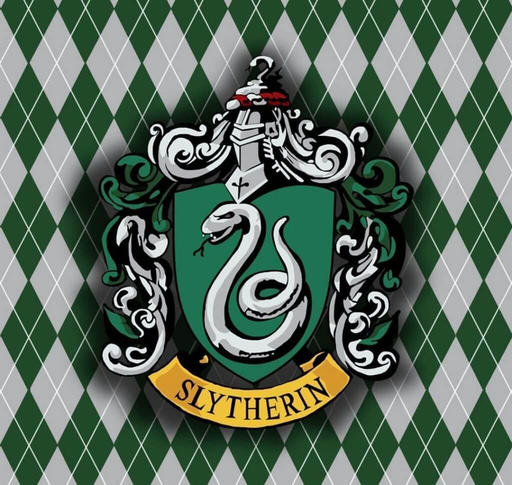
The snake is an ambiguous symbol that balances between the good and the evil. On the one side, it is associated with cunning and guile, on the other one – with wisdom and ambition, on the third one – with immortality and rebirth. All these traits are inherent in Slytherin’s disciples: they are smart, brave, ambitious, and find ways to achieve goals.
Colors and Fonts
The element of water represented by Slytherin is reflected through a silver-green palette. For the inscription, a simple typeface with delicate serifs is chosen.
Useful Techniques
Be careful when choosing complex images with ambiguous interpretations for misreading them can negatively affect the brand. When choosing this kind of symbolism, try to emphasize the desired meaning through the form, colors, and fonts.
Deathly Hallows
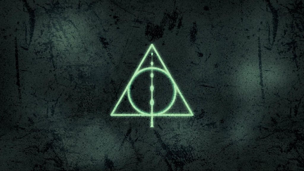
The graphic symbol consists of images of three artifacts of the Deathly Hallows: the Resurrection Stone, the Invisibility Cloak, and the Elder Wand. They are represented as a triangle with a circle and a vertical line inside.
Joan Rowling admitted that the creation of the emblem was influenced by Masonic symbolism. Therefore, the logo has acquired additional associations and became one of the most popular among the fans of Harry Potter.
Colors
The black and white palette looks strict and mysterious. There are no inscriptions on the logo in order not to distract attention from the nature of graphics.
Useful Techniques
Use a symbolic logo if you are sure of the message you want to convey to the audience. Choose a strong idea, use graphics to represent it, and add colors to deepen the impression.
Ministry of Magic
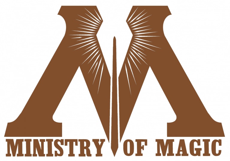
The image of the Ministry is embodied by a strict logo. In the inner circle on the scale, one can see the letter “M” pierced by a magic wand with divergent beams. The outer circle is filled with the motto in Latin: “Ignorantia jus neminem excusat” (“Ignorance of the Laws In No Excuse”). All this reflects the seriousness of the institution.
Colors and Fonts
The image is designed in a soft beige-brown palette. The main focus here is a large bold letter “M” with serifs adding to rigor and significance.
Useful Techniques
The shape of the logo is a strong tool to convey the company’s concept and values. As this type of logo is not very common, it will help to make your brand stand out in the market. The point is to avoid unnecessary detail: the image should remain simple and clear.
Ravenclaw
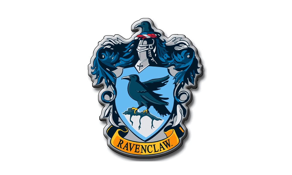
High intelligence, bravery, and creativity are highly appreciated in this faculty. It’s no surprise its symbol is an eagle, a clever bird of prey.
Colora and Fonts
The turquoise symbolizes the element of air to which the faculty belongs. The image is amplified by a delicate font with small serifs.
Useful Techniques
Images of animals convey a strong message. Choose an animal or a bird that suits your company’s temper and use it in your logo.
Beauxbatons
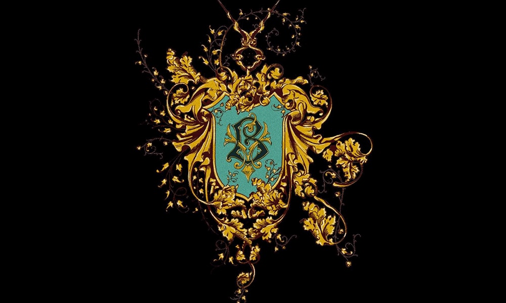
The symbol of a French magic school embodies its name. In French, it sounds “Beauxbâtons” which means “beautiful magic wands”. On the coat of arms of Beauxbatons, we see two crossed wands with the stars flying out of them.
Colors
The combination of blue and gold shades looks elegant and noble. Yellow symbolizes joy and luck, while blue symbolizes calm and serenity.
Useful Techniques
Sometimes a simple image of what you do can be the best logo. But be careful, you risk creating similar logos with your competitors.
Hufflepuff
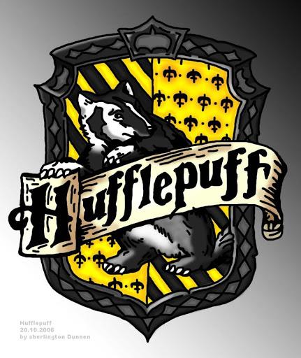
A badger is not often seen on logos. But it is this mascot that conveys the character of Hufflepuff’s disciples: honesty, loyalty, patience, diligence, and hospitality.
Colors and Fonts
The black and yellow palette represents the element of earth and a simple font does not distract attention from the image.
Useful Techniques
Choose a non-trivial symbol that is rarely used in your industry and look for associations that could correlate it with the brand. This technique will help to make you stand out on the market and attract your target audience’s attention.
