Minimalism and creativity, conservatism and rebelliousness…The 2022 logo trends come in all shapes and sizes. At ZenBusiness Logo Generator, we’ve studied the hottest trends that will be shaping the design scene next year. Which of these trends fits your business?
- The 90s
- Negative space
- Experimental fonts
- Overlapping
- Vibrant colors
- Minimalism
- Geometry
- Letter tricks
- Gradients
- Optical illusion
- Final word
- Logo Trends from 2021
- Logo Trends from 2019
- Logo Trends from 2018
- Logo Trends from 2017
1. The 90s
The last decade of the 20th century was characterized by a myriad of genres and styles, from pop culture, to grunge, to punk. One thing these subcultures had in common is that each of them provided a vast space for experimentation.
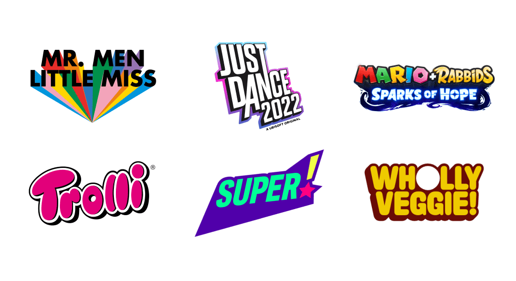
Today, the 90s are making a triumphant comeback not only to fashion runways but also to graphic design. This trend manifests itself through vibrant colors, abstract geometry, and fancy patterns. If you have a text-based logo in mind, go ahead and use unexpected font combinations, prominent shadows, and contrasting lines. This is a great design solution for brands that are looking to arrest the viewers’ attention with striking experiments.
2. Negative space
The term “negative space” refers to an empty space in between or around letters, images or graphic symbols. While not exactly new, this trend shows no signs of losing its relevance. Negative space always manages to find a unique visual voice in logos and other graphic images.
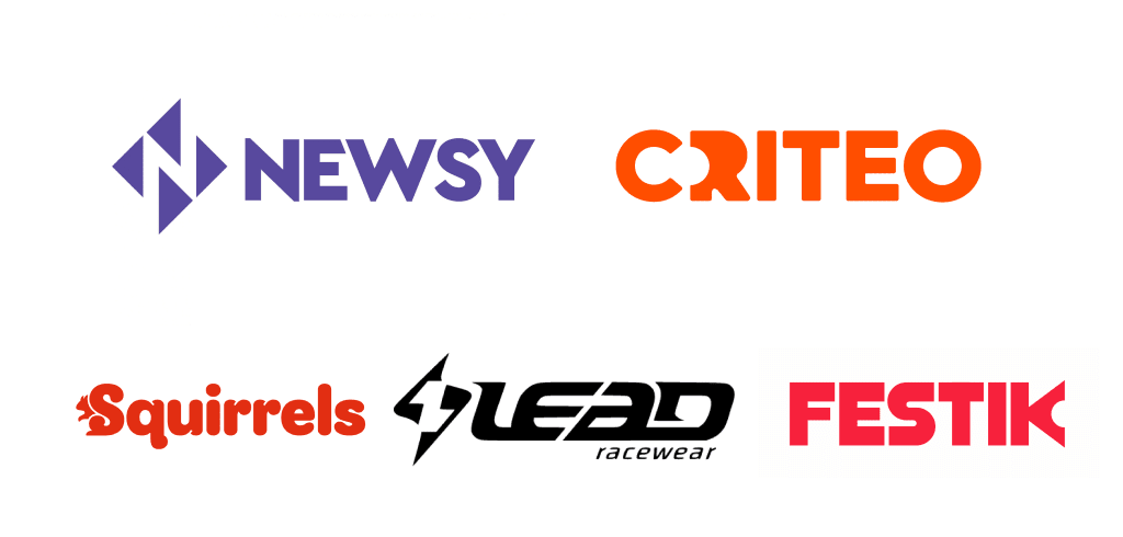
To make the best use of negative space, think about how you can incorporate your brand’s graphic symbol in between the letters or inside one of them. That will allow you to enhance your logo message without visually overcomplicating it. Plus, the ambiguity you create is sure to catch your audience’s attention, making them memorize your brand.
3. Experimental fonts
There is hardly a better way to create a one-of-a-kind logo than unique typography. Designers love experimental fonts for their ability to go against the rules of traditional typography. An experimental font doesn’t necessarily have to be overly fancy, illegible or over-the-top. The main thing is that it looks unusual and provoking. For example, it may have letters of varying height, unconventional lines, uneven kerning, etc.
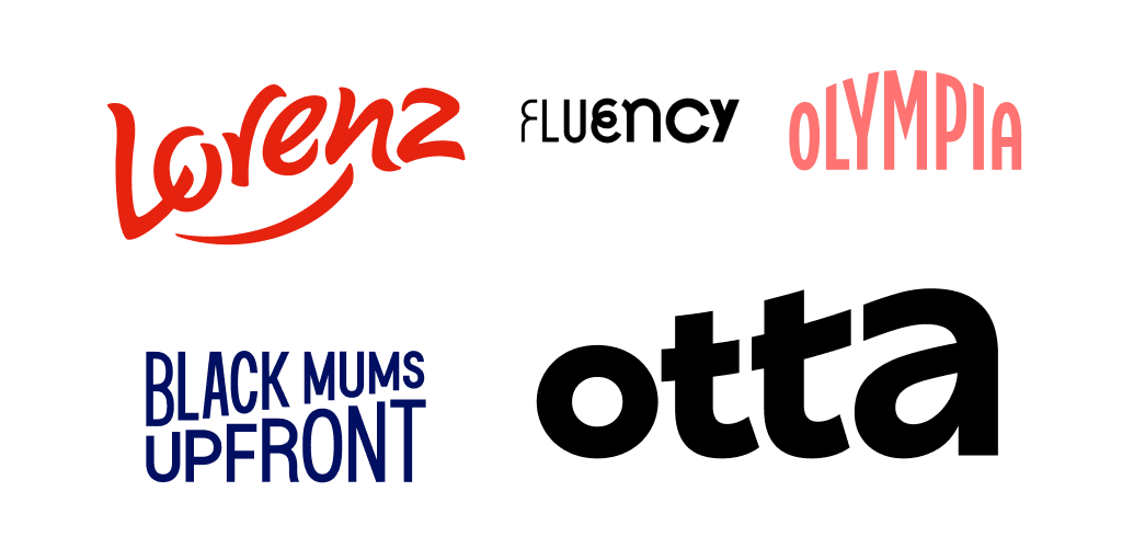
When using this design technique, it’s important to maintain a balance between your artistic ambitions and marketing goals. Along with being creative and unique, your logo also must convey the right message, evoke an emotional response from your audience, and be perfectly legible.
4. Overlapping
The overlapping trend opens up endless creative opportunities. Designers apply overlapping to letters, colors, geometric shapes, symbols, patterns, etc. If you’re looking to make your logo stand out, this time-tested approach won’t let you down.
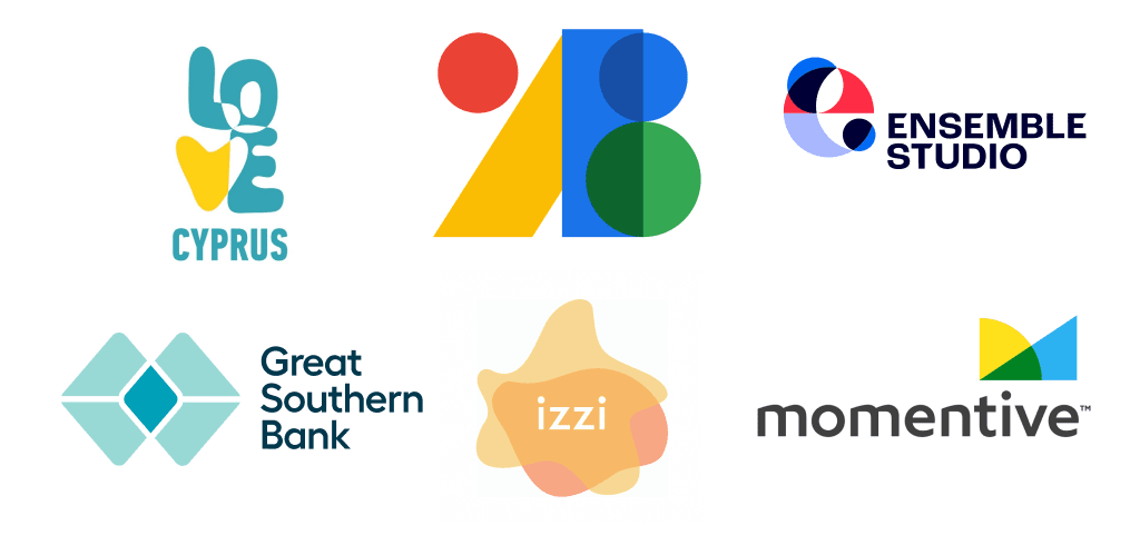
The overlapping technique can add depth and volume to your logo, highlight certain parts, and showcase connections between the elements. To effectively use the overlay, focus on the message that you want to transcend through this technique.
5. Vibrant colors
When going through hard times, people turn to graphic design for positive emotions. That’s why bright, intense colors are more popular nowadays than ever. By using saturated shades, you make your logo stand out and charge your audience with optimistic vibes.
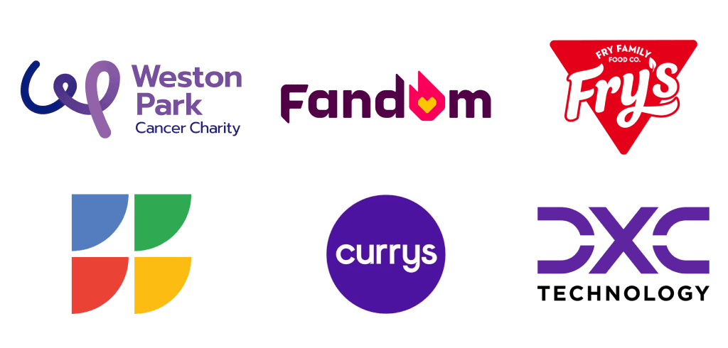
Want to spice up an old logo? Reimagine its color scheme! Add an exciting hue or come up with an entirely new color palette. Whatever you do, make sure your colors resonate with your customers and create the right associations in their heads.
6. Minimalism
Minimalism is a truly universal trend that has been dominating the design scene for years now. And honestly, we can’t complain! This technique follows the “less is more” principle. Despite simple geometry, fonts and composition, each element in a minimalist logo performs a certain function and sends a clear message.
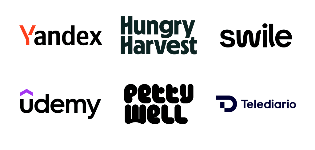
A visually concise emblem allows the viewer to instantly understand its message and memorize the brand. A minimalist logo boasts technical advantages as well. It can be effectively displayed across a variety of surfaces without loss of quality. Aside from that, a simple logo has the power to remain relevant for a long time, sparing you the need to upgrade it every couple of years.
7. Geometry
If you’re on the fence as to which trend to use, you can’t go wrong with geometry. Basic geometric shapes (line, square, circle, triangle, etc.) are at the core of a simple yet visually powerful brand identity.
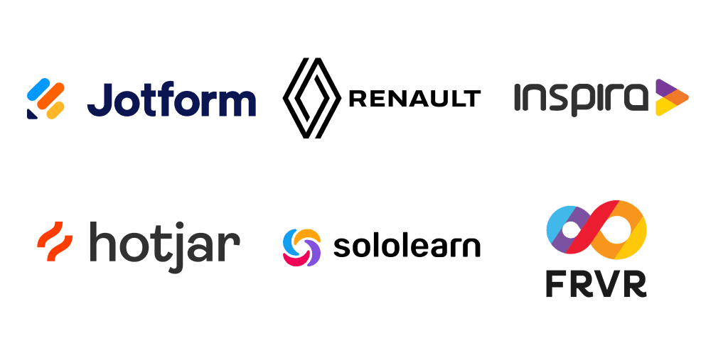
Basic geometric figures are widely associated with precision, hierarchy, and accuracy. At the same time, you can enhance this technique by throwing in saturated colors, creating original combinations, and more.
8. Letter tricks
Here goes another design trend that associates with exact sciences. Have you ever thought of replacing letters in your text-based logo with mathematical characters and geometric forms? For example, two letters “O” that follow each other recall the infinity symbol. As for the letter “i”, you can visualize it as a combination of a parallelogram and a circle. To further accentuate certain parts of your logo, tap into the power of colors and fonts.
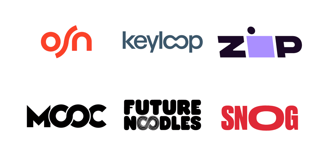
Graphic characters and symbols are a smart and yet not overused way to dust off your logo and set it aside from the crowd. This visual trick acts like a magnet, drawing customers’ attention and making them peruse your logo like a work of art.
9. Gradients
As digital technologies are marching forward, visually striking gradients (color transitions) are becoming more and more plentiful. You can’t go wrong by making colors the centerpiece of your logo. Gradients can add depth, volume and dynamics to your design. It’s a great way to grab your viewers’ attention.
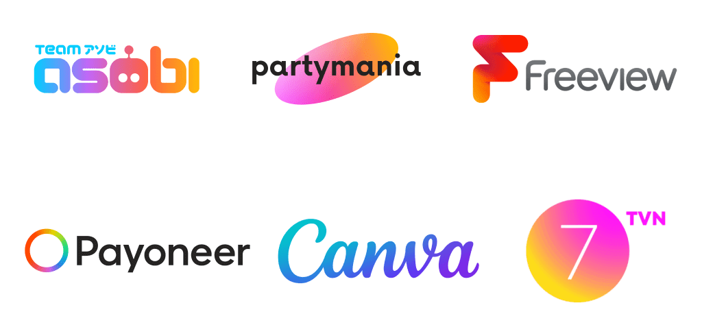
While gradients are mostly delicate and airy, this trend allows space for bold experiments. While some designers apply gradients to the entire emblem, others use color transitions to highlight specific elements, such as the background, graphic symbol, text, etc. Also, gradients can be made of different hues of the same color or several contrasting colors.
10. Optical illusion
A good logo is the one that – despite its visual simplicity – conveys several meanings. A simple emblem is not as simple as it may appear. For example, when a parallelepiped transforms into the letter “m”, you’re dealing with an optical illusion.
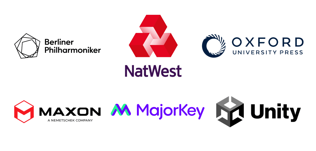
To create three-dimensional optical illusions, designers tend to play with geometry, colors and perspective. Seeing a “tricky” logo makes the viewer linger on the design and keep looking for more interesting details. Optical illusions give designers an endless creative freedom to convey meaning in a visually arresting way.
Final word
To be successful, businesses need to be flexible and adaptive, especially when it comes to their brand identity. Regardless of your business specifics, you’re sure to find the right solution for your brand among the 2022 logo trends. Remember that you don’t necessarily have to religiously follow trends or overhaul your existing logo in a drastic way. Pick design ideas that resonate with your brand and find a clever way to incorporate them into your brand identity.
A Look Back at Logo Design Trends from 2021
- Simplification
- Bold typefaces
- Gradients
- Letter destruction
- Overlapping
- Negative space
- Ultra thin lines
- Visual chaos
- Balance
- Monograms
A Look Back at Logo Design Trends from 2019
- Simplification
- Omitting details
- Logotypes
- Focus on detail
- Gradients
- Neon colors
- Letter stacking & vertical logos
- Corners and curves
- Circles
- Stripes
- Hand-drawn logos & Watercolor imitation
- Heraldry
- Thin lines
A Look Back at Logo Design Trends from 2018
- Simplicity
- Clean shapes and text
- Letter stacking
- Slices
- Negative space
- Text experimentation
- Gradients
- Overlaps
- Stamps and coats of arms
- Lettering
A Look Back at Logo Design Trends from 2017
- Minimalism
- Letter stacking
- Text logos
- Lettering
- Flat design
- Gradients
- Line art
- Stencil typography
- Black-and-white logos
- Overlapping gradients
- Geometric shapes
- Framed text
- Hand-made logos
- Negative space
