Dive into the dynamic world of logo animation, where creativity knows no bounds, and learn how to bring your brand to life with an interactive logo design that not only captivates but also inspires and engages your audience in a whole new way.

Starts at $0 + state fees and only takes 5-10 minutes
Last Updated: July 3, 2025
As a visual style, minimalism is timeless. While fashionable trends come and go like seasons, a minimalist design works flawlessly in any situation. Knowing the incredible power of minimalism, established brands keep their corporate identity designs clean and concise. For example, Nike has been true to its iconic logomark for decades.
This is how Wikipedia defines simplicity and minimalism.
– Simplicity is the state or quality of being simple.
– Minimalism is a style that only uses essential elements for maximum impact.
As you can see, minimalism and simplicity are not synonymous terms. At the same time, minimalism gravitates towards simplicity by shedding excessive elements that fail to meet the expectations of the audience.
In general, the tendency towards simplification and flattening is traced long time ago. The logos of different brands began to look simpler and more minimalistic.
The fact that the logos with many details turned into something simpler is not just an aspiration of designers or just design trend. It happened because logo may be placed in different mediums – if earlier it was necessary to put logo on physical media only, now the logo should look good on the web, including small screens.
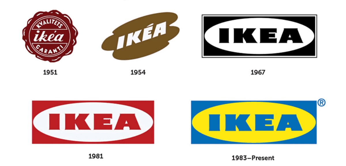
Here are examples of some brands, when logos became simpler:
Adidas

IKEA

Instagram

To create a smart logo, you must develop a simple yet engaging visual concept and stick to it. A sophisticated design will lose to an easily digestible emblem in its ability to convey your brand message — whether it’s your values, mission or motto — to your potential clients.
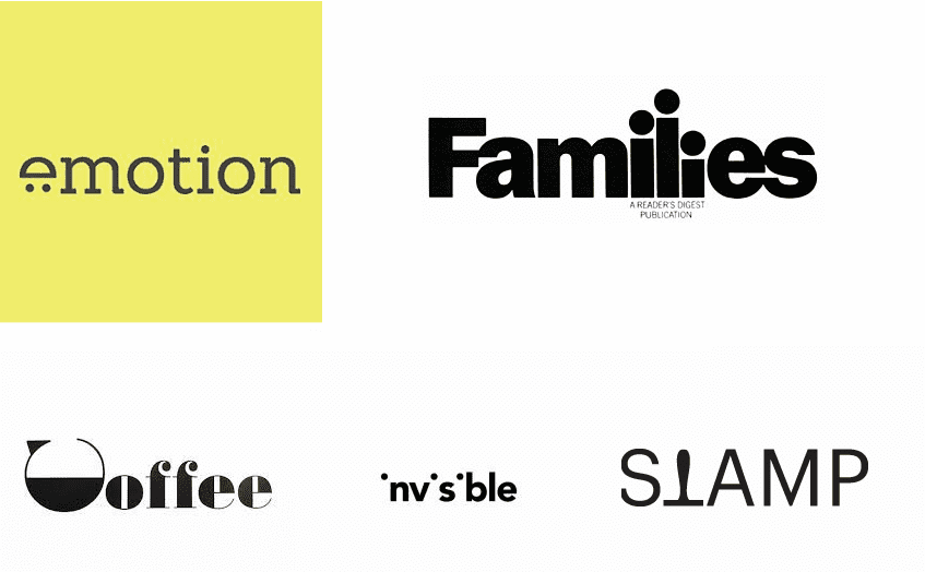
A logotype is considered the easiest type of a corporate emblem, and rightly so. A logotype only features your company name with no symbols, marks, or other graphic elements. As you may have already guessed, a font plays a major role in a logotype. With a stunning choice of fonts, you can try your hand at any style you want. A logotype has all chances to become an organic part of your brand for years to come.

Think about Disney, Philips, and Google. The logotypes of these giants have become synonymous with top quality and unique customer experience! More about logotypes you can find here.
Lines, whether straight or curved, are the core of any design. Using lines to express a multi-layered meaning is a true art, so take enough time to mull over your creative concept.

To think that straight lines are boring is a big mistake. With horizontal, vertical or diagonal lines, you can craft an original emblem that will look edgy and stylish in any context.
As for squiggles, you have a variety of options here. The best thing about irregular lines is that they can take any form. By curving and twisting a line, you can visualize your design concept in a number of ways. It’s a great chance to stretch your visual thinking muscles!

In logo design, geometry is not something you can ignore. Geometric shapes communicate your brand message, stand for your company values, and set the right mood.
A geometric figure alone can affect the way your target audience perceives your business. Remember that when deciding which shape to place on your emblem!
Just like colors, each geometric shape has its psychological connotations that are “seared” in our brains. Seasoned designers know the meanings behind a circle, square and triangle like the back of their hand. Read on to find out which figures you should use to project your corporate vision.
If you ask us which shape is trending nowadays, the answer will be: a circle. An ellipsis and circle both symbolize unity, love, friendship, commitment, and harmony. Take the iconic Olympic emblem as an example. The Olympic circles stand for the union of the five continents that take part in the Olympics, a global sports event that encourages countries to overcome their differences.
Also, a circle (e.g., a wheel) is often associated with constant movement and transformation. This is quite logical as a circle has no beginning or end.

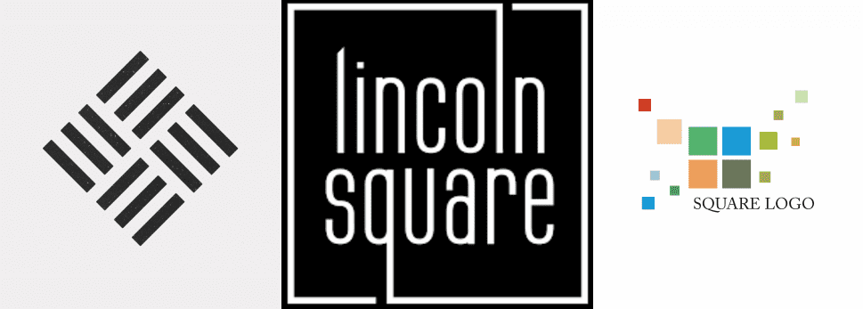
A square is another popular geometric shape that stands for balance, reliability, and professionalism.
The problem is that a square is a common choice among logo designers. To avoid the risk of creating a generic design, spice up your square-shaped object with colors. Be sure to choose the shades that go in line with your shape in terms of psychological meaning!

While a triangle is a far less popular geometric shape than a square, it’s a powerful visual tool that can tell the story of your brand. When looking at a triangle, you can’t help but feel a huge inspirational force behind it. This figure projects dynamics, hierarchy, change, and improvement.
With its sharp angles, a triangle literally radiates energy, which makes it an ideal choice to visualize innovation and progress. If, however, you want to translate the feelings of safety and comfort, stay away from triangles and go for squares or rectangles instead.

If you’re into all things retro, don’t hesitate to use this amazing style in your logo. This is a great chance to explore the possibilities of minimalist lines and thin strokes. A common technique typical for retro designs is placing a text along the outer circle of the emblem. To bring your audience back to the 80s, use sepia and neon shades that were trending at the time.
The biggest advantage of the retro style is that it allows a designer to borrow from a number of trends that shaped the design scene decades ago.

The benefits of a simple logo are numerous. A clean design is catchy, memorable, and appealing to the human eye. Plus, it allows you to interact with your audience in a straightforward way. All this makes a minimalist emblem an indispensable tool that creates a unique customer experience. Nonetheless, before crafting your own icon, take enough time to thoroughly research your target market and make sure a simple design is what your brands really needs to achieve its goals. We also hand-picked the 25 best company logos.
If you don’t know, how to create a logo, start the process with ZenBusiness. It worth of trying, you can find really good solution for your logo.
Recommended articles:
Disclaimer: The content on this page is for information purposes only and does not constitute legal, tax, or accounting advice. For specific questions about any of these topics, seek the counsel of a licensed professional.
Logo Resources
Ready to Start Your Business?
