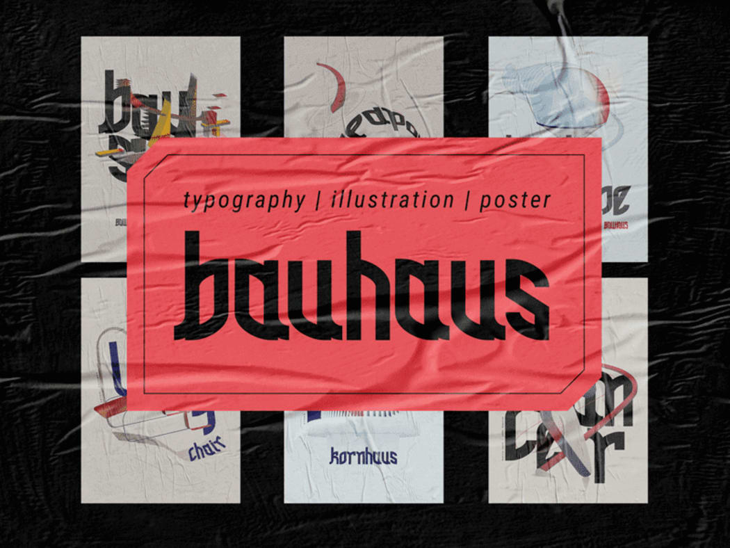
What do you see when you look at logos used by major brands? They must be much more than just trendy images!
Let’s play a game. Imagine that you are a doctor and your logo is your patient. In this post, we’ll be looking into the anatomy of brand identity. In simple words, let’s outline the top 17 graphic design principles which are trending in 2019.
Lines
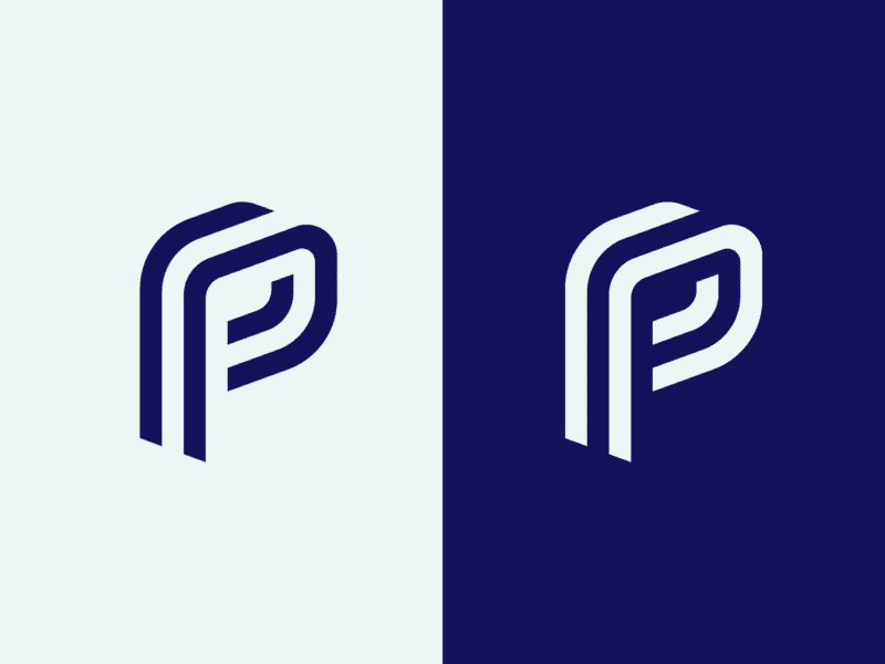
Source – Omnium
Lines are a great tool for expressing the “personality” of your design. For example, straight lines make the composition look solid and reserved, wavy lines convey dynamics, and zigzag lines translate the feeling of uneasiness. Nowadays, many logos consist of one continuous line. Plus, there are the so-called “guiding lines.” As their name suggests, they “guide” the user’s attention through the content.
Scaling
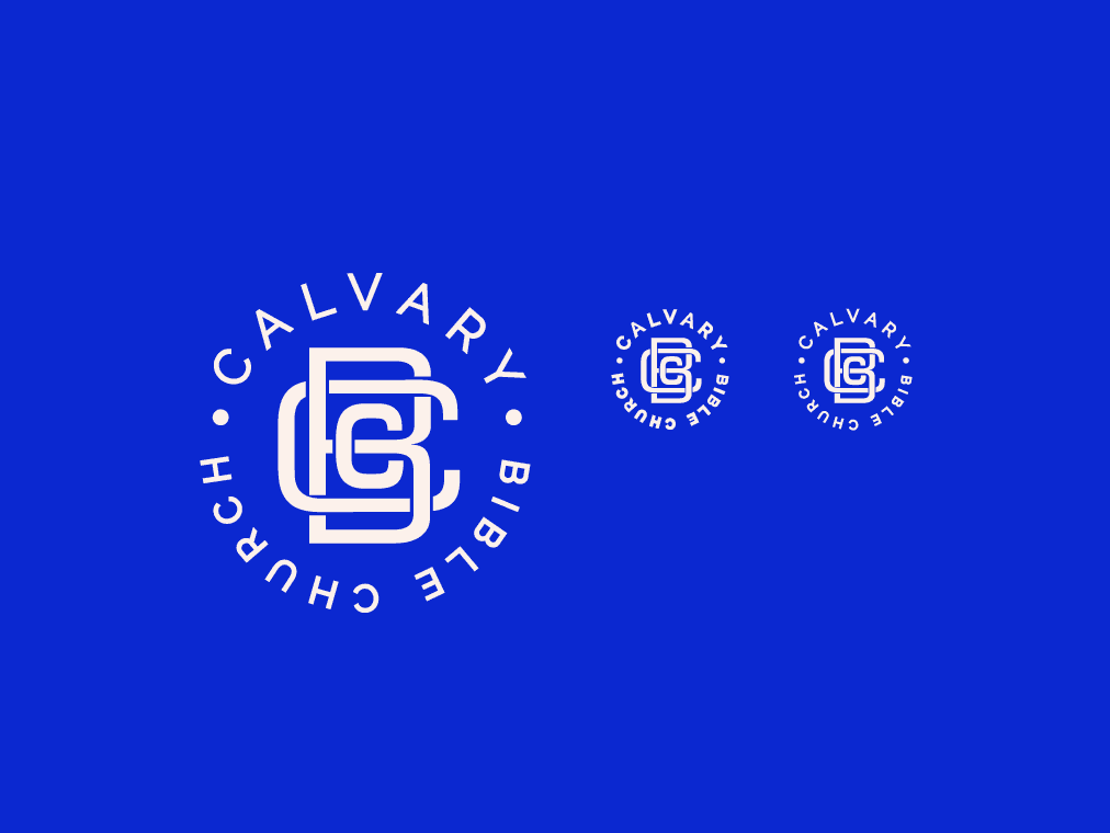
Source – Chris Calo
Scaling is used to express the real-life size of an object in relation to other objects. Also, scale is successfully used for highlighting important details even though their size is far from being impressive. Scaling allows to create a 3D effect, making some elements look closer or more distant. This is how designers build the hierarchy of elements.
Color
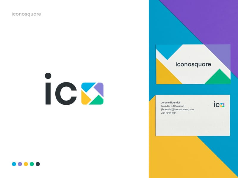
Source – Balkan Brothers
As you might already know, different colors can have different effects on a person. For example, red stirs up our feelings. Blue, on the contrary, has a remarkably calming effect. At the same time, yellow is believed to boost appetite! When choosing the right hues for your graphic design, be sure to educate yourself on the psychology of colors first. A balanced combination of 2 or 3 shades can have the desired effect on the audience. If you’re looking for a bold look, you can’t go wrong by pairing two contrasting colors. Mesmerizing colors palettes, filters, and visual effects give you plenty of creative tools to choose from!
Repetition
Source – Mr.Mockup™
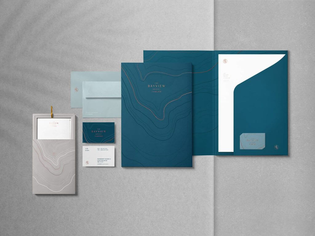
Using your brand identity on printed materials and online carriers is a straightforward way to make it more recognizable. When designing your website, be sure to repeatedly use your logo across different patterns and textures. If you take the trouble to design all you corporate elements in the same style, you’ll get a coherent corporate identity that will instantly strike as solid and professional.
Symmetry
Source – Esence
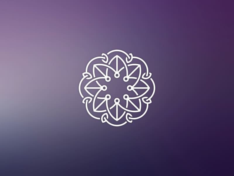
Symmetry has the power of instantly catching the human eye. This is why symmetrical logos look so attractive! If you feel like your design lacks something, why not try to add some symmetry to it? By the way, the best logos are often those where symmetry is only hinted at.
Typography
Source – Richard Smalley
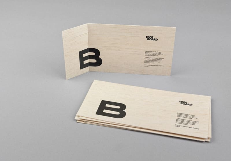
For printed materials, be sure to use a font with serifs. As for sans serif fonts, save them for web. If you’ve decided to combine several typography options, take the time to select the matching ones. Print out your design and look whether the fonts create a balanced combination. Use expressive typography for highlighting headers and other important details. Sadly, there is a limited choice of good Cyrillic fonts. On the brighter side, you can easily find some excellent options among Latin fonts.
Transparency
Source – Jennifer Kiza McDonald
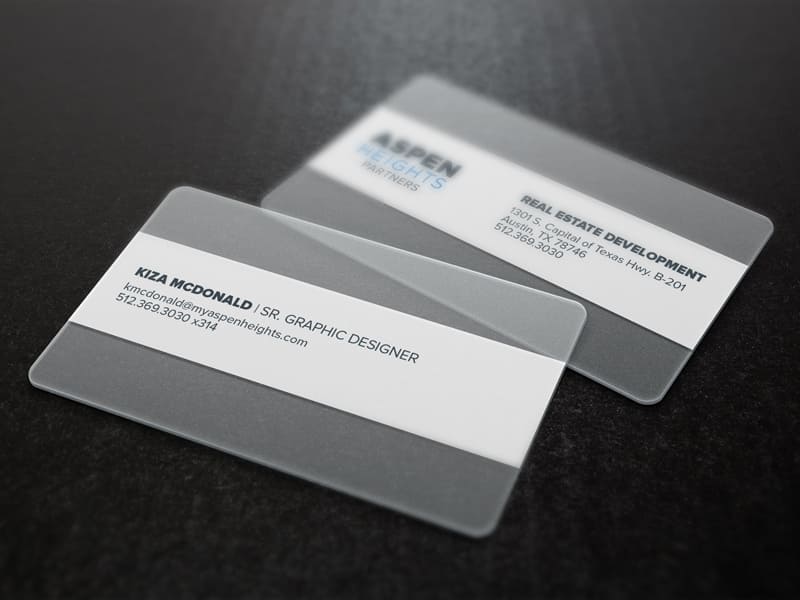
Transparency is very powerful tool that should not be overlooked. By overlapping different elements, you can create the effect of depth and dynamics. Transparent plastic is a very popular material among modern designers. It can create the feelings of harmony and cleanness. You clients are sure to value your creativity conveyed through transparent business cards, price lists, and other brand identity designs.
Texture
Source – Thati
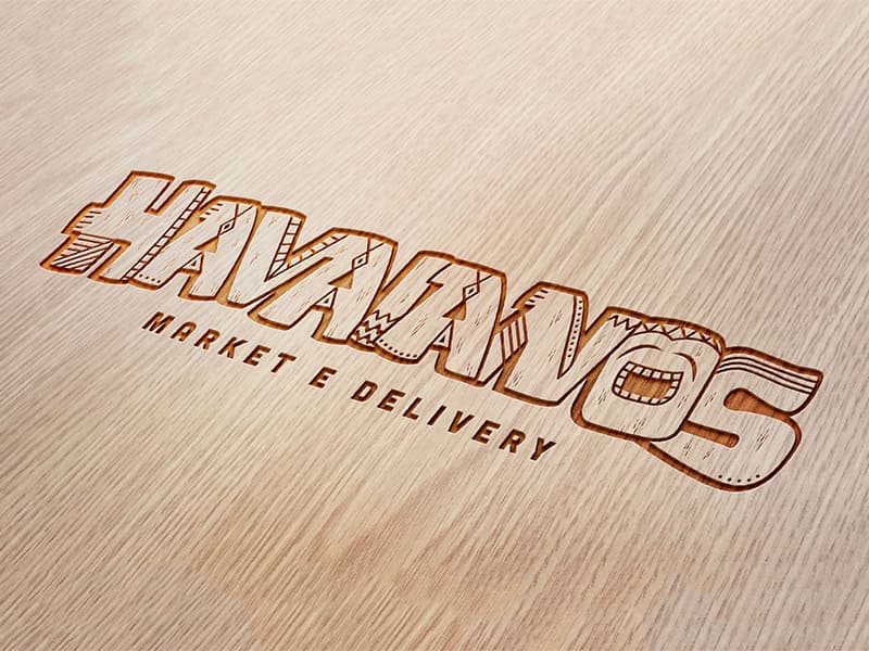
Fashion is not the only industry where textures are playing a huge role. Graphic design also depends on textures for its creative expression! Avoid too heavy textures unless you want to clutter your design. Go for light, unobtrusive textures that can bring out the best in your brand identity. By the way, textures can be applied not only to a logo but also to its carriers.
Negative space
Source – şamil bekiryazıcı
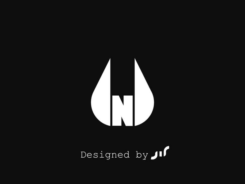
In graphic design, negative space works like a focus. Take the space between the elements of your logo and use it to create new senses and metaphors! With this technique, even the background can communicate a meaning!
Hierarchy
Source – Farrel Nobel
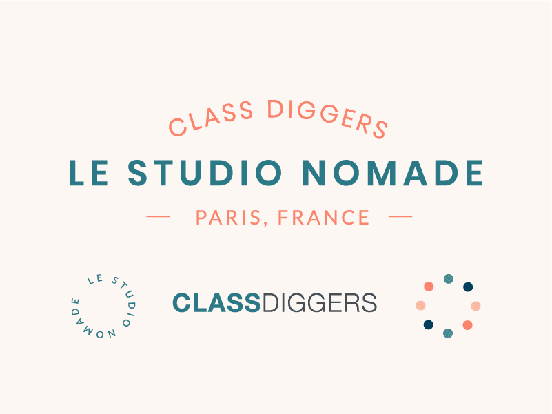
Split the elements of your design into three categories: key, basic, and additional ones. This is how you build the hierarchy of elements. Highlight the most important elements by using a bold color, scaling, or other methods. Basic elements should be less eye-catching but still visually engaging, while additional elements should be very subtle.
Balance

Source – Ksenija Mihailovic
When it comes to the accurate perception of a design, even the tiniest detail matters. Let’s debunk a common myth by saying that balance can be achieved even through asymmetry. In an asymmetrical composition, paired elements may look different but have the same expressive power. Try to combine two elements by making one of them bigger and the other one brighter.
Contrast

Source – Pablo Rozenberg
Contrast is an ideal tool for expressing yourself. Designers use this technique to make their visual content more clear and engaging. Experiment with contrasting colors, fonts, textures, transparency levels, etc. The results may surprise you!
Grid
Source – Ozan
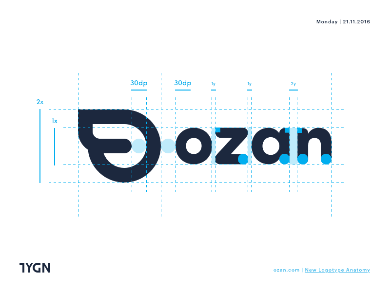
An orderly composition is always easy to understand and remember. In graphic design, order is achieved through using the module grid. Don’t be lazy to align the elements of your design to make it look neat and visually attractive. The more sophisticated your design is, the more rows and columns your grid will have. The grid makes your content easier to process.
Break the rules
Source – Haen Creative
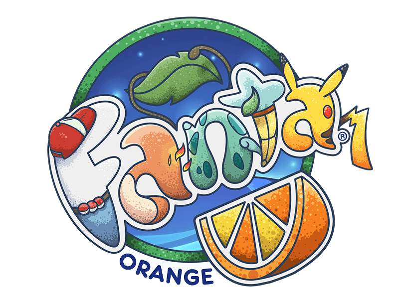
Designers would not be designers if they didn’t bend the rules from time to time. Breaking the established procedures is a fine way of displaying the brand personality. Asymmetry, unexpected color combinations, original decorative fonts.The tools for making your design rebellious are plenty! At the same time, you need to make sure that your brand identity remains stylish and universally clear.
Movement
Source – Logo machine
You can add dynamics and flow to any image, even a static one. To breathe a life into your design, use semi-transparent or blurry lines. This way, you can create the illusion that your icon is moving! Don’t get carried away though! Otherwise, you risk ending up with a composition that is heavy and bulky.
Depth
Source – Anthony Gribben
Adding depth is another way of making your design stand out. Experiment with shades, use overlapping techniques, and play with perspective…The options are many! The depth effect allows you to convey dynamics and change, as well as rank the elements by their priority.
Composition
Source – Mateusz Witczak
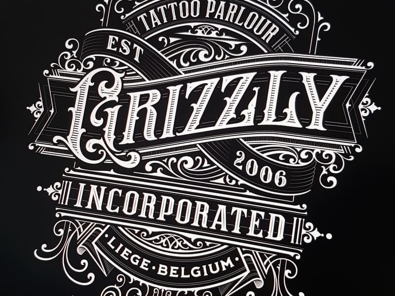
Now it’s time to combine all the techniques mentioned above to create a smart, engaging design. By being open to different combinations, effects, and tools, you can take your brand identity to a new level, leaving your competition far behind. After all, pushing the envelope is a sure way to get singled out by the audience, and this is what we all are here for!
We believe that the secret of a high-quality brand identity lies in both following the rules and breaking them. The best designs always have a fair share of imagination and originality in them. We encourage you to use the entire palette of creative methods available to you!

