A logo is an organic part of your brand identity. Despite its small size, a logo is responsible for a number of important functions that determine your company’s success. It’s the first thing your potential customers see when making acquaintance with your brand. A good logo ensures that your products stand out through their unique features and advantages. An aptly designed icon adds a professional feel to your corporate documents, employee uniform, marketing brochures, and other items that make up your brand personality.
From this article, you’ll learn about 7 types of logos used by modern companies. Plus, we’ve found beautiful examples to help you visualize each type. You’ll find out which icon is the best for your business and how to create one with ZenBusiness.
1. Types of logos
Logos come in all imaginable forms and sizes. You can see corporate icons on yoghurt bottles, jeans labels, car radiators, billboards, and many other places. Seeing dozens of logos daily, you may think that they all look the same. This is a big misunderstanding! Today, we’ll talk about the diversity of corporate designs. Knowing how other businesses created their corporate identity, you’ll find it easier to come up with a clever idea for your own icon.
Here are the 7 common types of logos:·
- Logotypes
- Abbreviations
- Symbols
- Mascots
- Abstract logos
- Emblems
- Combination marks
1.1 Logotypes
A logotype is a corporate image that only features a company name. On a logotype, you won’t see any symbols, graphic patterns, or emblems. Whether your brand name is concise or long, this type of logo is an ideal way to let your audience know what your business is called.
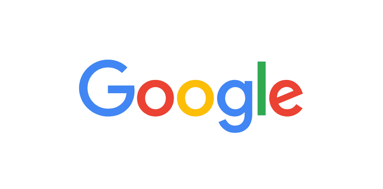
Who doesn’t know the Google logo? It’s a logotype at its best. Designed in 1997, the icon shed a few excessive elements in 2014, becoming an exceptional example of minimalism. Google managed to create a simple and airy logo, which is something few businesses can achieve. The icon boasts saturated colors without exploiting the beaten rainbow spectrum. Kudos to Google’s design solution!
Simple yet effective.
Here’re a few more logotypes used by Visa and Coca-Cola.

By placing a blue font on a white background, Visa makes its audience think about the clear and endless sky. An orange corner on the letter “V” stands for the picturesque hills of California.

As for Coca-Cola, its corporate image is literally bursting with positive vibes. There’s no better way to feel the upcoming holiday season than watching the Coca-Cola’s iconic Christmas ad! The playful font goes well with the idea of cheer and celebration.
The brands covered above have a one-word name which definitely looks better on a logotype. If, however, your business name includes more than one word, it must not stop you from designing a logotype!
1.2 Abbreviations
Let’s continue to explore letters and fonts in logos. What do you do if your business name is too long and looks clumsy on a logo? Here’s where an abbreviation logo comes into spotlight. An abbreviation contains the first letter of each word in a phrase. Short and concise, abbreviations are easy-to-perceive, both visually and phonetically.
An abbreviation logo gives you multiple design choices. By pairing an appropriate font and balanced colors, you can create a recognizable and unique icon. Take NASA (National Aeronautics and Space Administration), for example. Red letters written in an unconventional font are a surefire way to attract attention and convey a creative approach to work!

Letters are a simple and memorable design element. Remembering letters is much easier than memorizing an emblem or symbol. At the same time, you run the risk of designing a bleak logo that will look exactly like hundreds of other images. To avoid this, be sure to find (or invent) a one-of-a-kind typography solution or visual effect for your image. Take a look at the IBM logo with its “striped” design!
1.3 Symbols and graphic signs
A graphic sign (symbol) is a central branding element that creates a unique personality of your business. What’s the first thing that comes to your mind when you hear about Twitter? A blue bird, obviously. As for Apple, the IT giant is known for its bitten apple. The logos of these brands have become standalone symbols that allow us to identify the brand by only looking at its corporate sign.
The biggest advantage of symbols is their versatility. Symbol logos look good across a variety of contexts, from mobile apps to trucks.
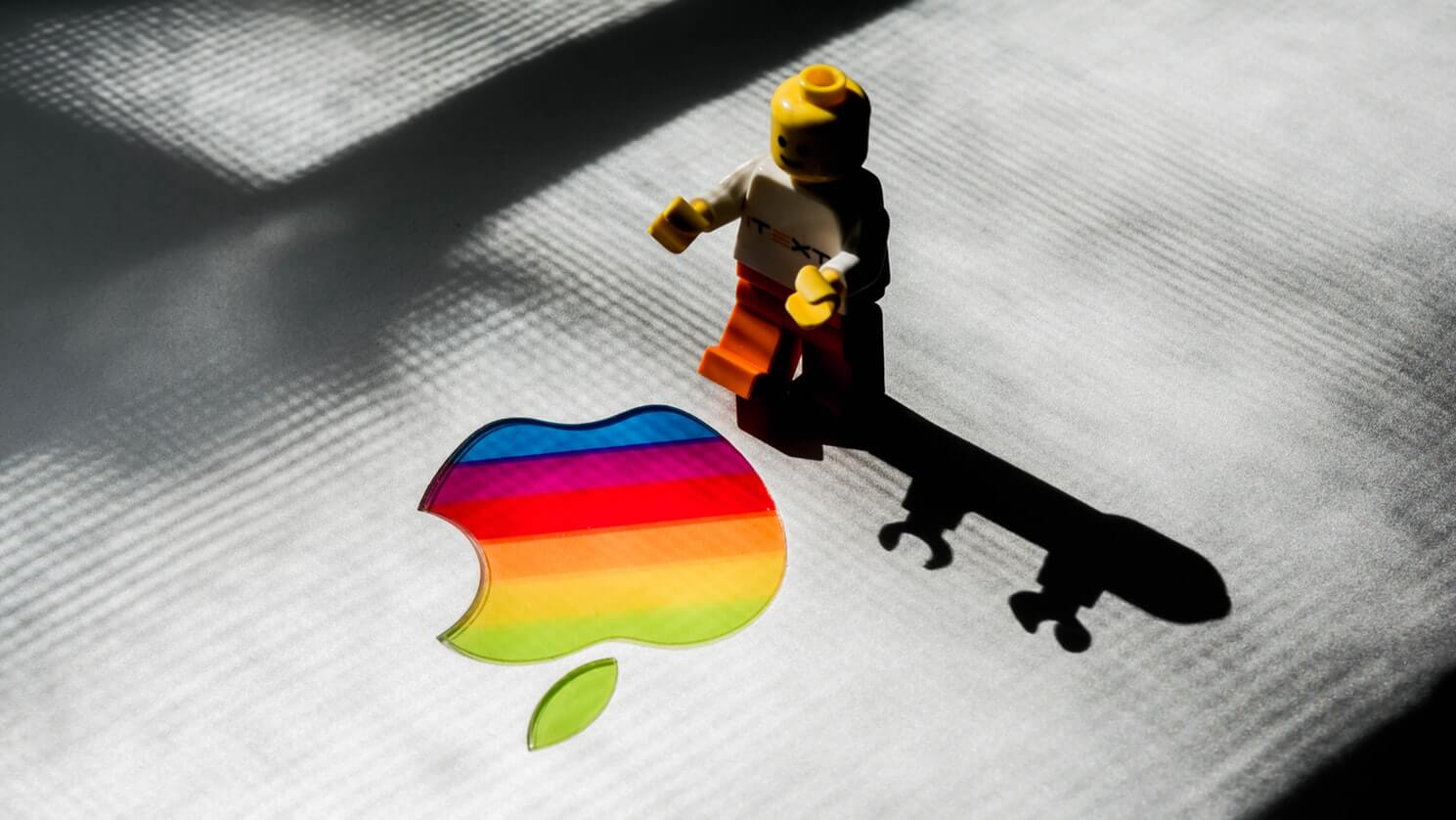
Apple is an iconic example of a symbol logo
Although an apple has nothing to do with the company’s specialization, this doesn’t take away from its value. With professional design and smart marketing efforts, the logo has become a globally recognizable symbol with its own voice.
However, most brands prefer to play it safe and choose symbols that reflect what they’re doing. If you think about it, every industry has its distinctive items. If you’re baking bread, consider using a loaf of bread or cake on your logo. For a legal practice, Themis with a scale will be a great choice. Groceries can choose from an abundance of vegetables and fruits (cucumber, potato, etc.). While for some businesses the choice of icons is obvious, others will have to think outside the box to come up with an original image. Remember that your selected symbol must tell your customers what kind of products or services you’re offering them. A bun is hardly a good idea for a sports club logo, don’t you agree? (Unless you have a really good concept that justifies your choice of an icon.)
Inanimate objects are not the only symbols you can build your corporate identity on. Alternatively, you can use the image of an athlete, chef, barber, etc. This brings us to the next chapter of our article that looks at mascot logos.
1.4 Mascots
We all loved cartoons as kids. (And some of us have never stopped loving them.) Do you remember your favorite cartoon character that won you over with their charisma and sense of humor?
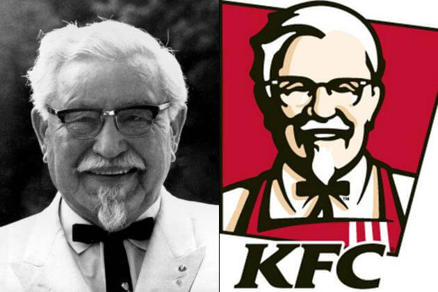
Colonel Harland Sanders, the owner of the American fast food restaurant chain Kentucky Fried Chicken, didn’t think twice before putting himself on his brand logo. Sincere and happy, Colonel Sanders is smiling from KFC packaging and billboards, inviting us to taste his delicious fried chicken. An image like that immediately establishes an emotional bond with customers which explains the wild popularity of the KFC brand all over the world.
Mascots are a great choice for companies that target families with kids. If you own or manage a children’s café, entertainment center, or school sports team, prepare to explore the world of superheroes, animals, and fairy-tale characters. Find the mascot that communicates you brand message and makes your value proposition unique.
Here are some amazing mascots:
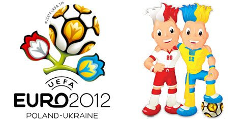
These cheerful footballers were featured on the 2012 European football championship logo
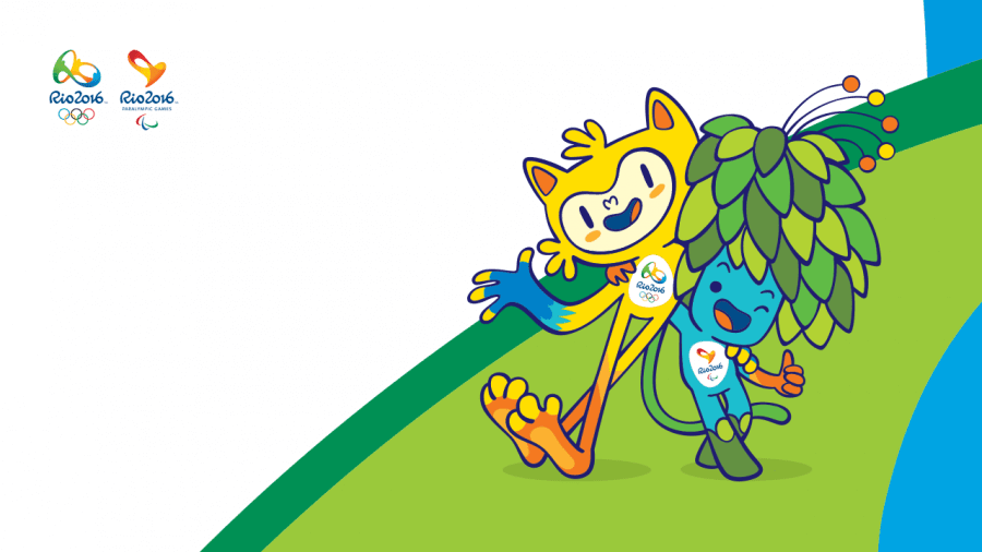
Brazil’s flora and fauna inspired the logo for the 2016 Olympic and Paralympic Games in Rio de Janeiro
If don’t feel like putting a mascot on your logo, consider creating an abstract composition!
1.5 Abstract logos
An abstract logo features one or several geometrical shapes: diamonds, triangles, squares, lines, and any other forms you think of. When it comes to abstract designs, the only limit is your imagination!
The biggest names that use abstract designs include Adidas and Pepsi. Let’s take a closer look at how these giants have visualized their corporate identities.
Adidas has not one but three abstract logos:
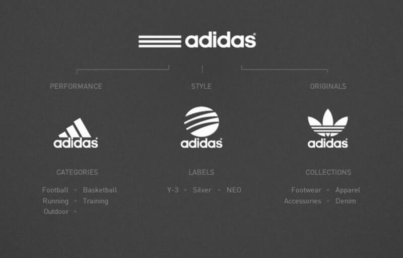
Created in 1972, the original design featured a trefoil. In 1997, Pepsi introduced a new design in the form of stairs that lead you to the top. The idea behind the 2001 circular logo was to keep up with the fast-evolving world.
Currently, Pepsi is using an attention-grabbing red, white, and blue circle as a tribute to American soldiers.

As you can see, abstract images can stand for a number of things, e.g. a flower, globe, stairs, and even gratitude and respect.
While not always straightforward, abstract images are synonymous with creativity and positive thinking. To craft a smart abstract design, you must go off the beaten path and view the world with fresh eyes.
Check out this amazing website with plenty of useful ideas for abstract logos and other designs.
Feel like a using an abstract logo doesn’t go in line with your business concept? Read on to find out about emblems. Who knows? It’s may be the emblem that fits your business just right.
1.6 Emblems
An emblem features a word, symbol or sign inside a geometric shape. Stamps, coats of arms, and similar designs all fall into the category of emblems.
Emblems are often used by schools, universities, social organizations, and state agencies.
While educational facilities opt for “safe”, conventional emblems, companies put lots of creative efforts into crafting unique images. You can hardly find another design that would resemble the famous Starbucks emblem with the beautiful siren, right?
The 3rd version of the Starbucks logo was used in 1992-2011
As the next branding step, Starbucks removed the company name from its emblem, only to make it even more stylish.

Harley Davidson is an American motorcycle brand with a global name. Along with its vehicles, the brand put its edgy emblem on apparel, bottles of perfume, jewelry, stationery, and other items.
Harley Davidson emblem has a sophisticated form
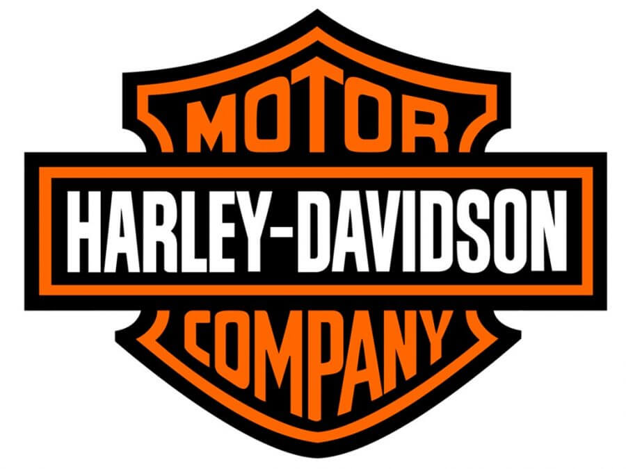
At the same time, emblems are less versatile than signs, logotypes, or abstract symbols. Due to a number of small details and intricate patterns, emblems become illegible when placed on small surfaces (favicon, envelope, pen, business card, etc.). So think twice before opting for this type of logo!
If you’re adamant about representing your business through an emblem, be sure to strike a balance between form and meaning. Read here on how to craft a good-looking emblem.
1.7 Combination marks
As its name suggests, a combination mark is a union of letters and images. Taking the best of the two worlds, a combination mark is the most popular type of corporate designs.
An icon and text can be merged in a number of different ways. For example, they may be placed side by side or overlap. Like with an emblem, the space around the elements on a combination mark remains blank:

If you’re an aspiring business vying for customers with established brands, a combination mark is your best choice. There’s no better way to position yourself in the market than using 2 identification elements at the same time.
A smart combination mark works both ways. Let’s take the Lacoste image, for example. When seeing the crocodile icon, you don’t need the brand name to know that this is the renowned French company. At the same time, the word “Lacoste” evokes associations with the iconic reptile. As your corporate image gains visibility in the market, you may consider removing your company name from your logo.
Combination marks are especially loved by food manufacturers as this is the most effective way to separate your product from the competition. Plus, it helps customers not to get lost among a huge choice of products on supermarket shelves.
A combination mark brings together 2 powerful tools, a business name and graphic image. If you have enough artistic talents to craft a balanced combination of the two, your design will be easy to perceive and memorize.
In this article, we’ve covered 7 common types of logos. Choosing the right logo for your project is no walk in the park. You must consider your company’s specialization, goals, mission, strong sides, and other crucial factors.
Who needs designers with their sky-high rates when you have a professional logo maker like ZenBusiness?
Make yourself a nice cup of tea and prepare to create your own logo in less than 5 minutes!
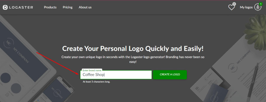
Check out how you can design a logo with ZenBusiness in 3 steps:
1. Enter your company name and industry:
2. Choose the appropriate colors and enter the slogan:

3. Use our search options to find the best icon for your corporate design:
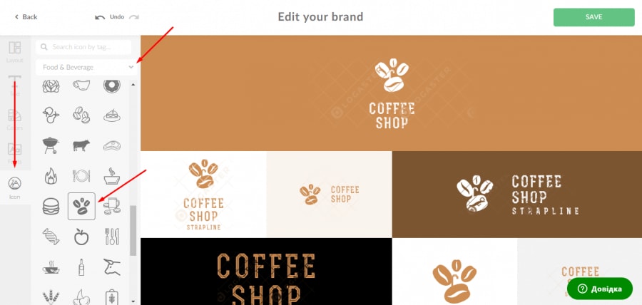
Click “Next” and save your logo.
A logo is not the only design ZenBusiness can help you with! Feel free to use your freshly designed logo to craft a favicon, envelope, business card, and letterhead. While a small-sized logo is downloadable for free, you can order a full branding kit (covers for social media pages, images for print, etc.) at an attractive price.
Whether you’re working on your first logo or running a rebranding, you can’t succeed without knowing the modern tendencies in the graphic design industry. Gain an edge over your rivals and check out the hottest design trends of 2018.
Wrapping it up
Creating a corporate logo is not as daunting as it might seem at first. The main thing is to take the process step by step. Sit down to think which elements you’d like to see on your design: letters, graphic image, symbol, or maybe abstract pattern? With the ZenBusiness online maker, you don’t need a big budget or outstanding creative skills to craft a worthy design!
If your corporate identity were a house, a logo would be the first brick in its foundation. A logo is what makes your potential clients notice your product on a supermarket shelf and choose it over your competitors’ offers. Not bad for a small image, huh? This article will help you decide which type of logo will emphasize your company benefits in the best way possible. Plus, you’ll learn how to create your own corporate design in 3 simple steps.
RELATED: Brand Identity Lessons from ExxonMobil: How To Do Smart Rebranding

