Discover the essential elements and creative inspiration behind designing an unforgettable vodka logo that captures the spirit of your brand.
Starts at $0 + state fees and only takes 5-10 minutes
Last Updated: July 9, 2025

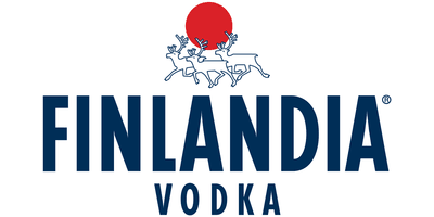
The Gray Goose brand uses the self-titled character (the gray goose) for its logo. The symbol of Finlandia vodka depicts three reindeer running against the backdrop of the sun’s disk. American vodka Rain highlighted its name in the logo by placing a few drops of rain falling on the letters. Ketel One vodka’s logo is literal: The name is written in a font stylized as Gothic. Absolut, Smirnoff, and Effen vodka chose a text logo. Market leaders emphasized unique font options that are now recognizable among the audience.

Vodka is a traditional hard drink. Unlike other types of alcohol, there is no particular space for experimentation with the recipe. Manufacturers place maximum emphasis on identity to highlight their product, including the unique vodka logo. The visual element should highlight the drink among others, promote memorability, and evoke the necessary associations among the audience. A vodka logo emphasizes the key value of the product: It can be a natural composition, a unique recipe component, or an emotional component: family values, masculine courage, etc.
The visual component of the vodka logo should emphasize several qualities. The first is the product category (elite, superior, quality, etc.). The second is the main feature (national flavor, special recipe, etc.). Most manufacturers focus on text logos, with the memorable font and name clearly visible on the label. This is a serious competitive advantage because products from different manufacturers are usually on the same shelf.
As with other alcohol brands, the key color for the vodka logo is any shade in the gamut reminiscent of transparency, freshness, and purity. The most common options are white, silver, pale blue, and blue. At the same time, black and red are used because they are strongly associated with traditional vodka logos and labels. The trend is minimalism; therefore, for text logos, choose simple color combinations and gradients, without an abundance of colors and details. The color of the logo should be consistent with the overall brand concept and the label design.

Before you start creating, you can familiarize yourself with the works of our users.




Disclaimer: The content on this page is for information purposes only and does not constitute legal, tax, or accounting advice. For specific questions about any of these topics, seek the counsel of a licensed professional.
Logo Resources
Ready to Start Your Business?
