Discover the artistry and elegance behind designing a captivating harp logo that resonates with musical charm and visual appeal.
Starts at $0 + state fees and only takes 5-10 minutes
Last Updated: July 4, 2025
Harp is known for its pure and idyllic sounding. Across different mythologies, a harp was considered the instrument of gods. It’s associated with global harmony and viewed as a “bridge” between the mundane and divine worlds. In the modern culture, a harp stands for an ideal harmony and visual beauty. Thanks to its symbolic meaning, a harp can be successfully used across a variety of organizations, including airline companies, private schools, and social organizations.


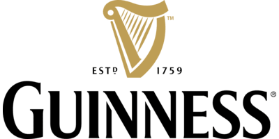
Guiness, a major beer brand, uses a golden harp which looks a lot like the one on the coat of arms of Ireland. Harp Ceramics designed a stylized image of the musical instrument. Ryanair, a world-known airline company based in Dublin, uses the image of the traditional Irish harp. The logotype of Humanitarian Assistance and Resilience Programme features harp strings incorporated between the letters. It’s an elegant nod to the abbreviated name of the organization, HARP.



Companies rely on the easily recognized silhouette of a harp. As for harp strings, you can use them as the main or additional visual element on your emblem. Free free to opt for an graphic-based logo or combination mark. If you choose a text-based logo (logotype), consider adding graphic elements for a better brand recognition and uniqueness. For example, it might be a good idea to add harp strings to one of the letters or replace a letter with a harp. Also, don’t be afraid to experiment with abstract images that suit your industry and brand.

When composing the optimal color palette for your harp logo, think about the message you want to communicate to your target audience through your emblem. For example, use shades of green to transcend harmony and peace. Also, feel free to play around with other hues, such as white, golden, orange, yellow, blue, etc. As for the golden color, you should be careful so as to avoid associations with the renowned brand. If you’re working on a combination mark, give preference to white, green, silver, and black.



Before you start creating, you can familiarize yourself with the works of our users.



Disclaimer: The content on this page is for information purposes only and does not constitute legal, tax, or accounting advice. For specific questions about any of these topics, seek the counsel of a licensed professional.
Logo Resources
Ready to Start Your Business?
